It lives in what we do, what we transform, and the connections we create. It is momentum, presence, and movement. A force expressed through ideas, actions, and the drive to make things happen.
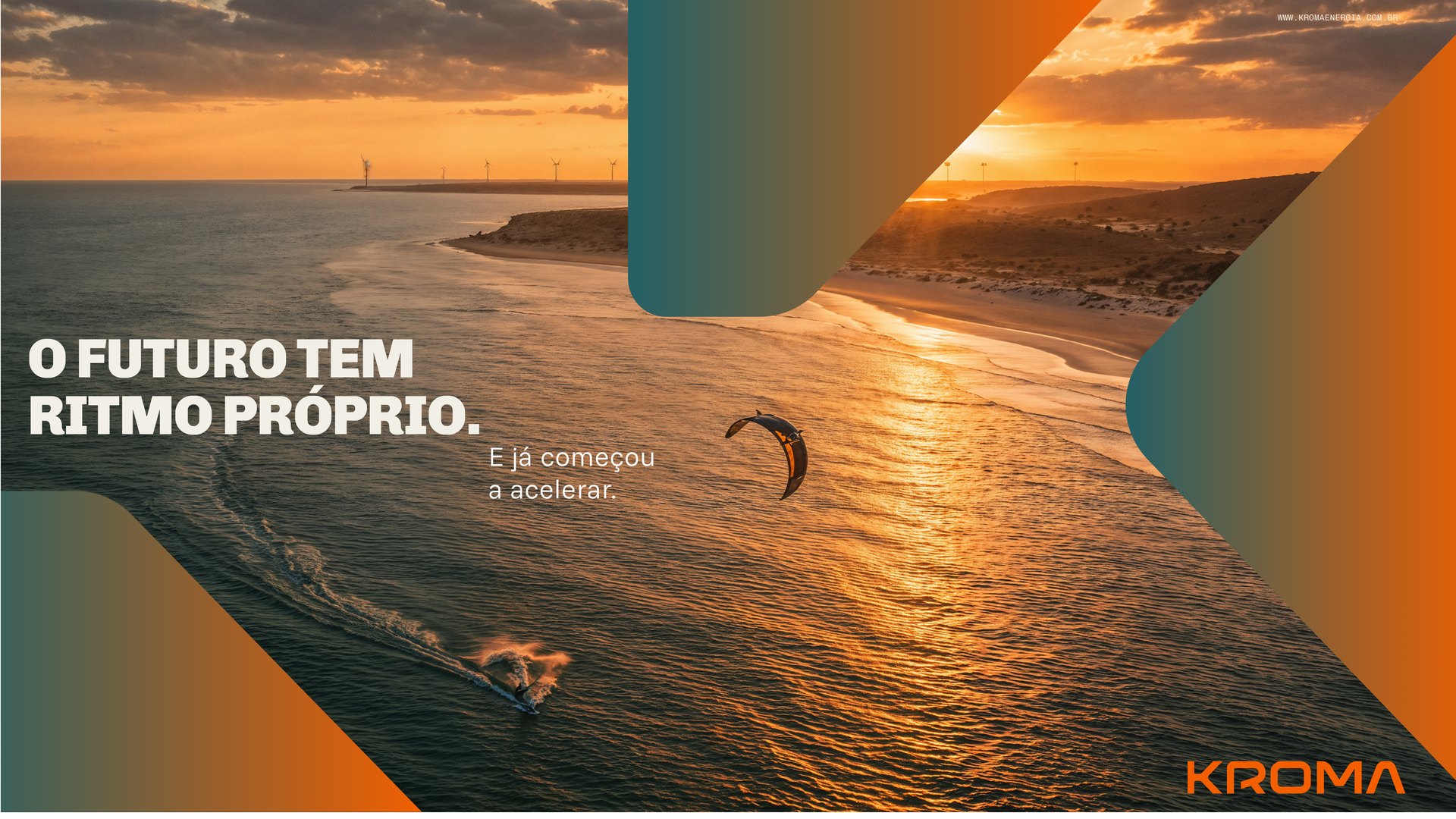
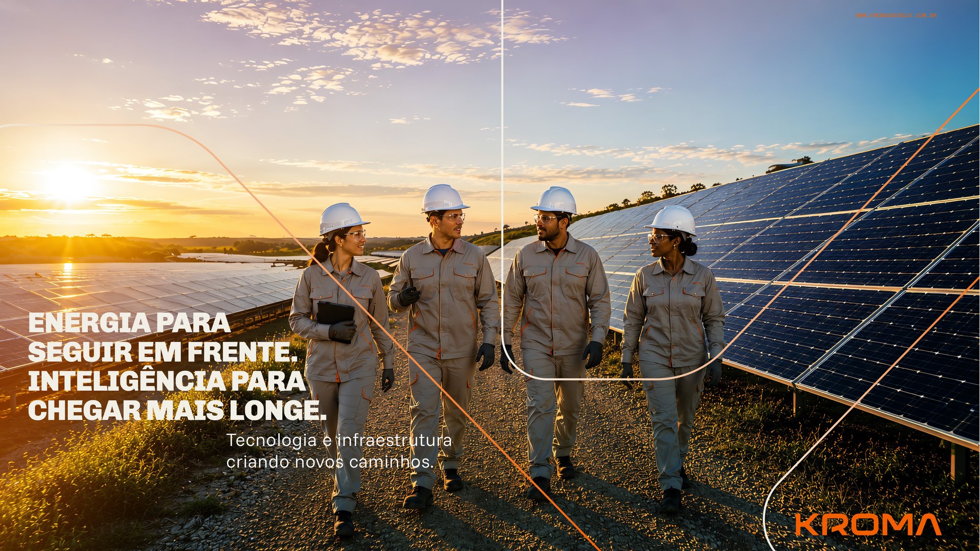
This perspective shaped our redesign of Kroma’s visual identity. A brand that channels the dynamism and transformative potential of renewable energy into a vibrant, contemporary visual language full of character.
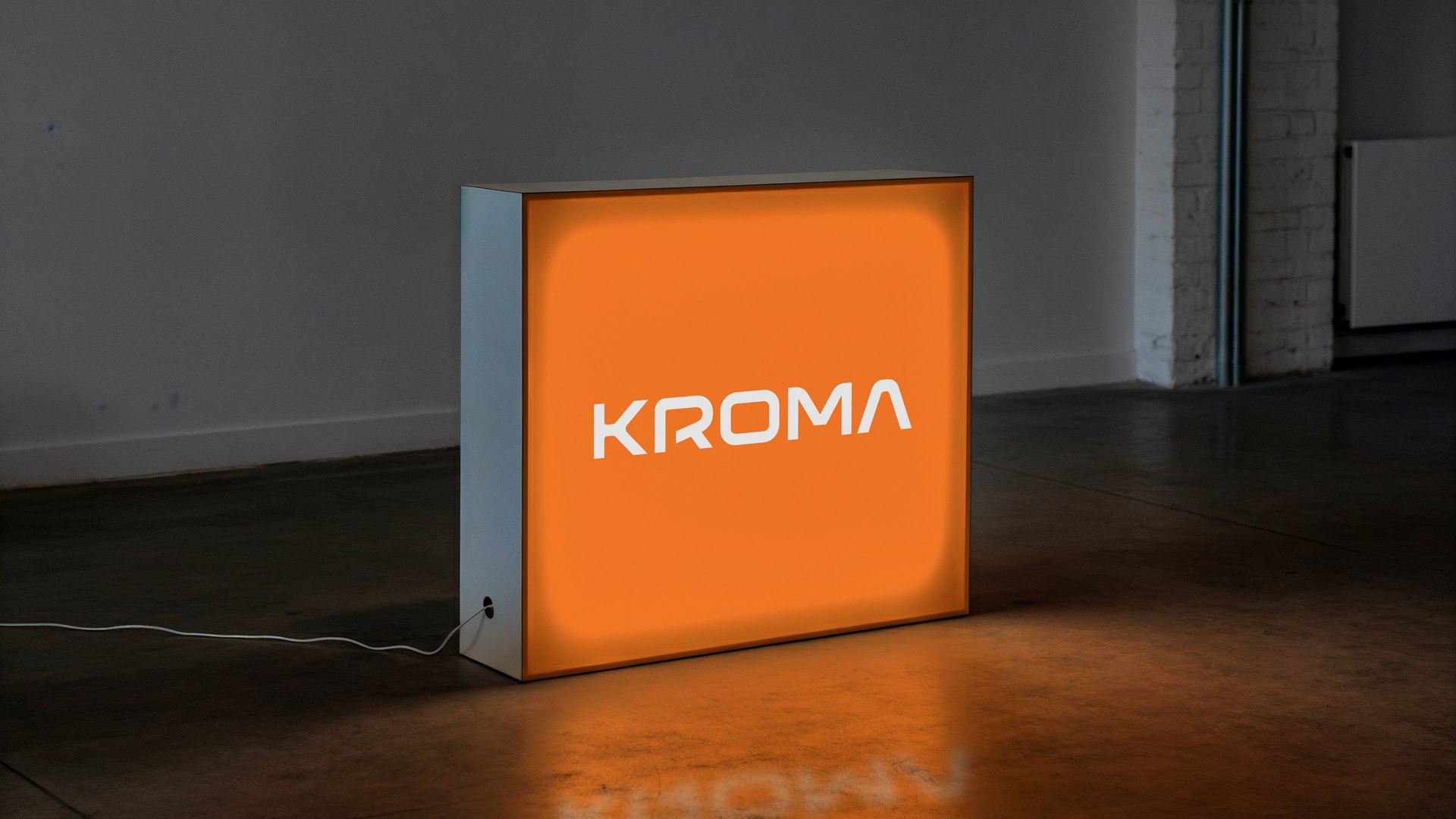
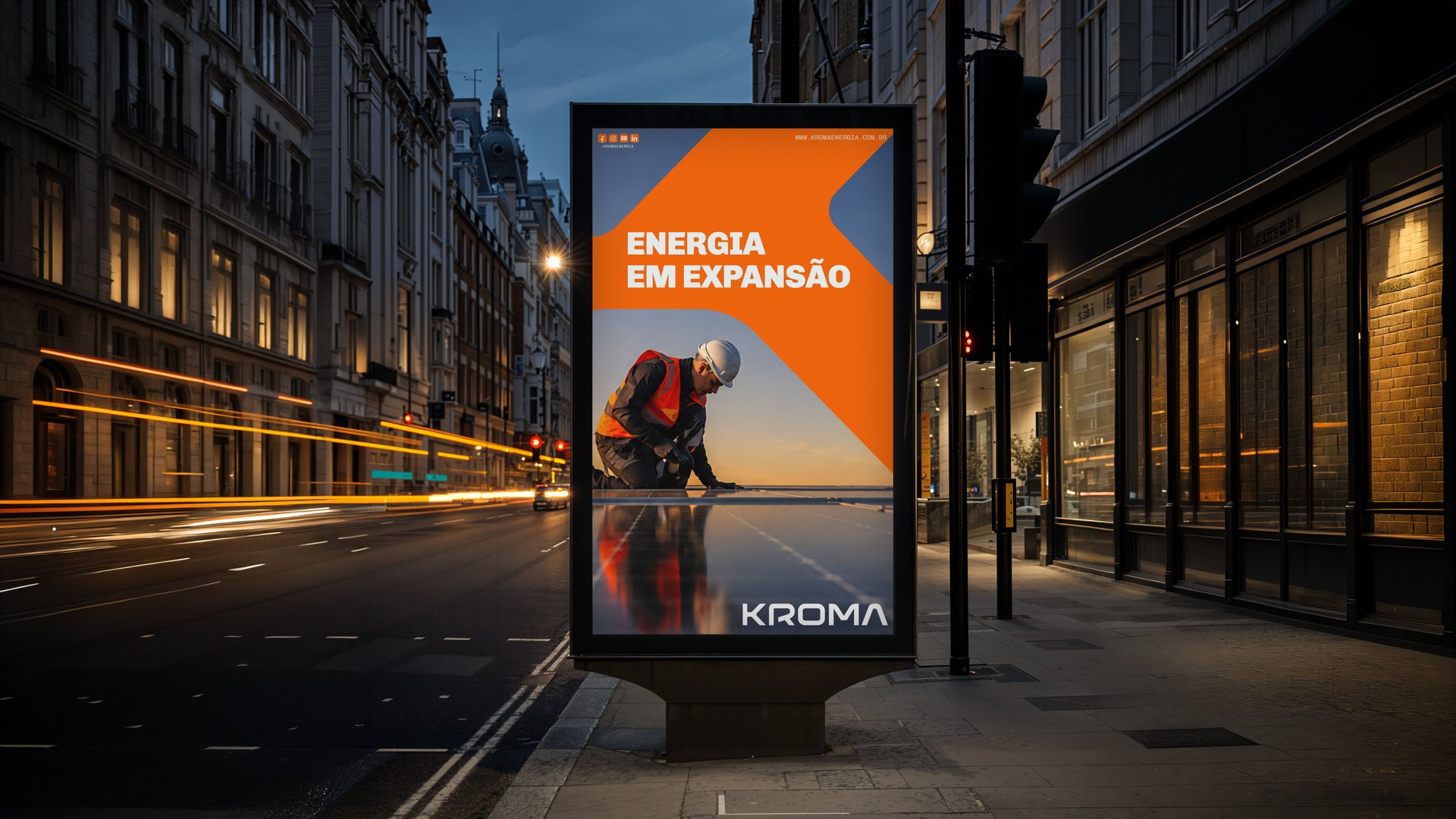
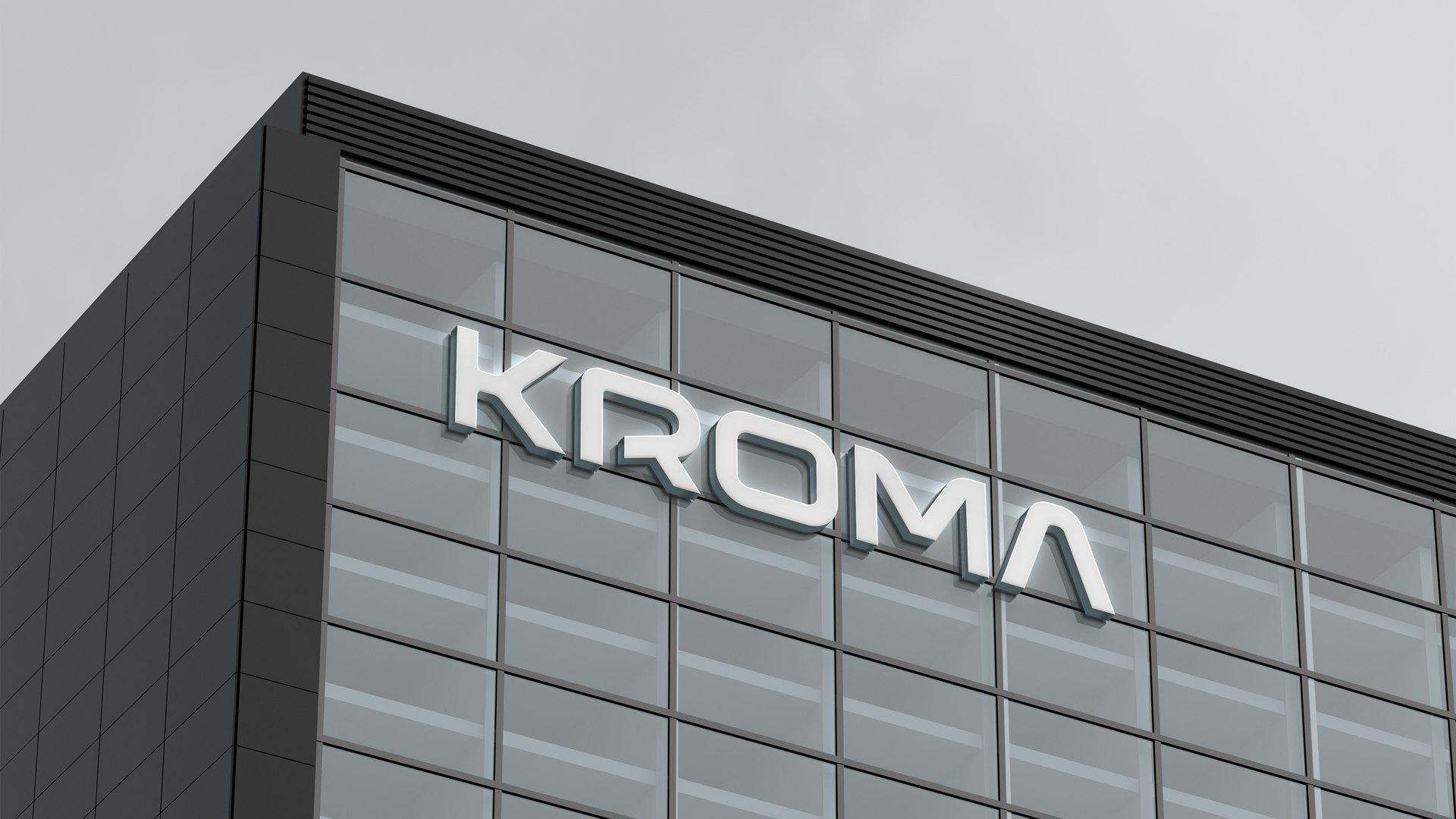
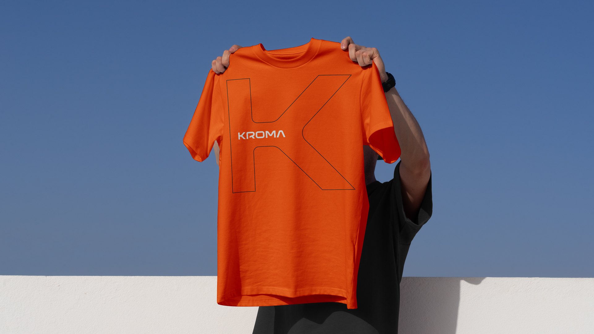
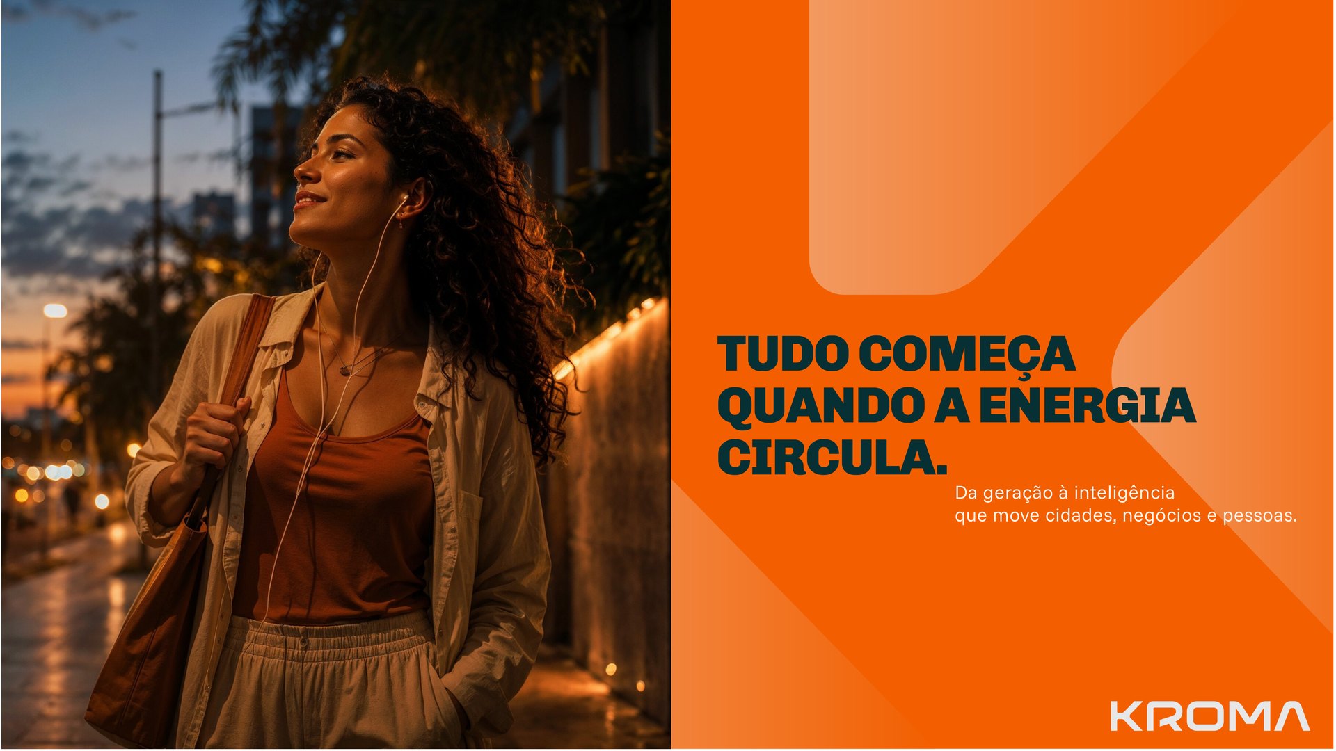
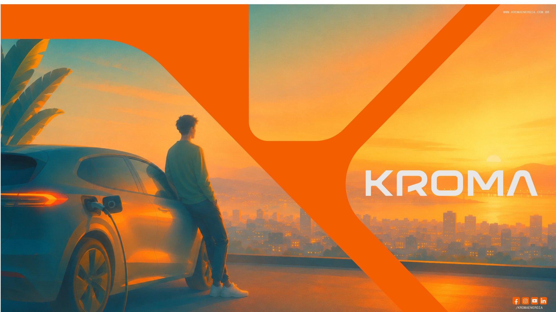
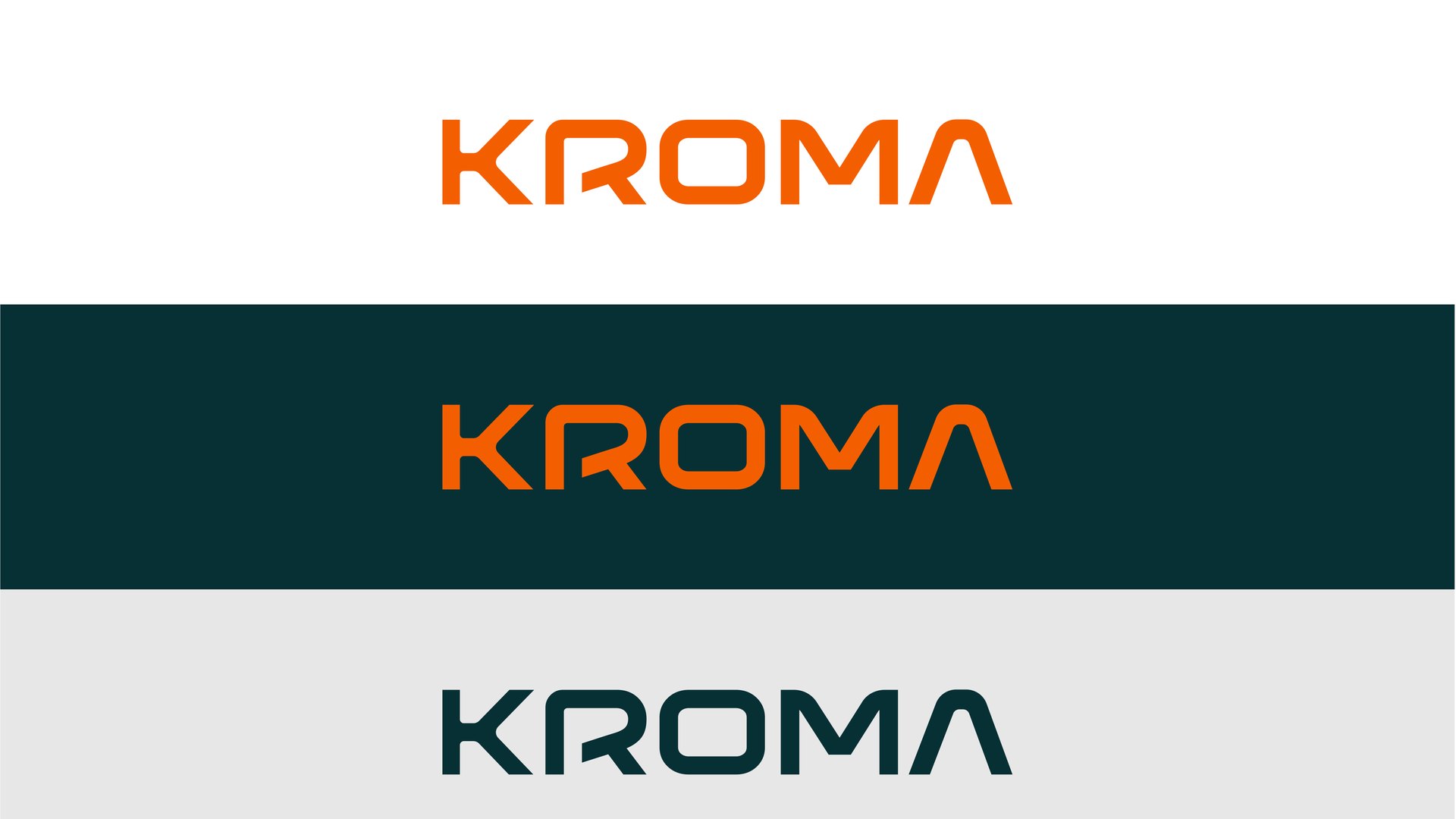
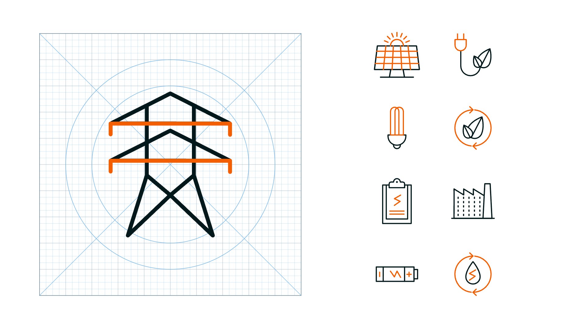
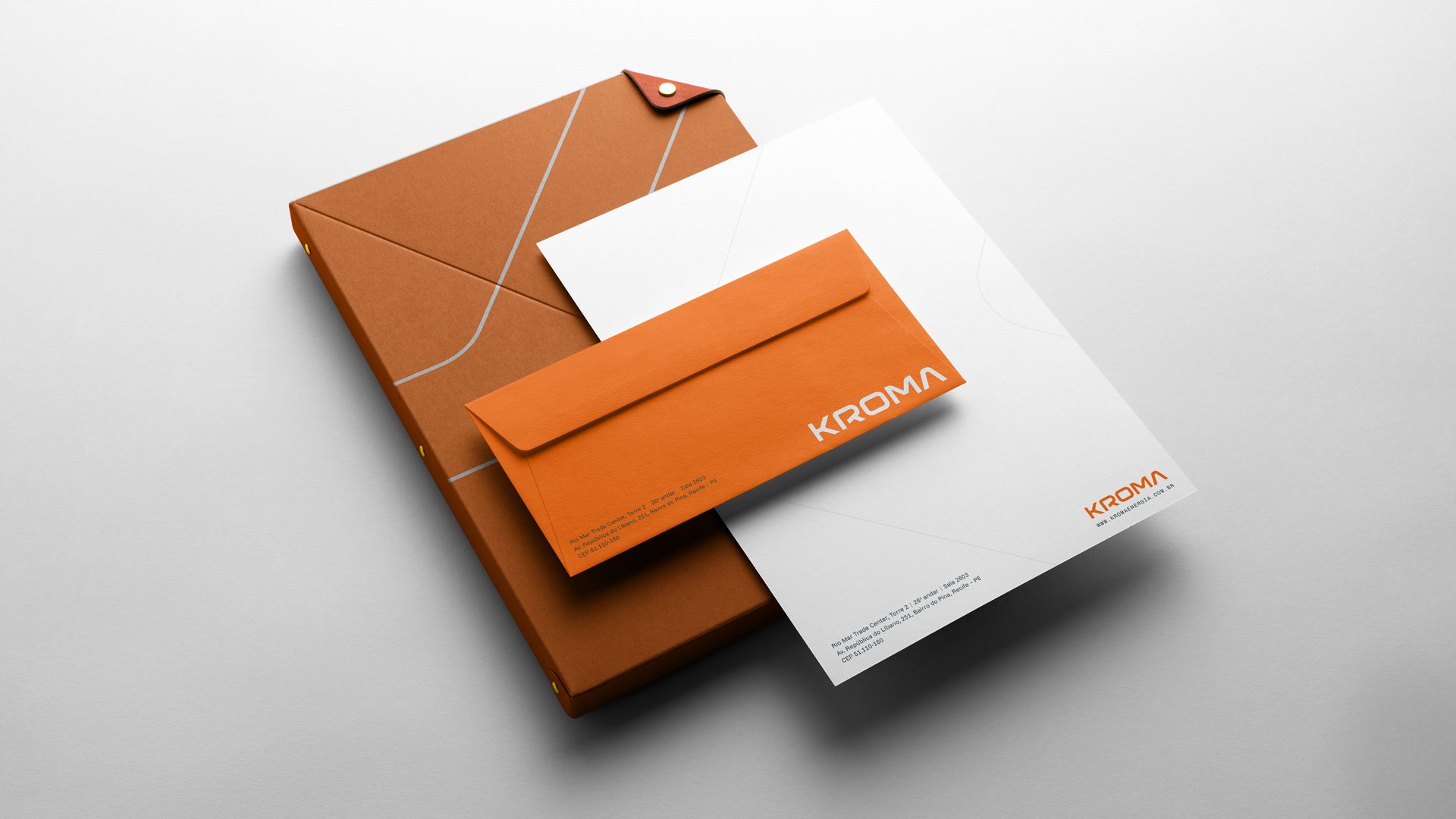
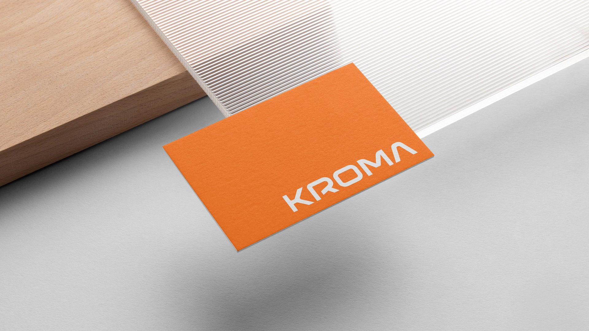
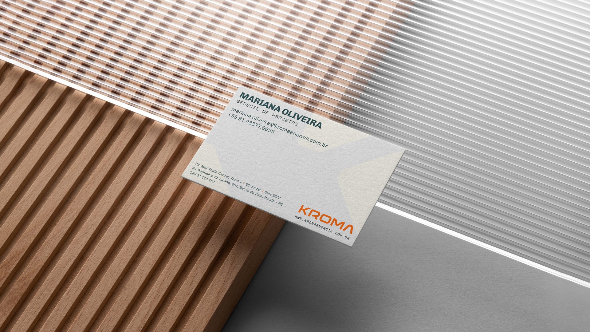
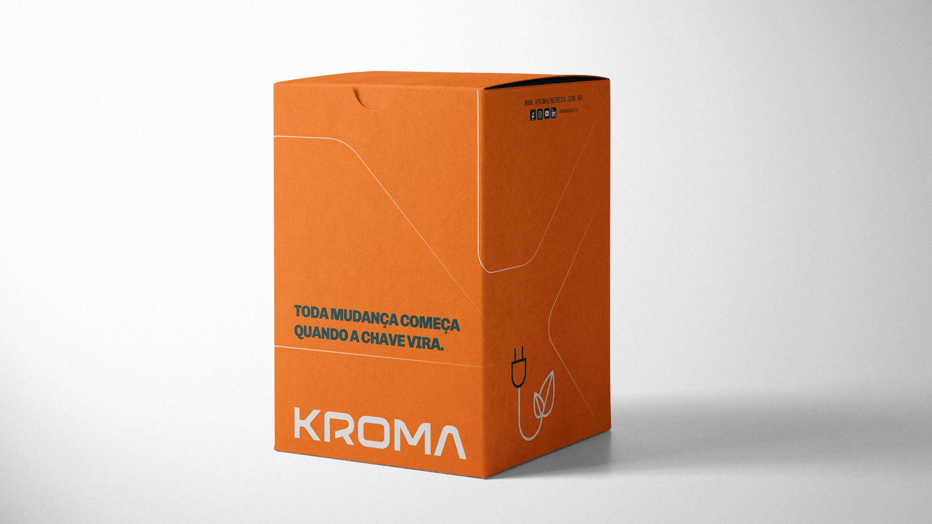
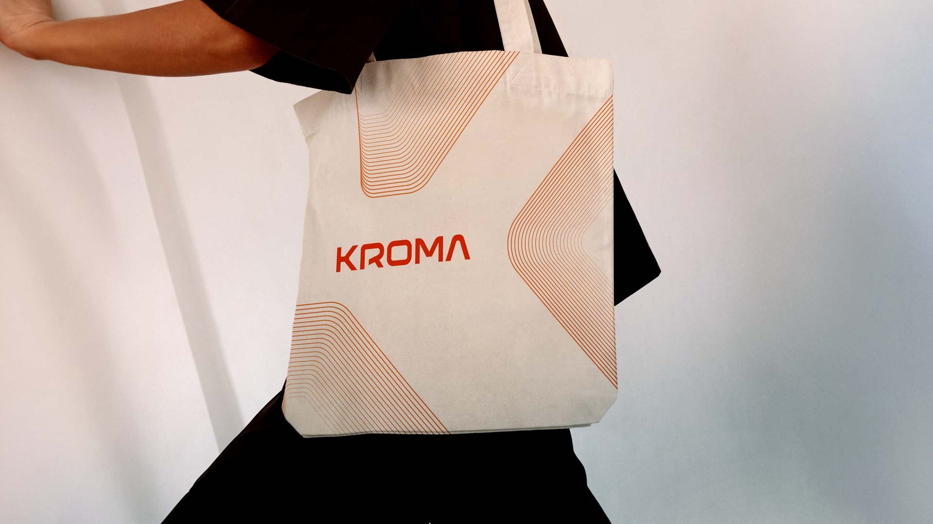
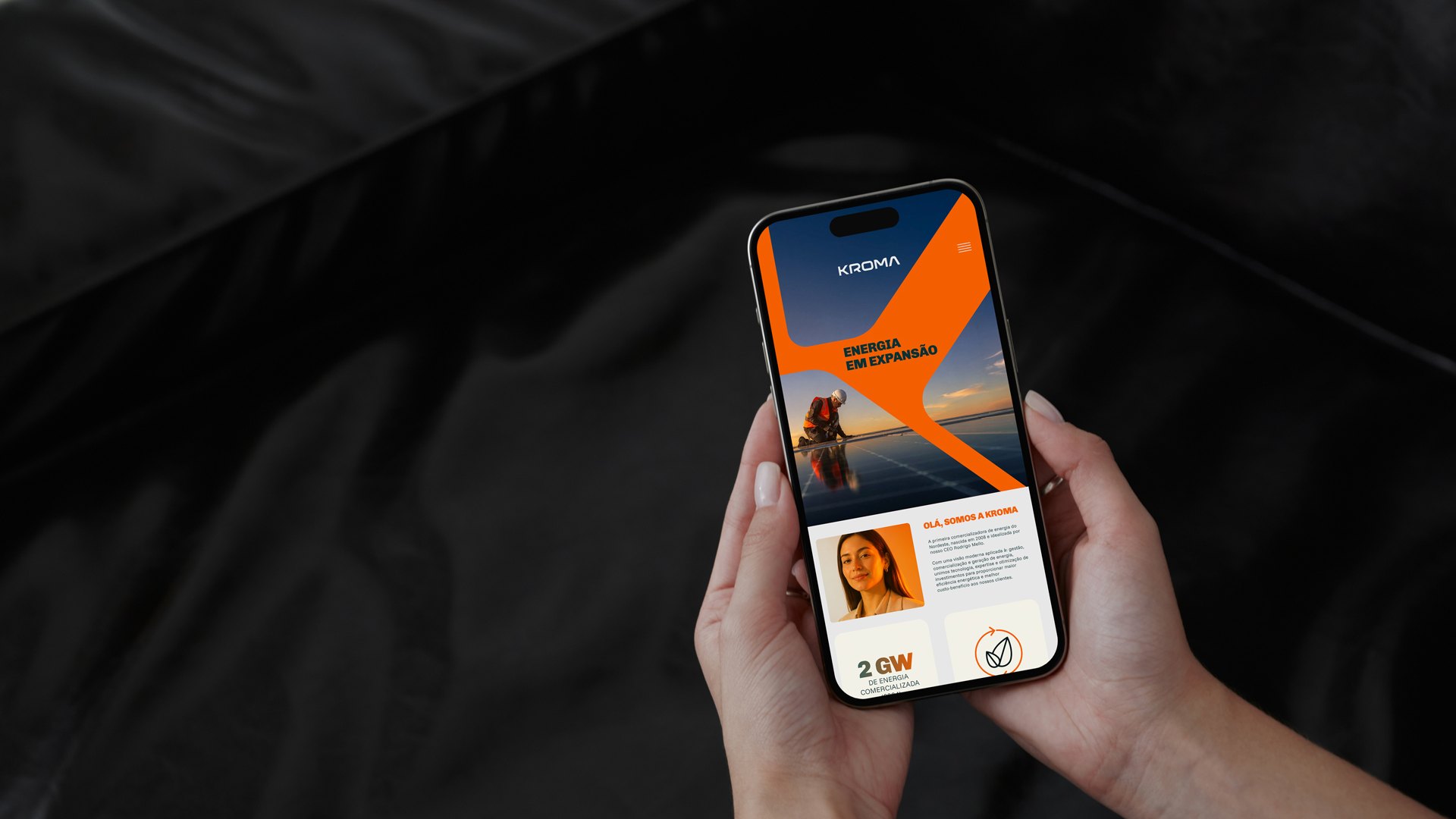
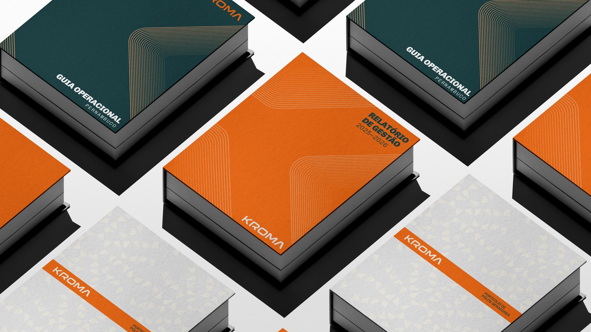
Movement begins with the mark itself. A wedge cutting through the K conveys momentum and direction, becoming the foundation of a dynamic, expansive graphic system. Orange takes center stage with its sun-powered intensity, while deep, rich tones bring balance and strength. Typography, photography, and graphic elements come together to create a visual universe that adapts seamlessly across different scales, formats, and experiences.
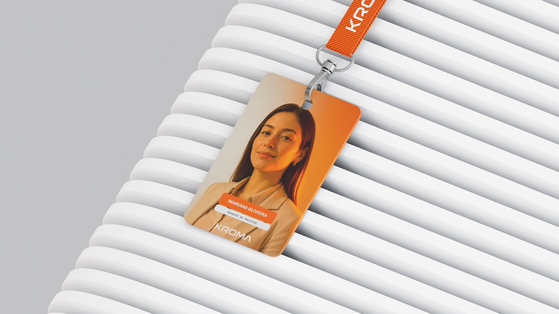
An identity that comes to life in the streets, in spaces, and through people. One that captures the spirit of a company embracing change and its determination to drive transformation all around it.
Because every change begins the moment something clicks.