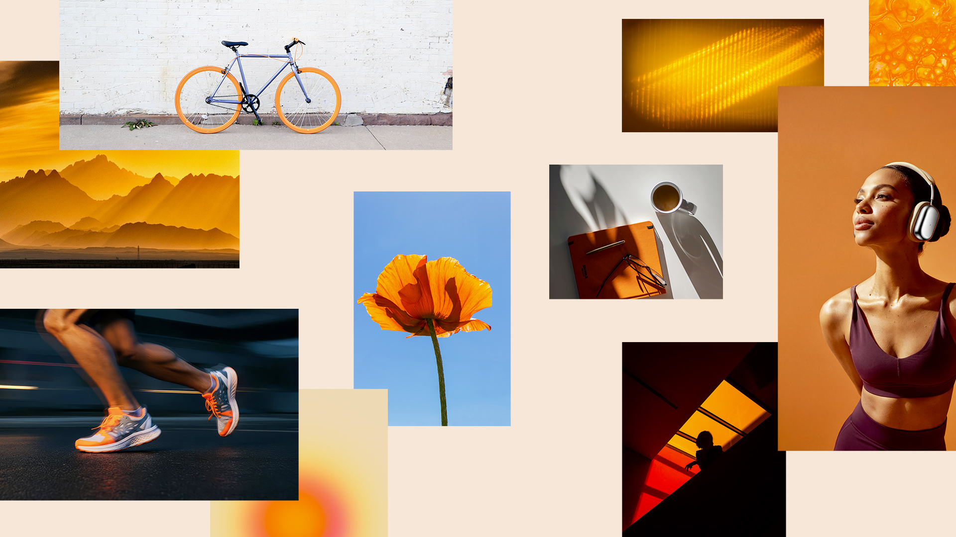
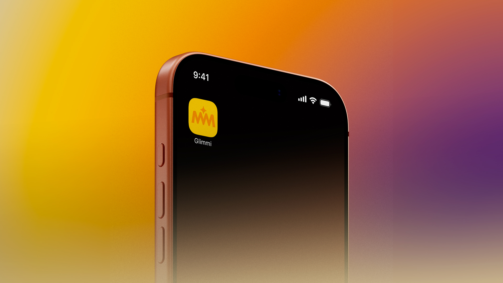
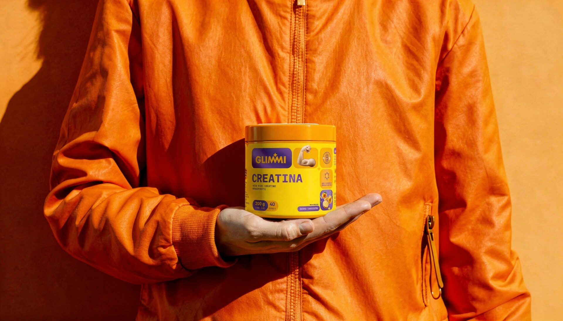
Glimmi started with an insight: there was room to talk about health and wellness without leaning on the usual fitness clichés. The idea was a younger, lighter, more relatable brand, one that fits into all kinds of routines and lifestyles and can grow well beyond supplements.
The name comes from the Nordic root “glim,” meaning to shine, and it already hinted at a brighter, more optimistic brand. Estúdio Mola took that idea and built Glimmi’s branding, visual identity and first packaging line around it.
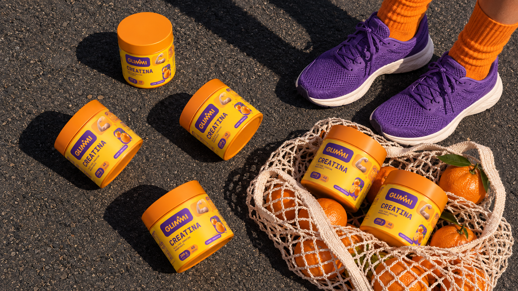
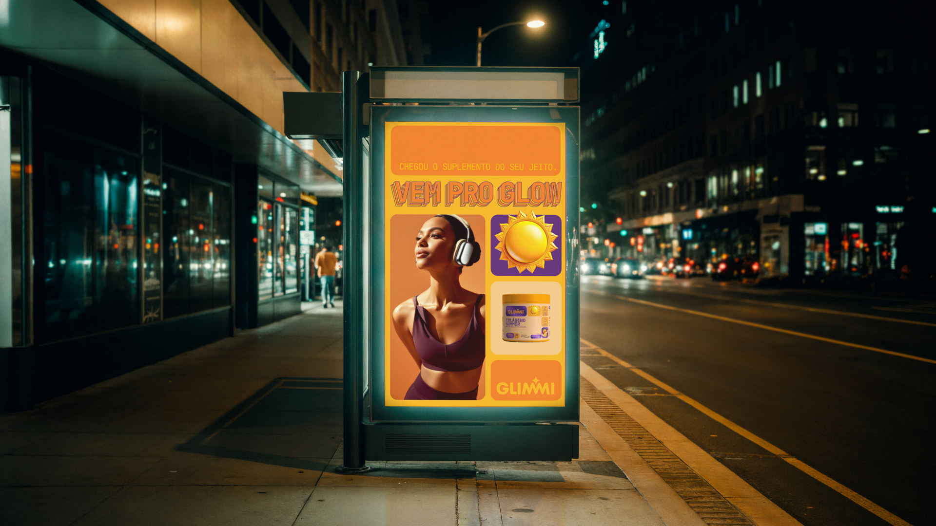
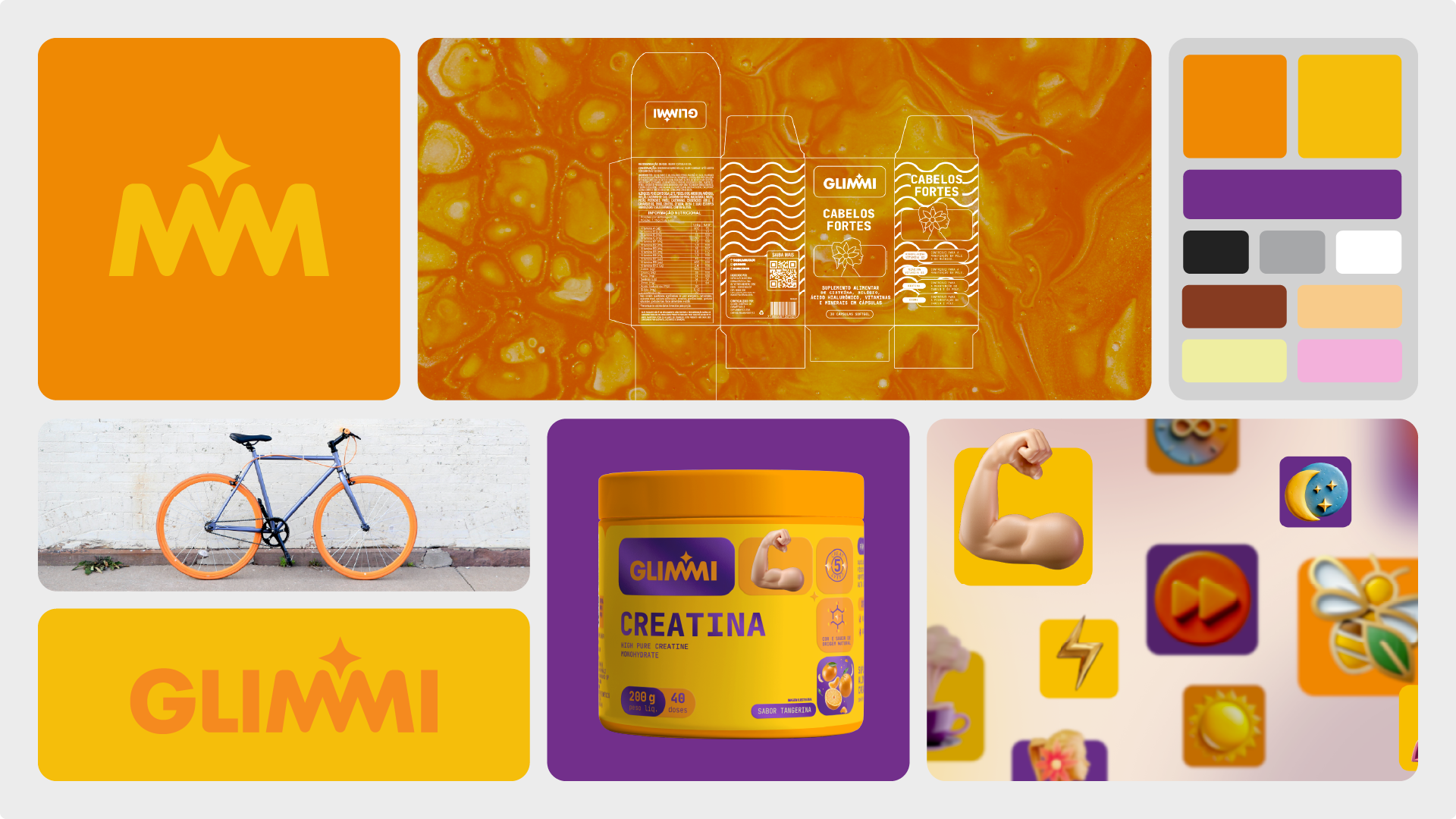
The result is a sunny, vibrant, digital-first world. Bold colors, expressive type and icons that shift between 2D and 3D give the system its character. On pack, a bento box–inspired grid keeps claims and information clear, sets a rhythm and lets the product take the spotlight.
The result is a young, flexible identity that brings wellness into everyday life, with more lightness, more energy and plenty of room for Glimmi to expand into new products, categories and experiences.