Fabbrique began as a pastificio, with artisanal production at the heart of the business. Ten years later, the restaurant has taken center stage, and the brand needed to evolve with it — becoming more mature and sophisticated without losing the hands-on approach that has always been part of its DNA.
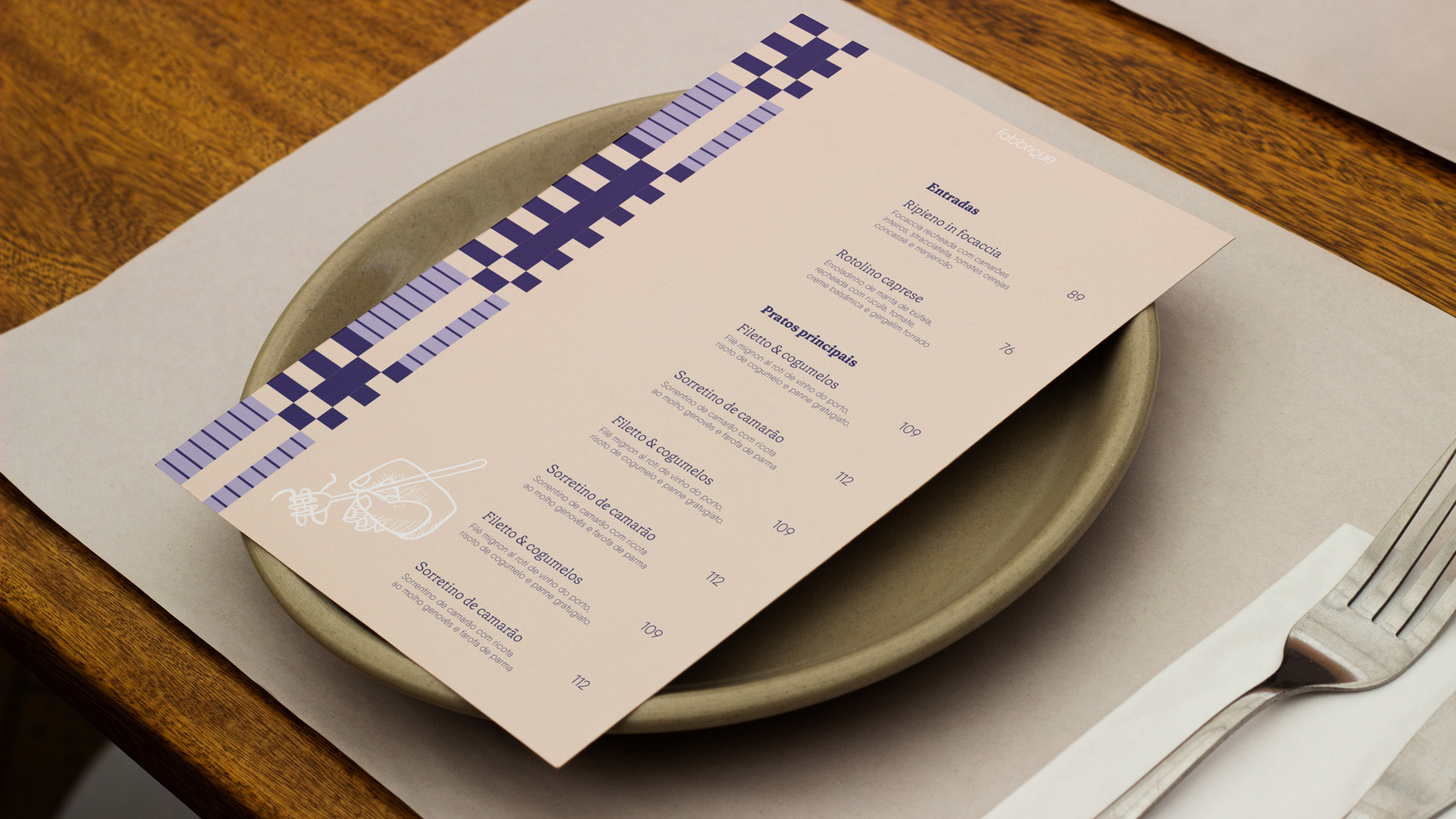
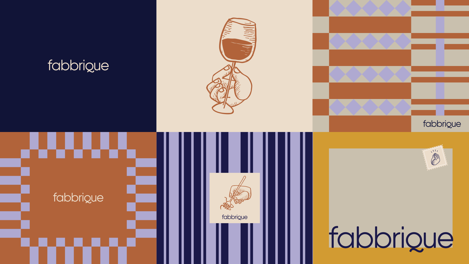
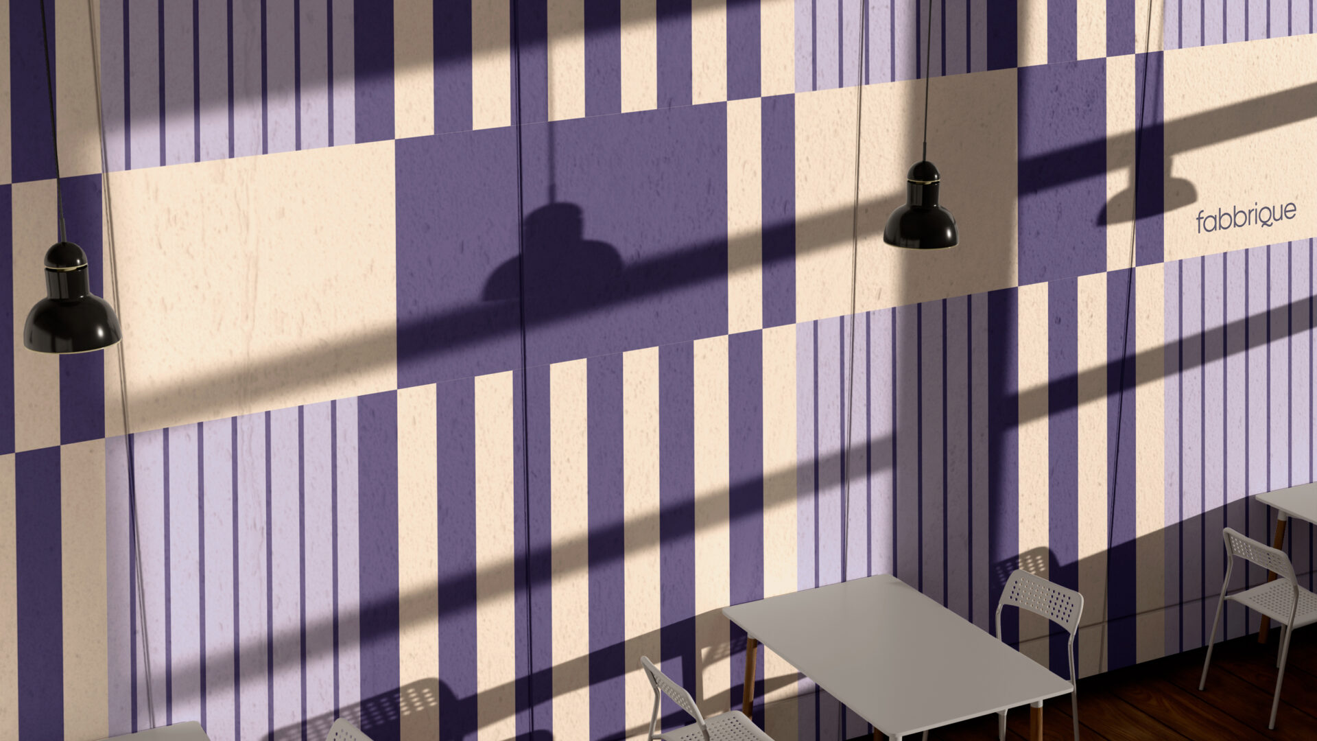
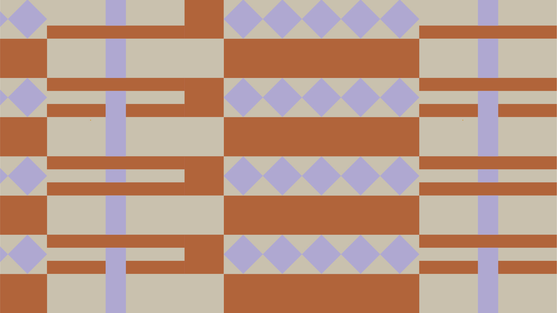
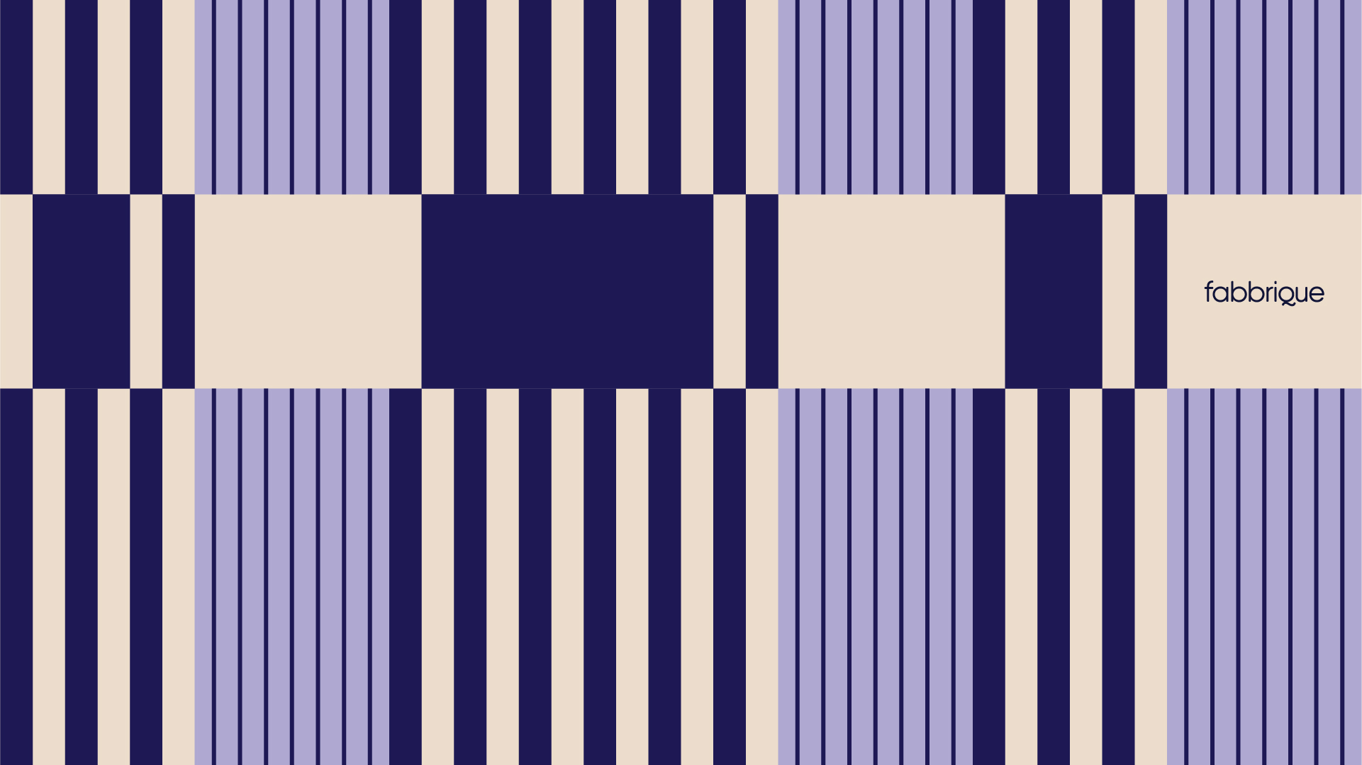
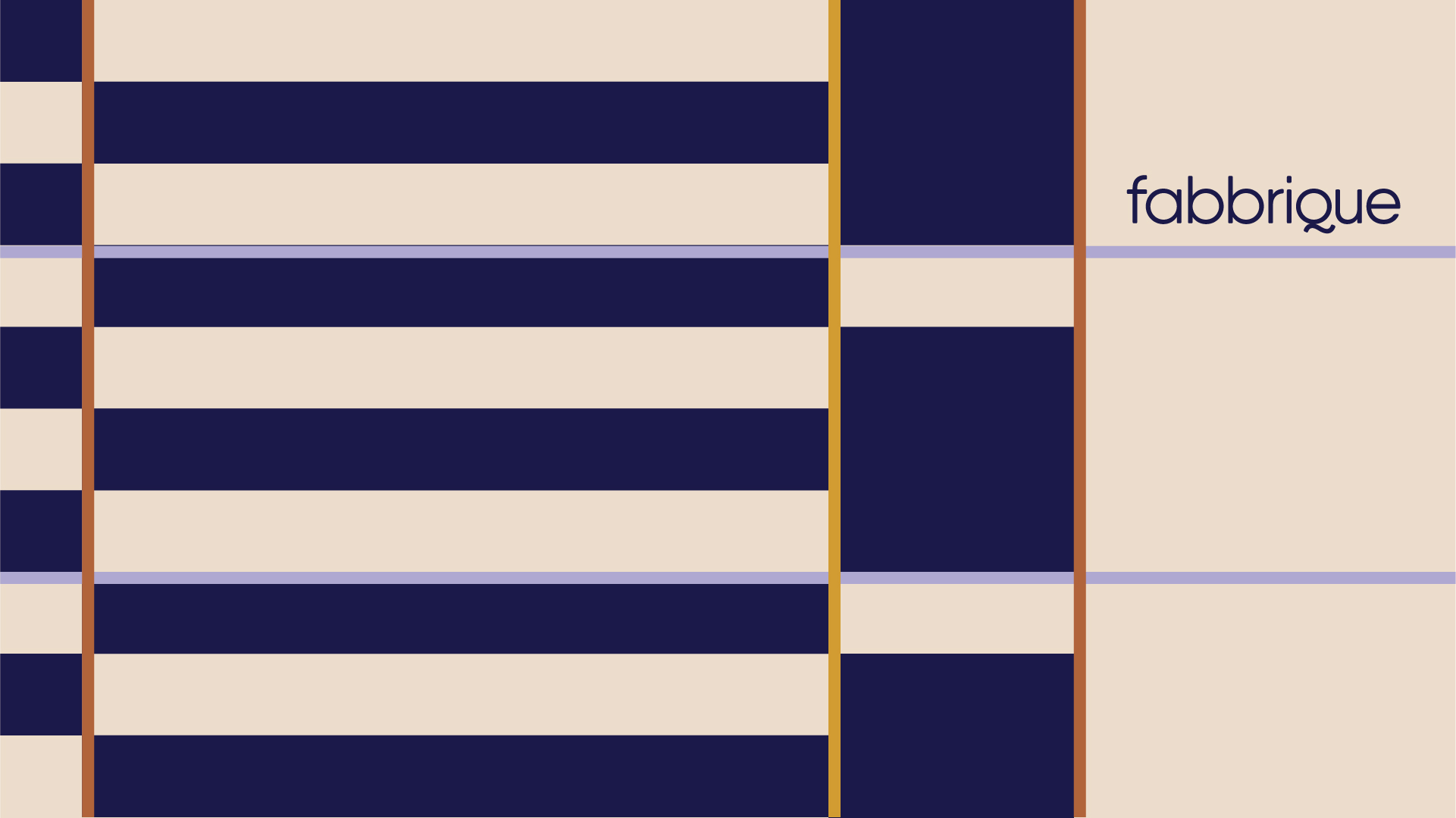
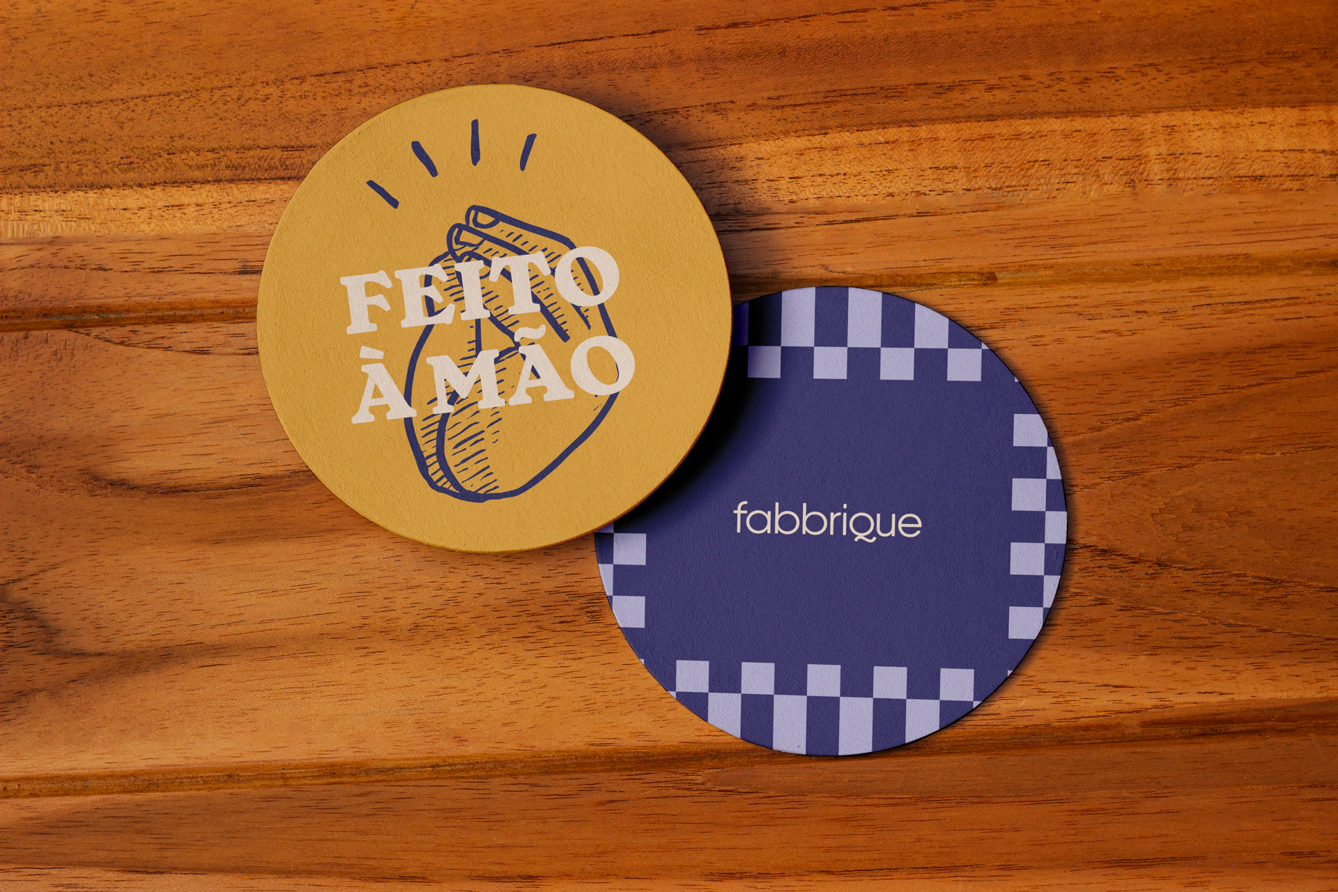
The redesign builds on what was already familiar about Fabbrique while making room for a more contemporary visual language. Blue remains at the core, now in a deeper shade. The logotype becomes softer and more approachable. The color palette expands, while new graphic patterns offer a contemporary take on the traditional tablecloths found in Italian trattorias.
But it is through the hands that past and present come together.
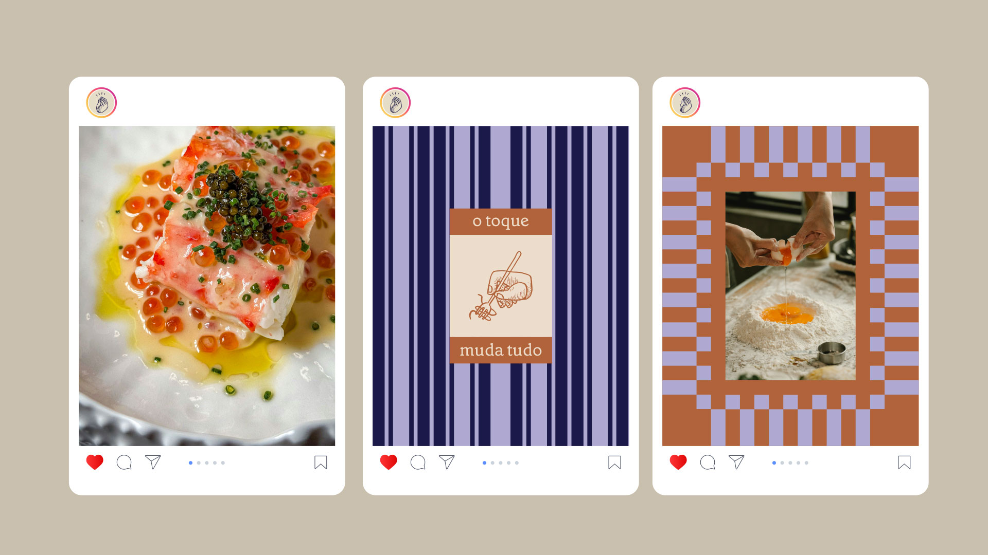
They become the thread running through the new identity: hands making pasta, finishing a dish, pouring wine, holding a fork, sharing a table. A simple element that speaks to craftsmanship and Italian roots, while also capturing a restaurant experience that feels more relaxed, contemporary and, above all, human.
A lot has changed at Fabbrique. The human touch remains.