Solidity renewed with lightness.
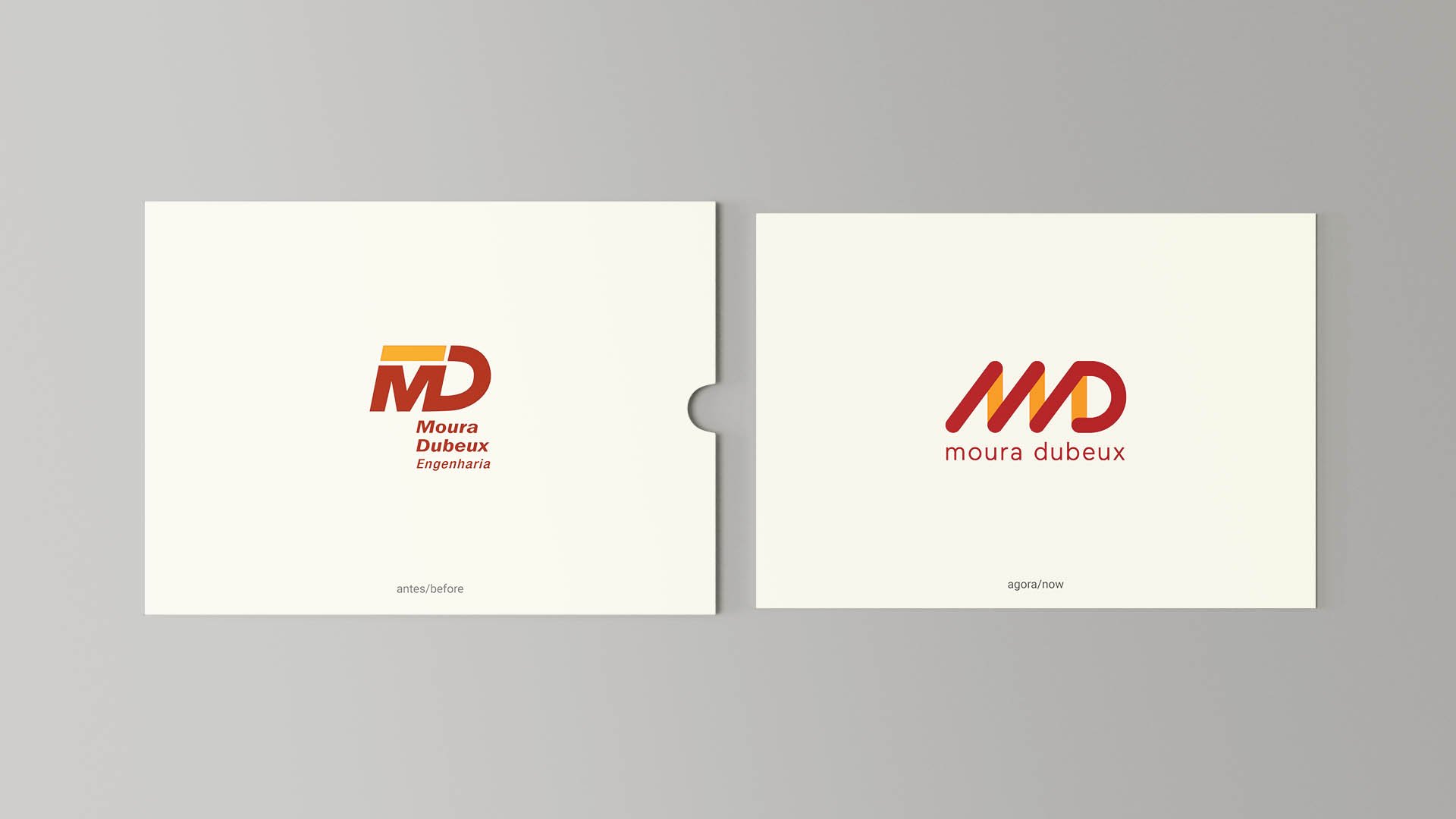
One of the leading players in Brazil’s real estate market, Moura Dubeux was preparing for its IPO and anticipating a series of changes the company would adopt for a new stage after 37 years of constant evolution. The context was strategically right to solve two central challenges: correcting undue modifications the brand had suffered over time and forcefully communicating the transformations on the horizon.
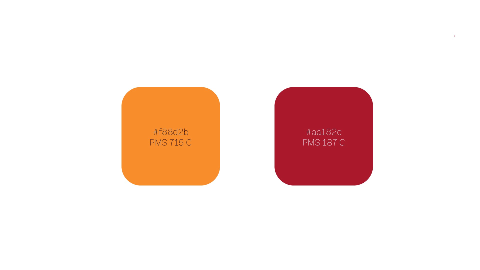
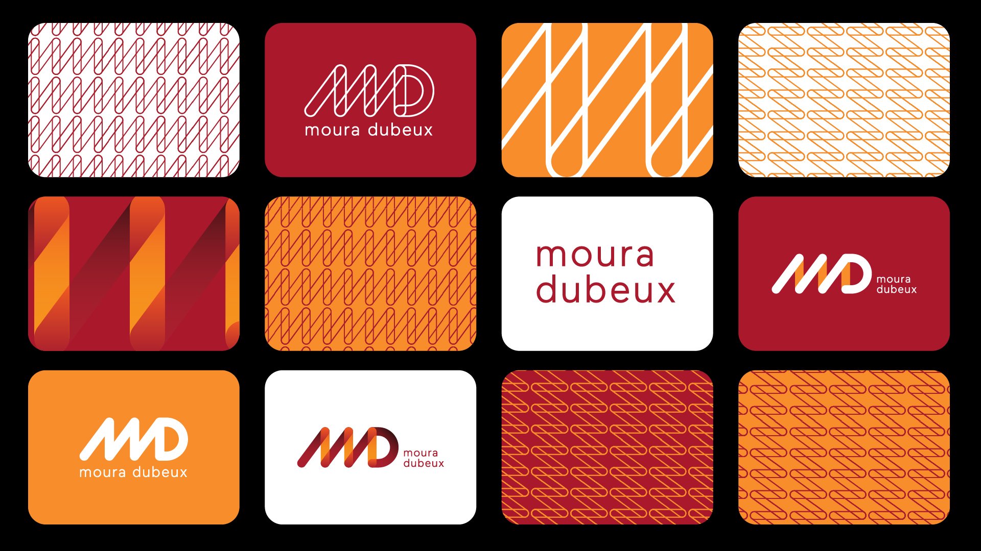
Some premises were tactically defined: updating and standardizing the color code without creating ruptures. Keeping a typographic solution for the symbol, with the “MD” initials still as the protagonist. Capillarity to support multiple platforms. Building a stronger bond with a younger audience without losing concepts such as trust, solidity and security.
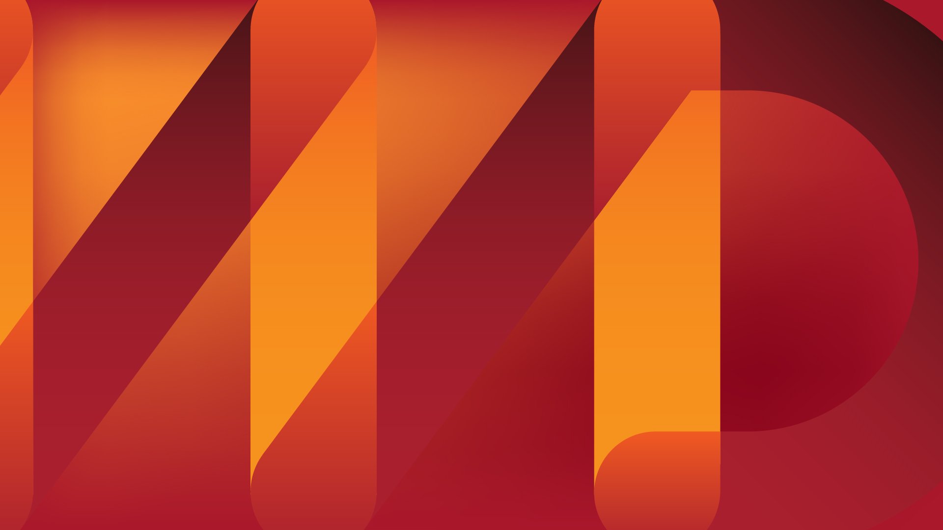
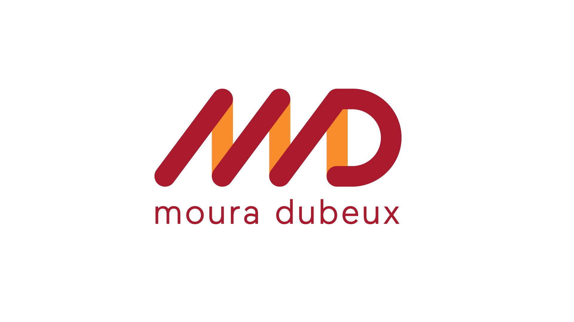
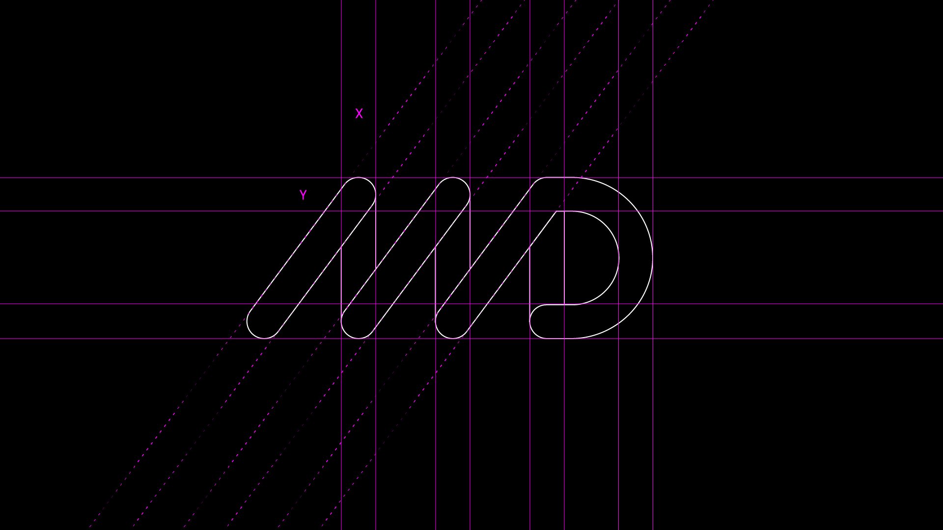
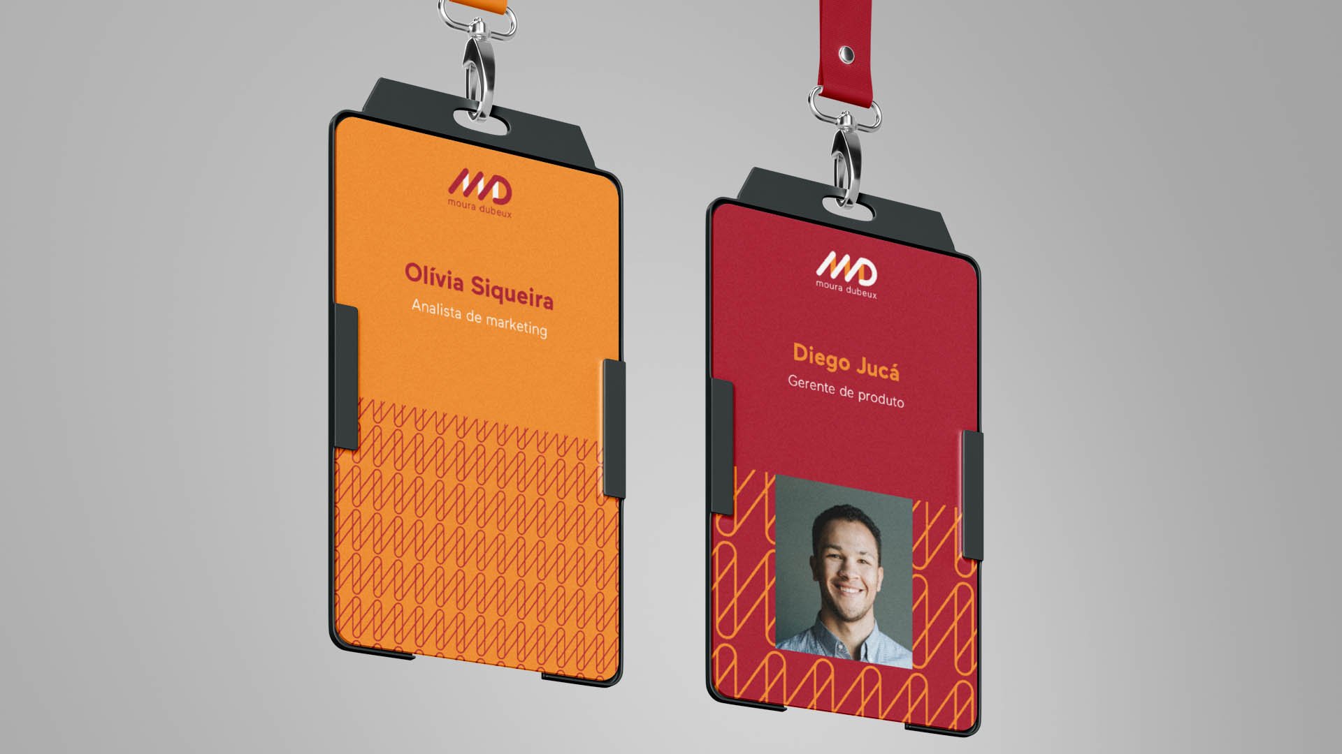
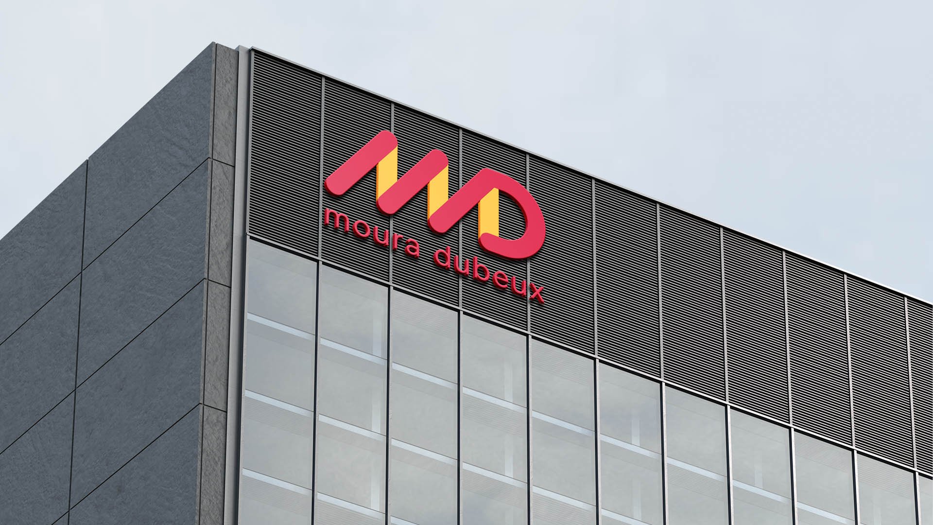
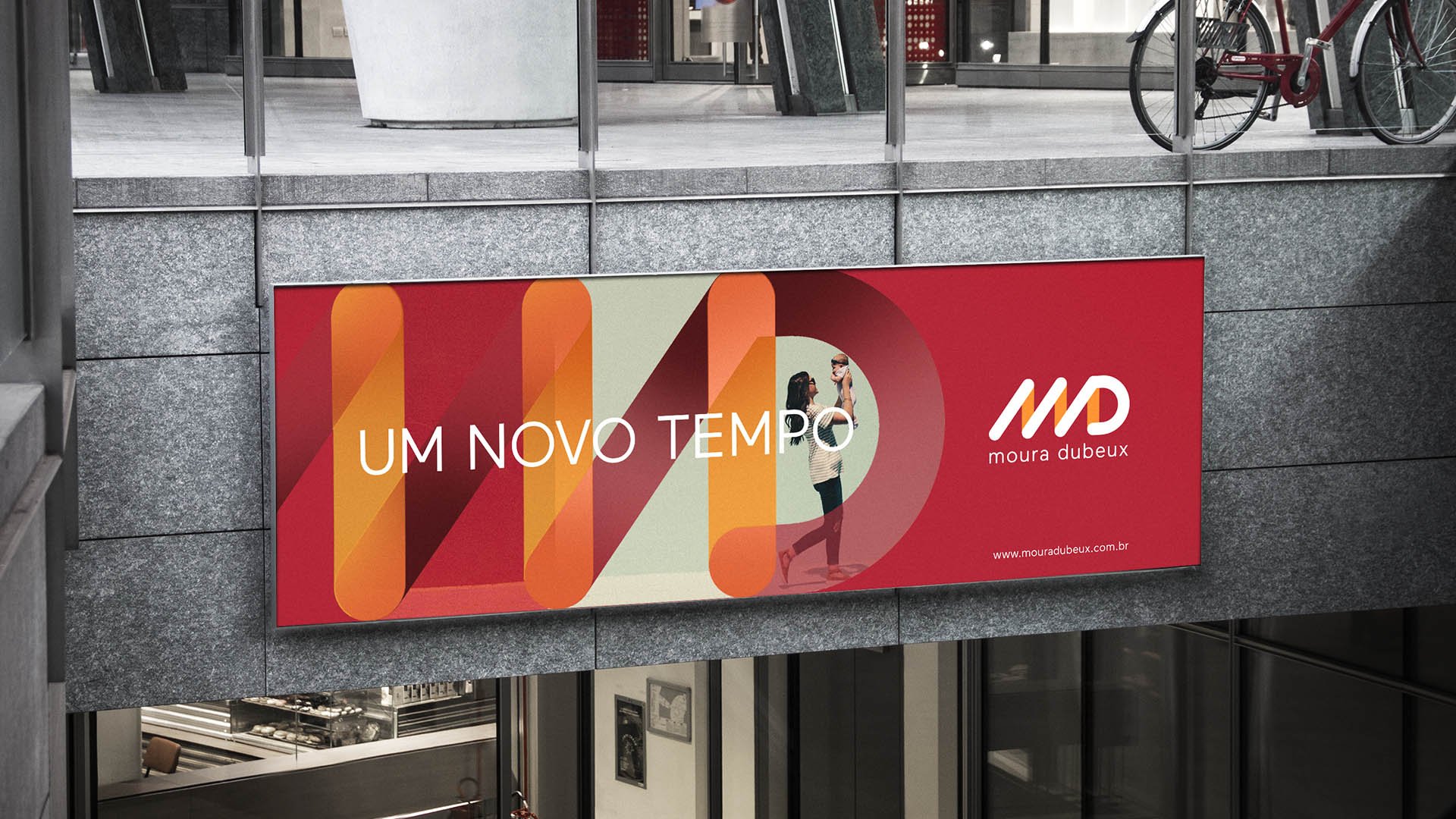
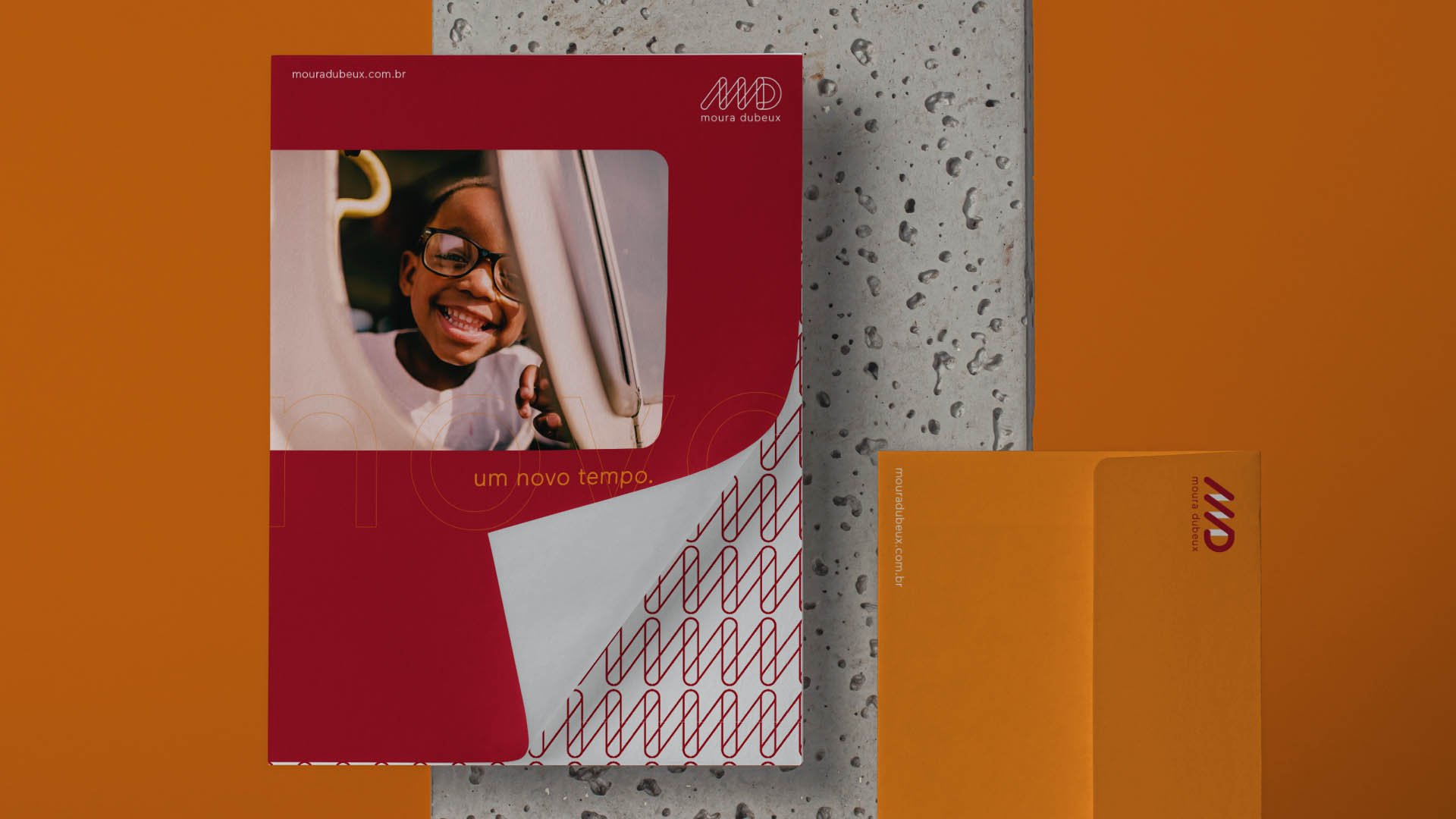
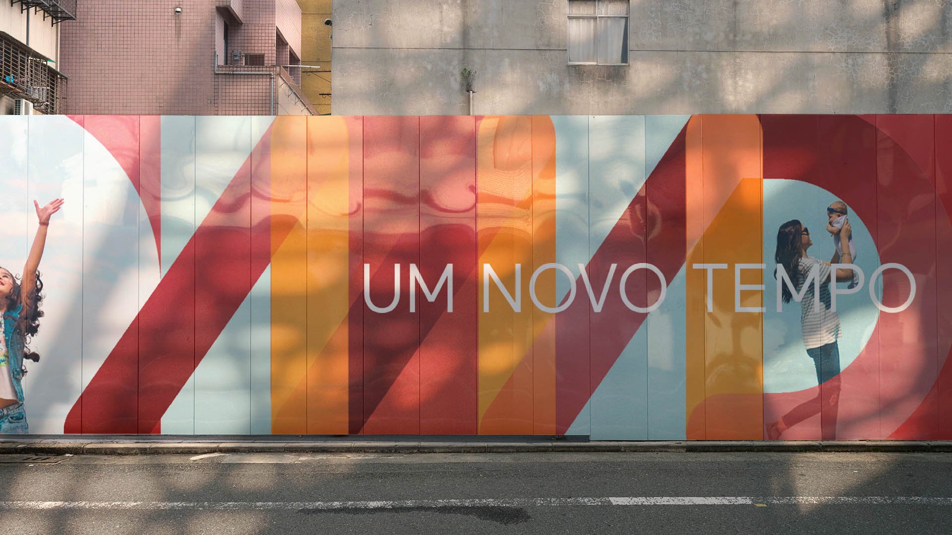
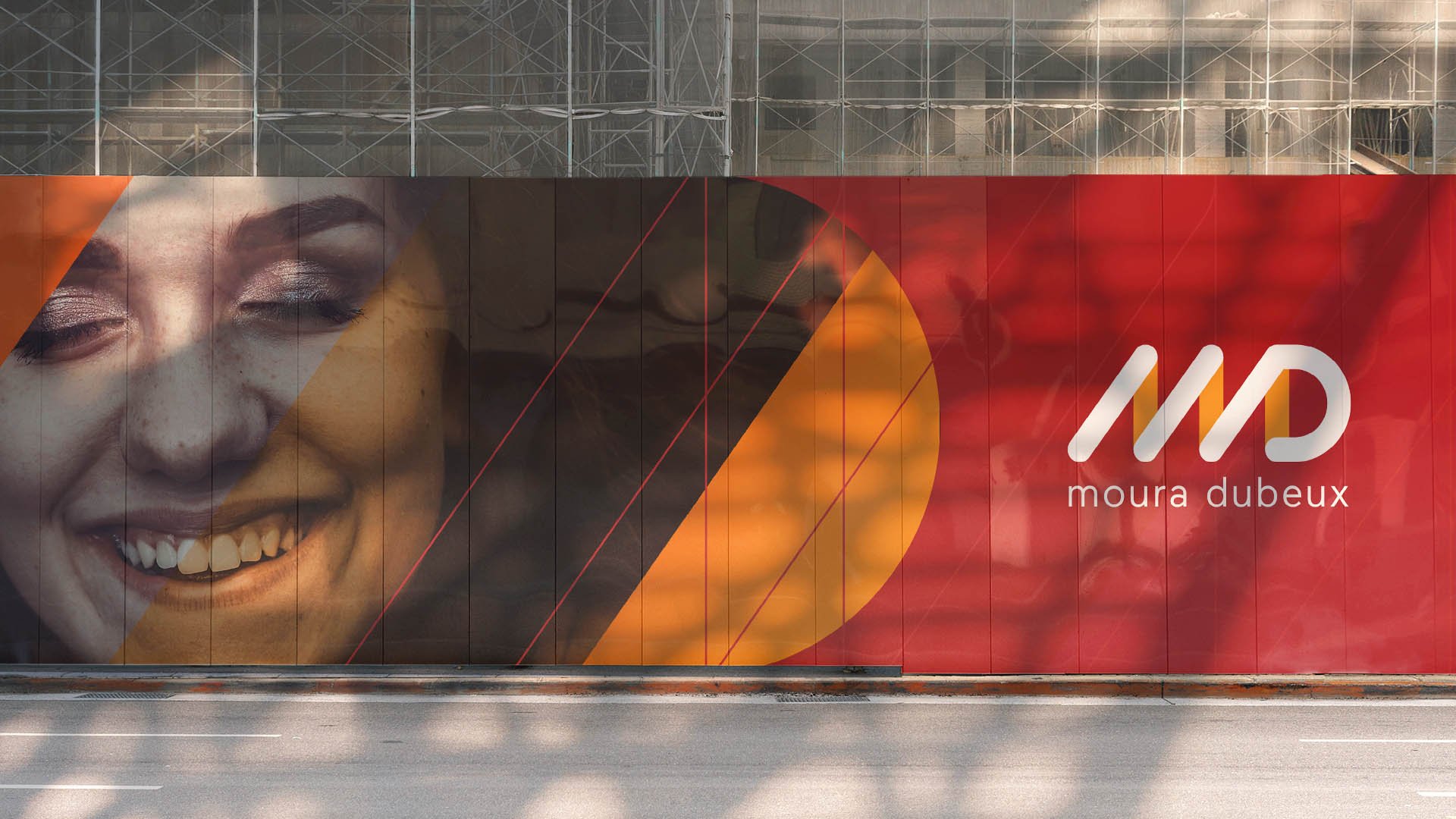
The design embraces the idea of movement through the “italic” sequence of slanted bars, interspersed with vertical ones, bringing the expected balance between security and dynamism. The semicircular shape closes the main group with lightness and youthfulness. The lettering, composed entirely of lowercase characters, suggests closeness. Generous spacing gives the ensemble more breathing room and performs comfortably on digital platforms, one of the project’s priority demands. The resulting elements make it possible to create a distinctive, striking graphic grid, supporting a robust system of visual expressions.
The timing and strategy of the project’s actions were fundamental to the complete success of its implementation. Every aspect that deserved to evolve was addressed as planned. The new identity was instantly embraced by stakeholders and delivered the desired impact and results from the very first moment.