ADALU VISUAL IDENTITY REDESIGN
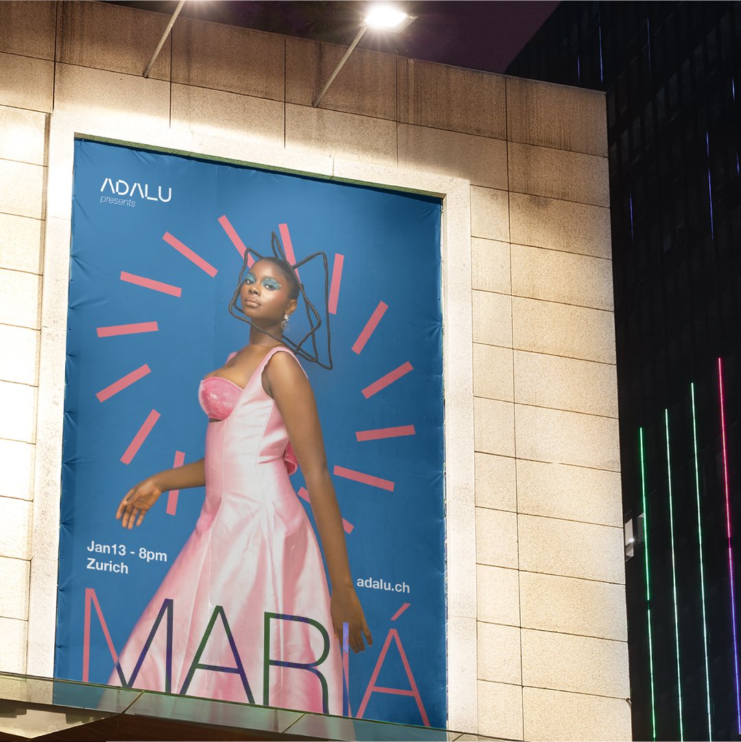
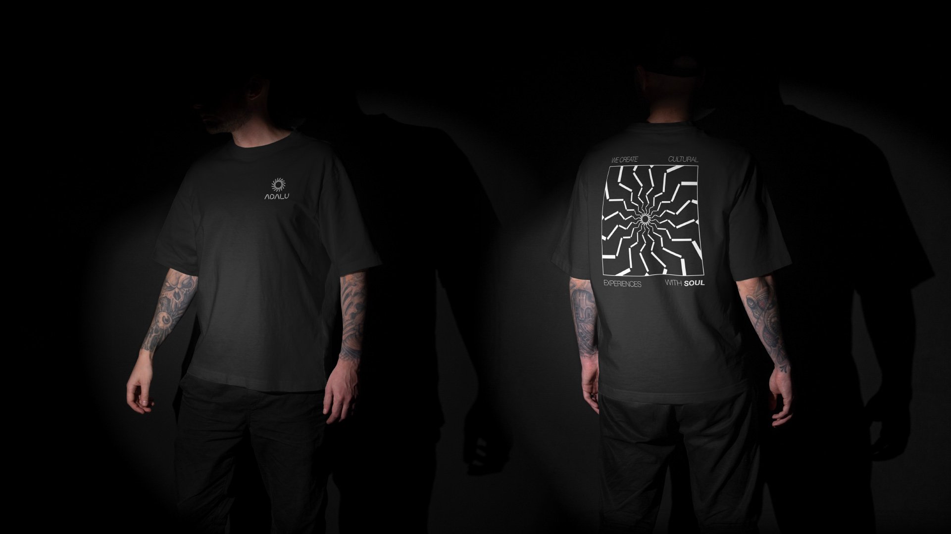
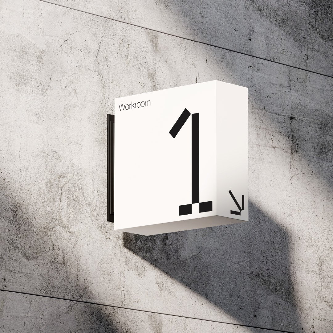
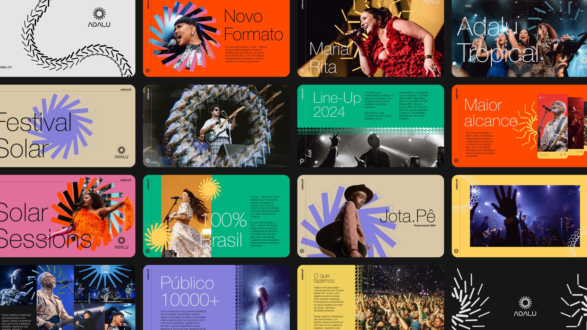
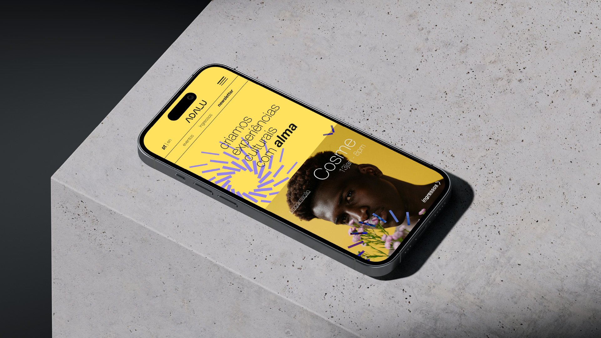
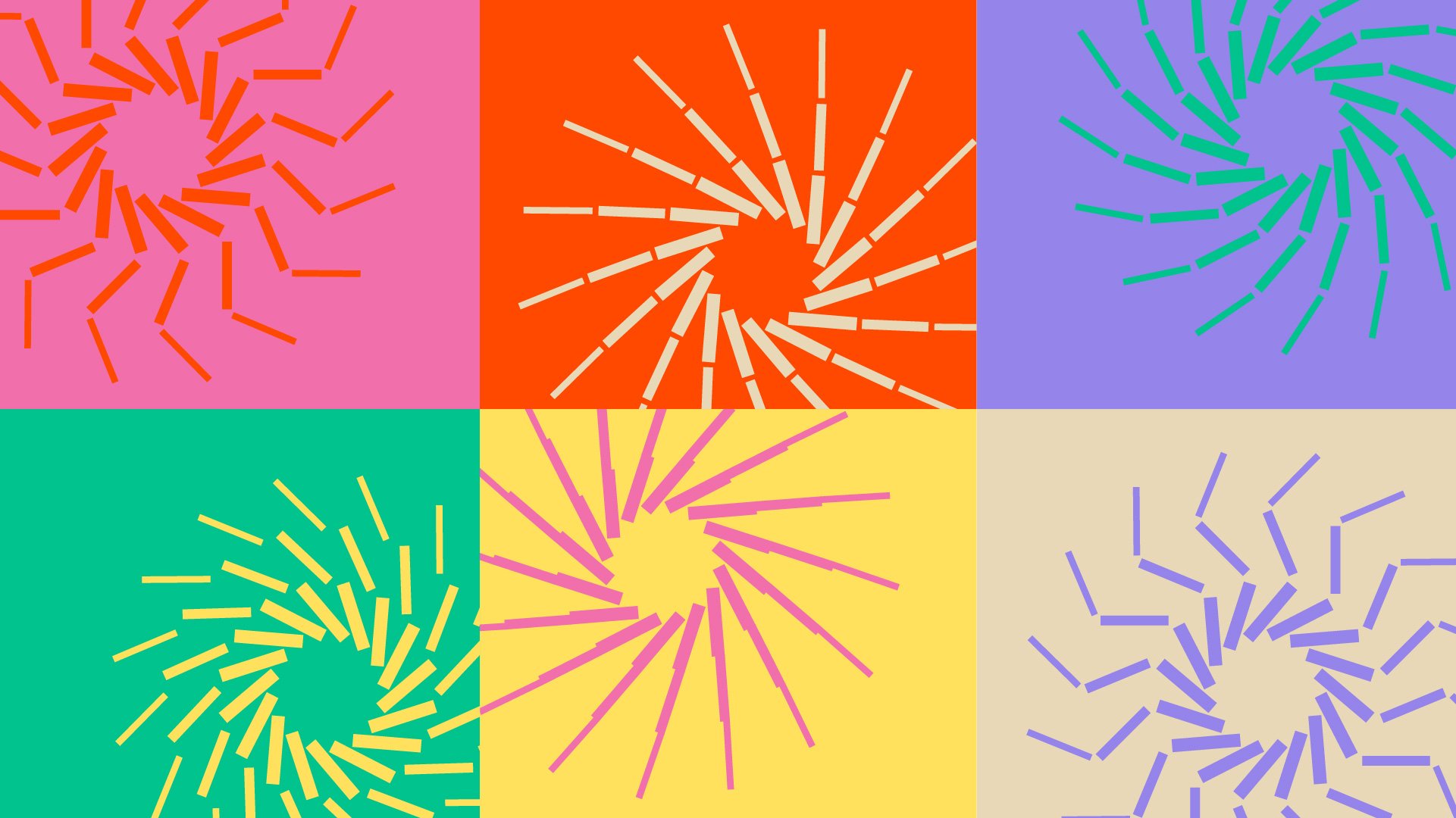
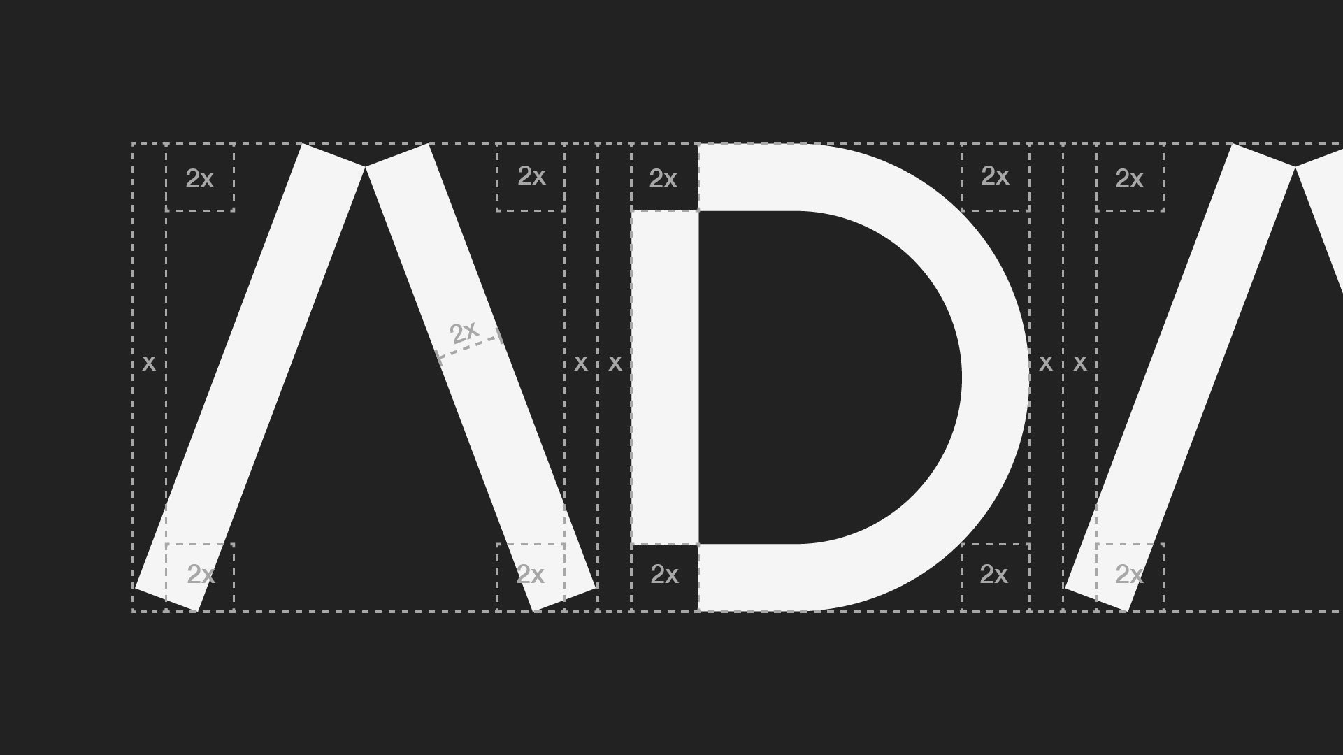
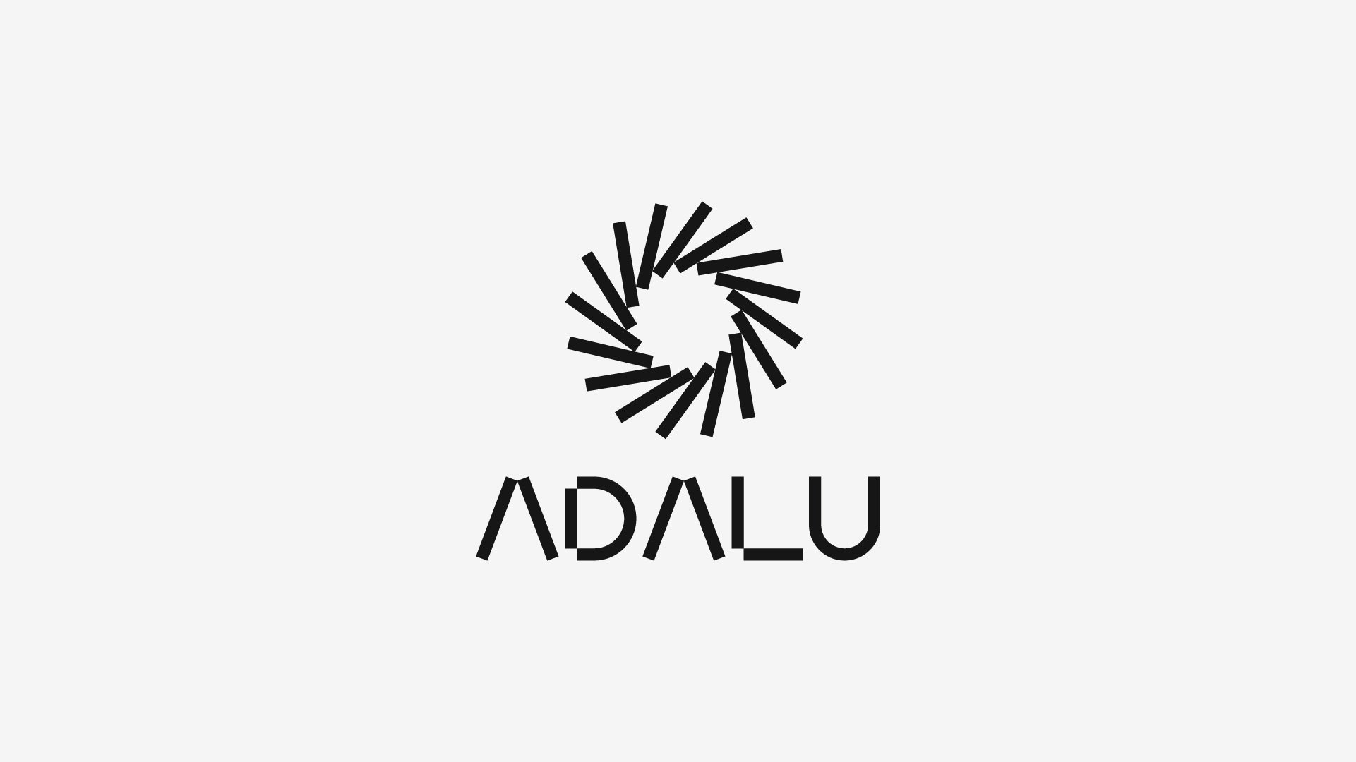
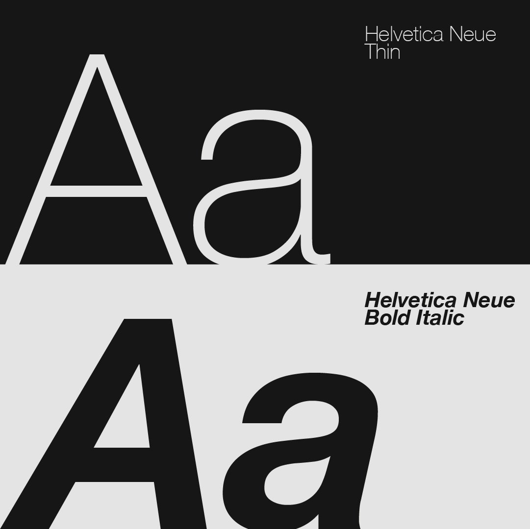
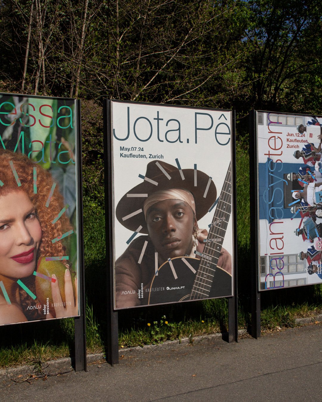
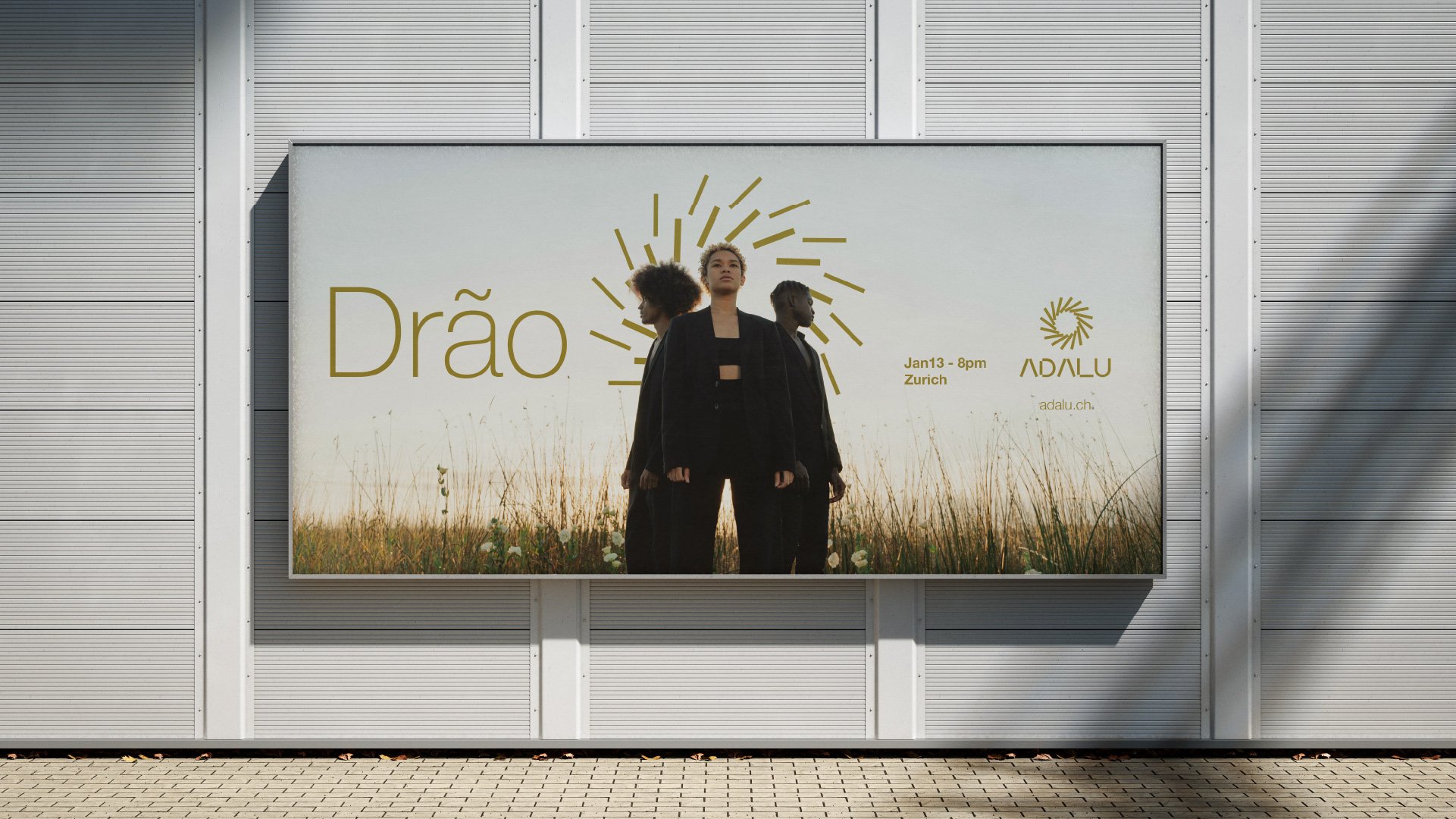
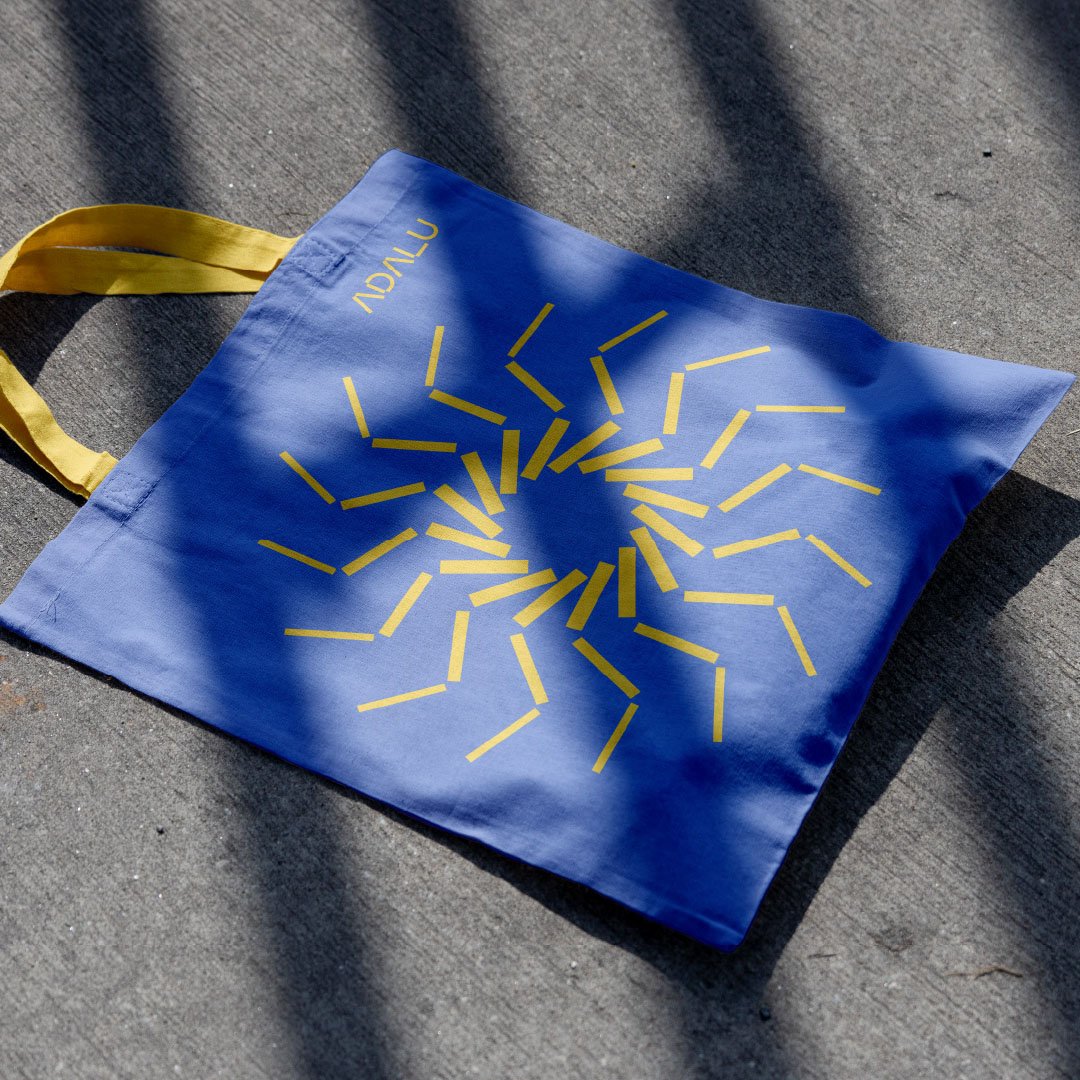
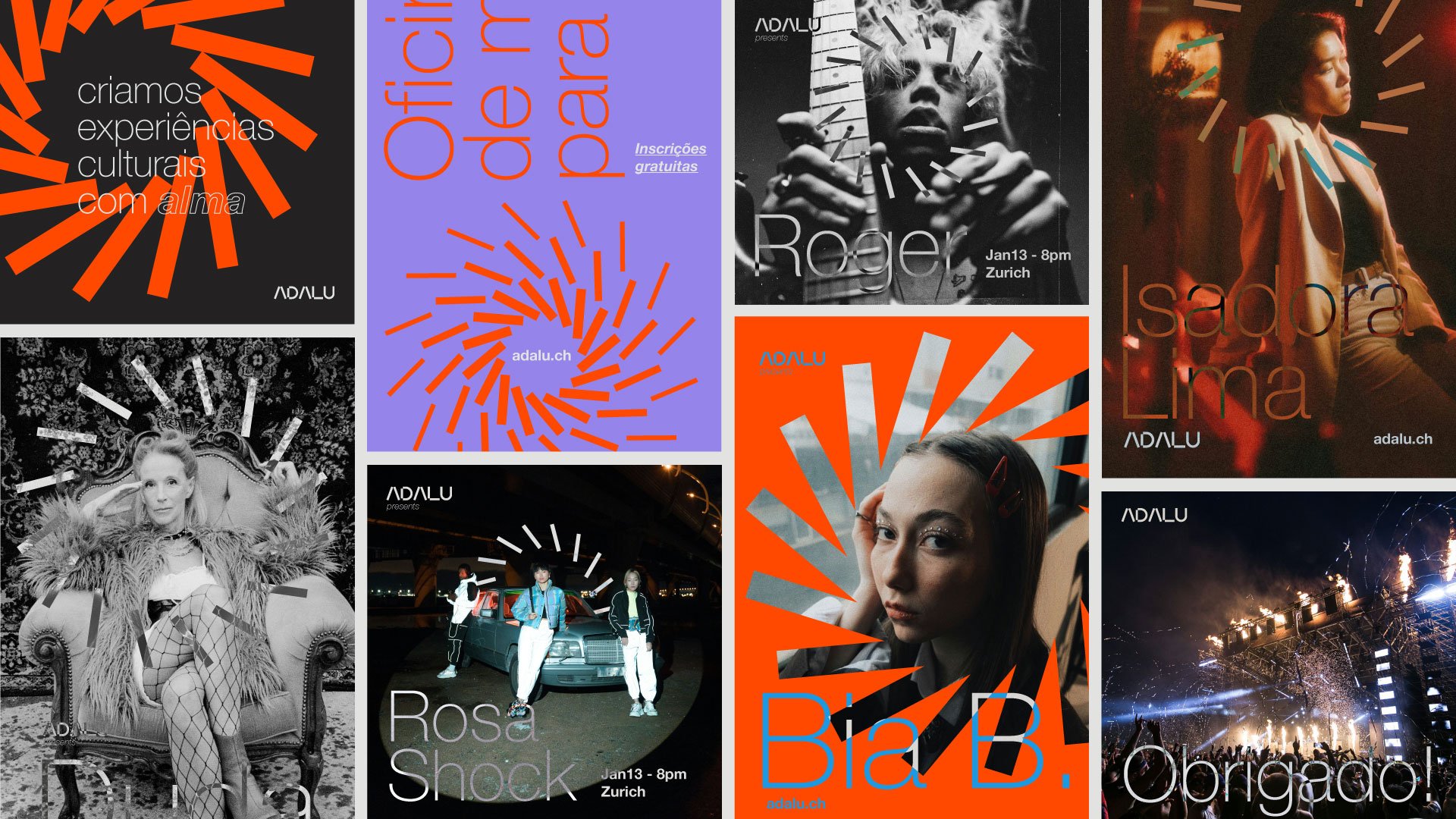
The redesign of Adalu’s visual identity is all about building bridges between Brazilian and Swiss cultures, giving new life to its visual expression. We drew inspiration from graphic signs of African origin, a cultural heritage that is so strong in Brazil. These elements not only add depth to the identity but also celebrate the historical roots that shape Adalu’s identity. The typography harks back to Swiss classics and connects to a palette of vibrant colors, capturing the dynamic, vibrant essence of the association. No formalities here: we wanted to convey a sense of freedom and creativity. The result is a visual identity that pulses with energy and authenticity, reflecting Adalu’s mission to promote culture and art in all their forms.