Selected for the 12th Brazilian Graphic Design Biennial
In conversations with Mesa’s founders, it was already clear that the company’s new moment called for special attention to mobility as a keyword, whether because of its main product at the time (mobile solutions) or the agility and dynamism of the new management formats it had adopted. Translating that spirit would guide the creative process and generate visual elements that embodied the concepts of uniqueness and lightness (an adjective also clearly identified in the workplace).
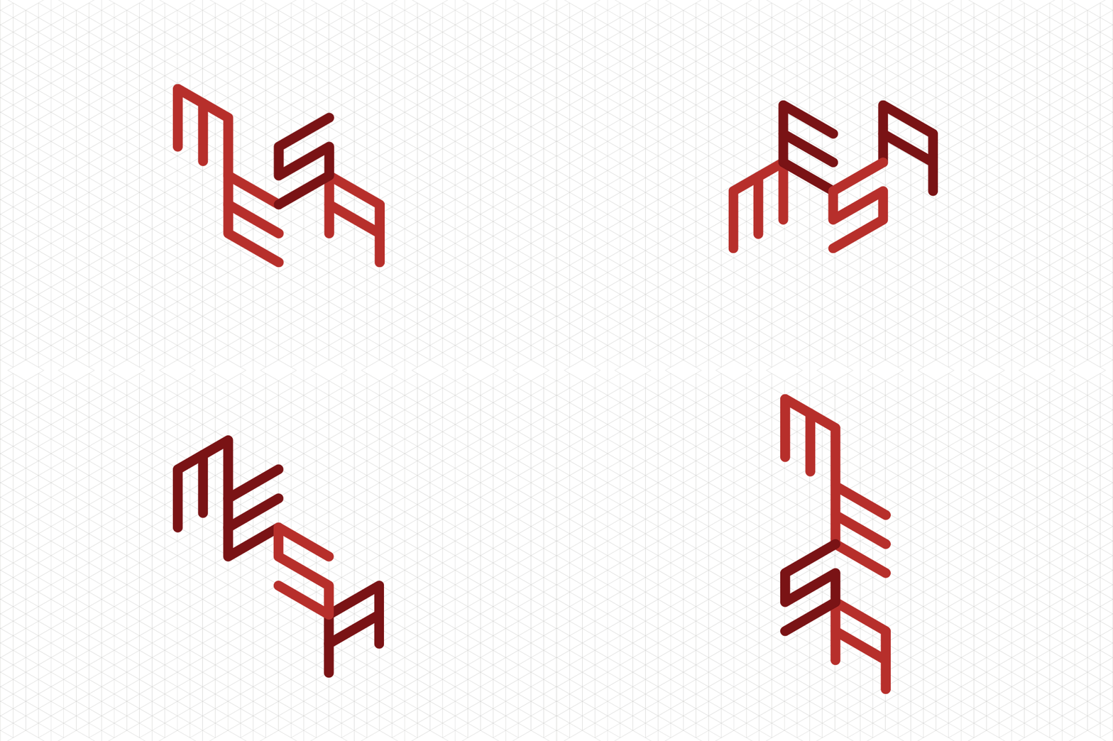
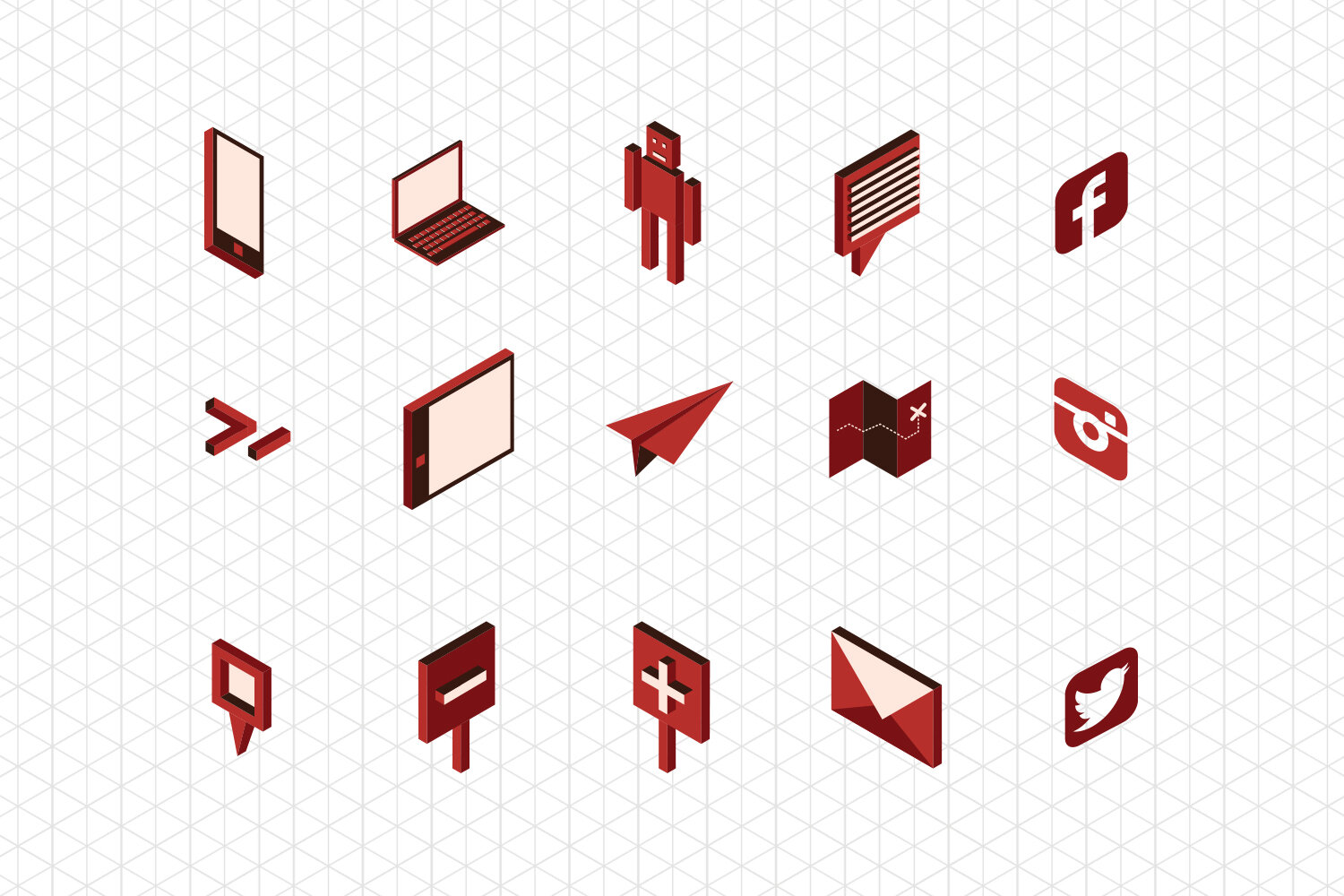
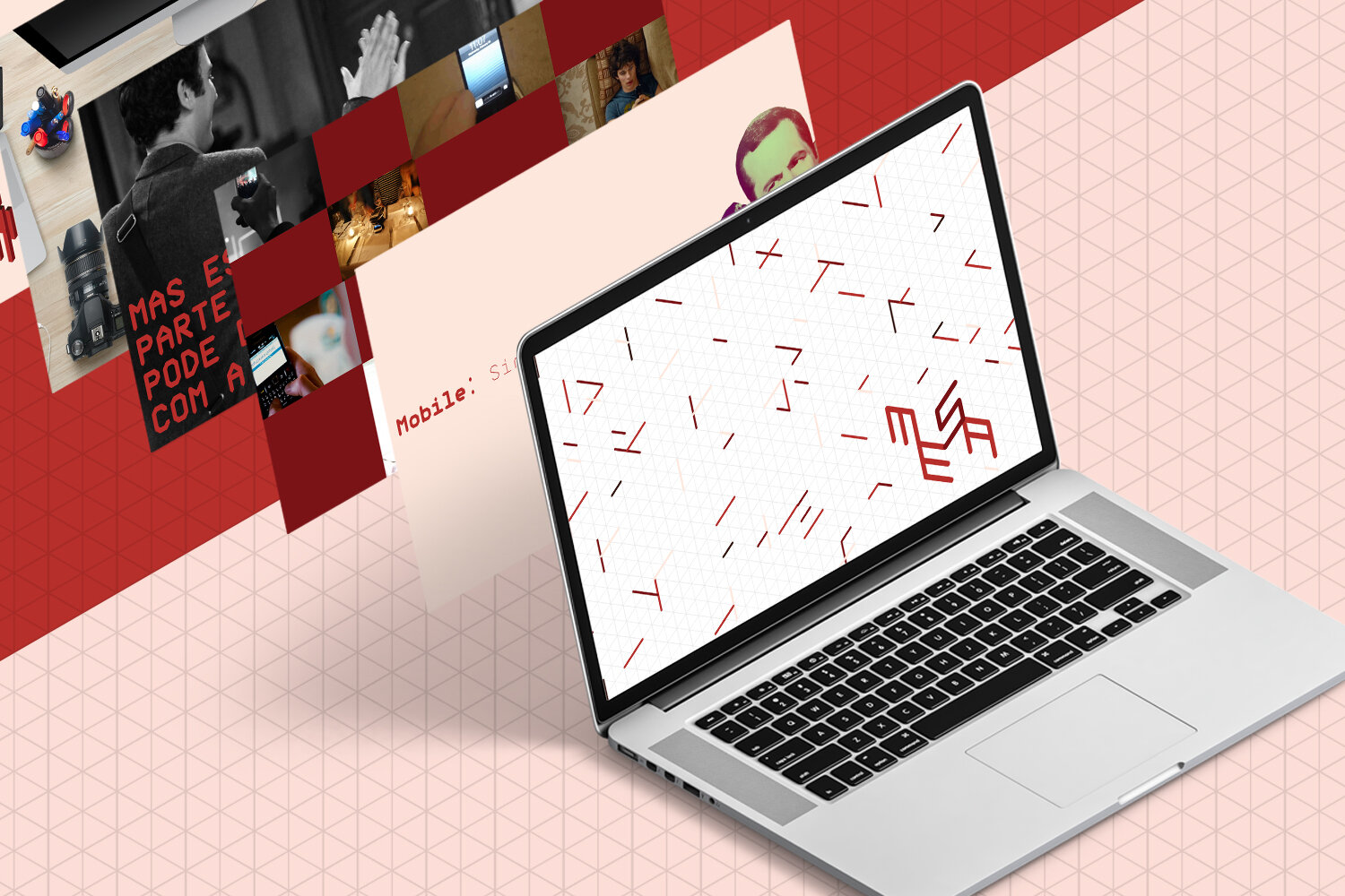
We then created an exclusive typeface based on a hexagonal grid that carried the desired mobility and dynamism in its very DNA. This construction grid would go on to guide the iconographic structure and help establish the idea of lightness that should always be present at the core of the business.
The visual language had to be clear and distinctive enough for the new identity to evolve at the same speed as the business without falling prey to trends or fads.
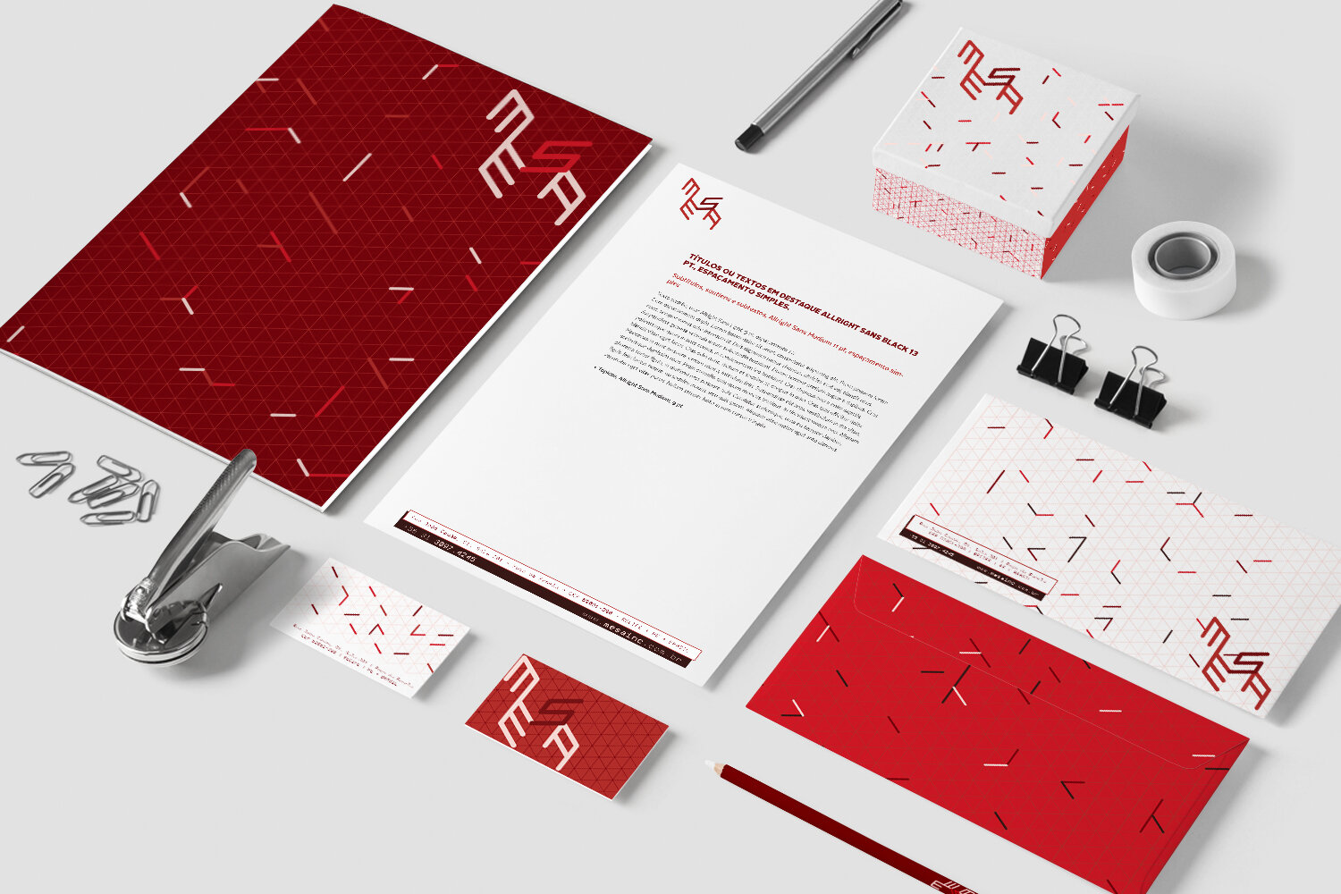
Of the elements in Mesa’s previous brand repertoire, the color would be kept. Beyond its link to the original brand designed by one of the founders, the red carried the warmth so present in the relationships Mesa built in its projects.
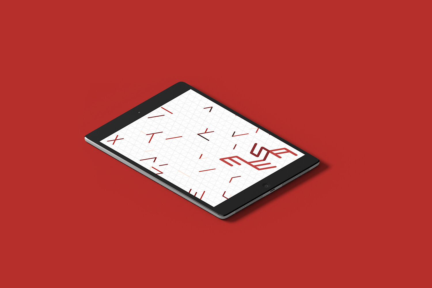
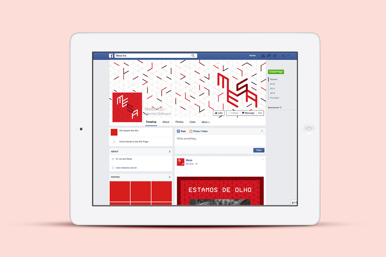
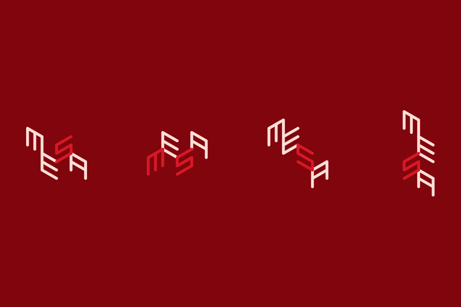
The brand would go further: it would have different versions, reinforcing the concepts of adaptability and versatility even more. Communication made wide use of animated GIFs, in a relaxed reading connected with its stakeholders.