Parque da Jaqueira
Um parque que já nasceu icônico. E que segue vivo, pulsando verde em meio à cidade.
A nova identidade visual do Parque da Jaqueira foi pensada para abraçar tudo o que o espaço representa: a natureza generosa, as curvas orgânicas do terreno, as atividades diversas que fazem dali um ponto de encontro afetivo para gerações.
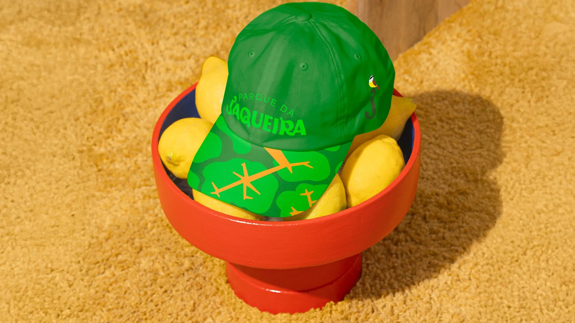
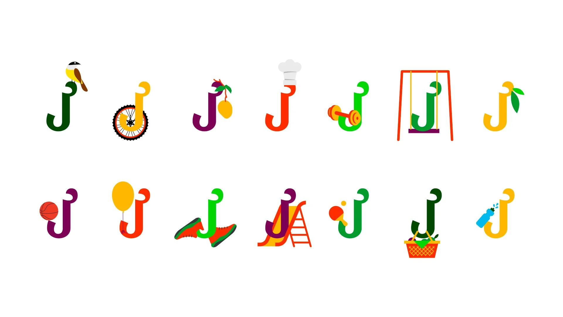
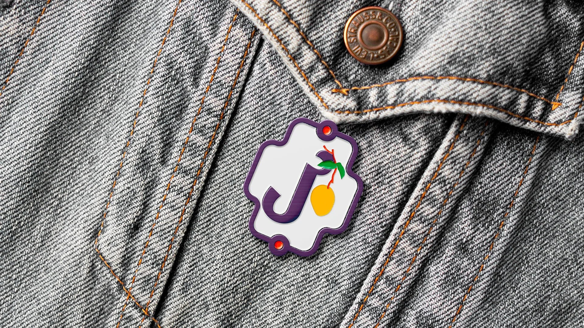
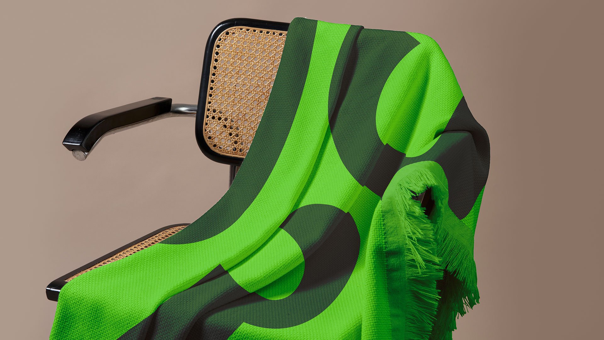
Partimos da letra J como elemento central – símbolo que se ramifica em grafismos e formas que lembram folhas, frutos, caminhos. A paleta cromática é vibrante como o parque em um domingo de sol. Os verdes são protagonistas, mas ganham companhia em tons que evocam movimento, diversidade e vitalidade.
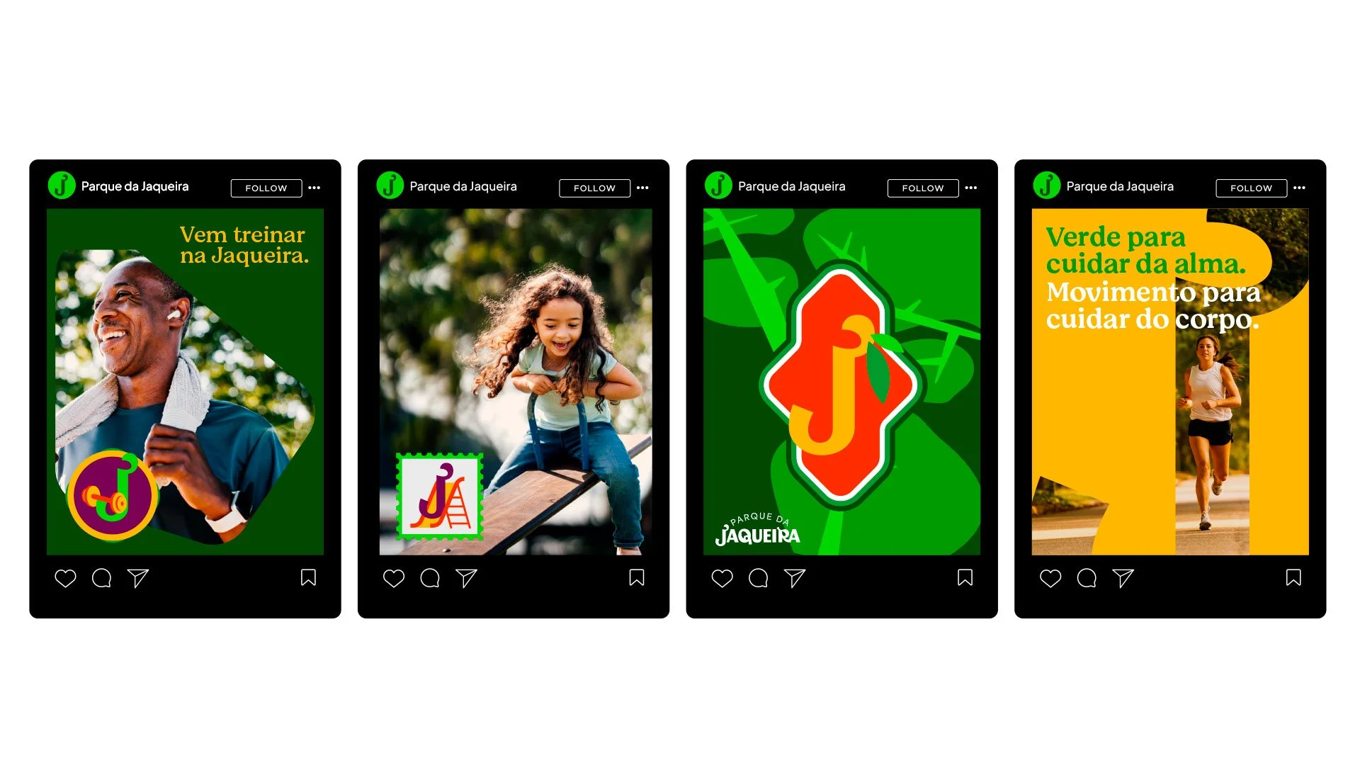
Como recifenses e frequentadores, sentimos o peso da responsabilidade e o carinho de quem desenha para um lugar que também é memória pessoal. Da escolha tipográfica à linguagem visual, tudo foi pensado para reforçar a identidade viva da Jaqueira: um espaço de bem-estar, encontro e pertencimento.
____
An iconic park since the beginning. Still thriving, still green at the heart of the city.
The new visual identity of Jaqueira Park embraces everything the space stands for: lush nature, organic curves, and the wide range of activities that turn it into a beloved destination for generations.
We started with the letter J as the core element — a symbol that branches into graphic shapes inspired by leaves, fruits, and paths. The color palette is as vibrant as a sunny Sunday in the park. Green takes center stage, accompanied by tones that evoke movement, diversity, and vitality.
As locals and frequent visitors, we felt both the responsibility and the affection of designing for a place that’s part of our own memory. From typography to visual language, every detail was crafted to reflect the living identity of Jaqueira: a space of well-being, gathering, and belonging.