Selected for the 12th Brazilian Graphic Design Biennial
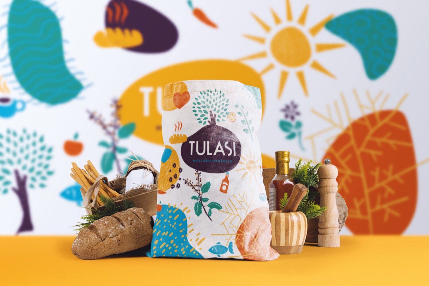
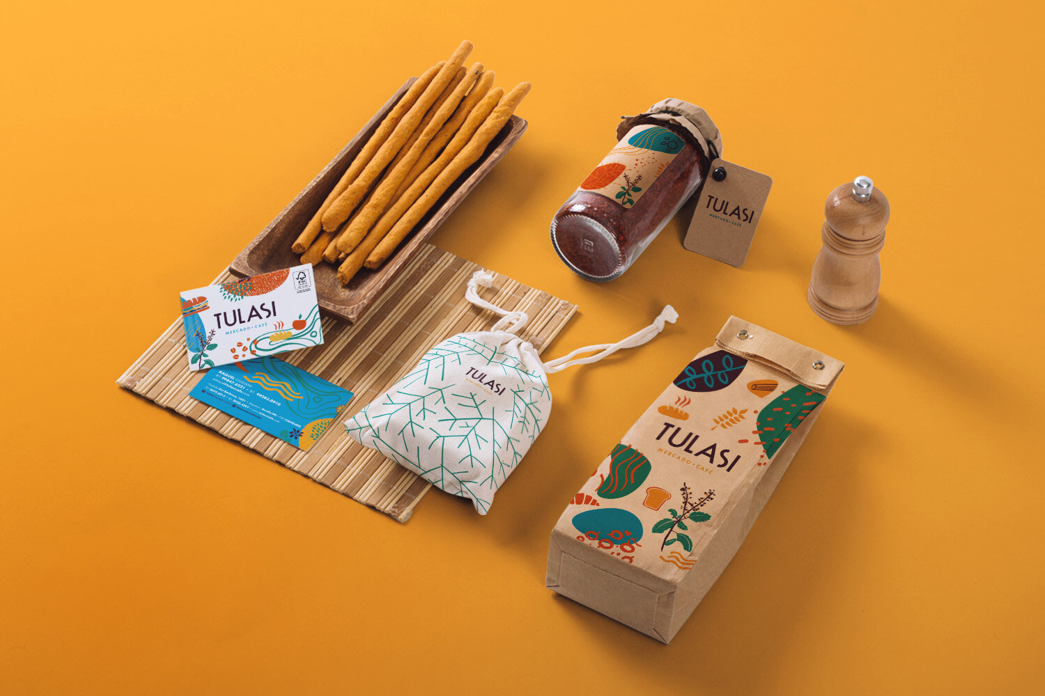
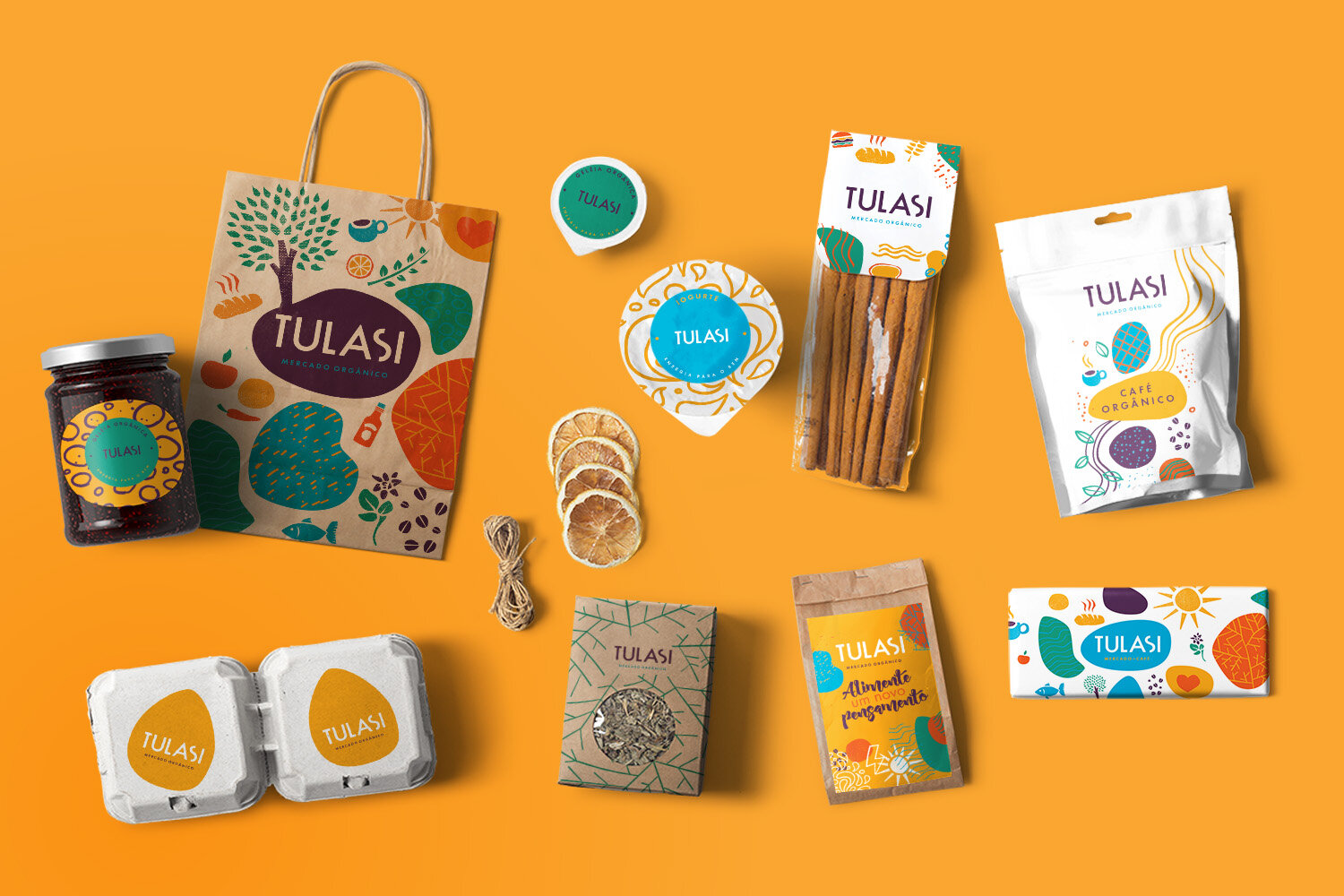
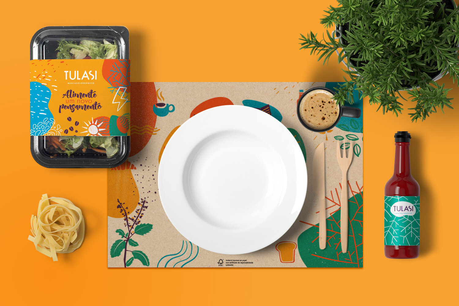
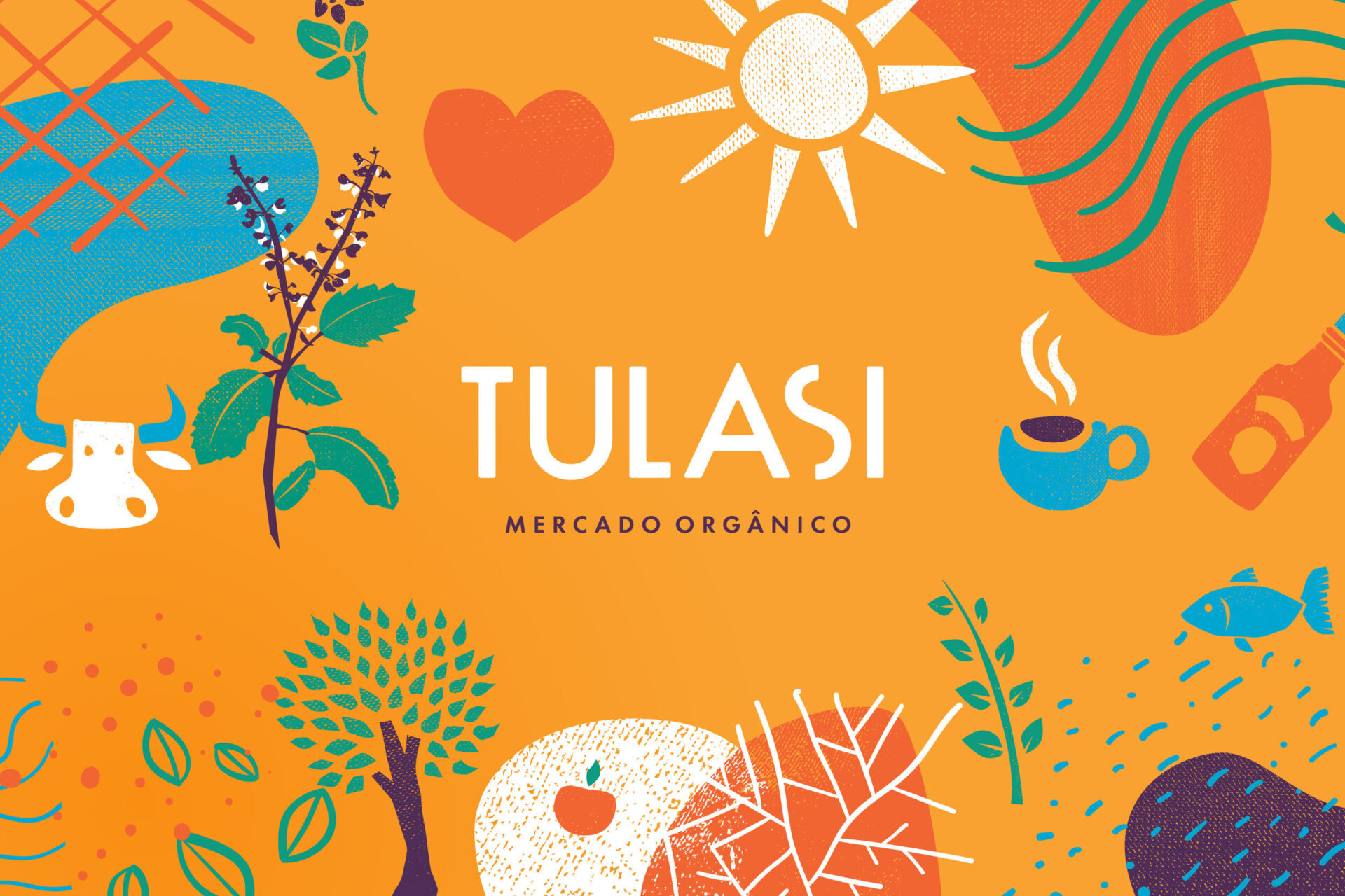
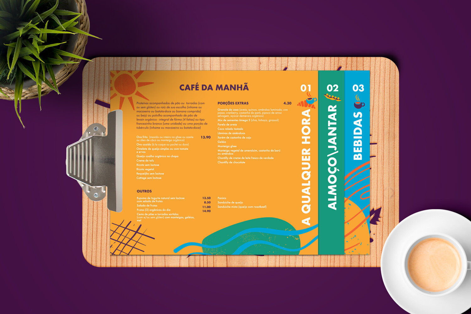
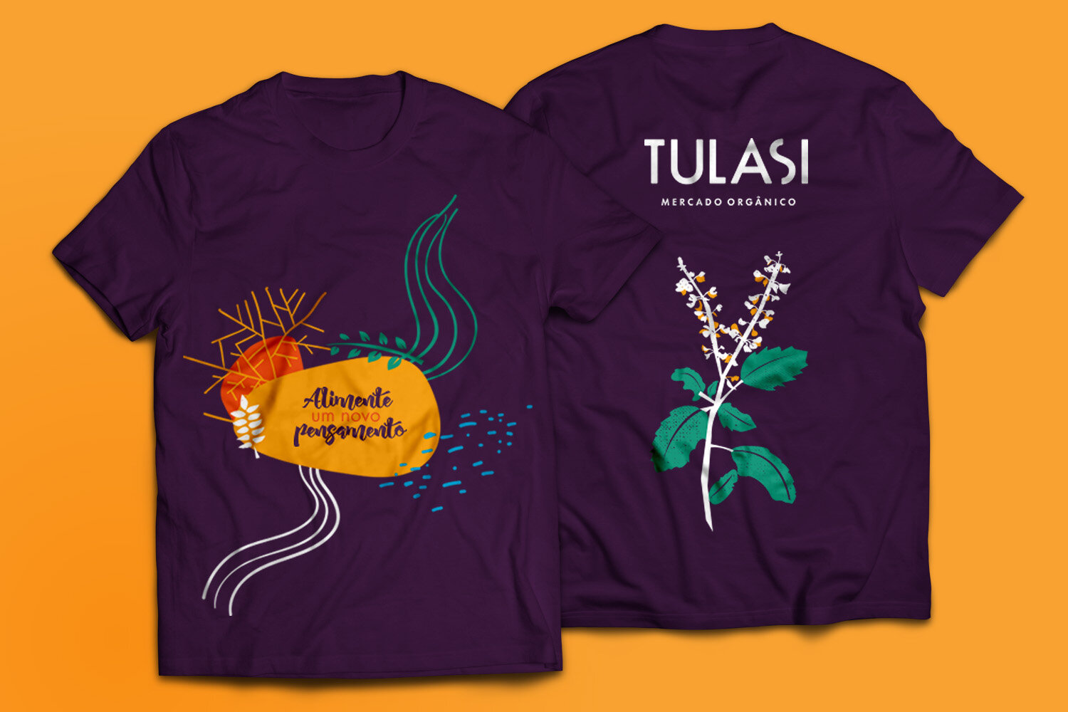
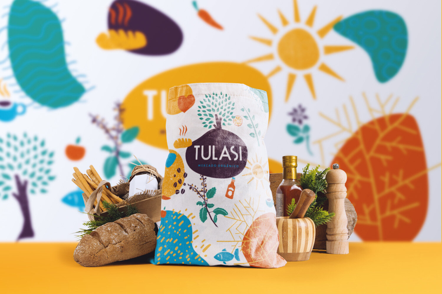
Building on the brand strategy developed by änimä (positioning, values, purpose, tone of voice and manifesto), we created the brand’s entire visual expression. Every element of the visual identity was designed to convey a sense of warmth and closeness.
We found room to build a visual personality robust enough to cover Tulasi’s full range of products and initiatives, balanced by a clear, accessible language. The result is a rich, distinctive universe for a brand in constant evolution.
Irregular textures and the organic contours of the graphic symbols invite touch and suggest the coziness the space aims to convey.
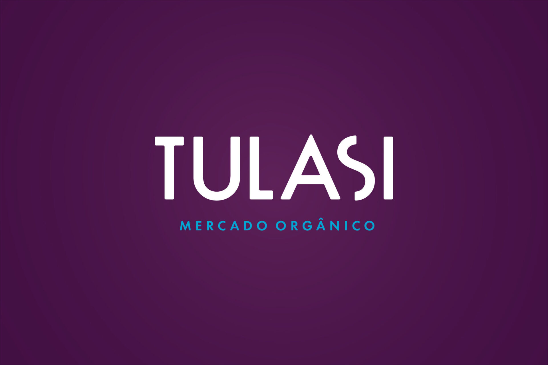
A soft, inviting yet assertive tone of voice matches the austere, no-frills typography of the Tulasi logotype.
Sophisticated in form and deceptively simple, the wordmark is the backbone of the visual system, leaving room for illustrations, textures and imagery that help frame new ideas.