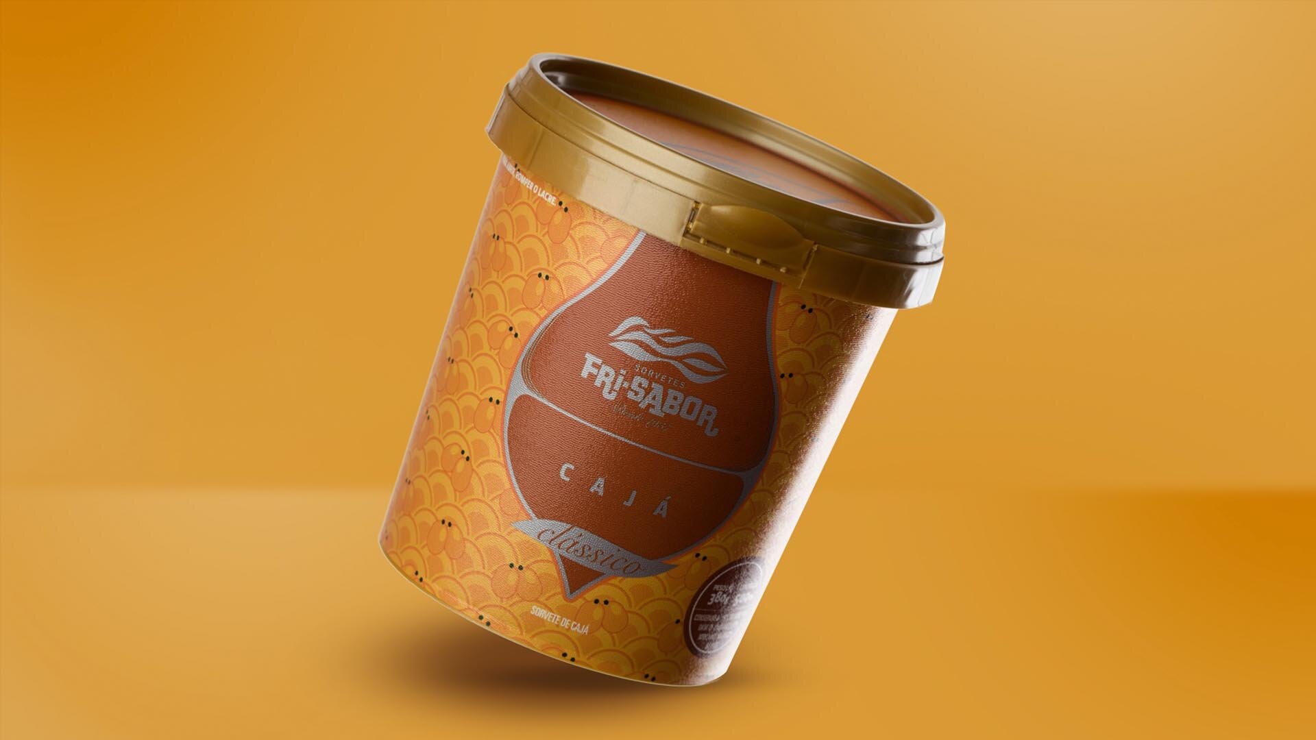
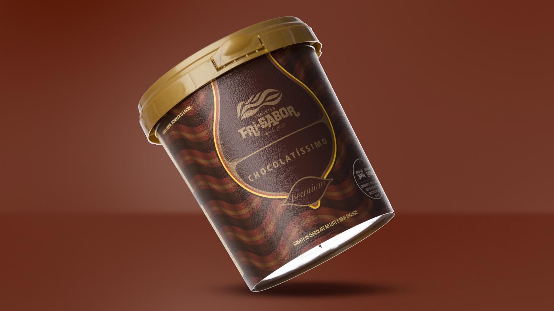
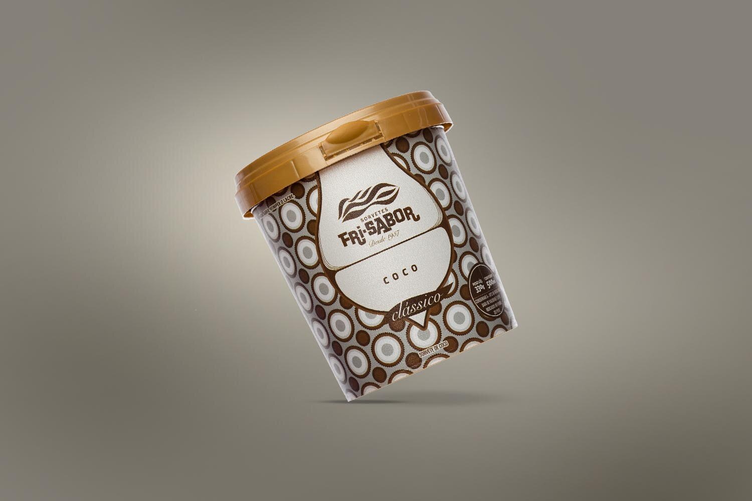
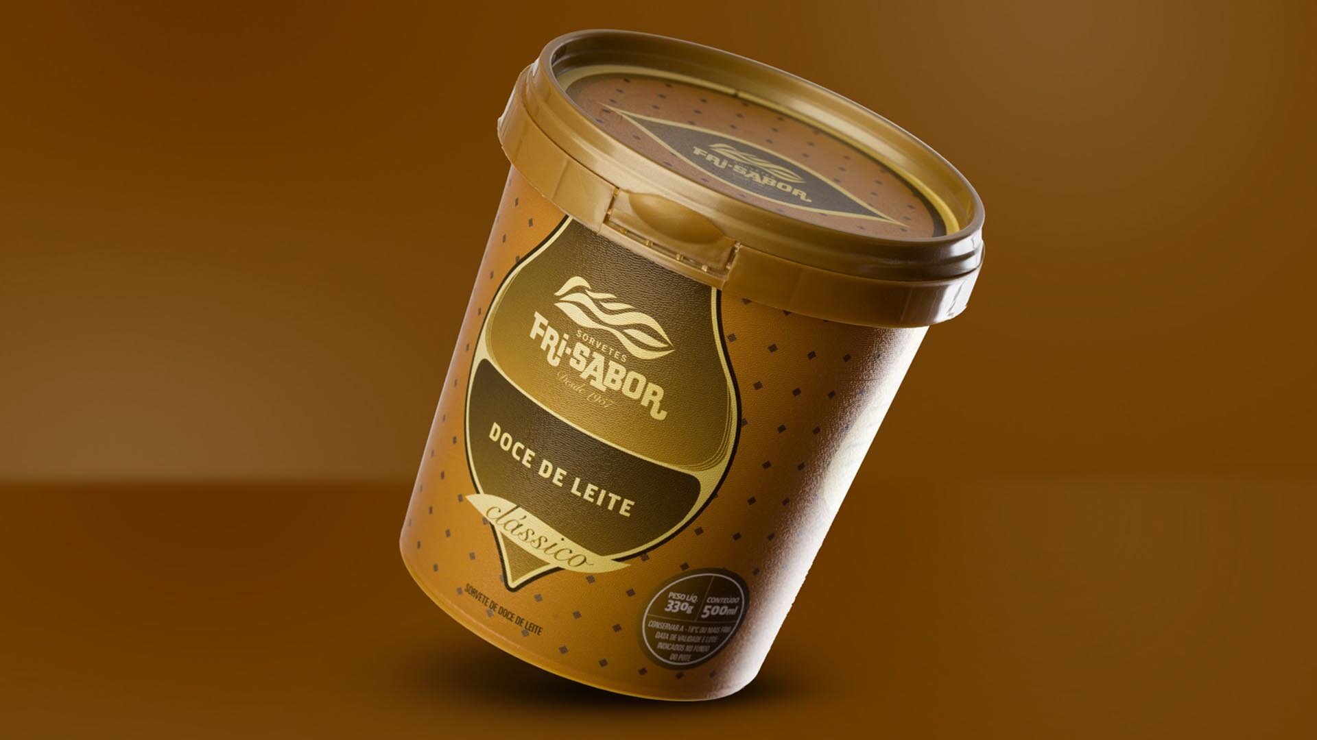
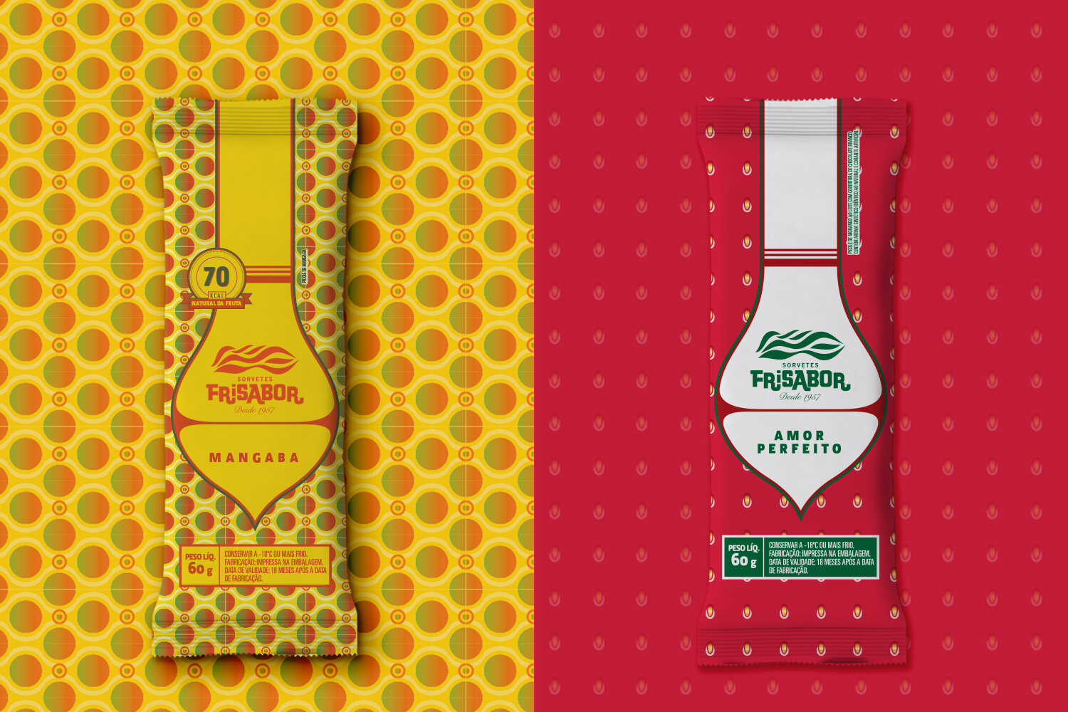
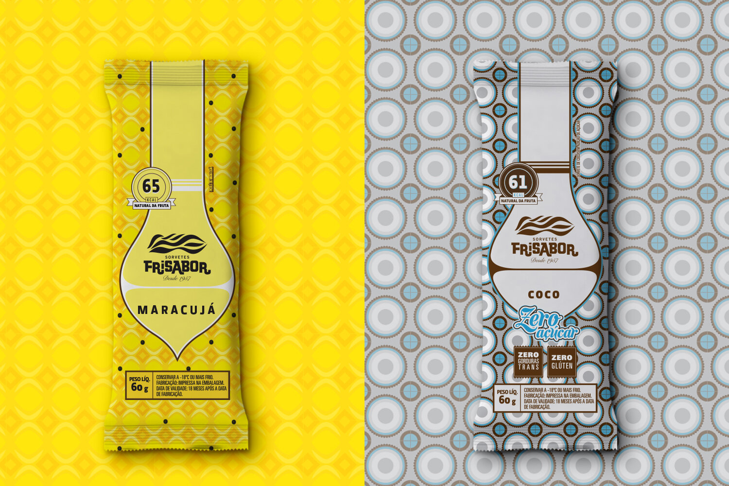
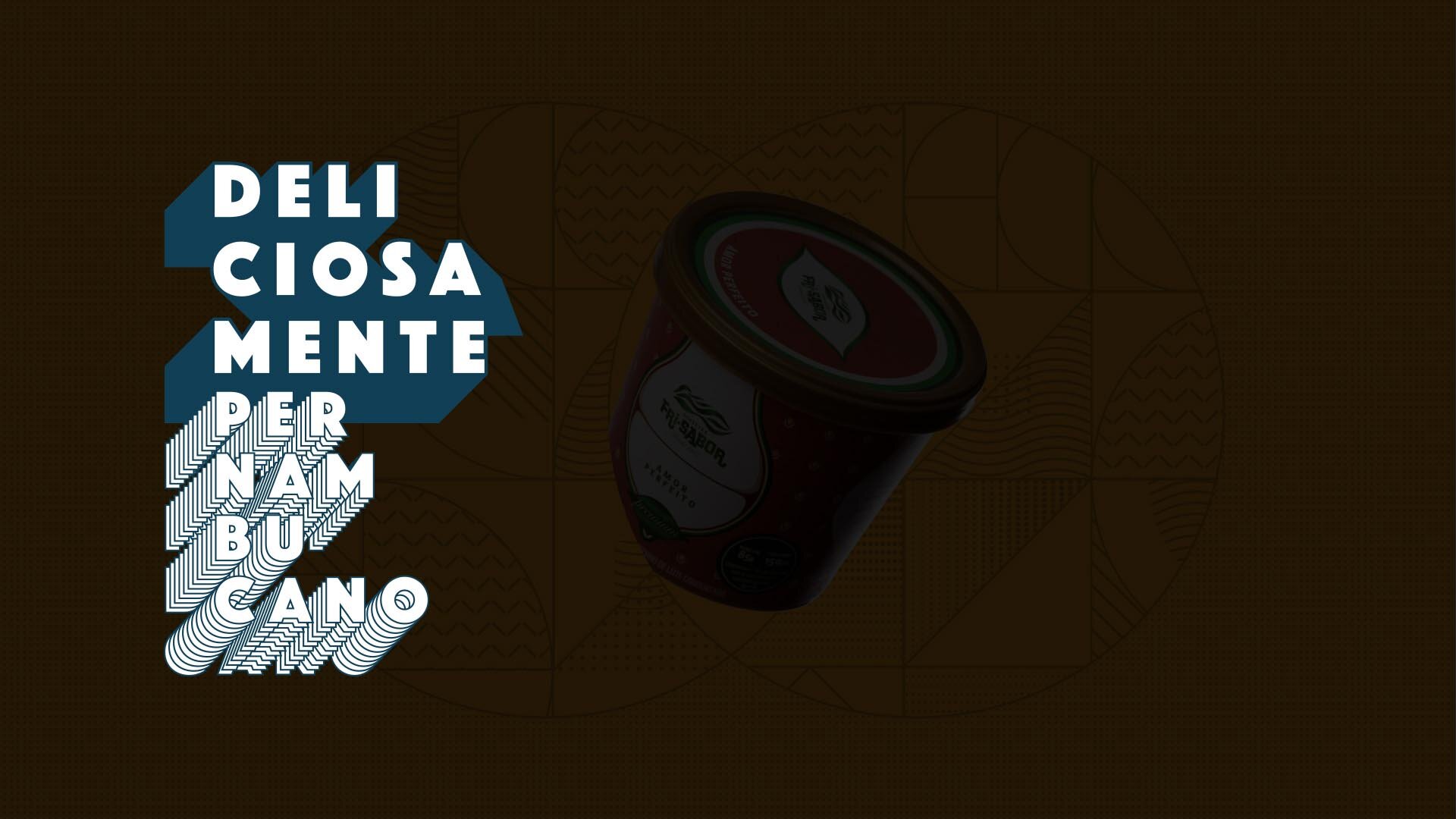
Packaging as the protagonist of the brand’s positioning.
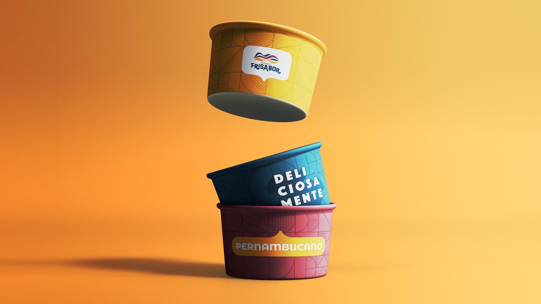
It was 2010, and FriSabor was going through profound changes and needed to reposition itself, presenting updated management with new initiatives without losing the strong emotional bond with an audience loyal since 1957. The strategy involved entering retail, and launching a line of striking packaging was essential.
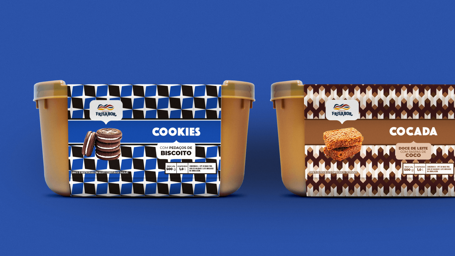
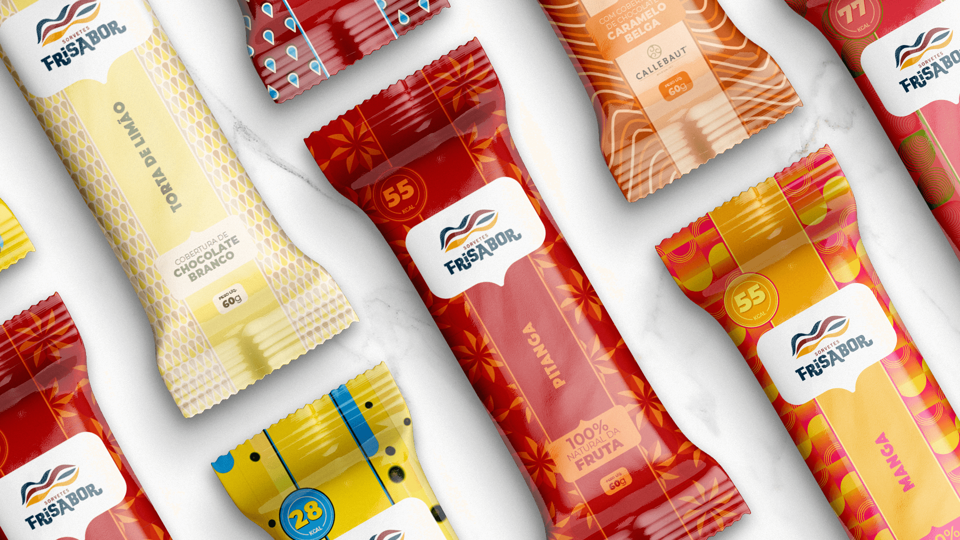
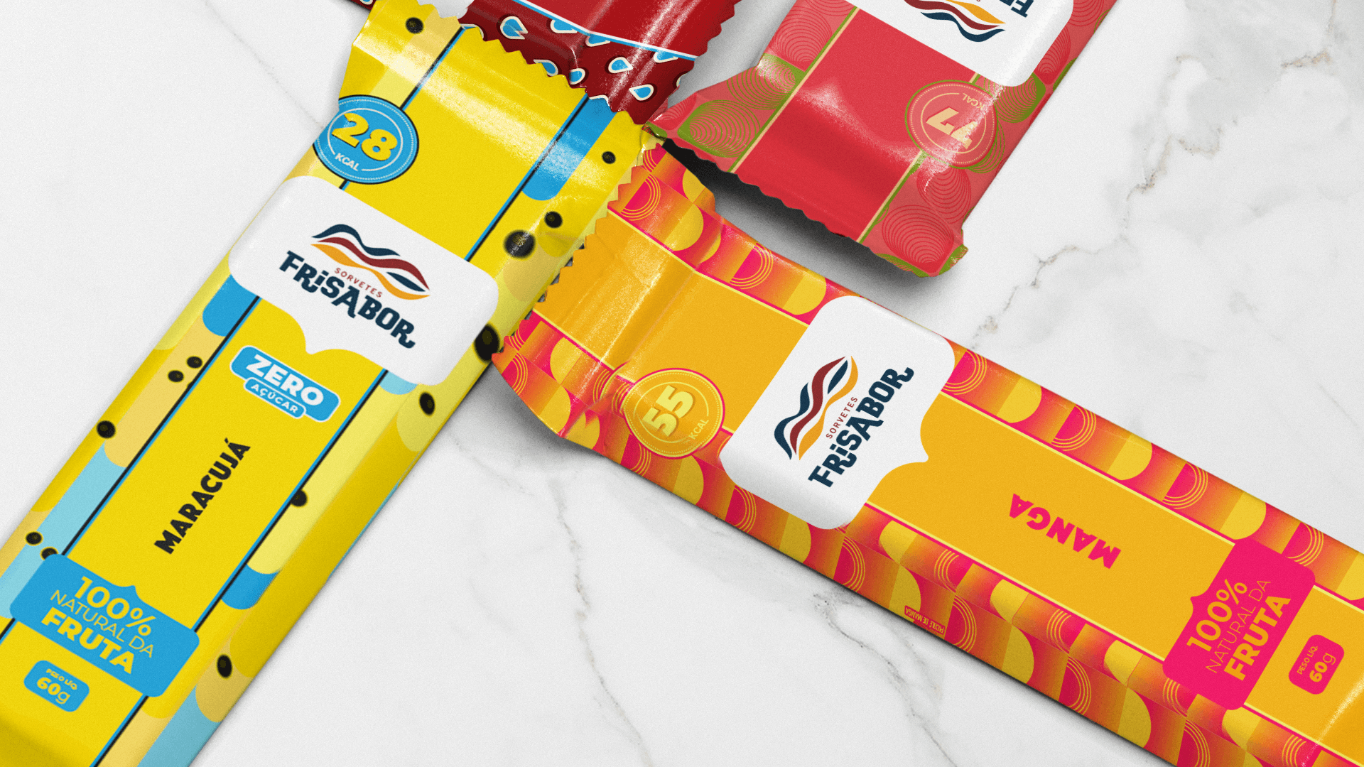
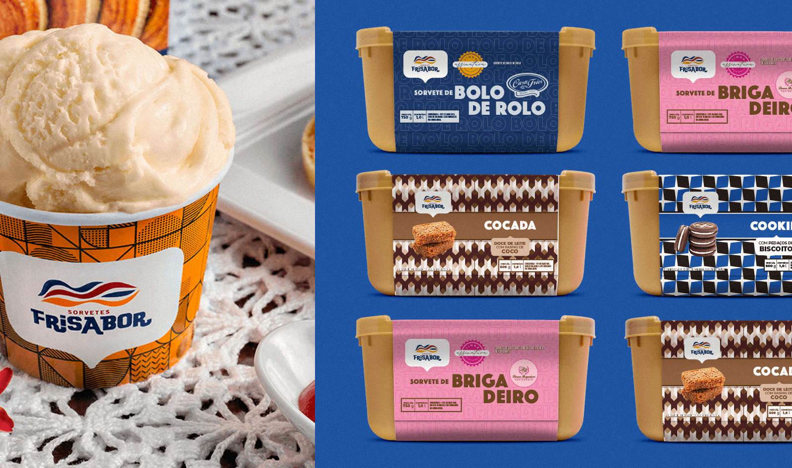
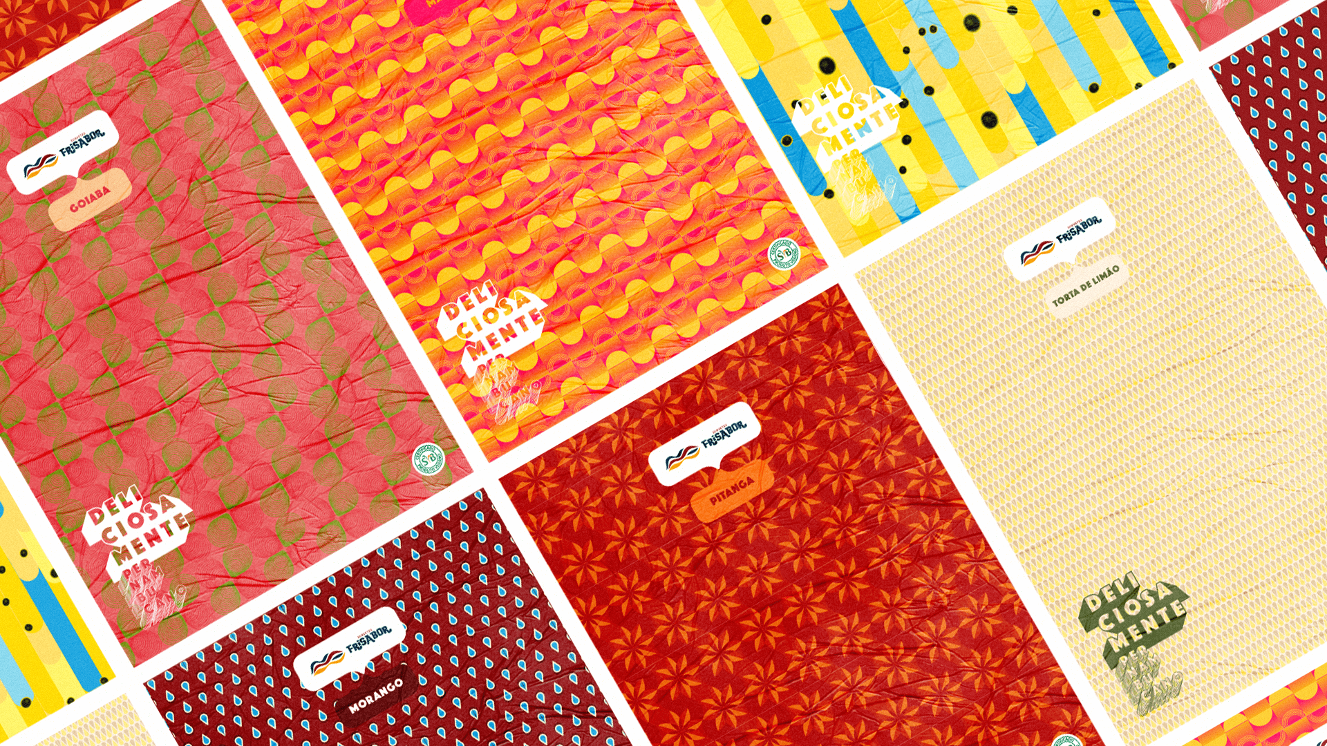
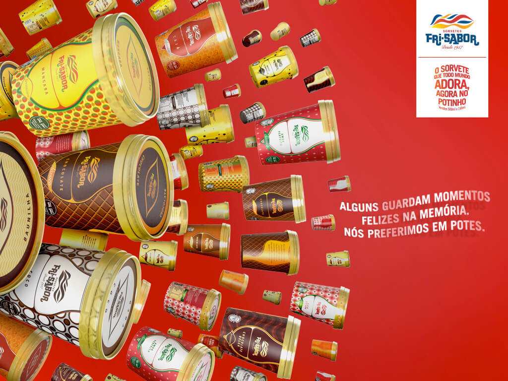
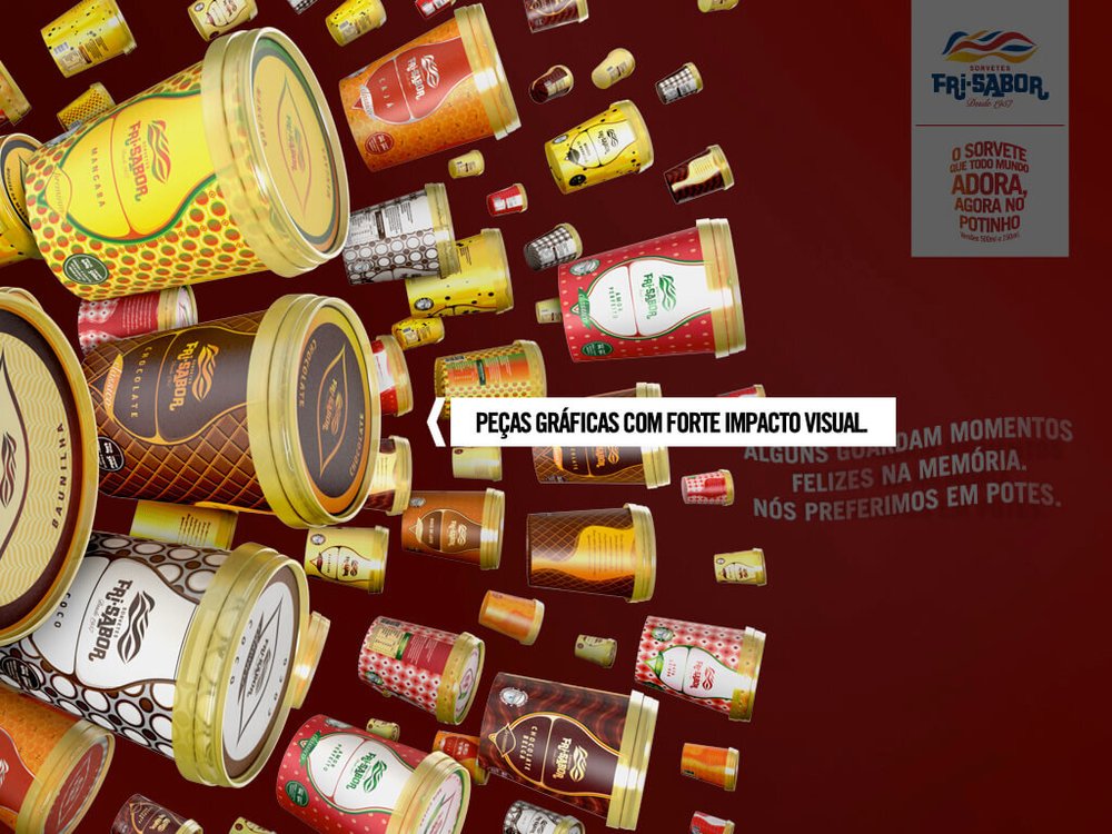
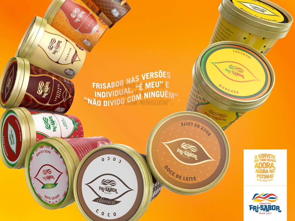
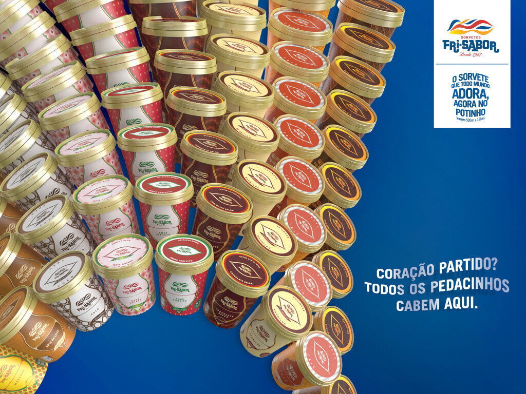
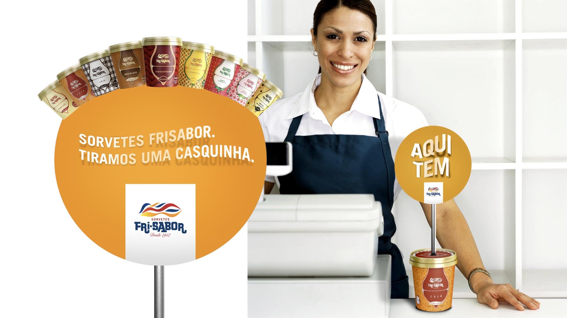
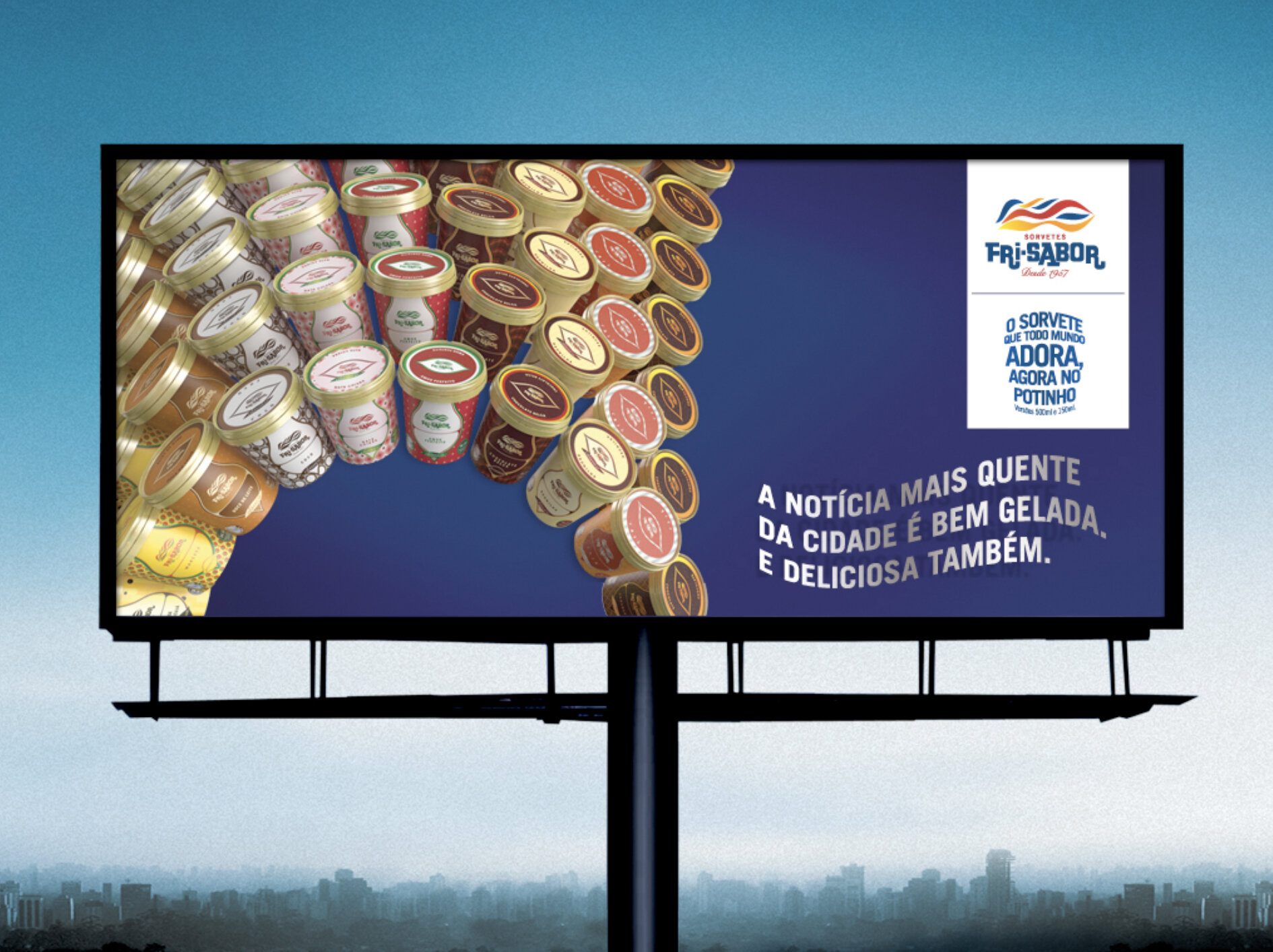
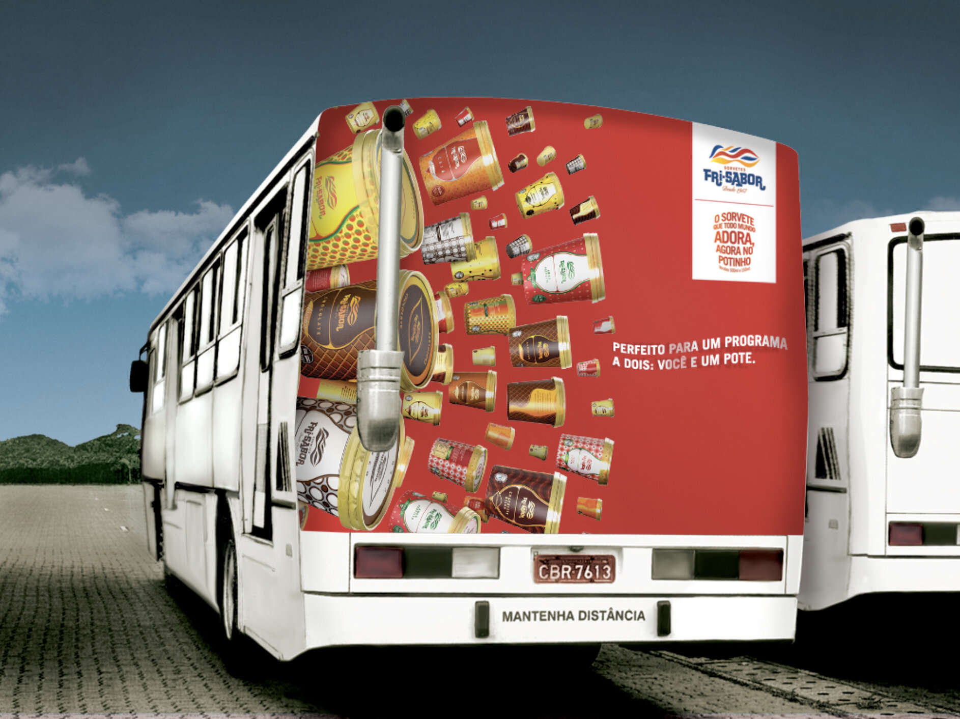
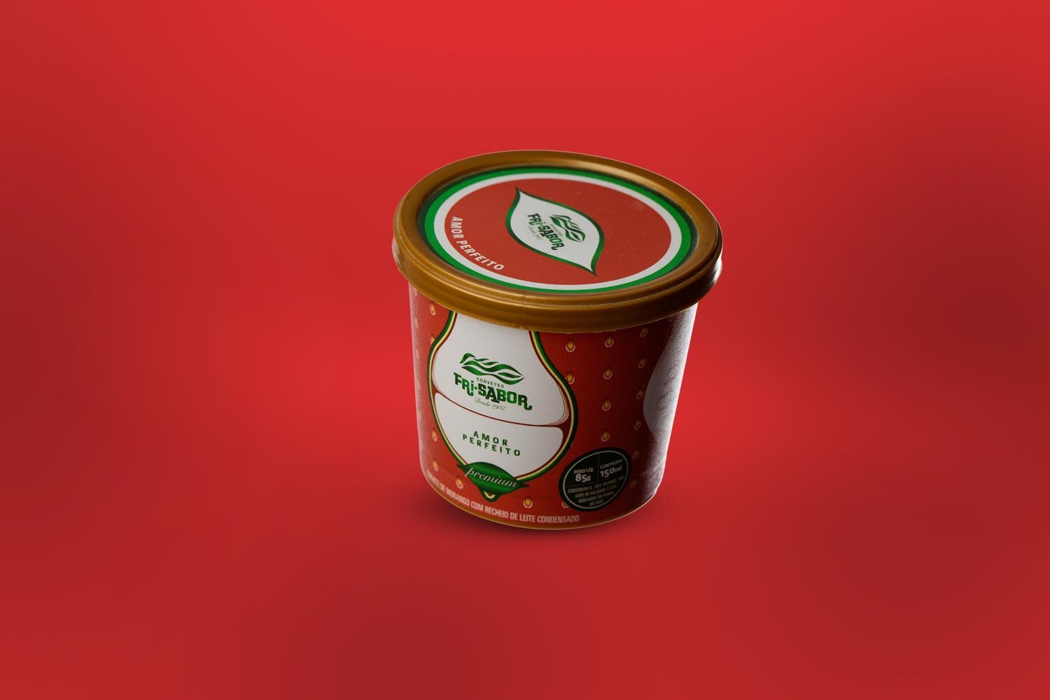
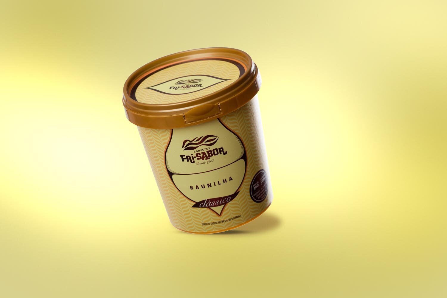
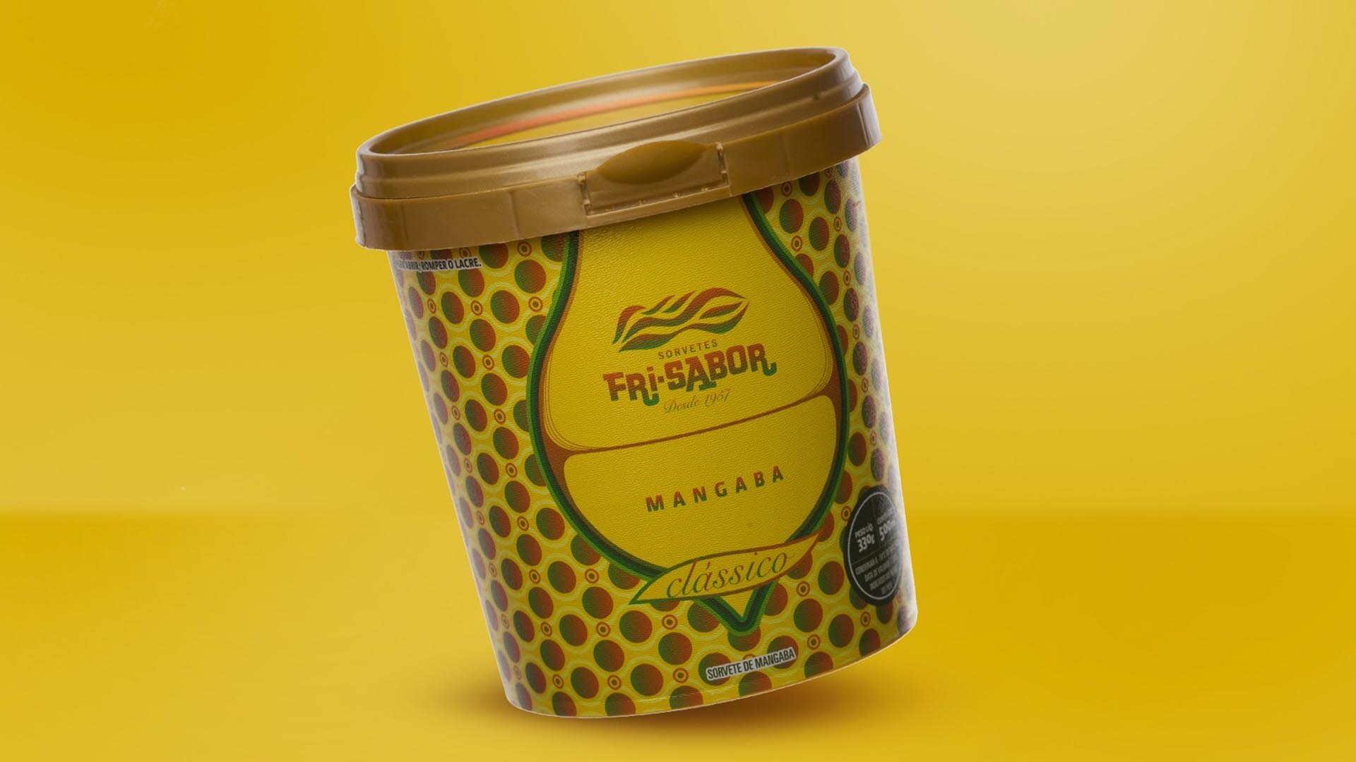
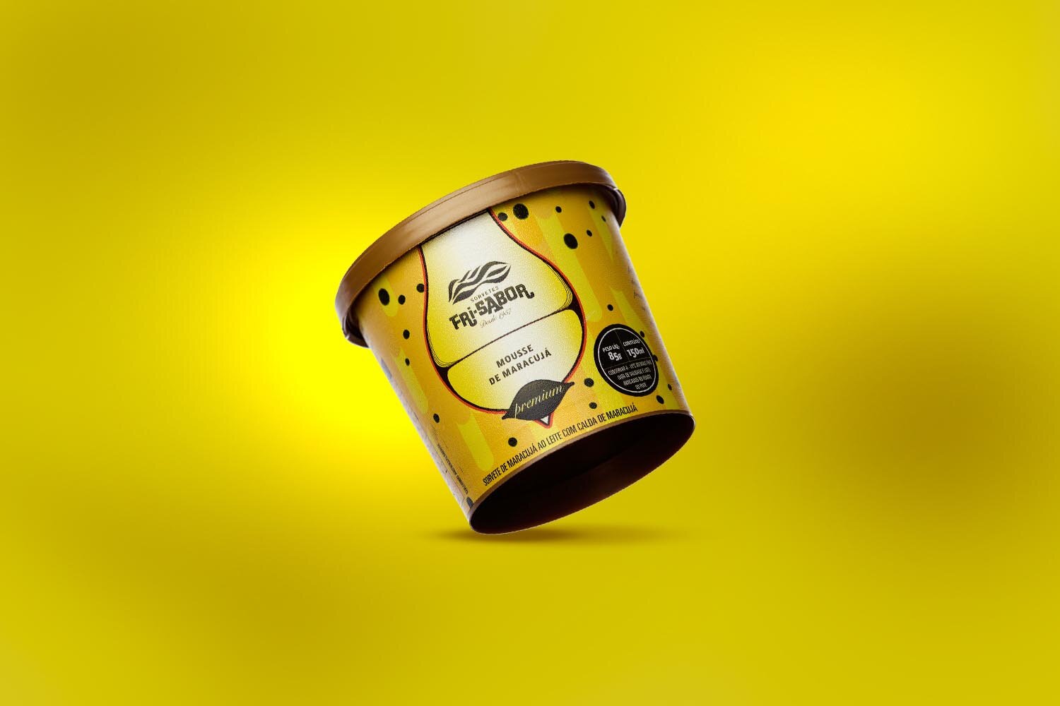
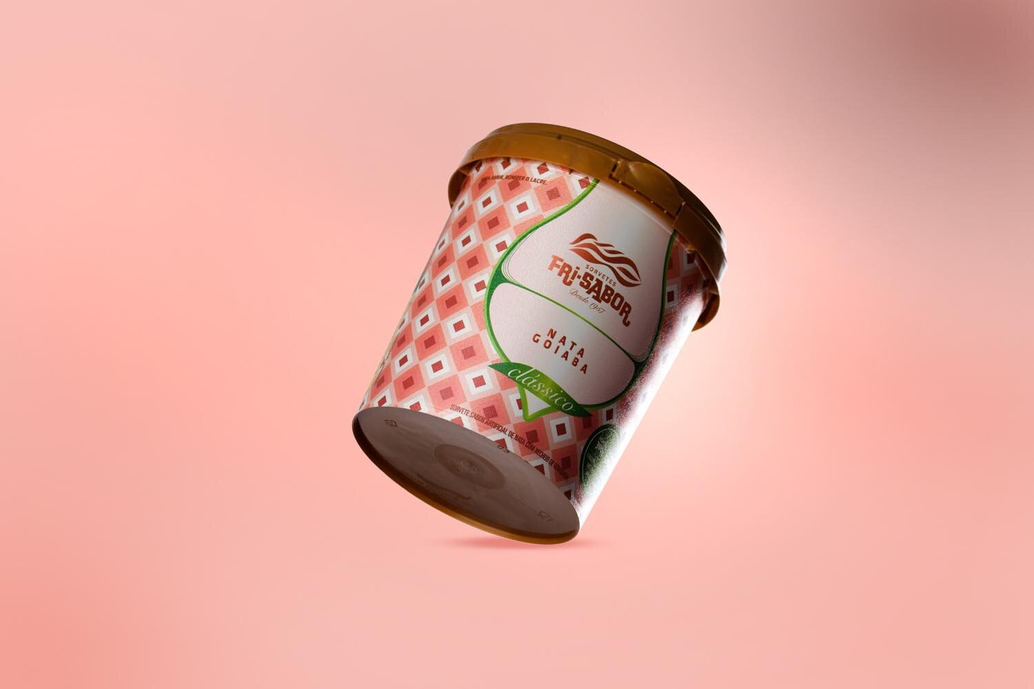
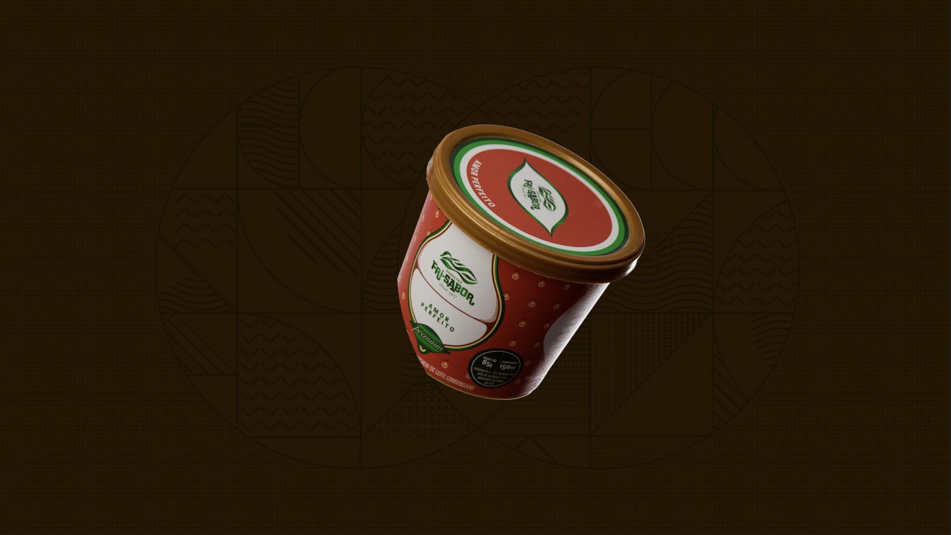
We designed a flexible visual system for the new line of tubs, with a large area reserved for an abstract interpretation of the flavors through richly textured elements. A fixed structure shared by all the tubs ensured brand recognition.
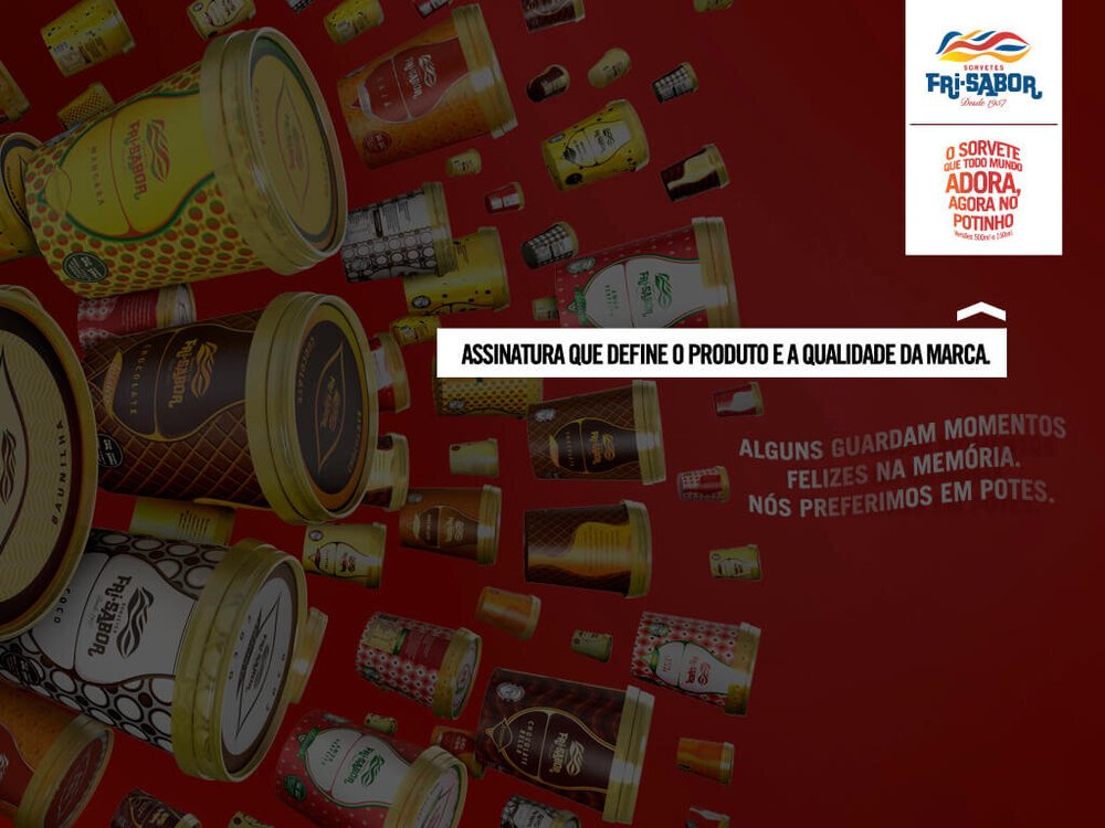
The ice cream everyone loves, now in a tub.
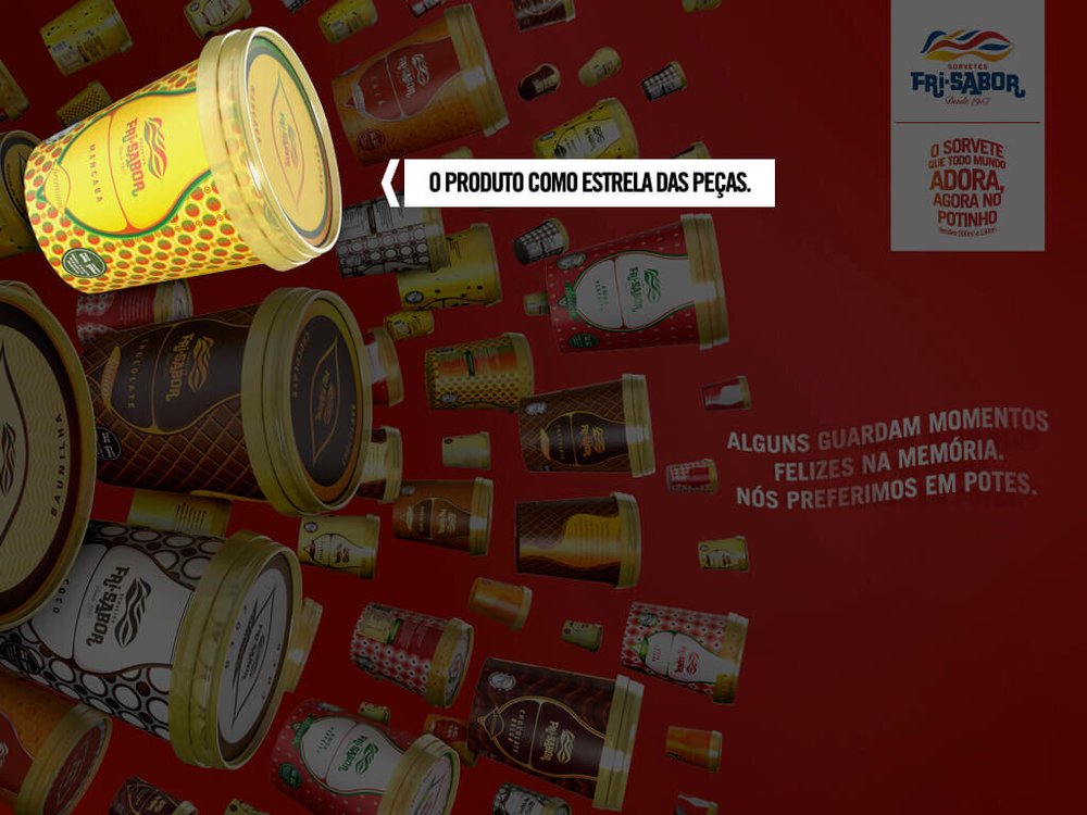
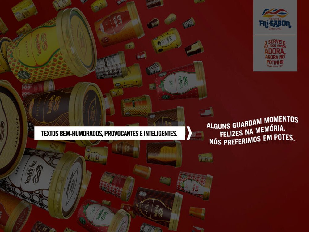
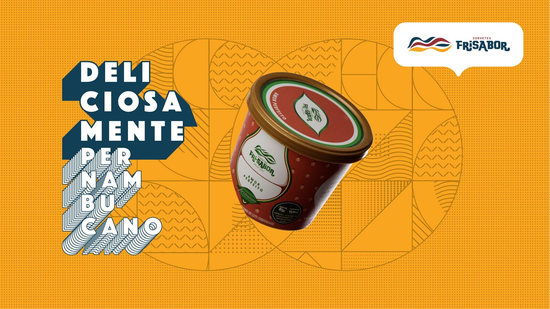
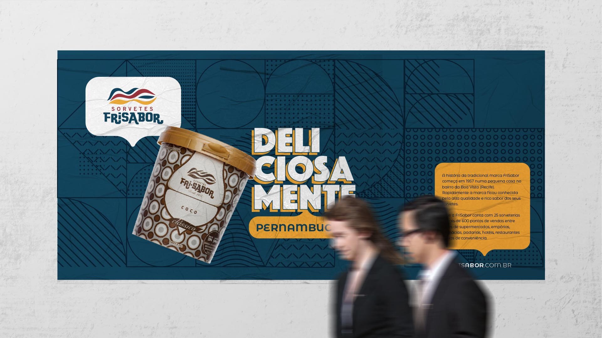
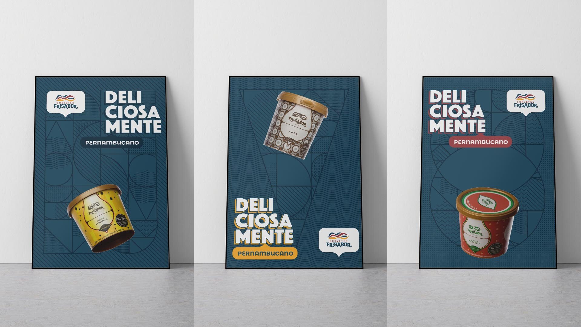
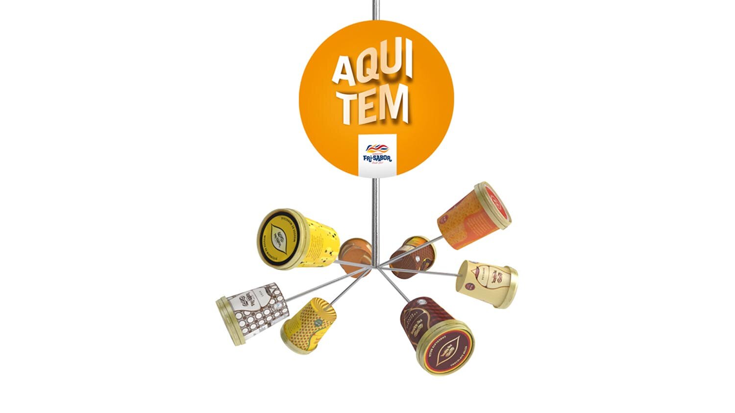
The launch was crowned by a campaign that made the tubs burst across the layout. The strategy was a sales success and revived the brand’s regional pride. The business’s growth revealed some everyday challenges with the visual identity, confirmed by research.
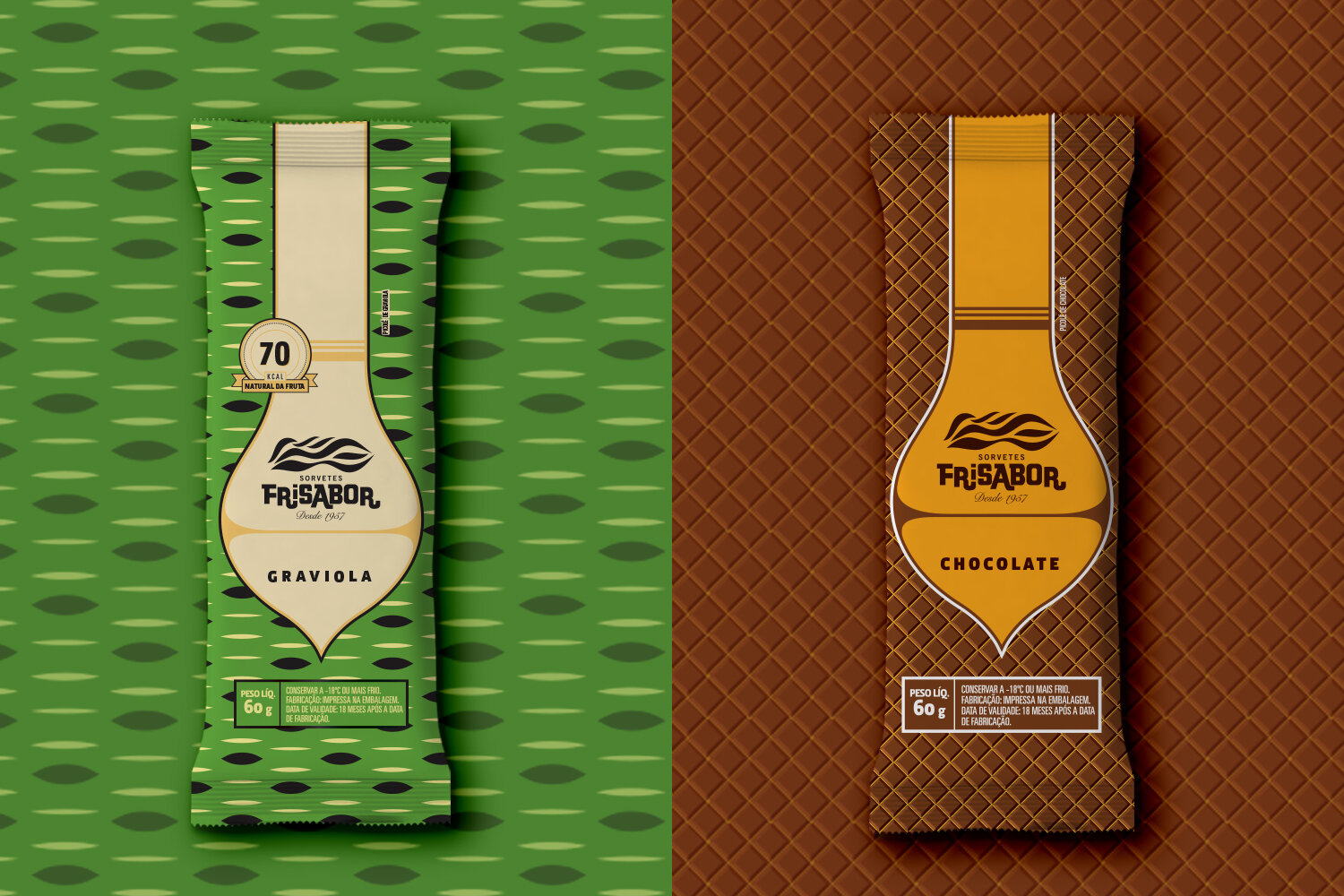
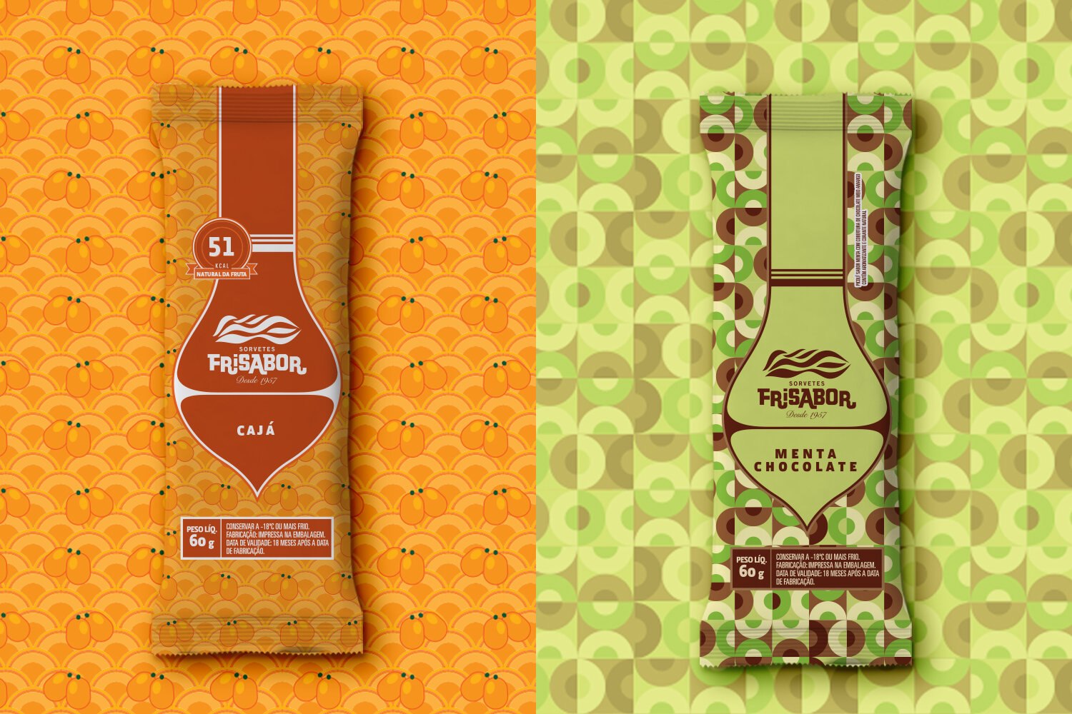
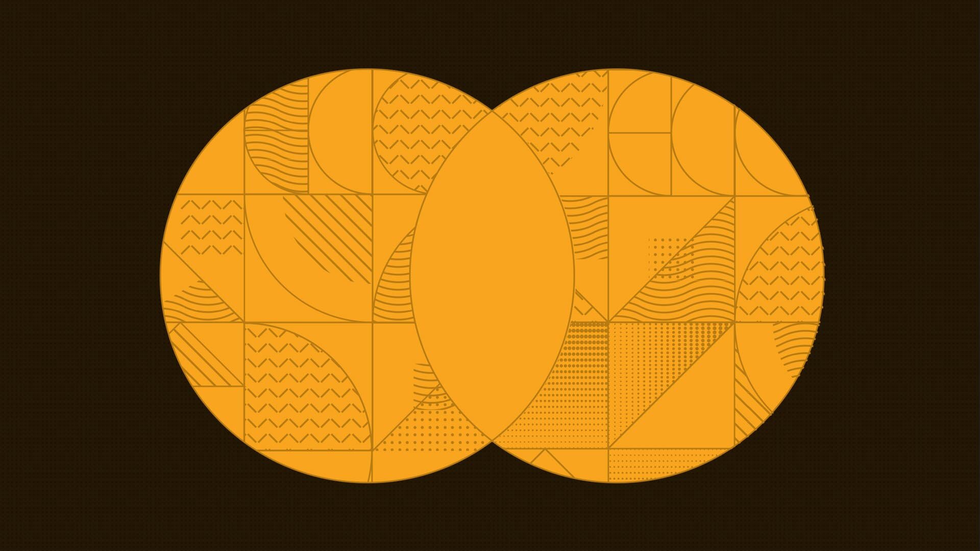
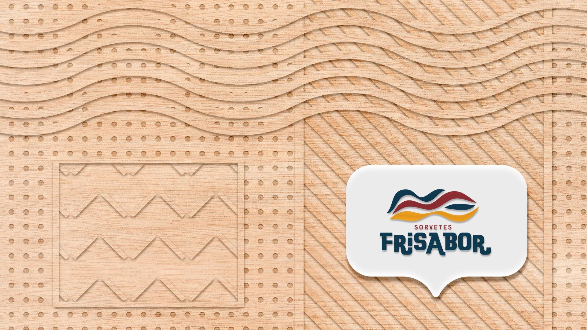
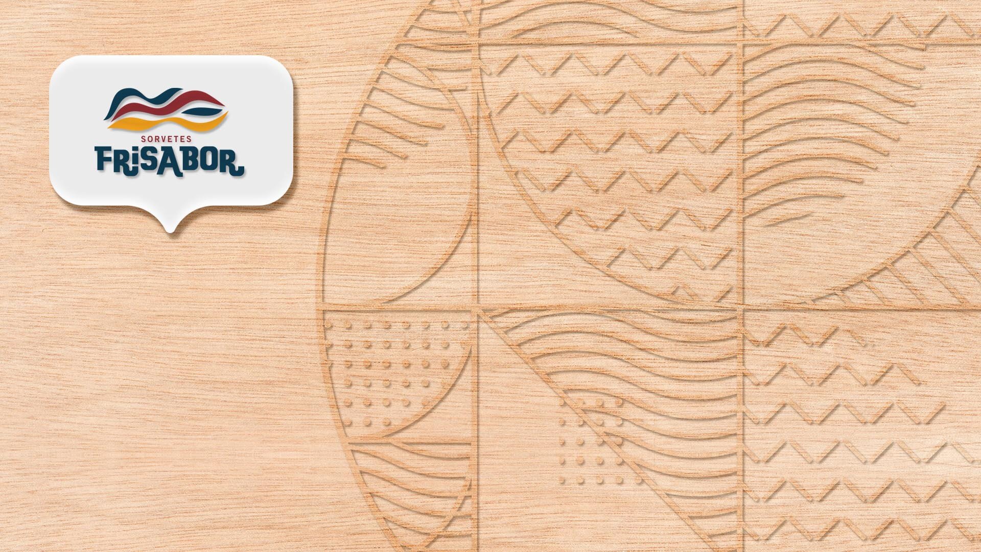
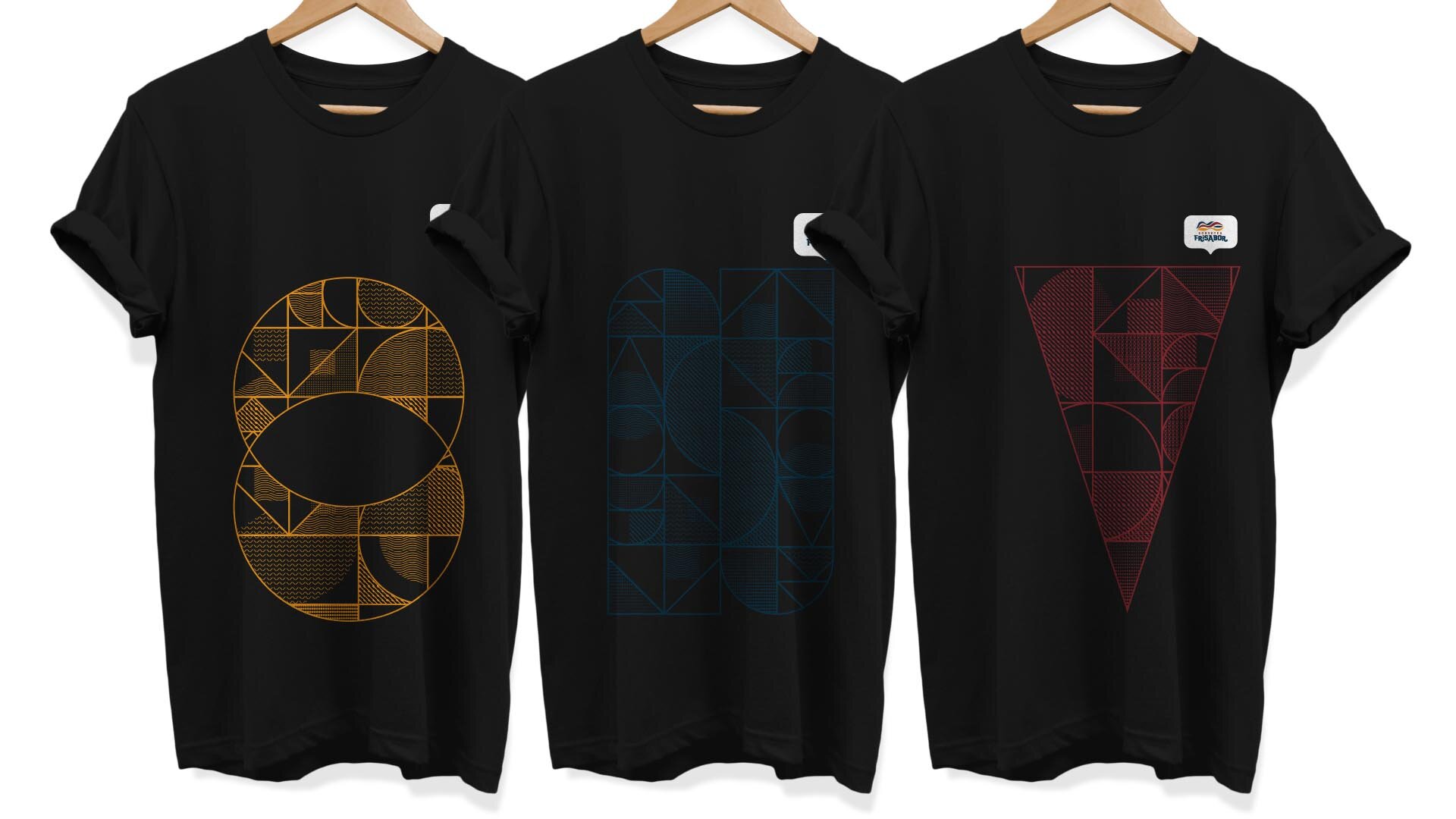
It was clear that the graphic patterns had become part of the brand’s visual universe and an important point of connection with the audience.
It was a second moment for FriSabor’s repositioning and the right time for deeper work systematizing its identity.
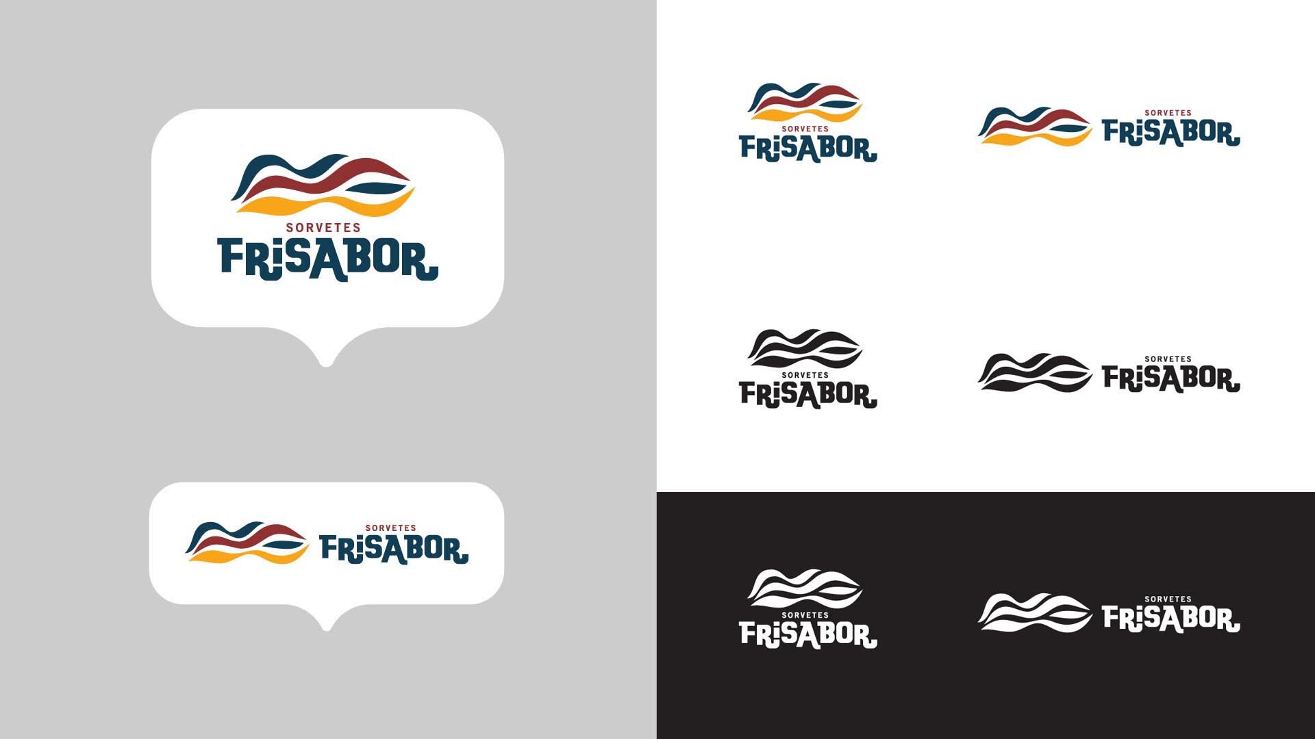
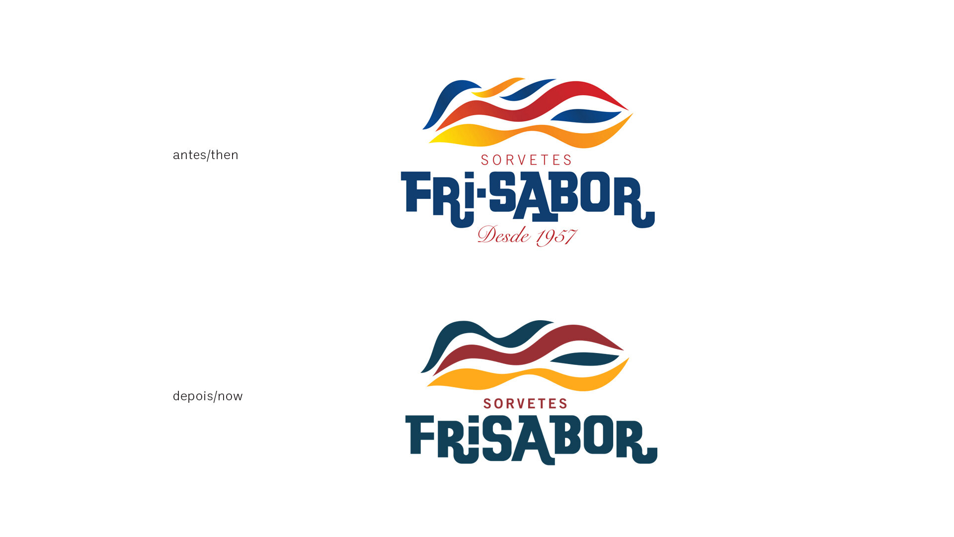
The lettering was redrawn, and the symbol’s elements were reduced and softened.
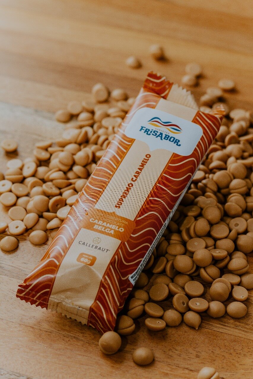
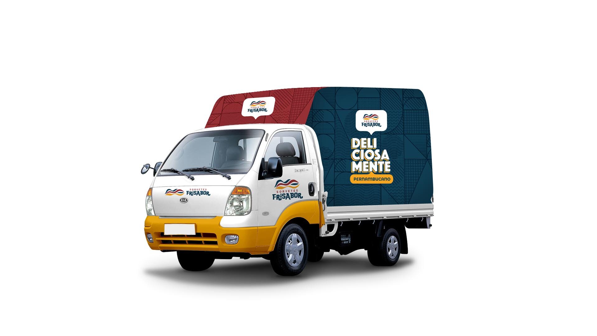
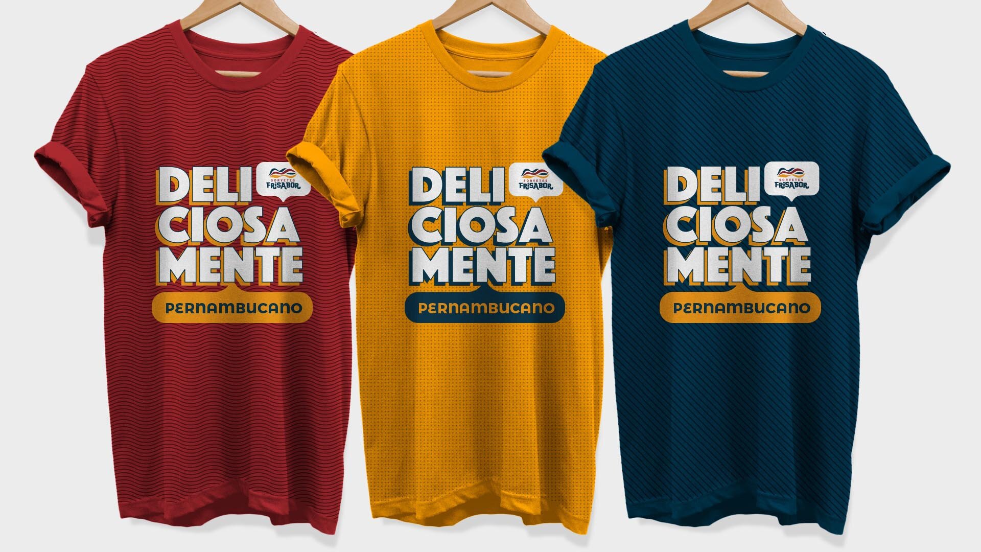
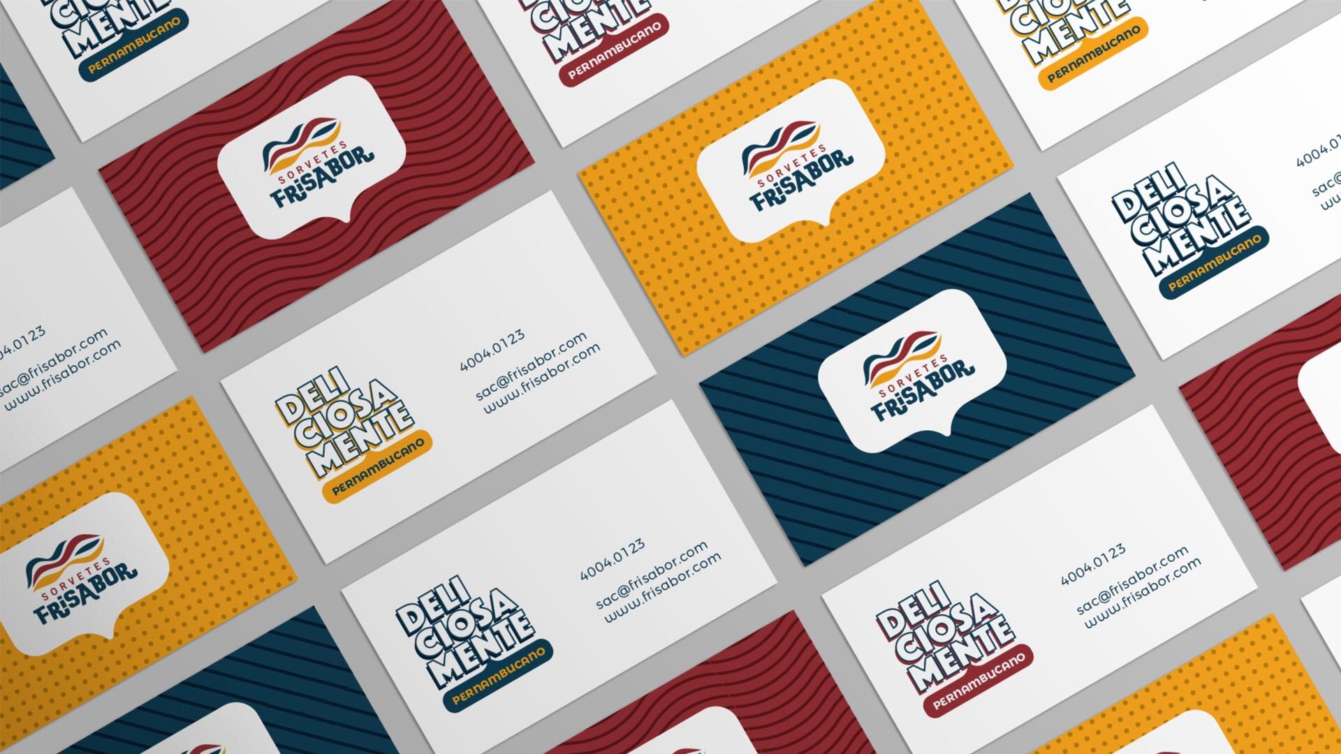
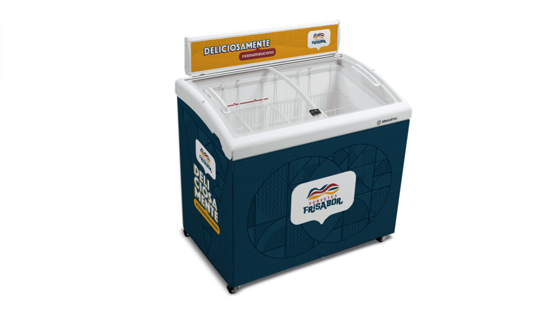
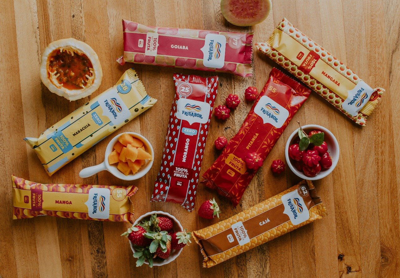
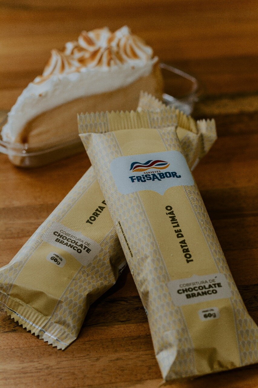
The typographic palette was unified and the color palette was systematized and expanded. Custom illustrations became the basis for building a unique graphic grid. Signature variations were presented and approved. Product lines with partners were defined, as well as the architecture between these brands.
In this way we created a robust visual universe for an original identity, shaped by years of immersion and relationship with the client.
The non-linear strategy that has paced the FriSabor brand’s sequence of actions over more than 10 years is a great example that formulas don’t apply to brands seeking uniqueness.
The strategy of competing through tubs generated key insights that flipped the logic and ended up becoming central to the branding.