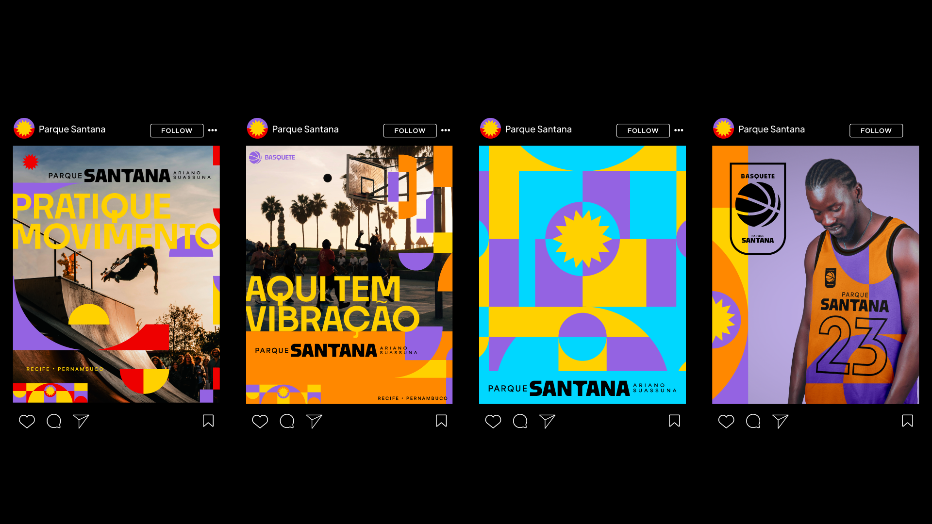
Culture, sport and community. There’s a buzz here.
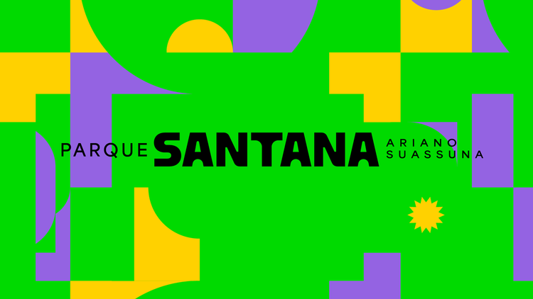
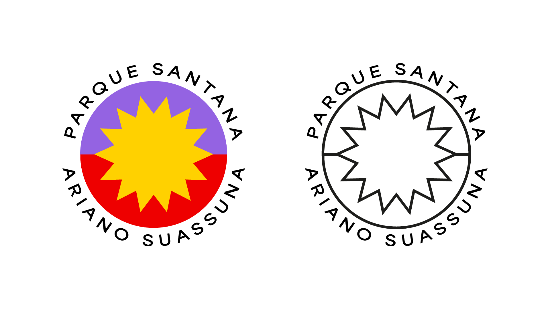
Parque Santana is rhythm, encounter, people in motion. The new visual identity follows that pulse, with a language that brings together tradition and contemporaneity.
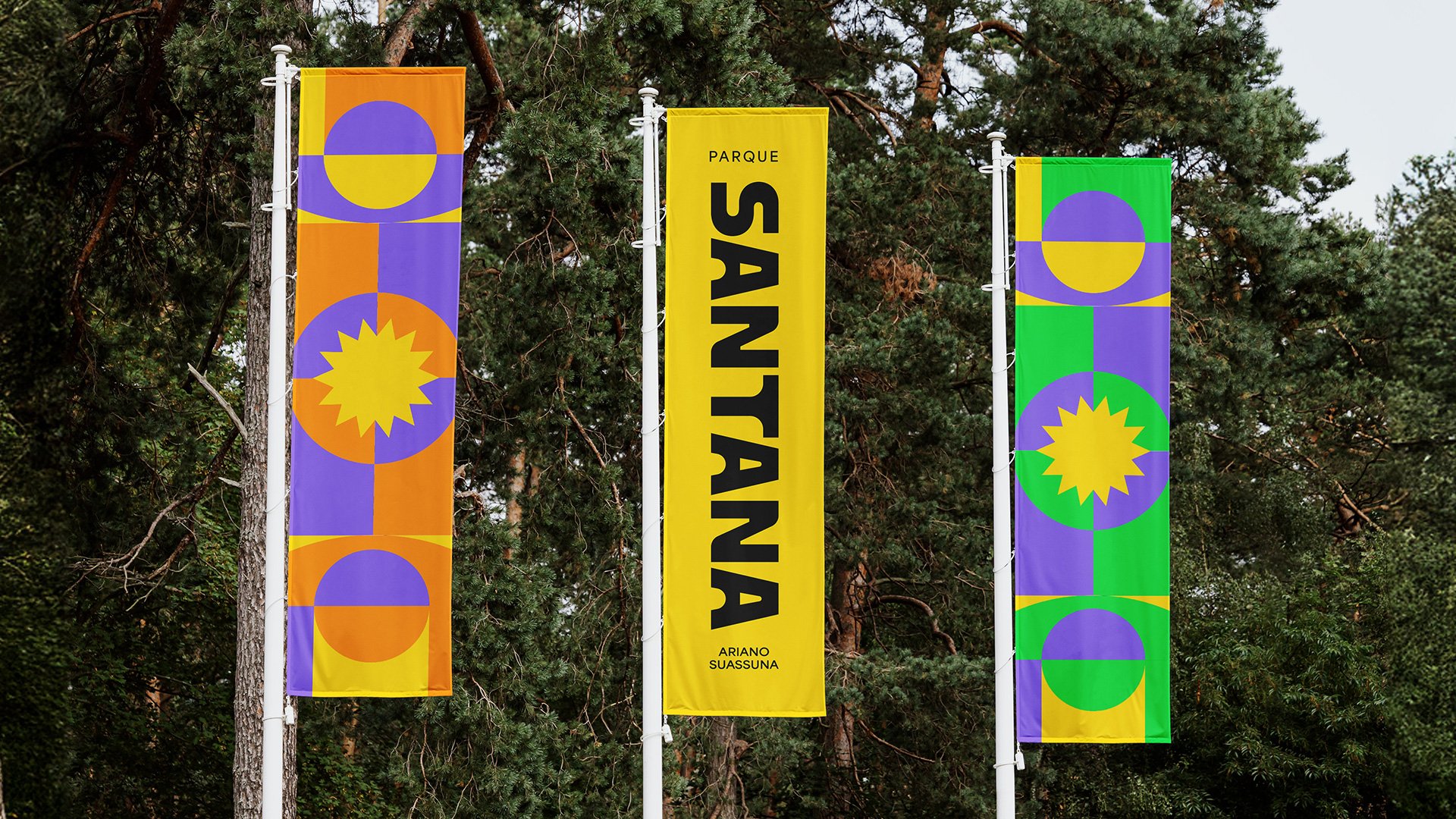
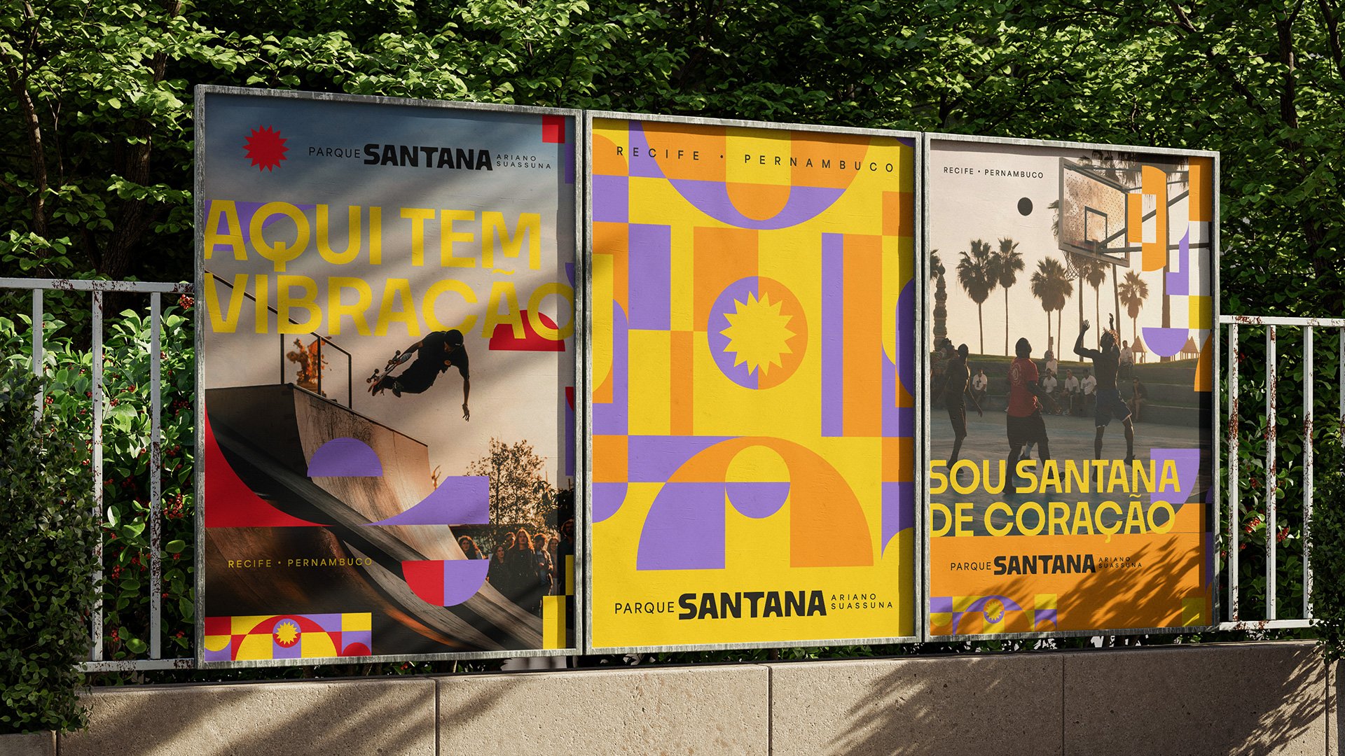
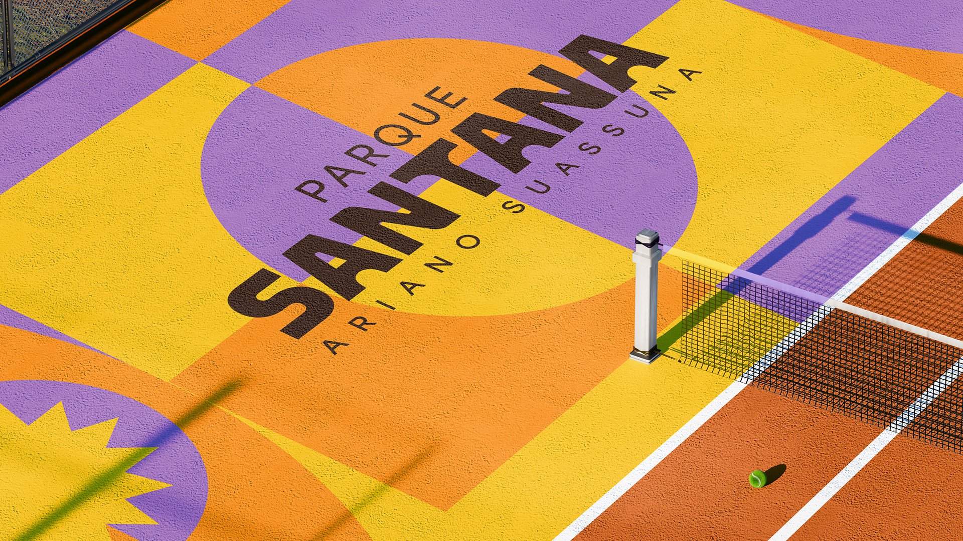
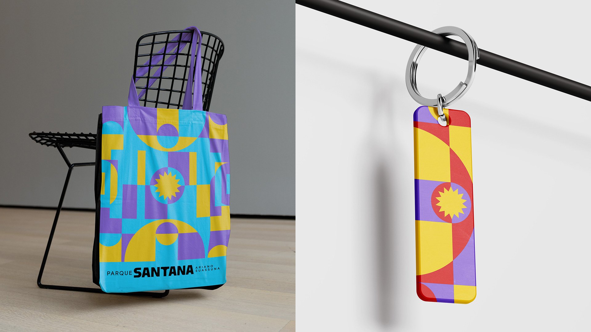
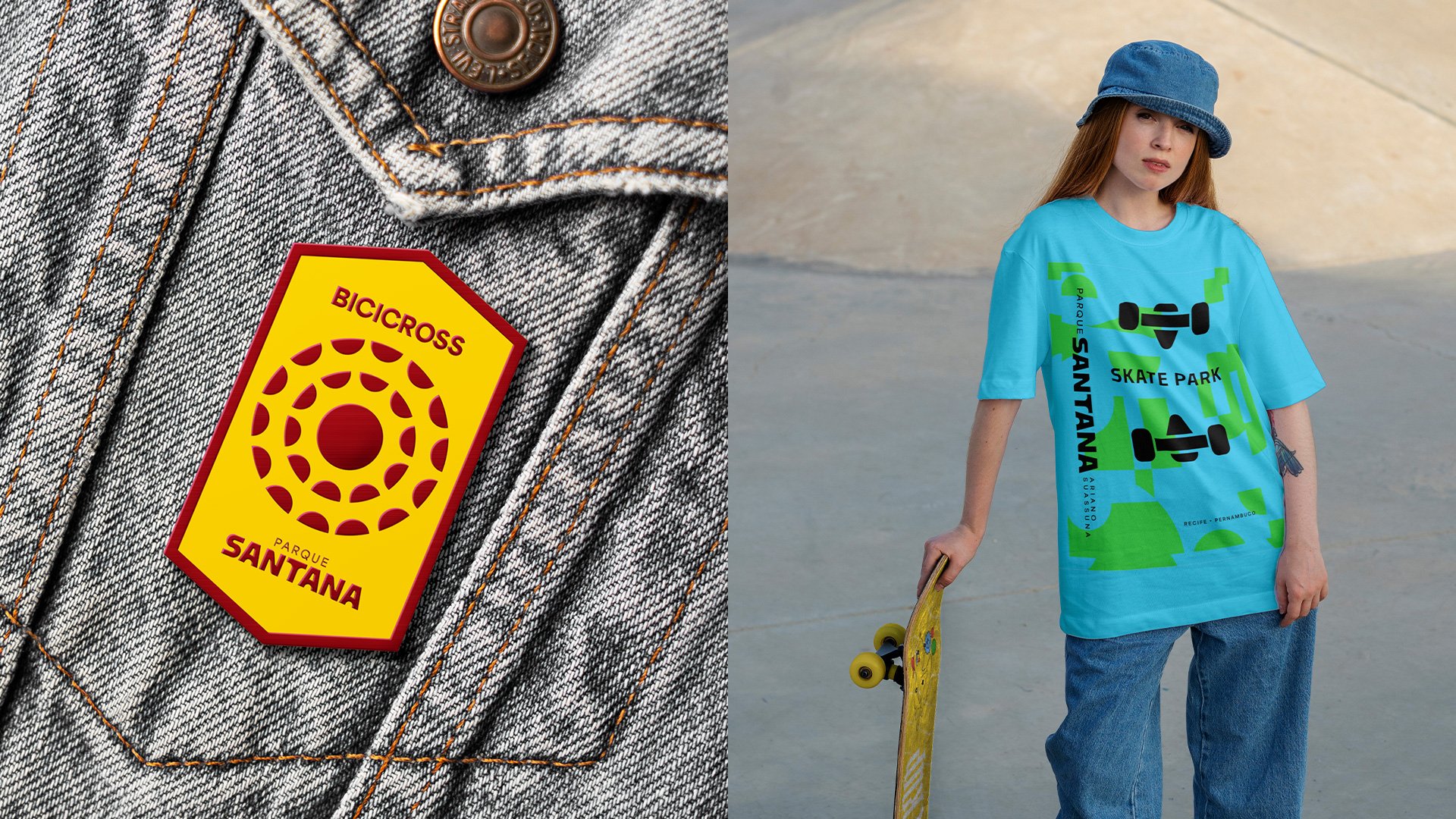
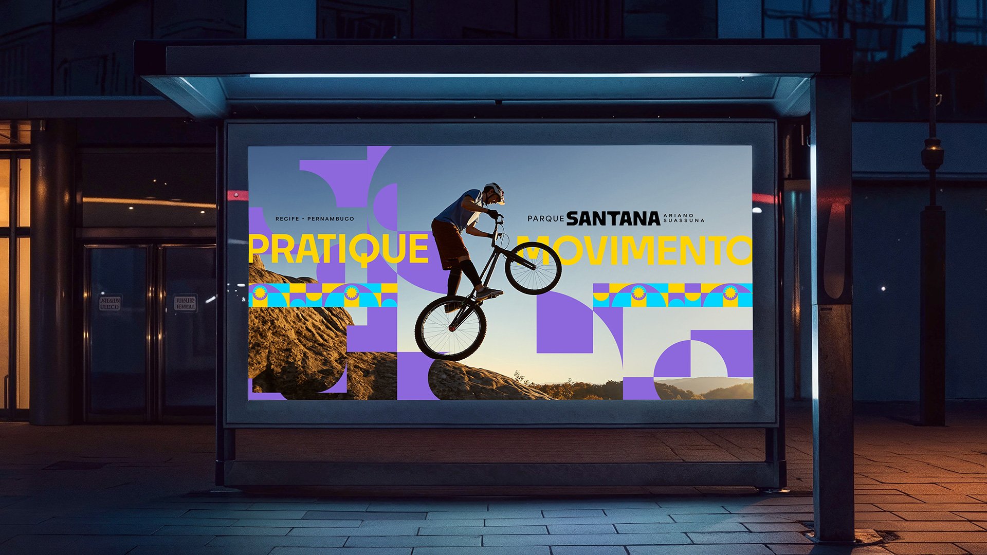
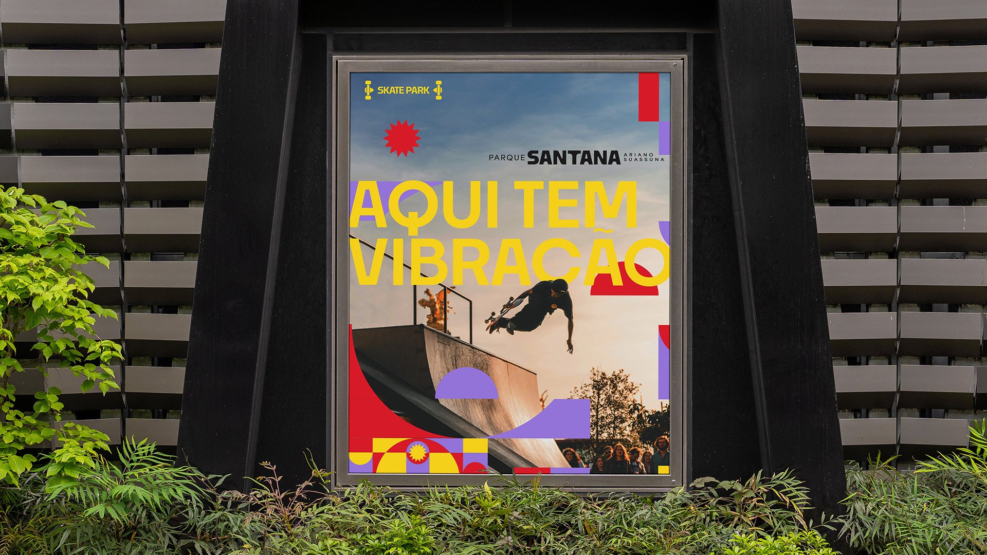
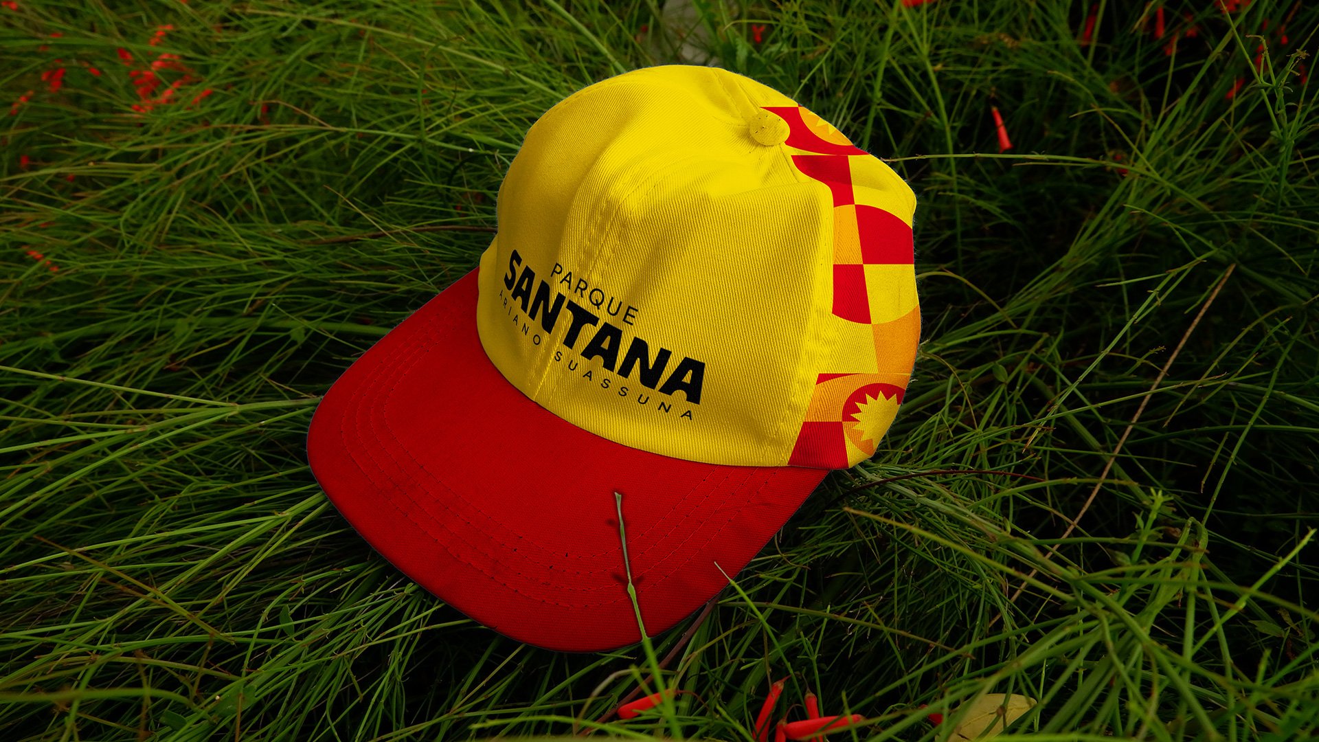
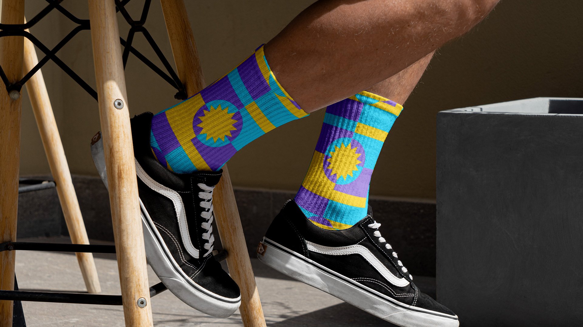
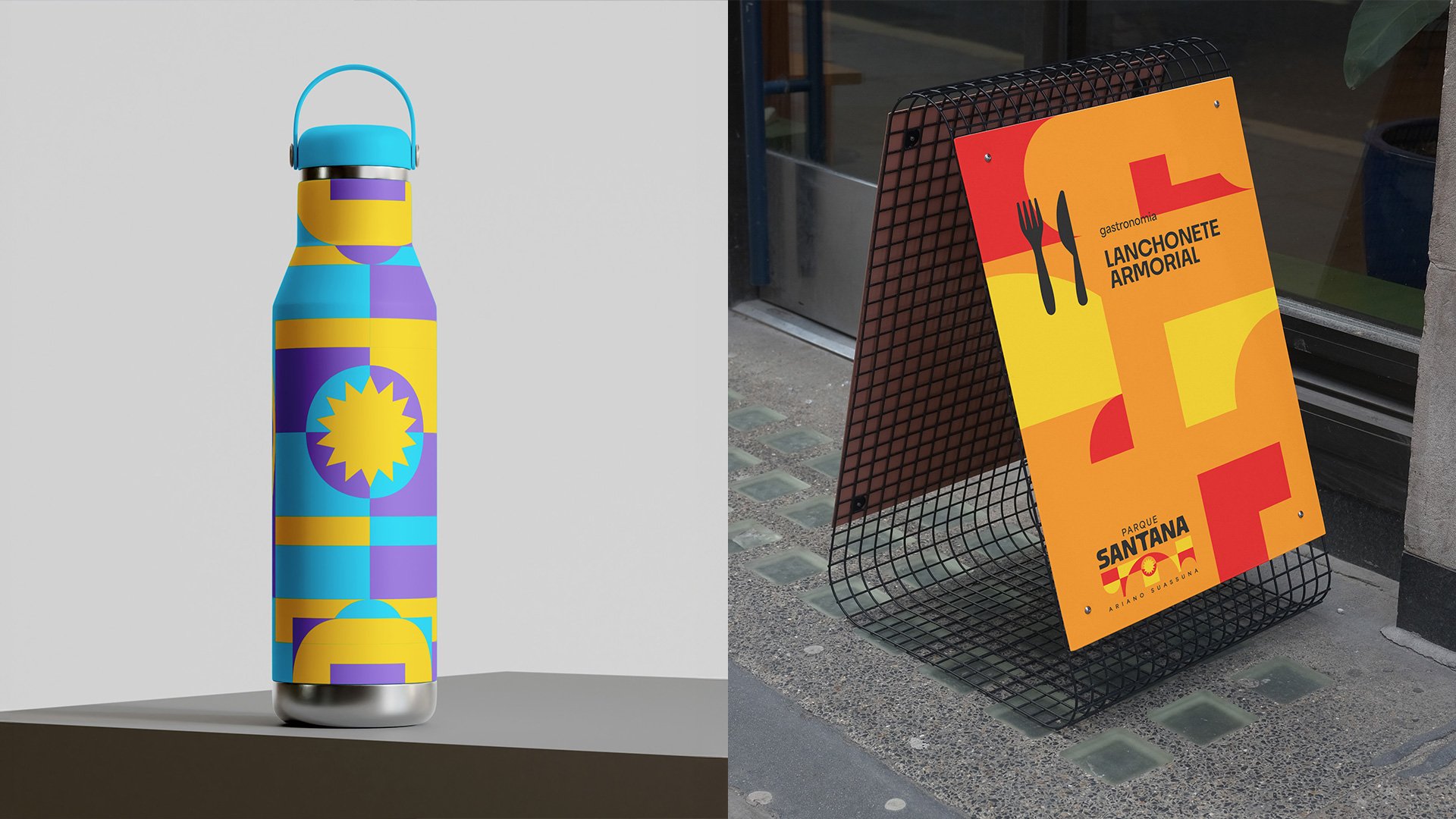
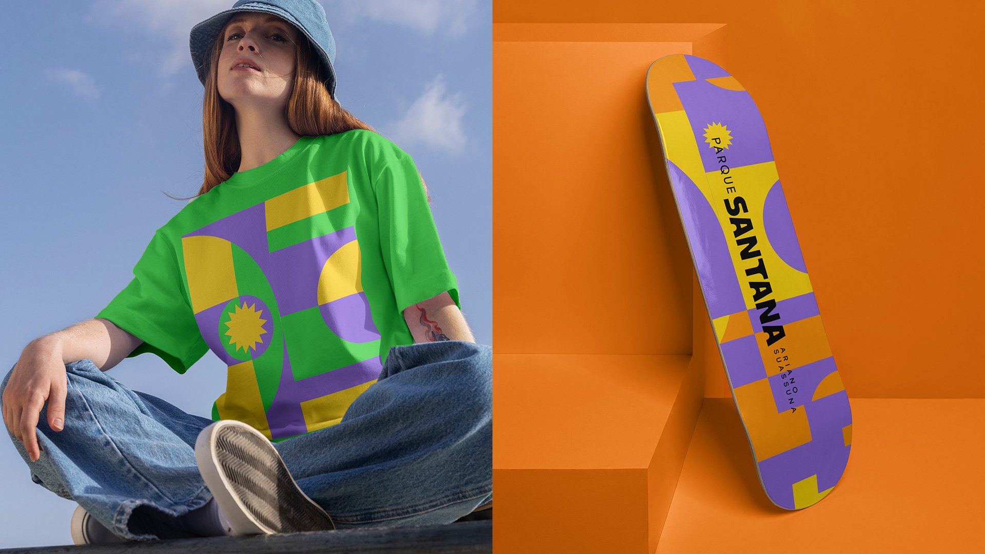
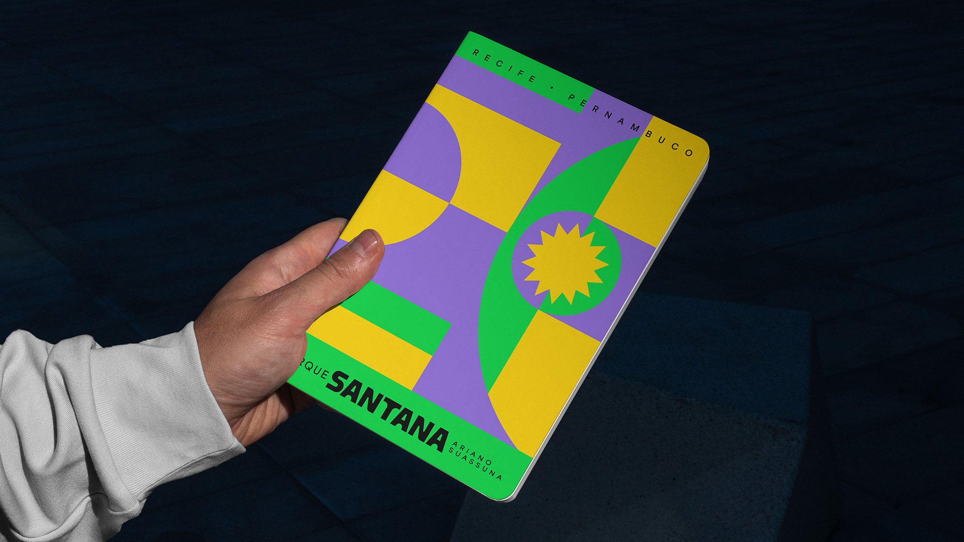
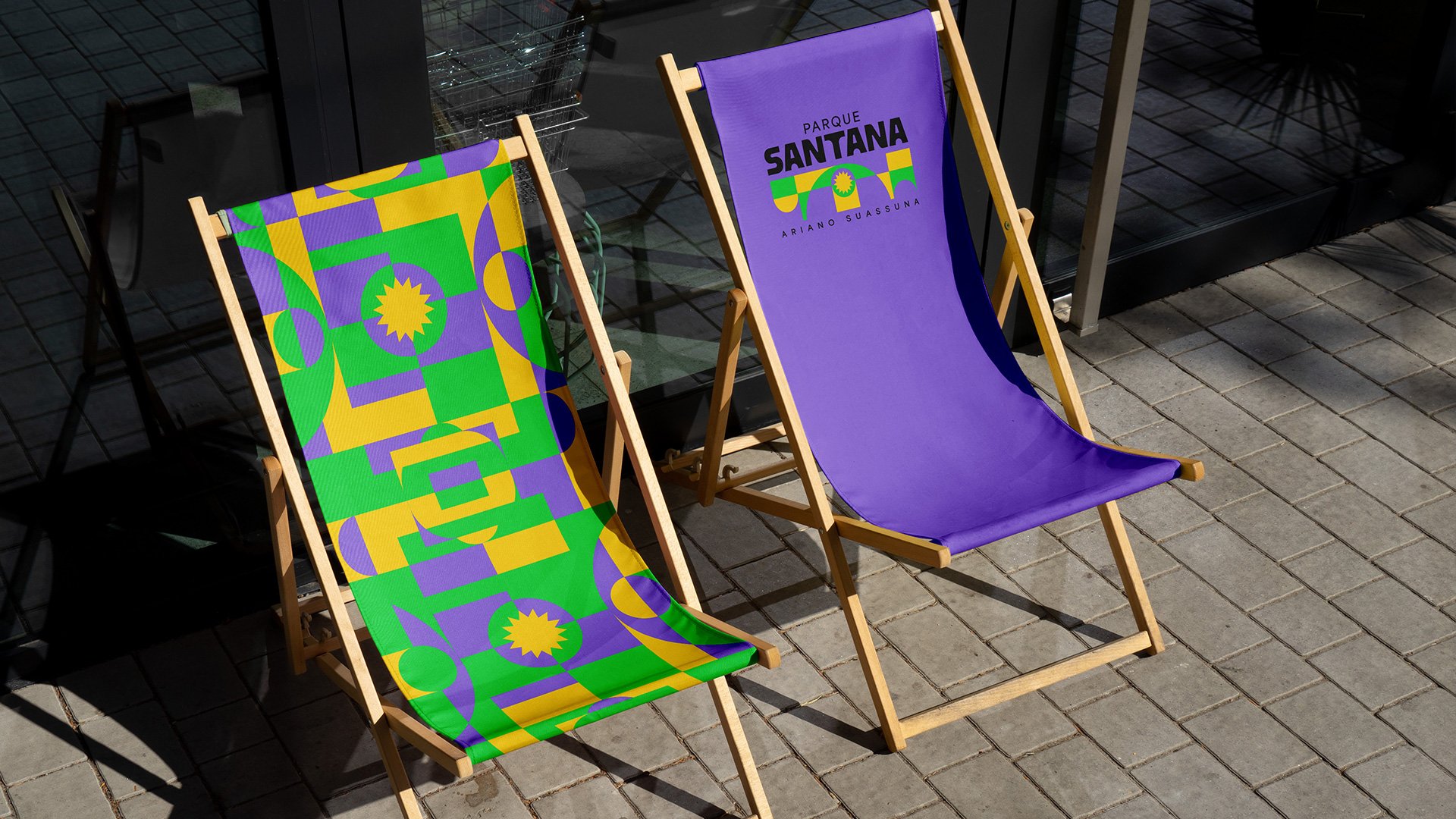
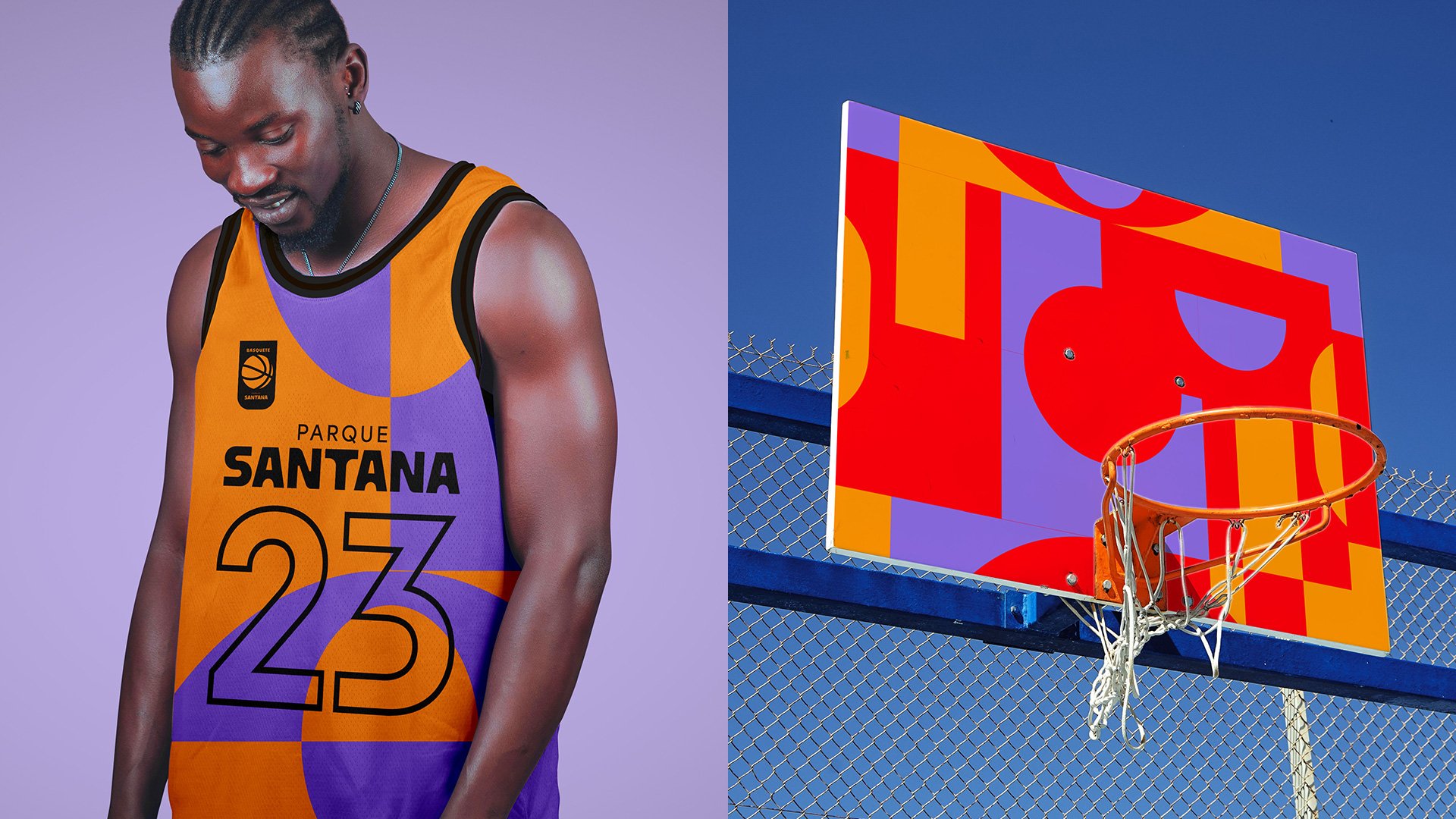
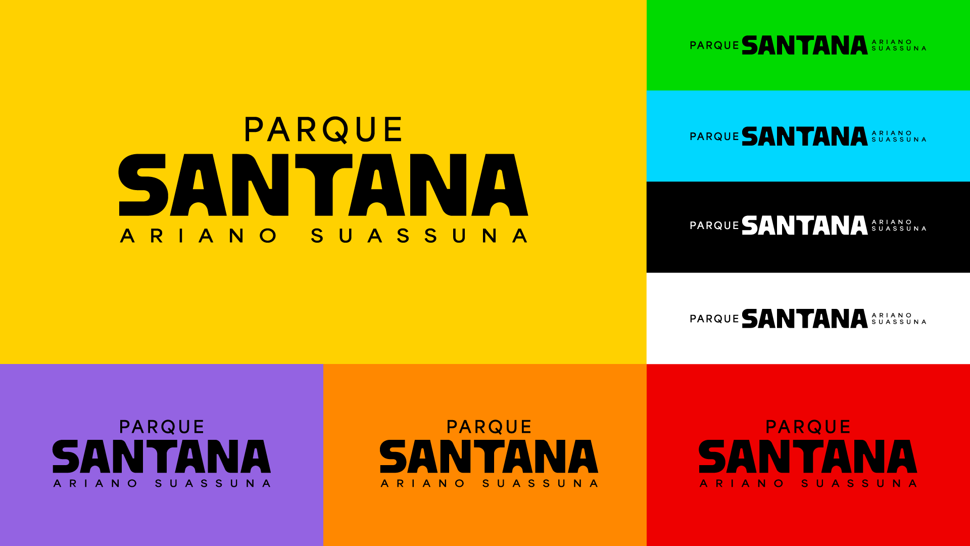
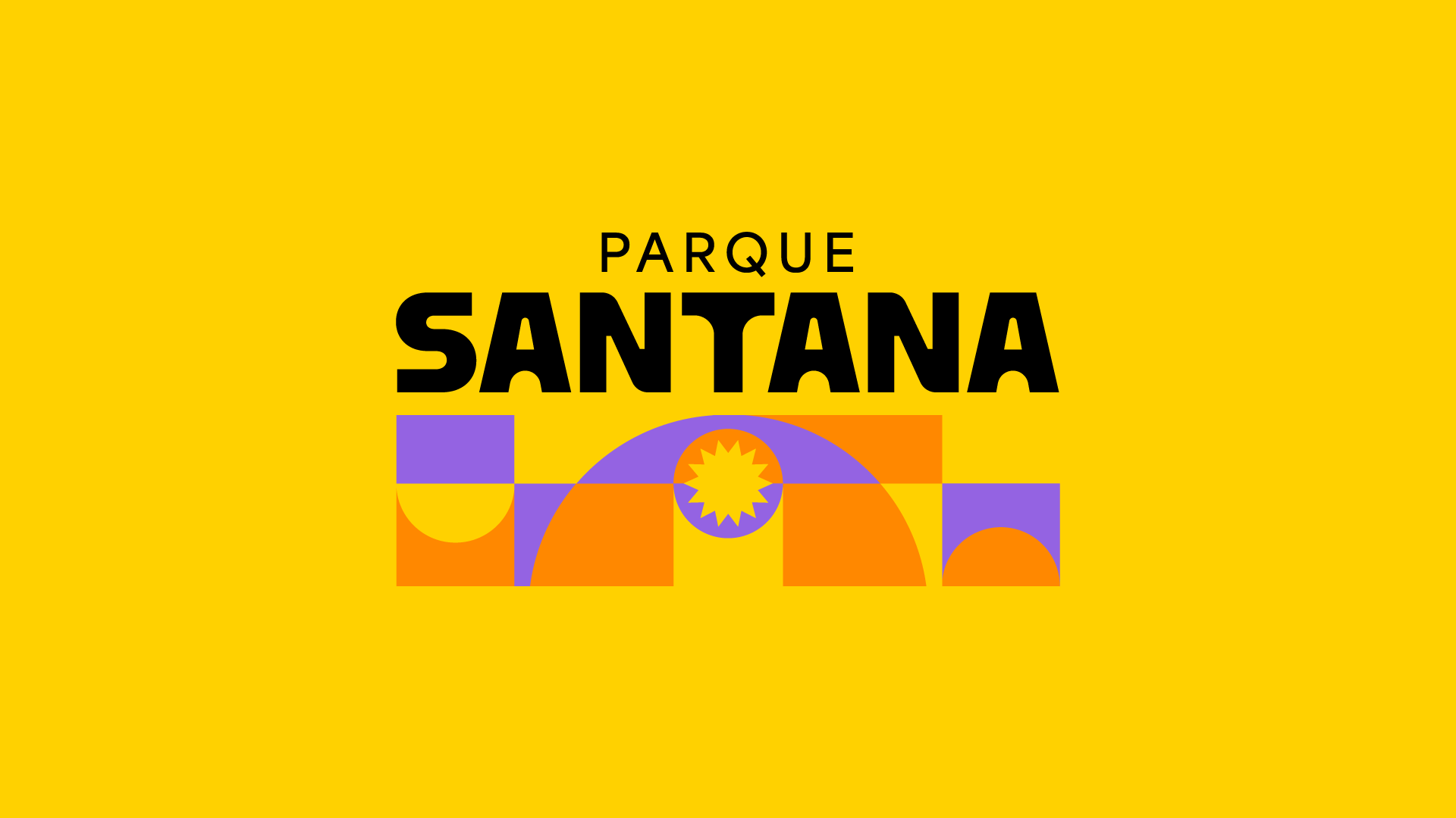
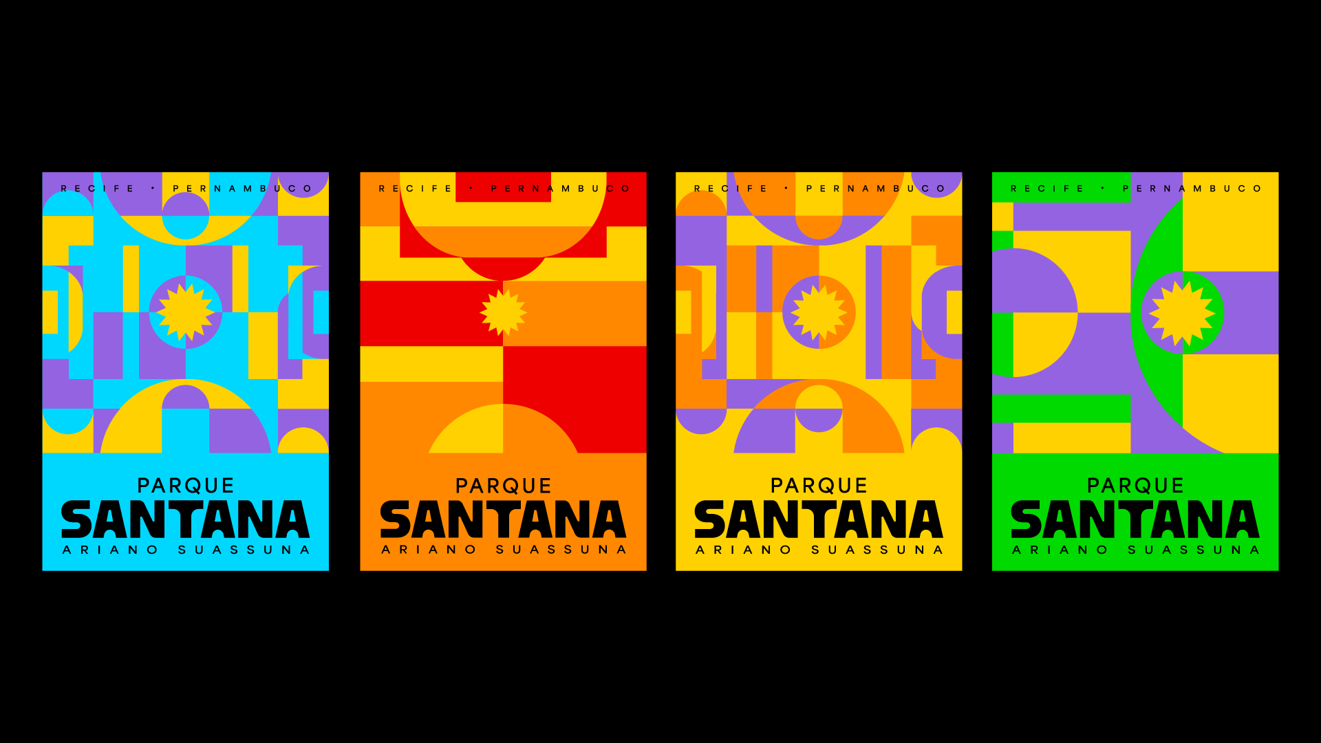
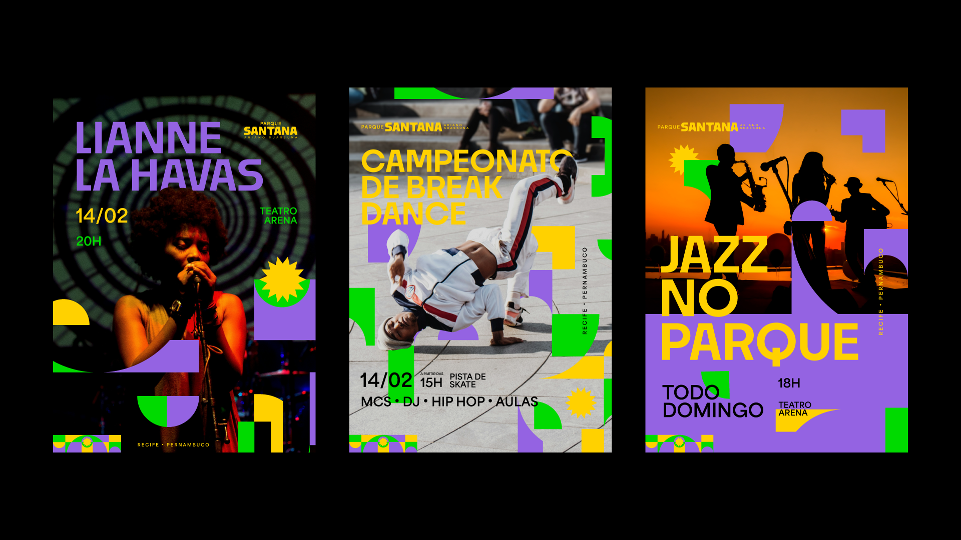
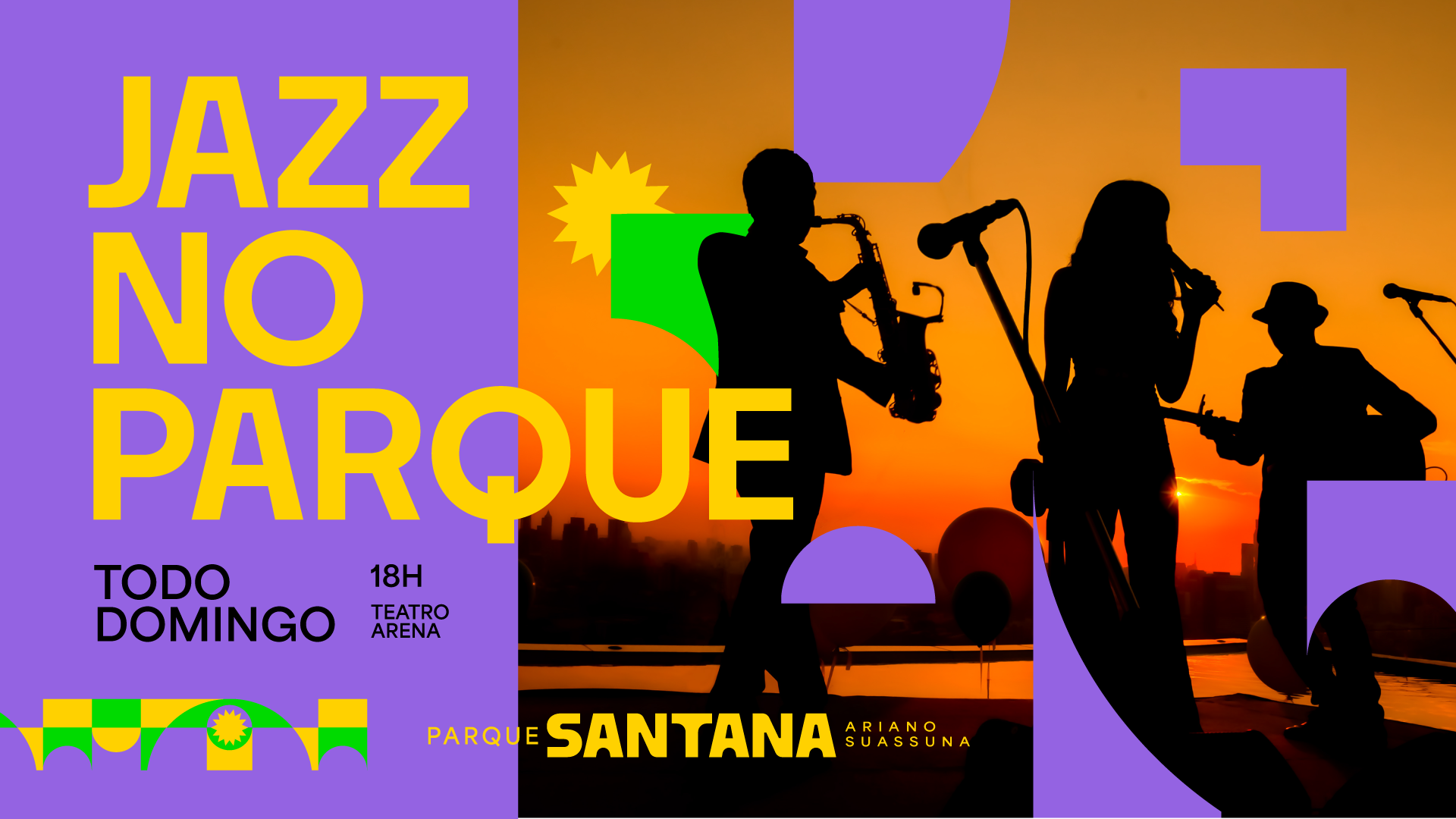
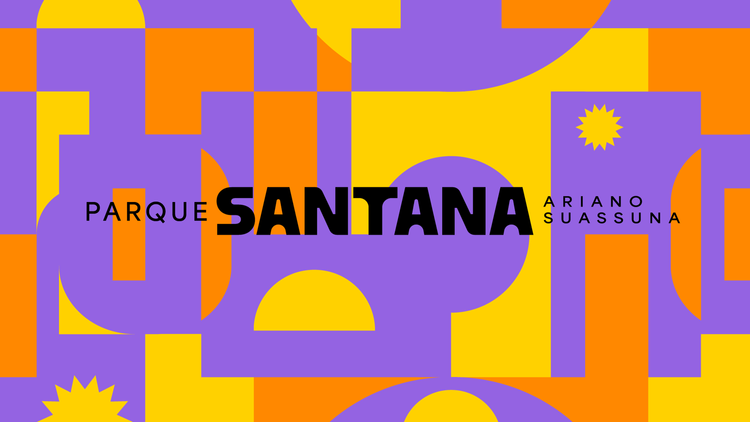
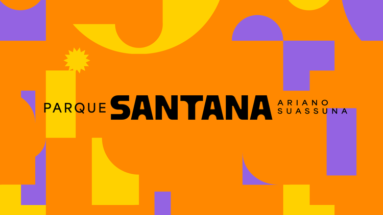
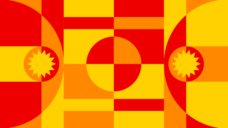
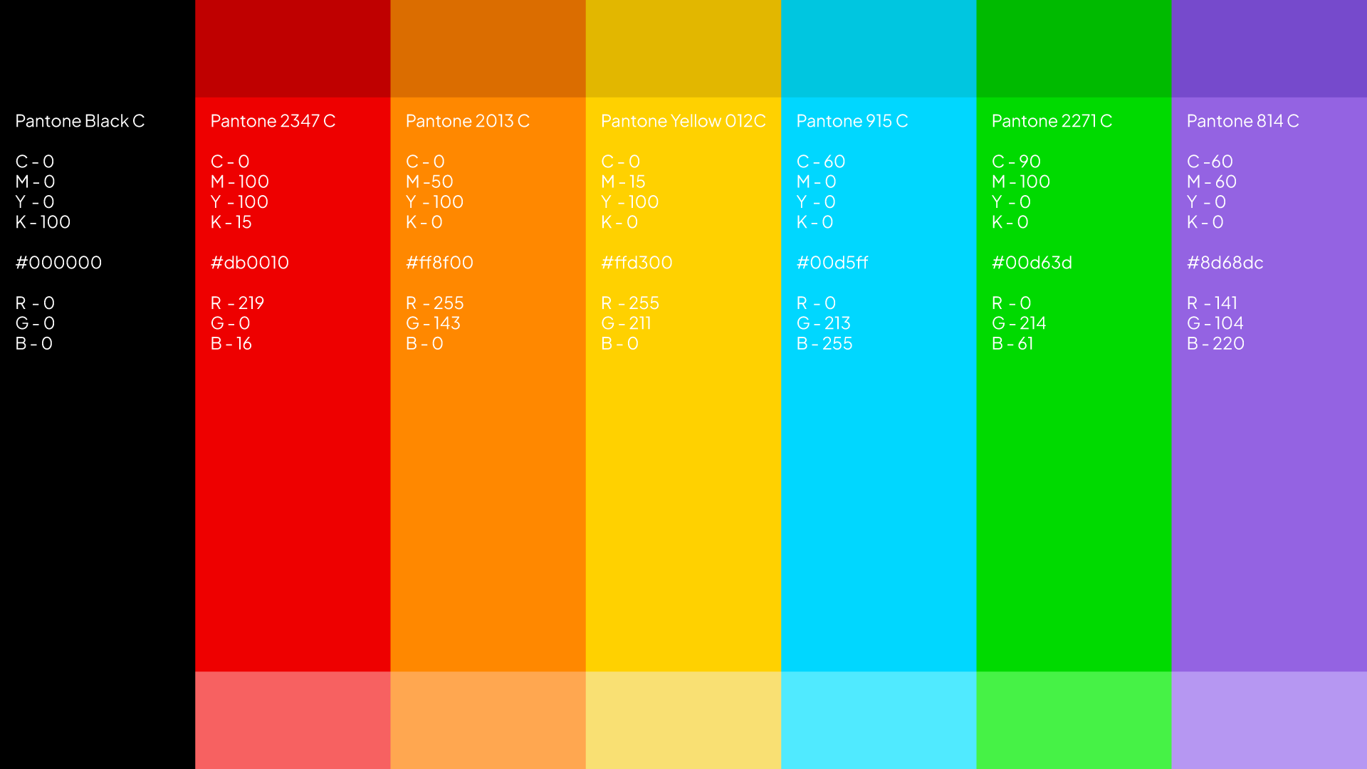
The brand reflects the variety of activities and audiences that fill the space every day. The graphic elements echo the mosaic of activities (concerts, sports, fairs and leisure time), while yellow stands out as the lead color, evoking energy, warmth and visibility.
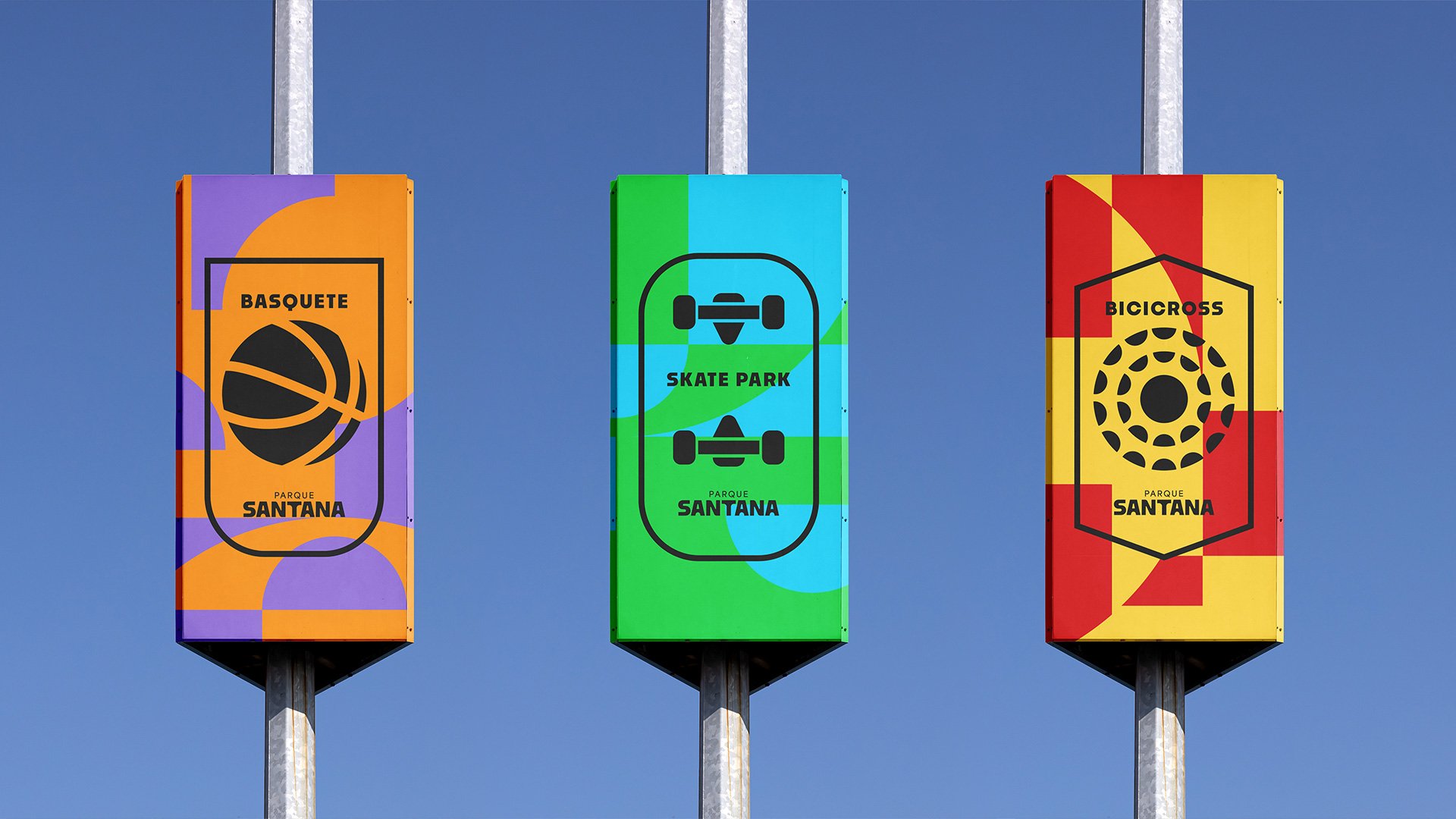
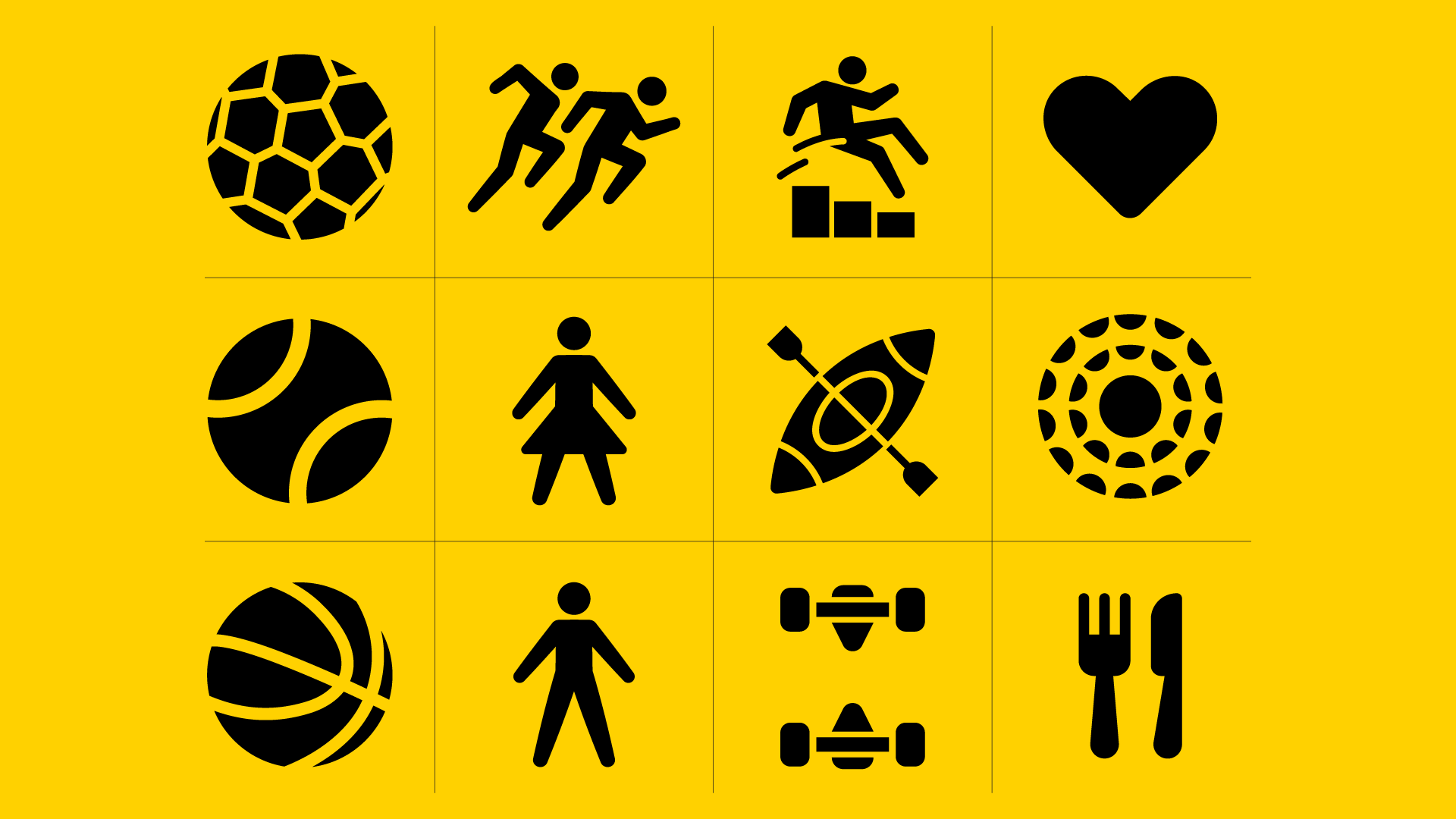
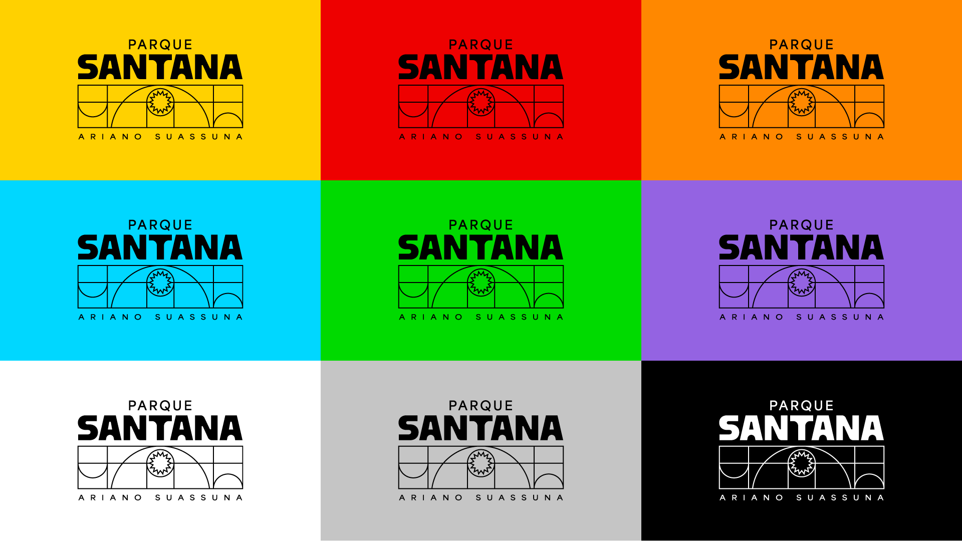
Firm, accessible typography reinforces the park’s direct, popular tone. The iconography, inspired by crests and sports symbols, deepens the sense of belonging. And as with any living identity, the graphics are versatile and can adapt to new programs and formats.
Santana is for those who live the city with their body, heart and soul. And the new identity expresses that with color, clarity and power.