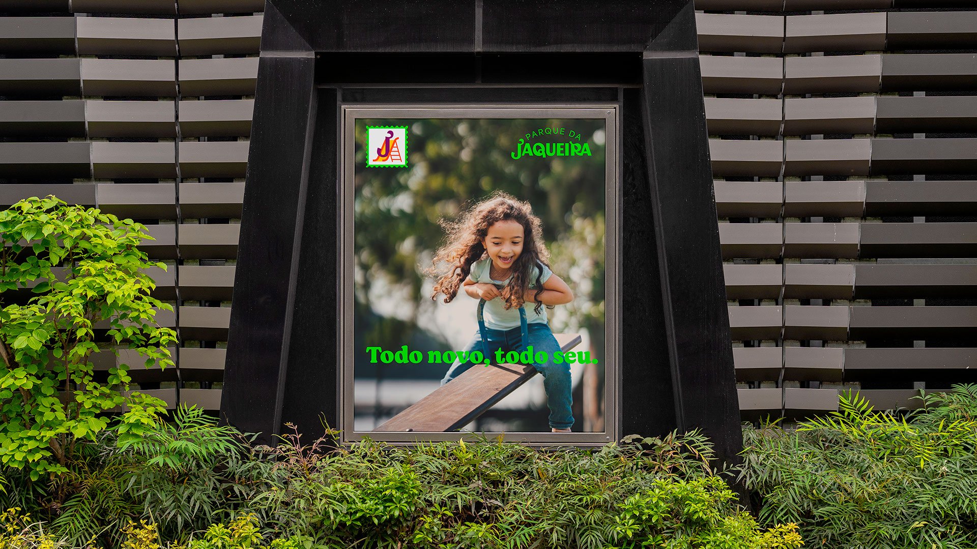
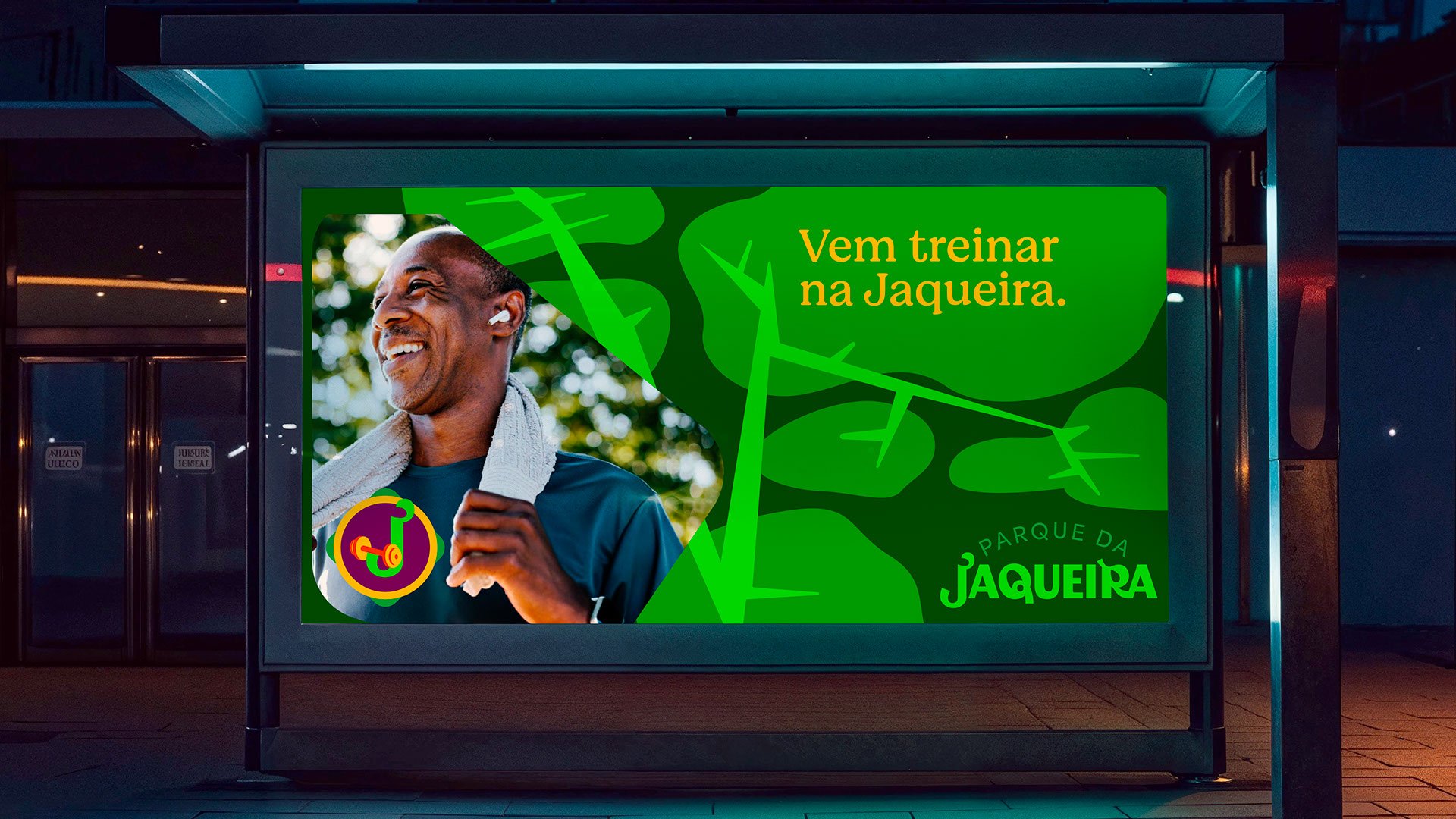
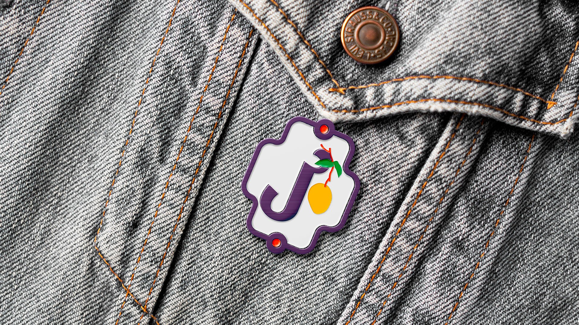
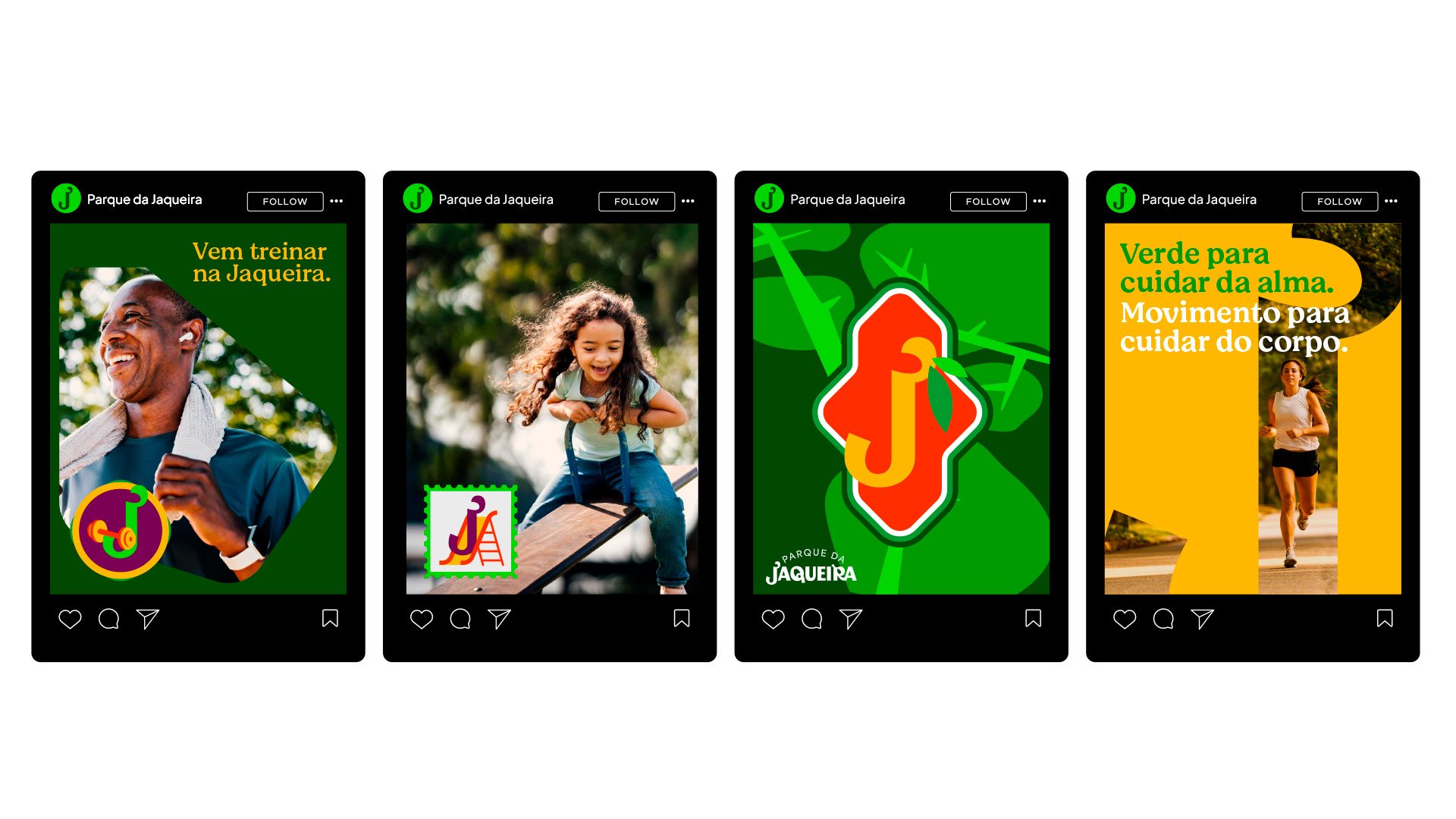
A park that was born iconic. And that remains alive, pulsing green in the middle of the city.
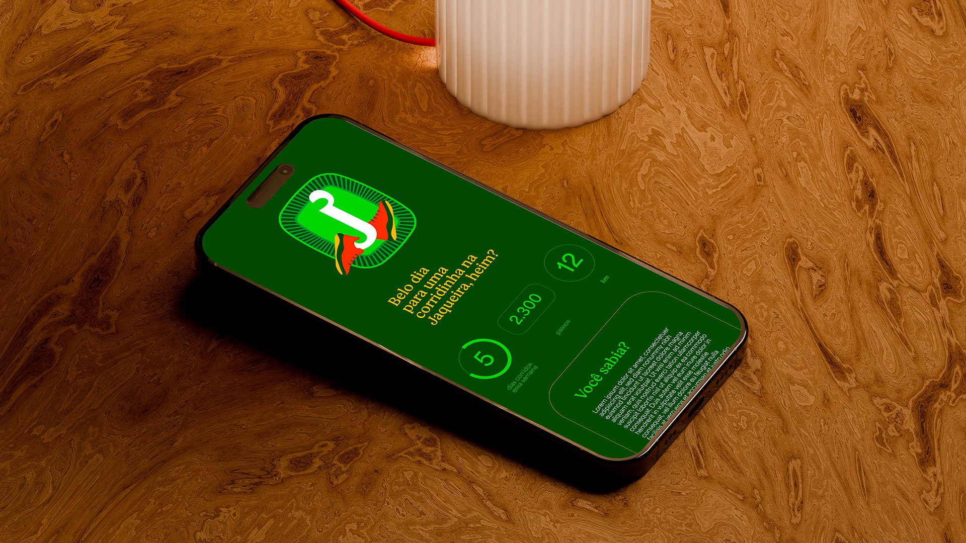
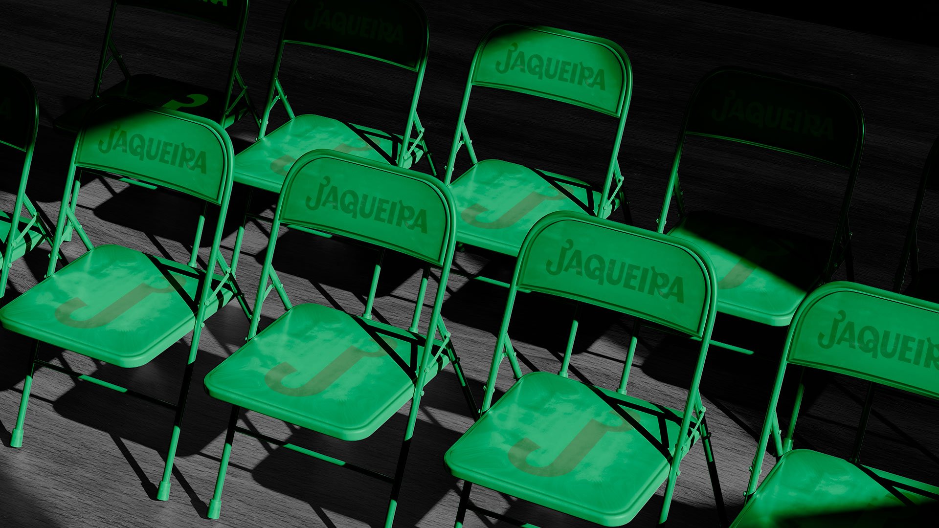
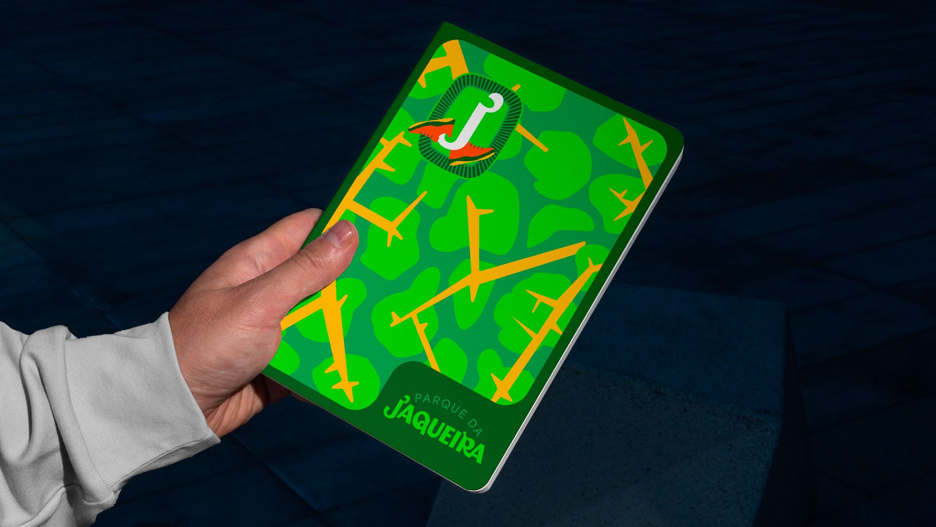
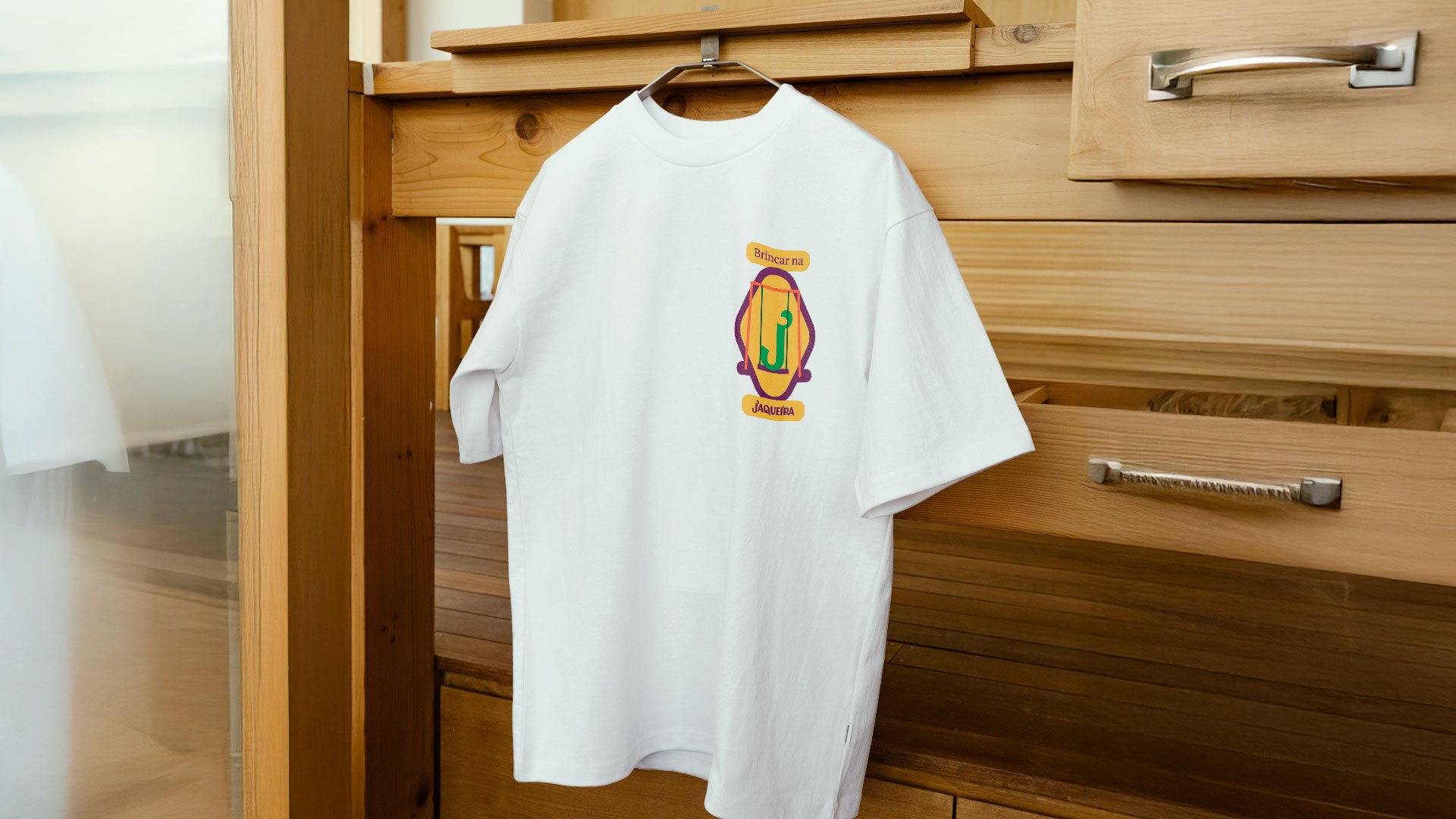
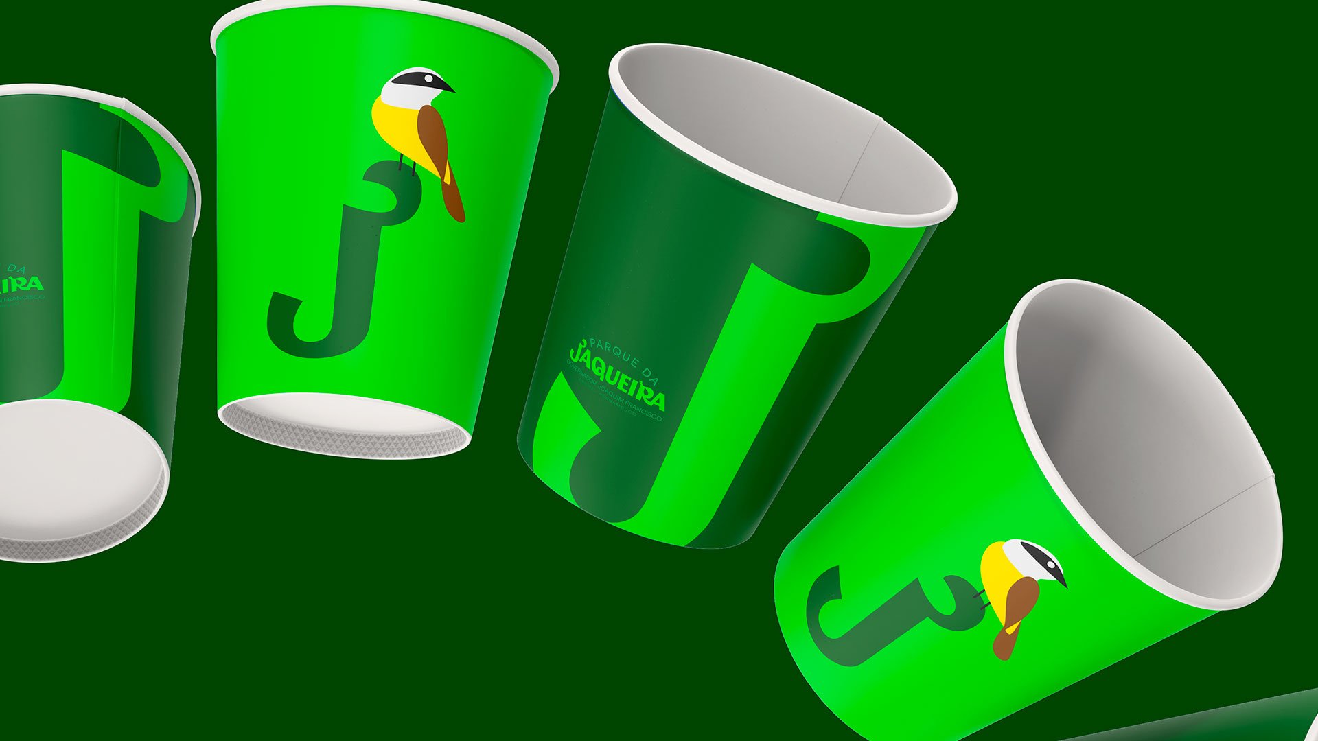
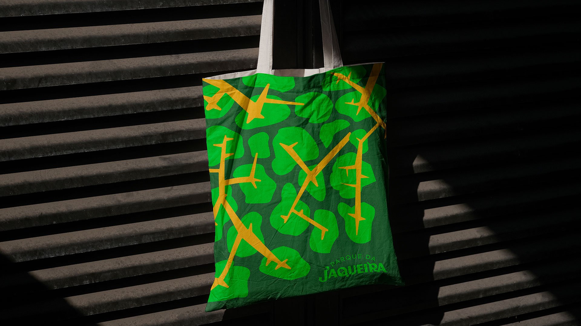
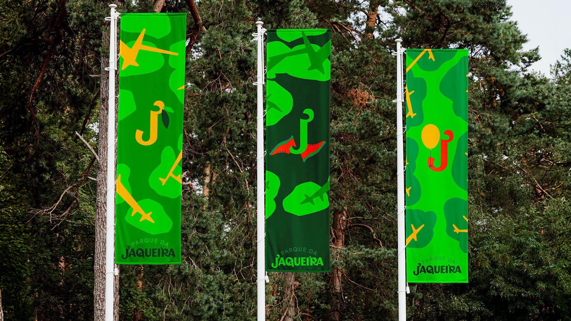
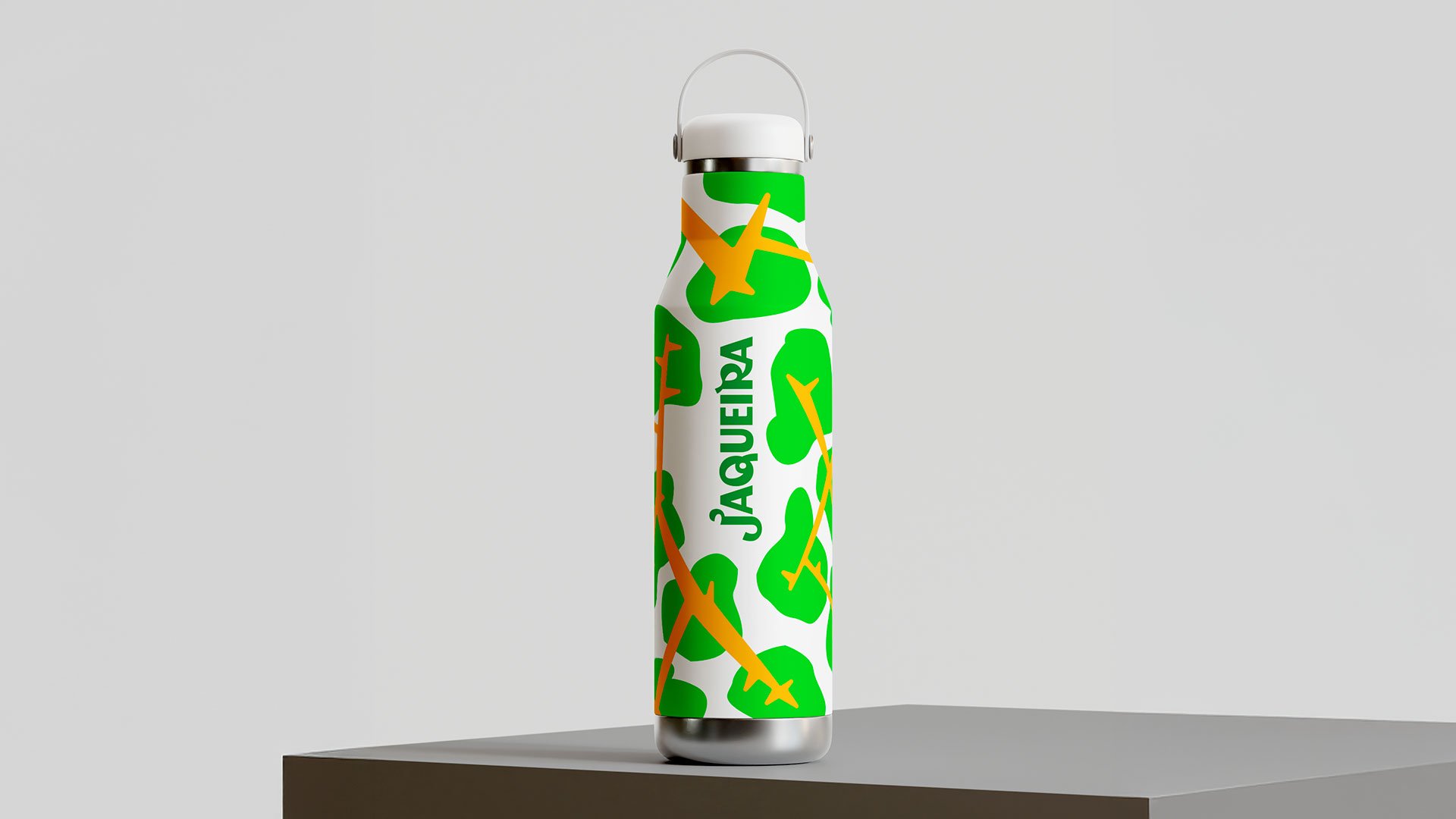
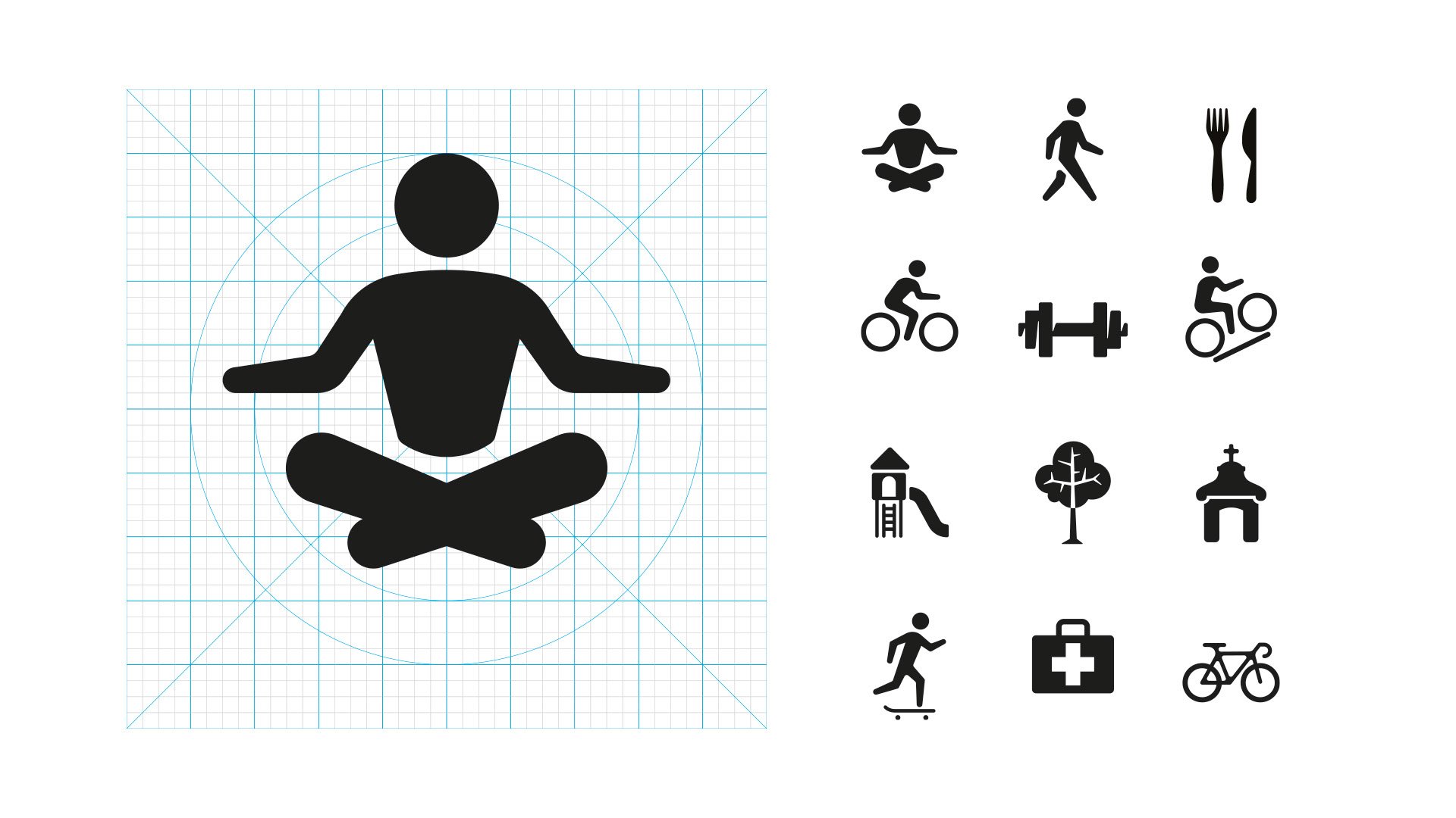
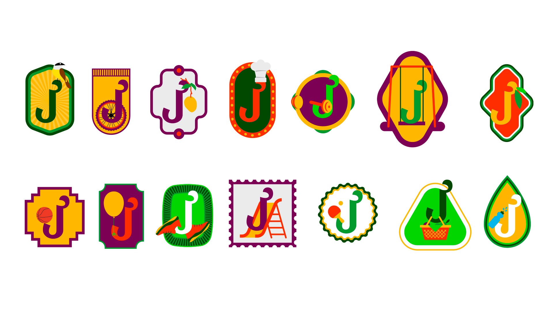
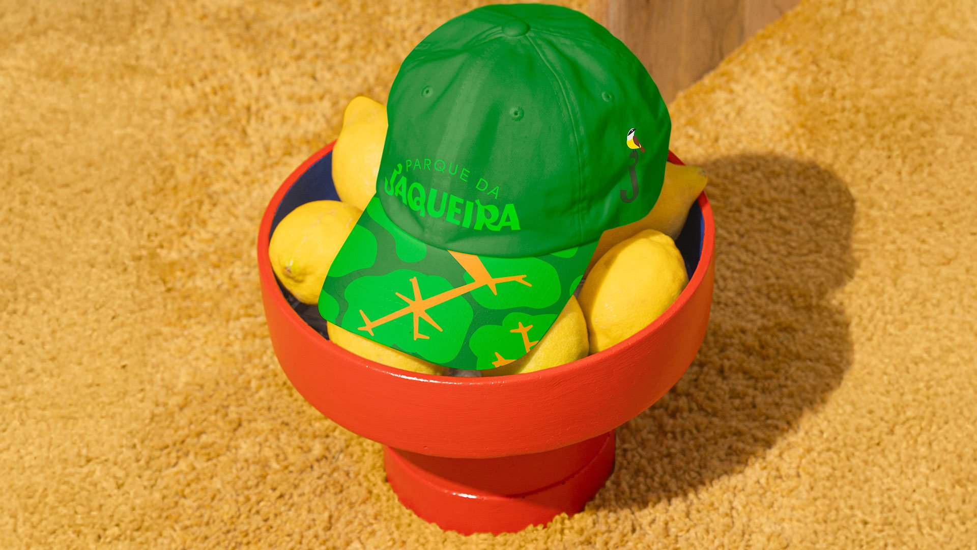
The new visual identity for Parque da Jaqueira was designed to embrace everything the space stands for: generous nature, the organic curves of the terrain and the many activities that have made it a cherished meeting point for generations.
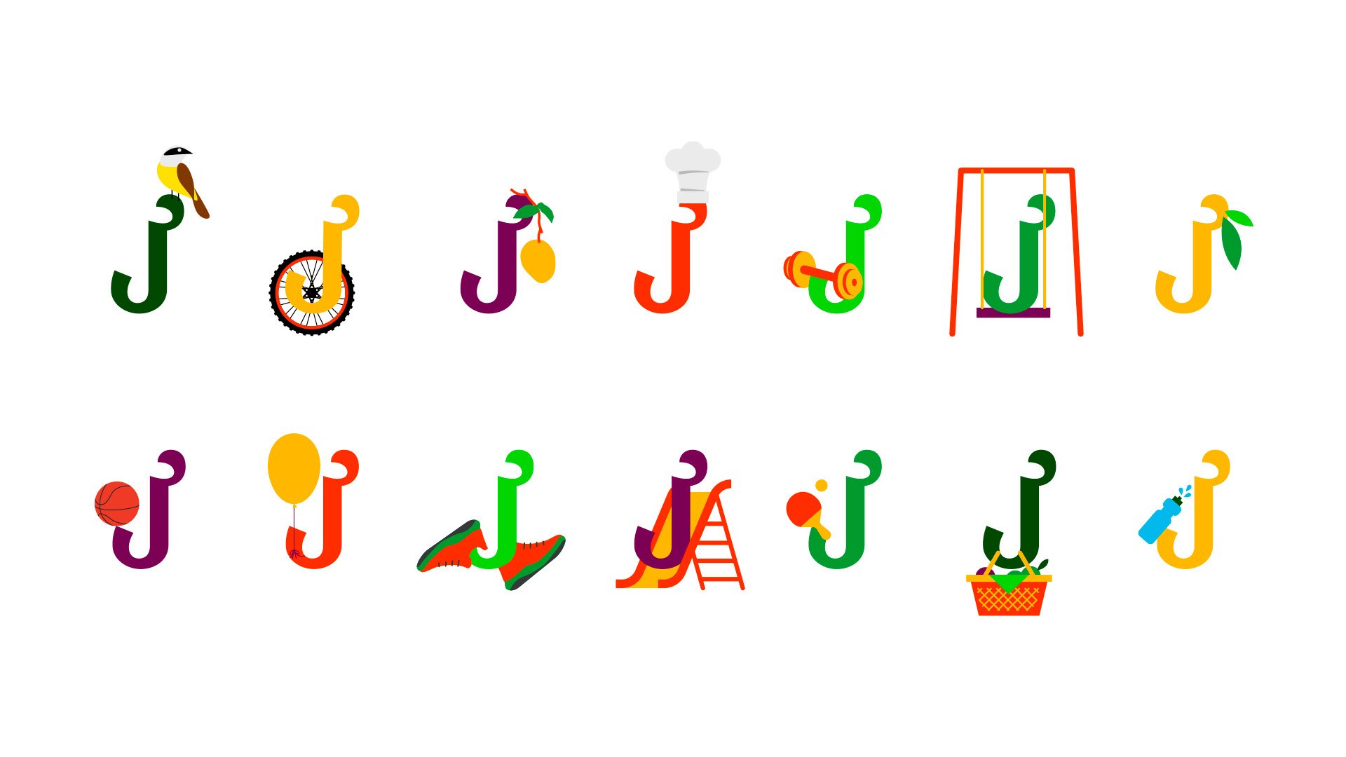
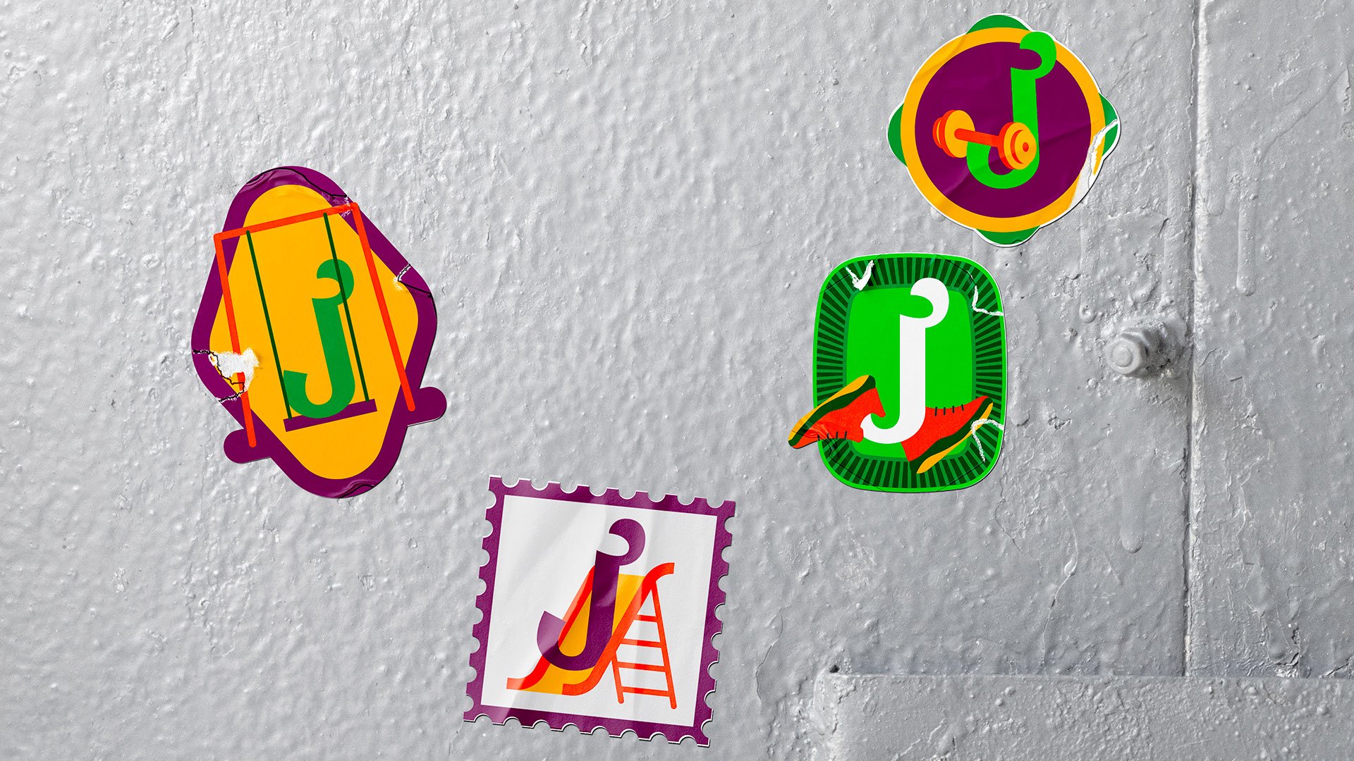
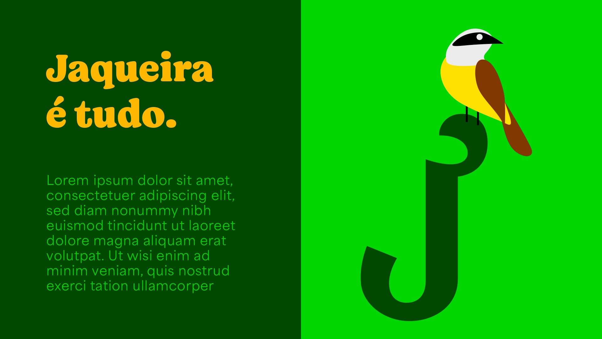
We started from the letter J as the central element, a symbol that branches out into graphics and shapes that recall leaves, fruit and paths. The color palette is as vibrant as the park on a sunny Sunday. Greens take the lead, joined by tones that evoke movement, diversity and vitality.
As people from Recife who use the park ourselves, we felt both the weight of the responsibility and the affection of designing for a place that is also personal memory. From the choice of typeface to the visual language, everything was designed to reinforce Jaqueira’s living identity: a space for well-being, encounter and belonging.