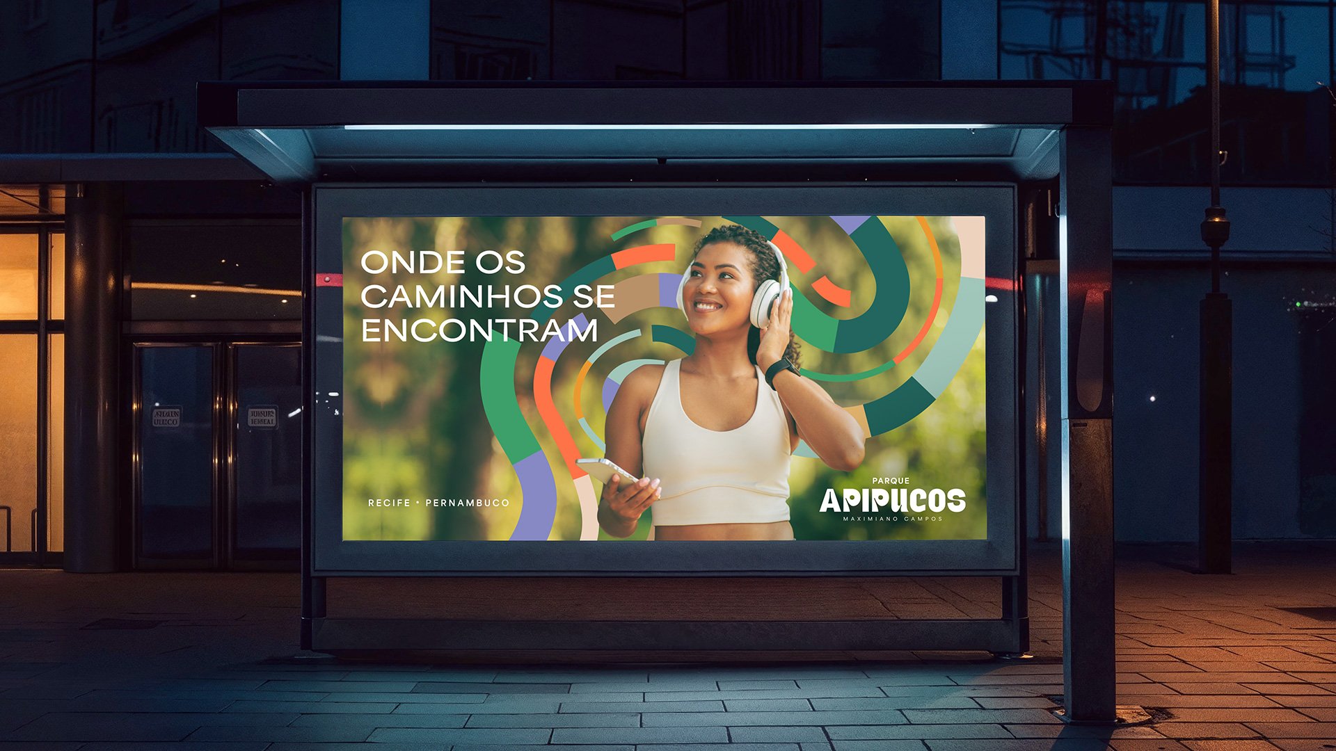
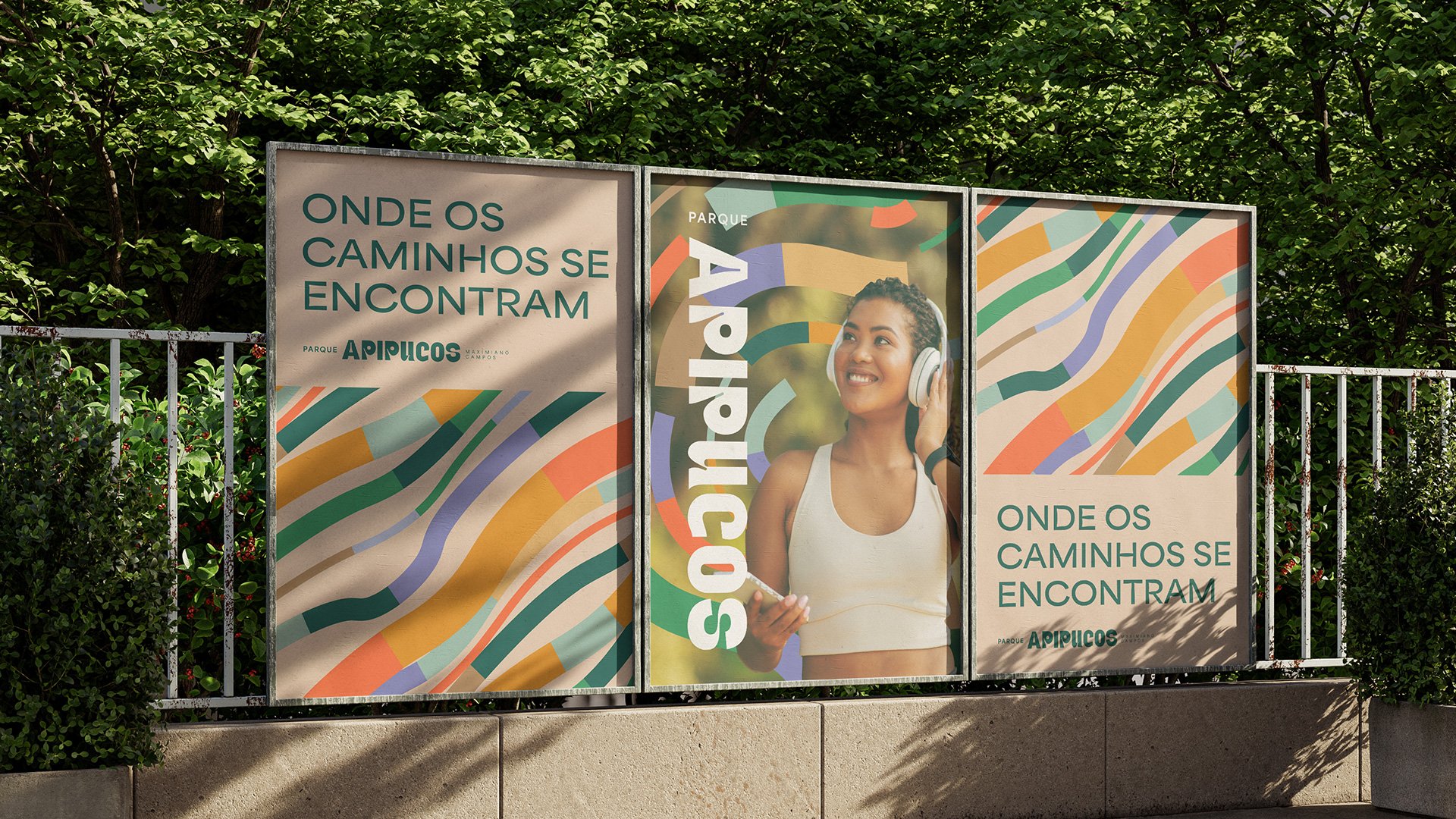
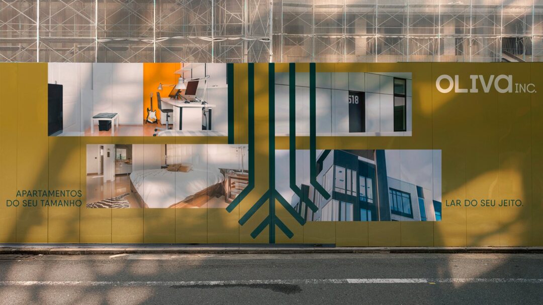
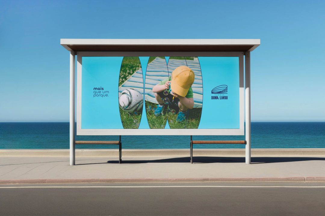
Breathing room, memory and nature. A park to slow down.
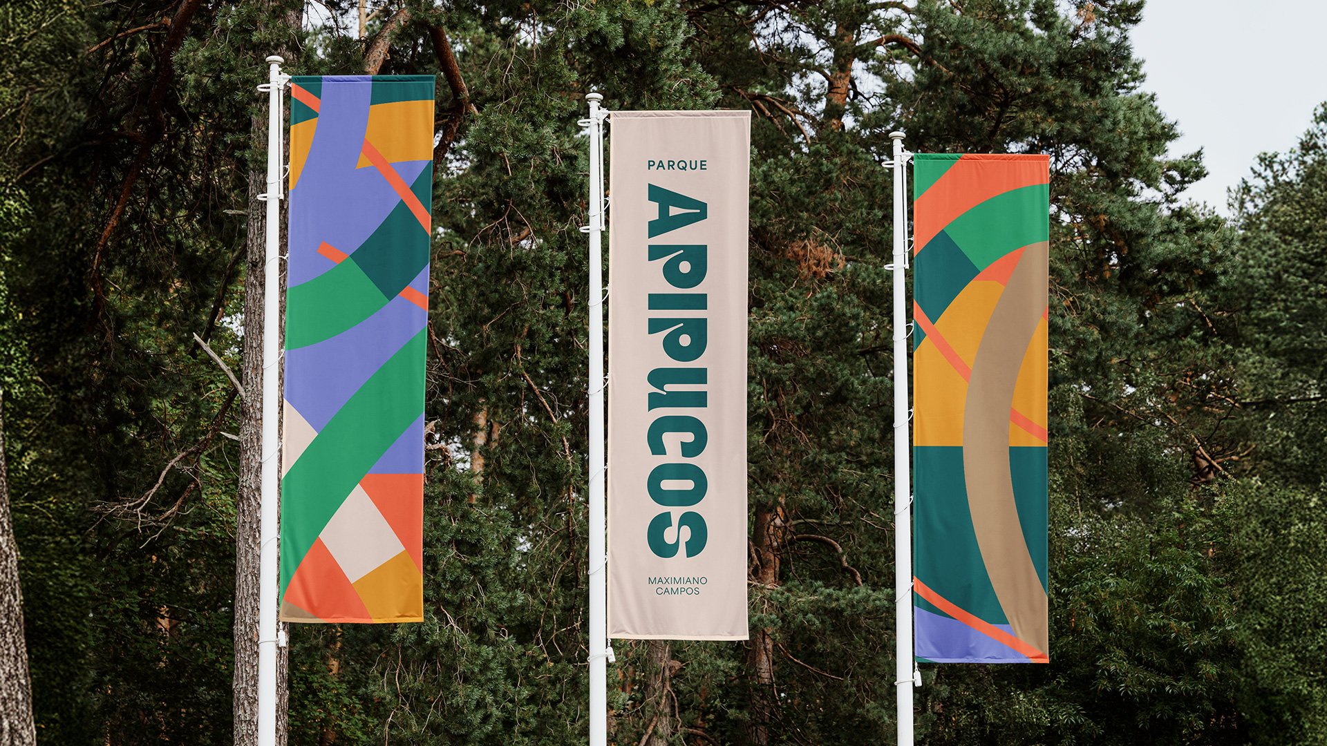
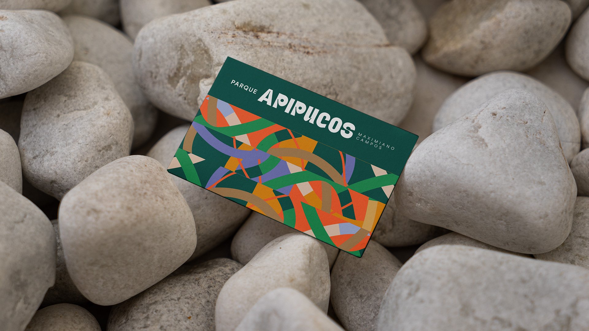
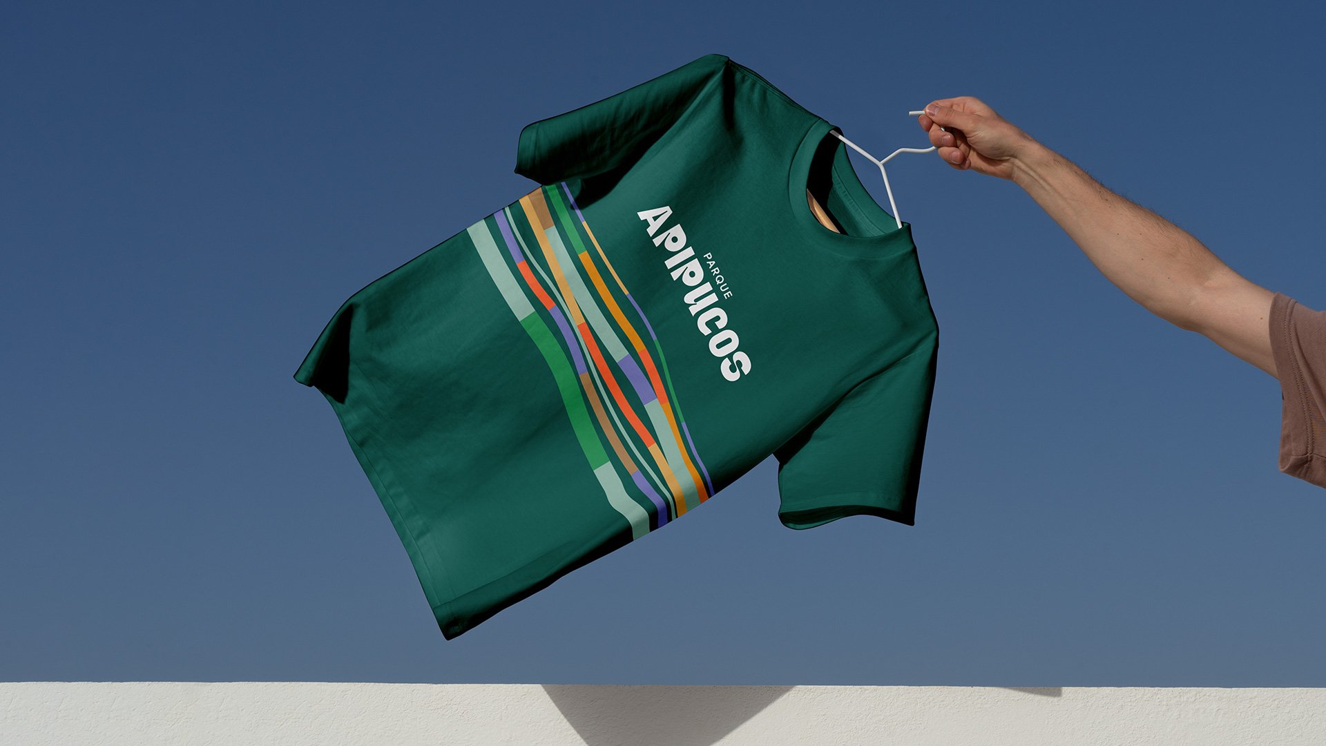
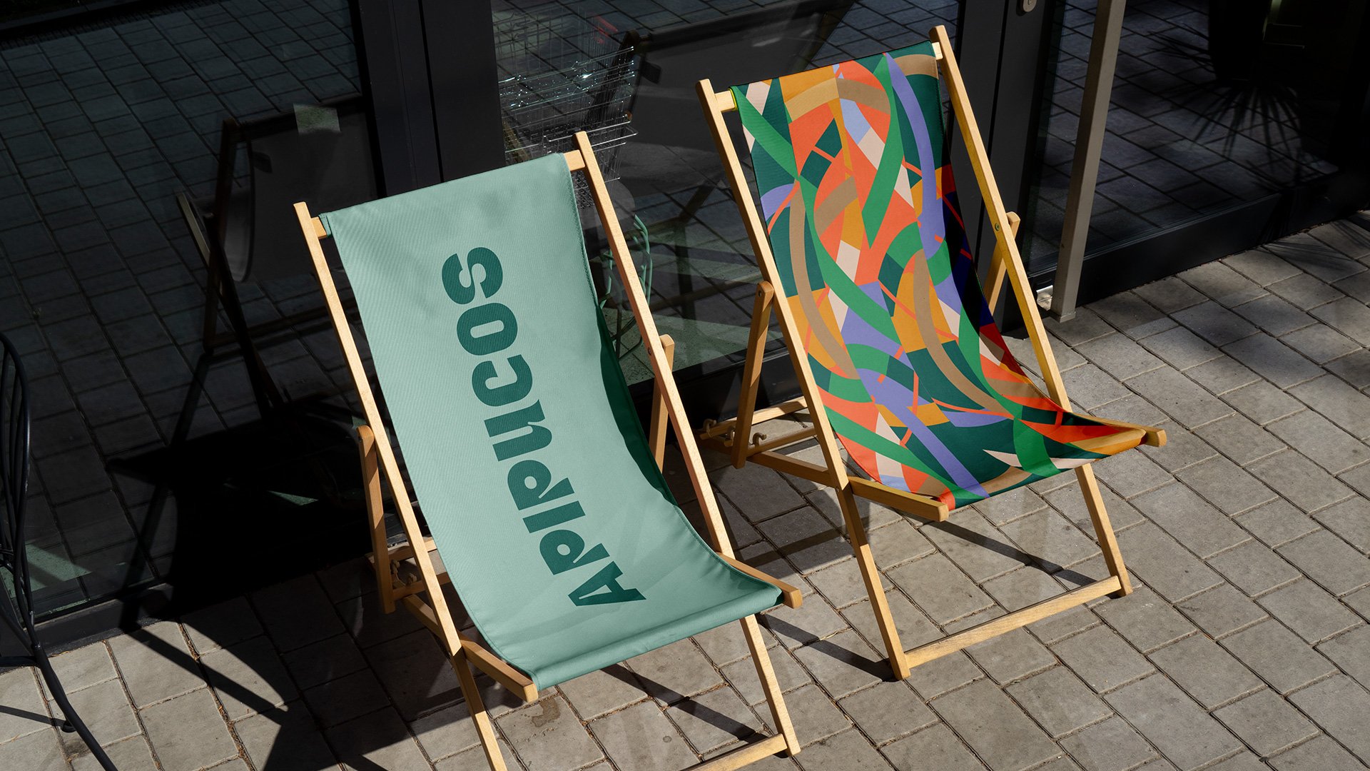
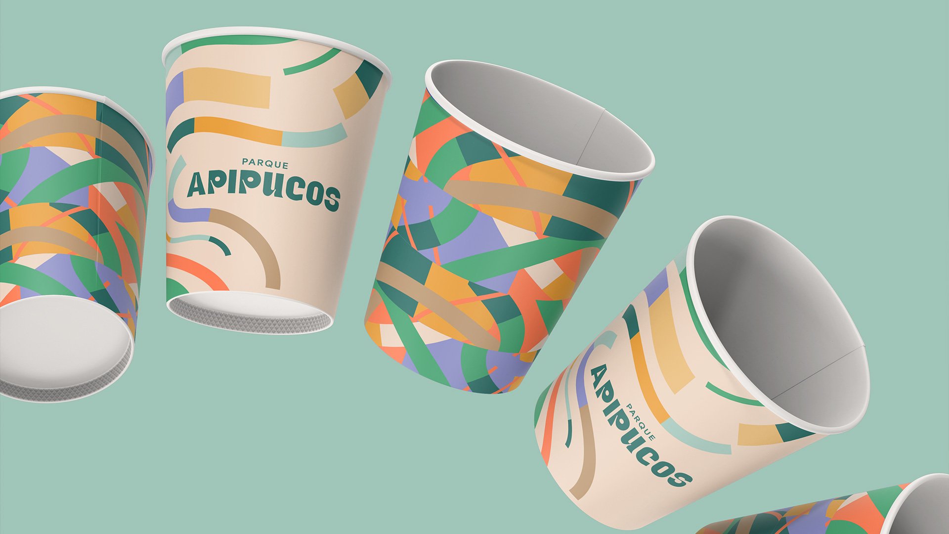
The visual identity for Parque Apipucos grows out of the meeting between the urban and the natural, the historic and the contemporary. A space that invites contemplation, unhurried walks and time spent with the greenery and the river.
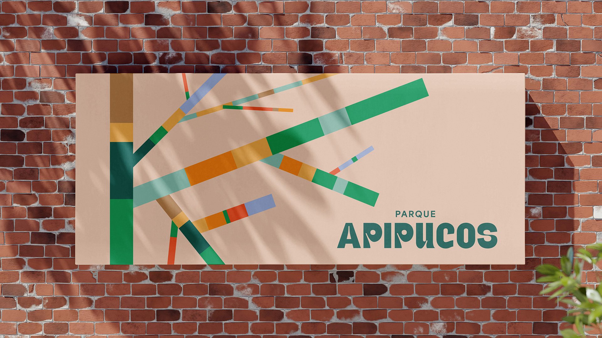
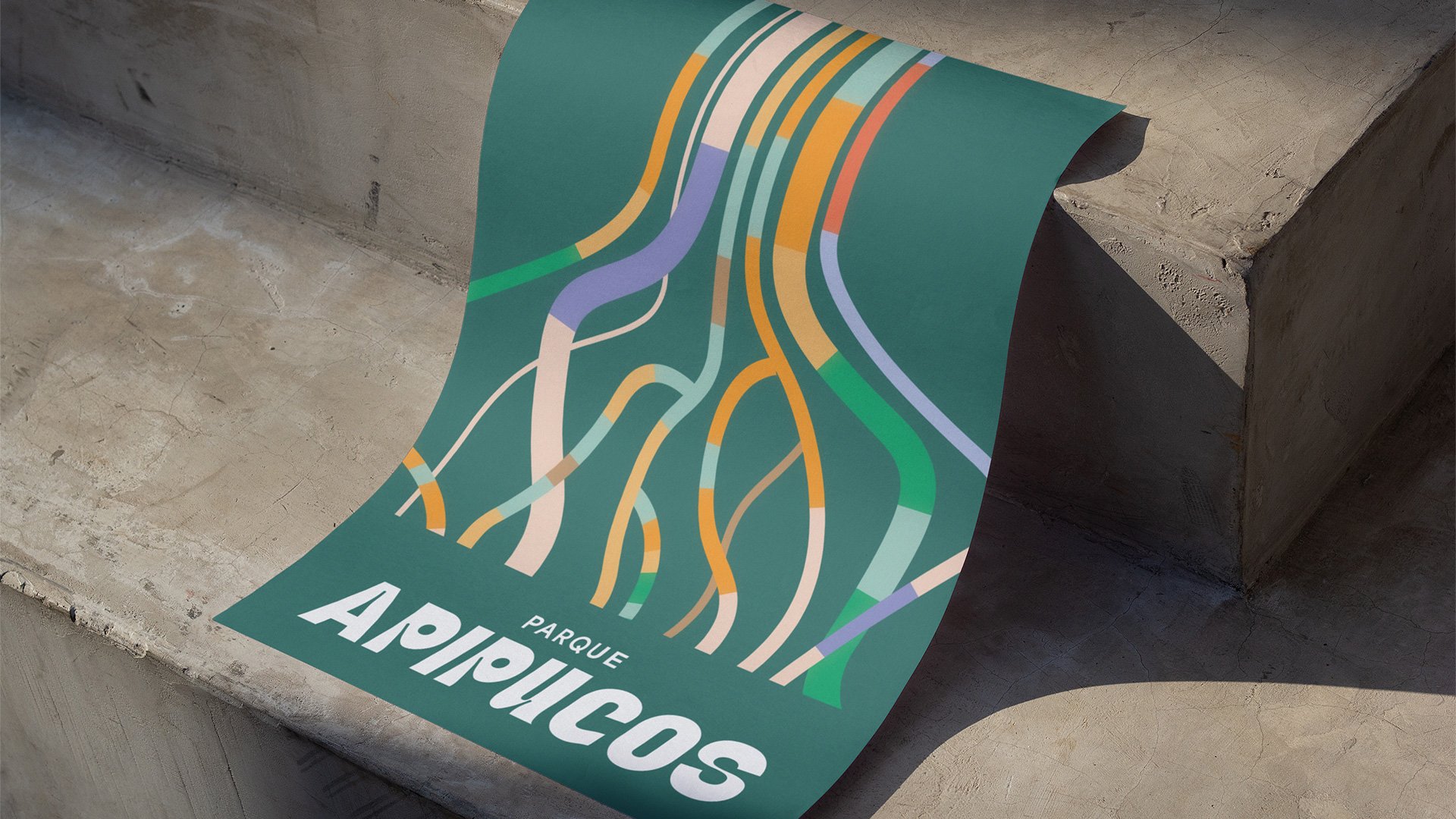
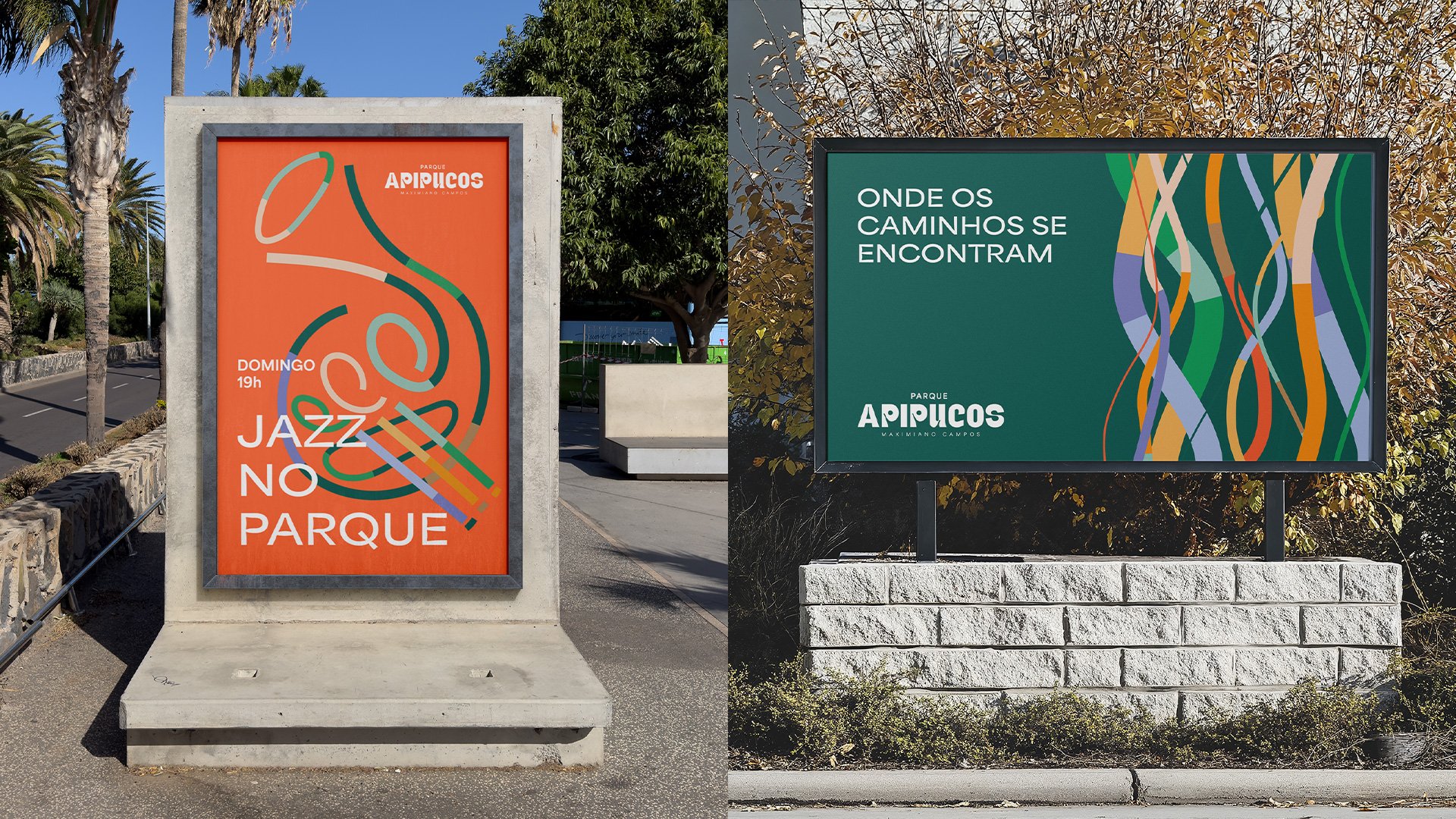
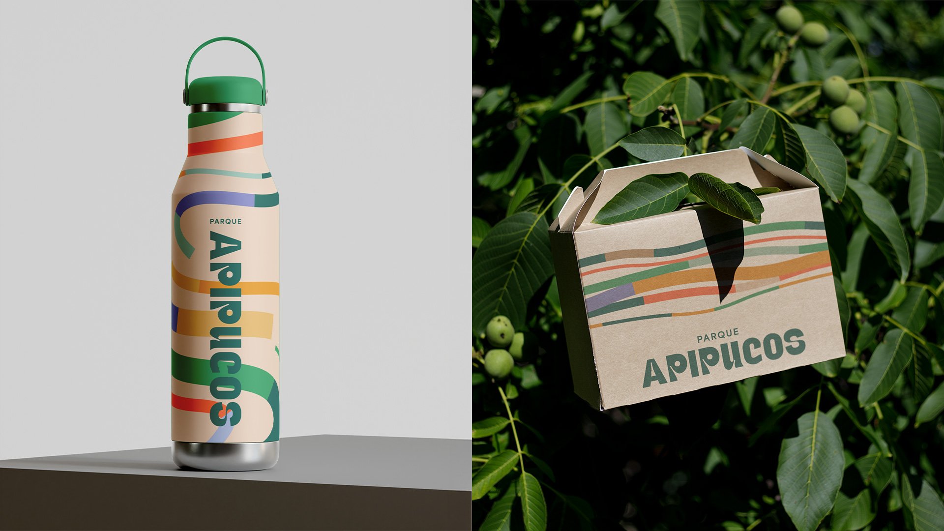
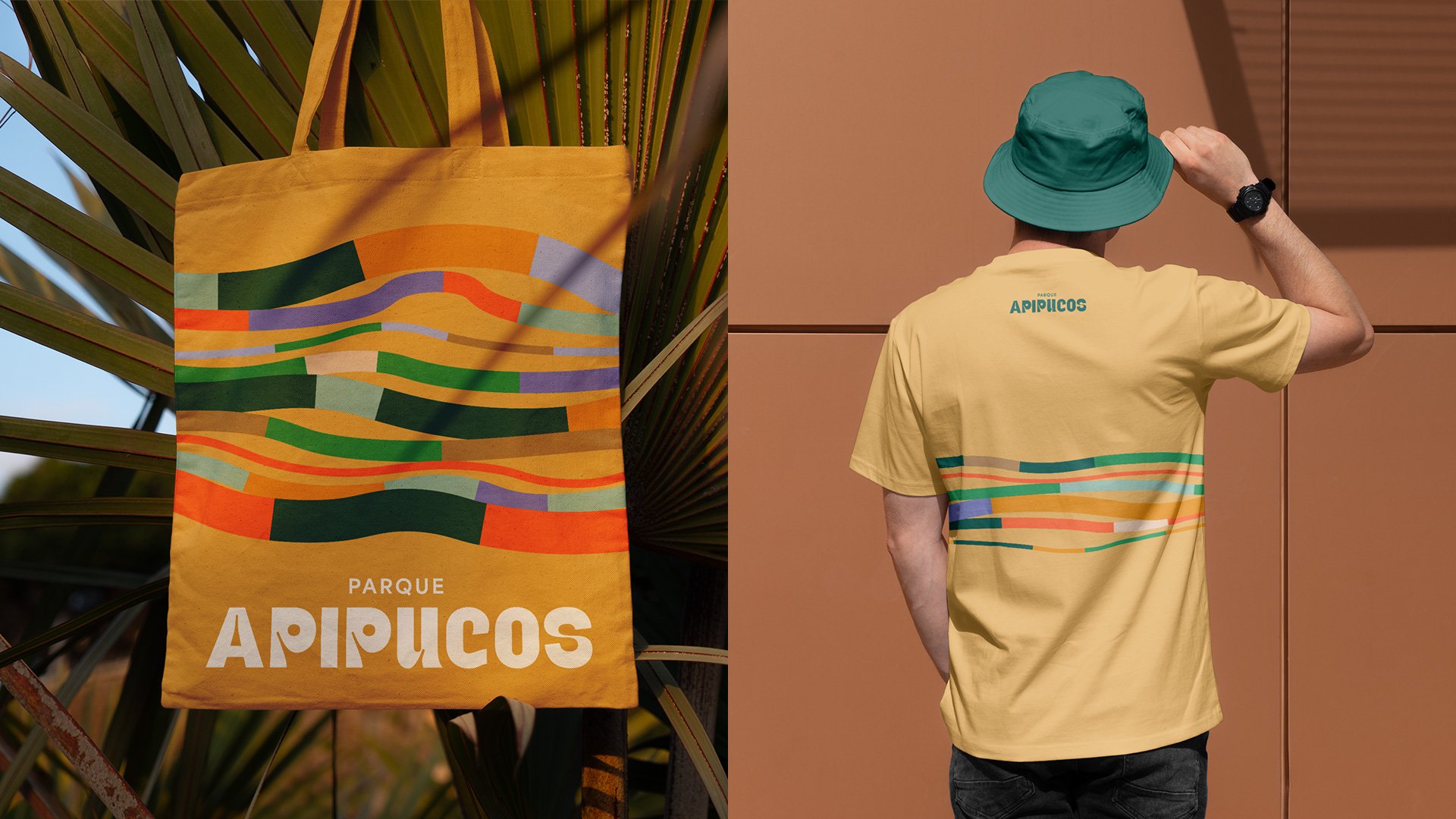
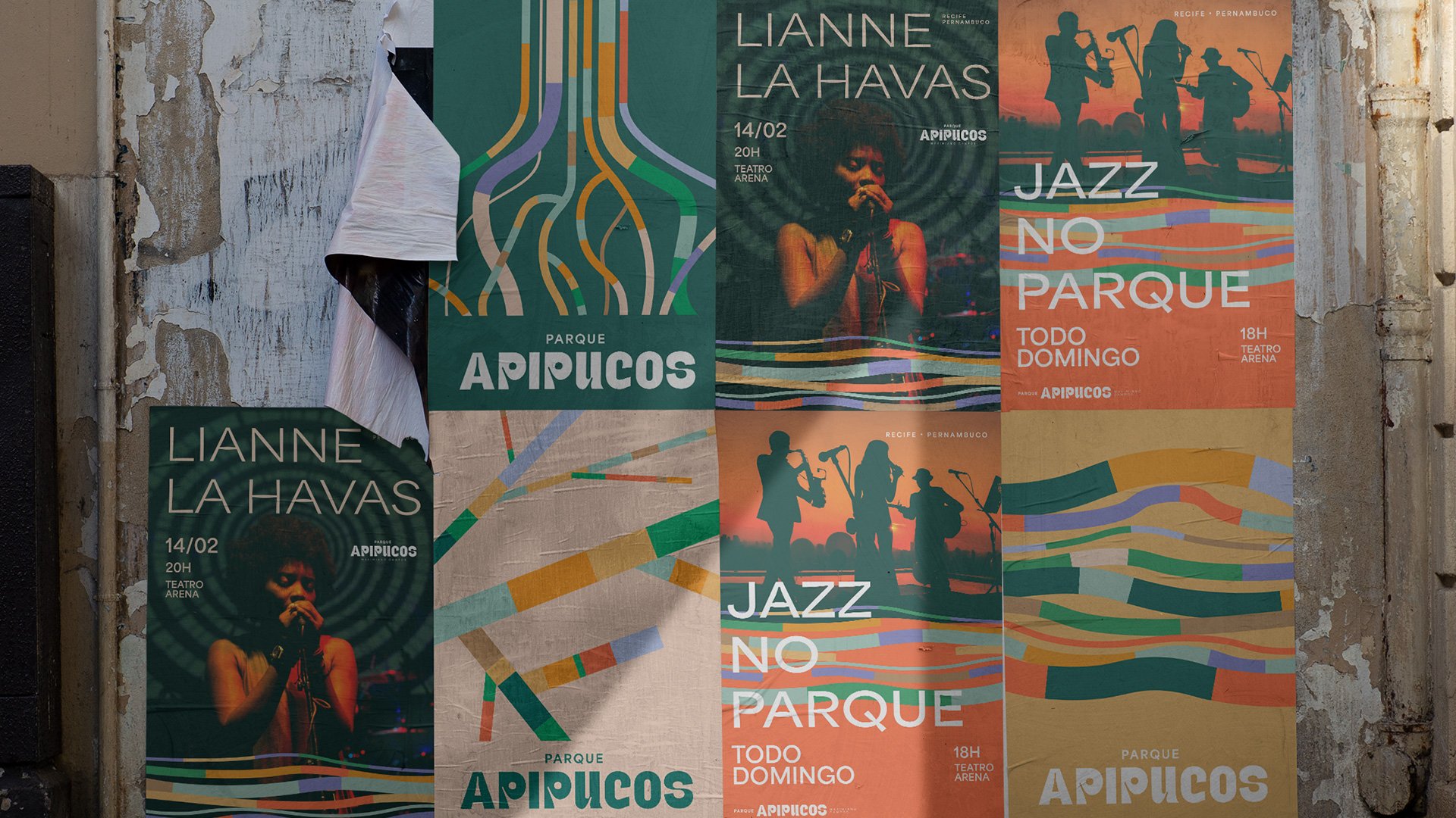
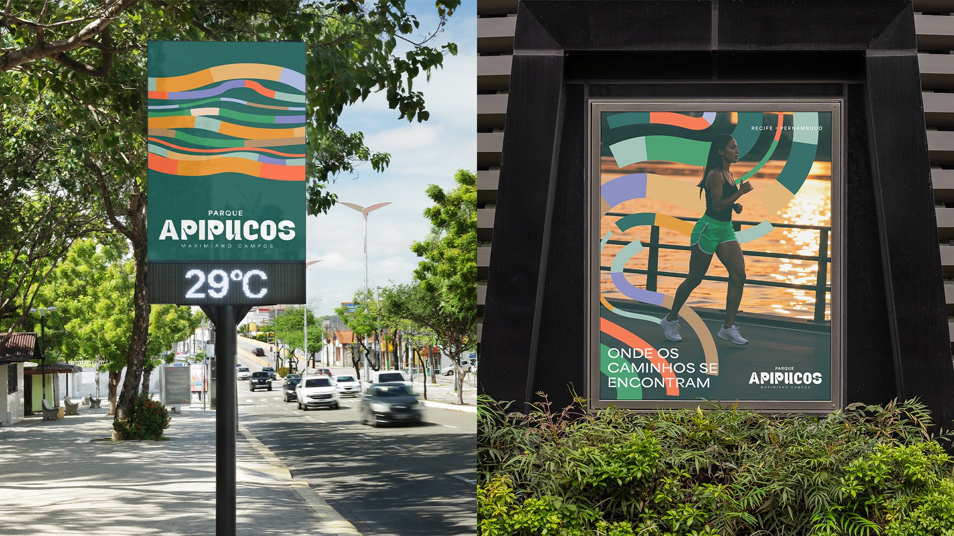
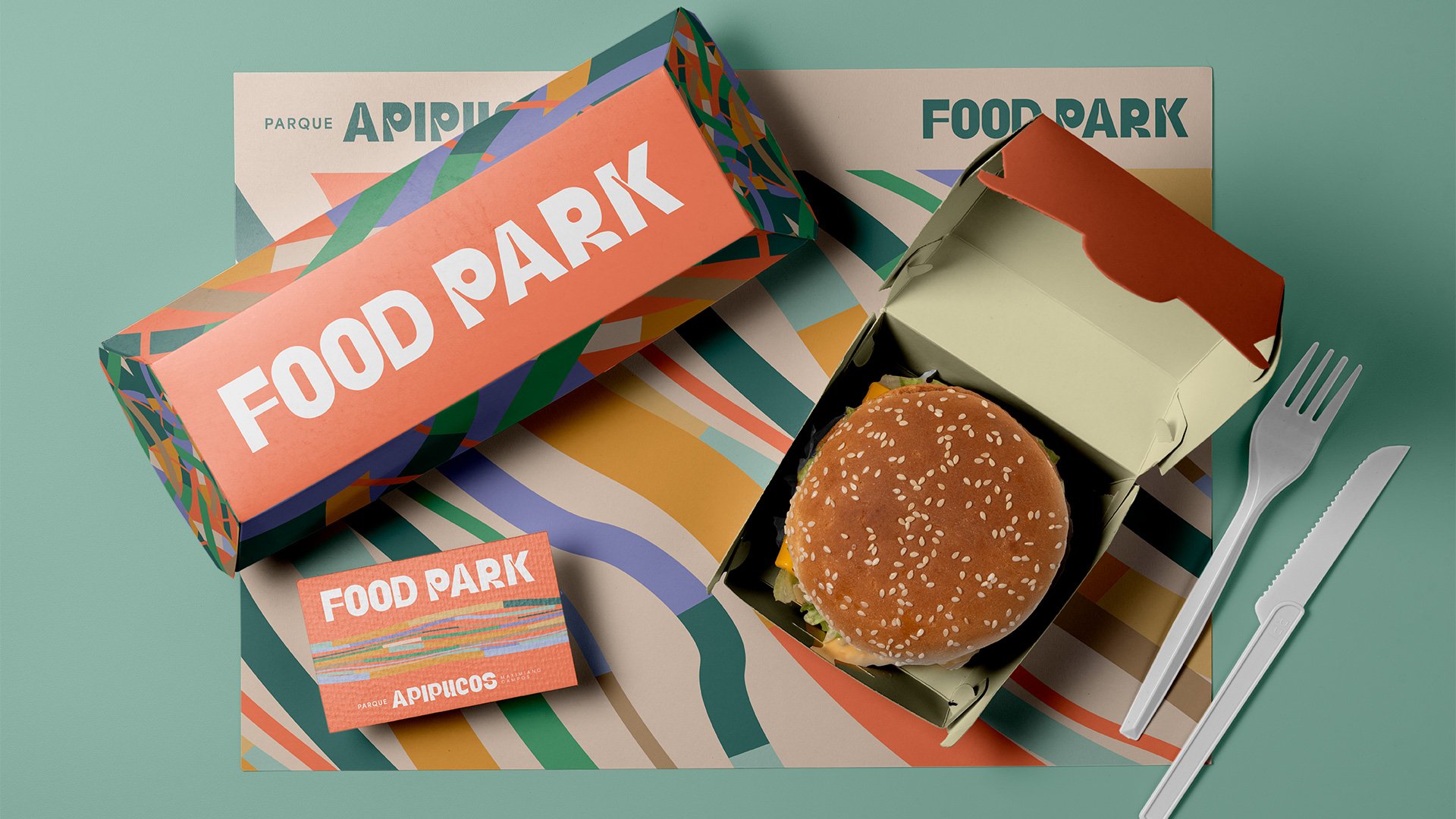
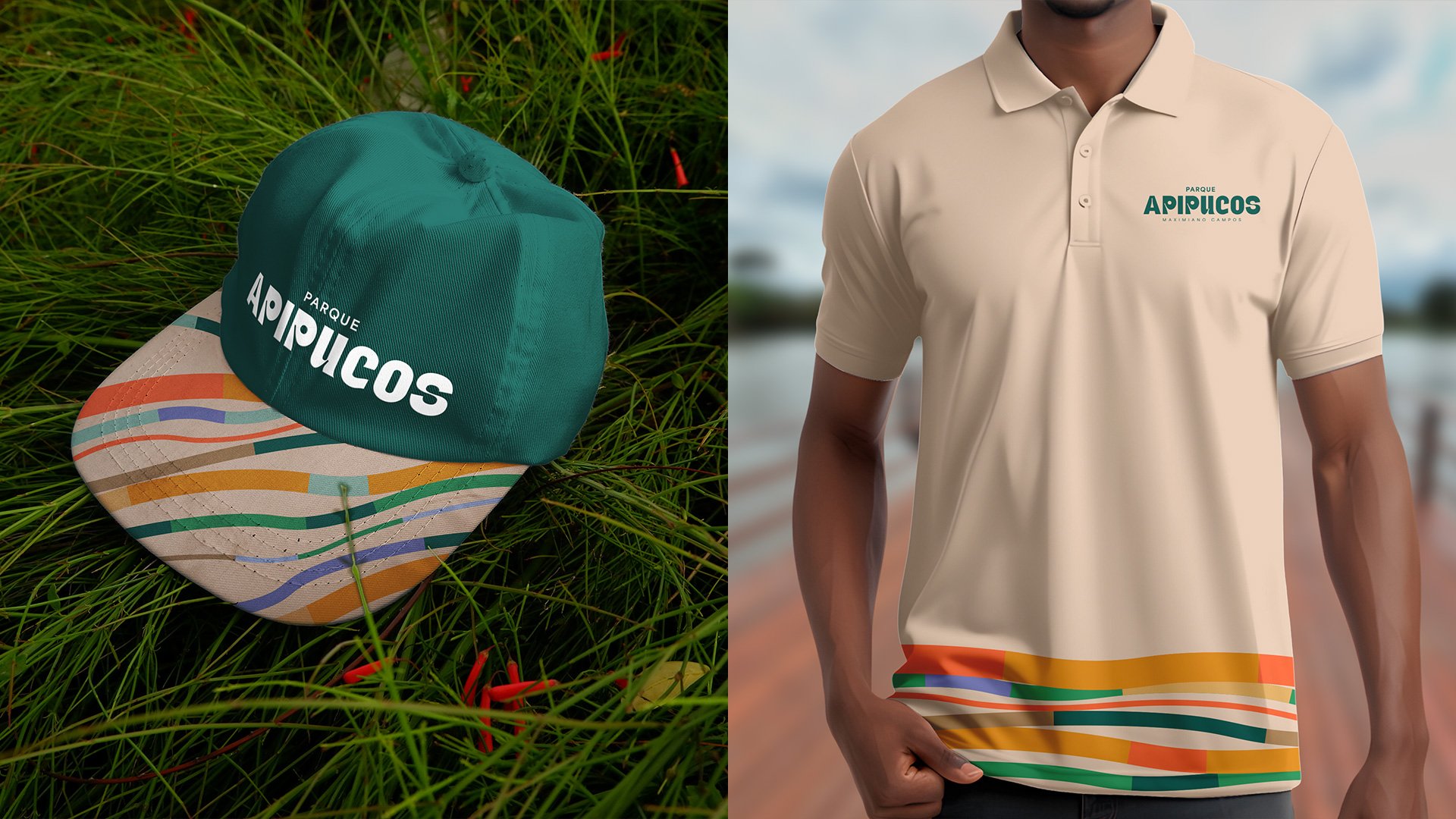
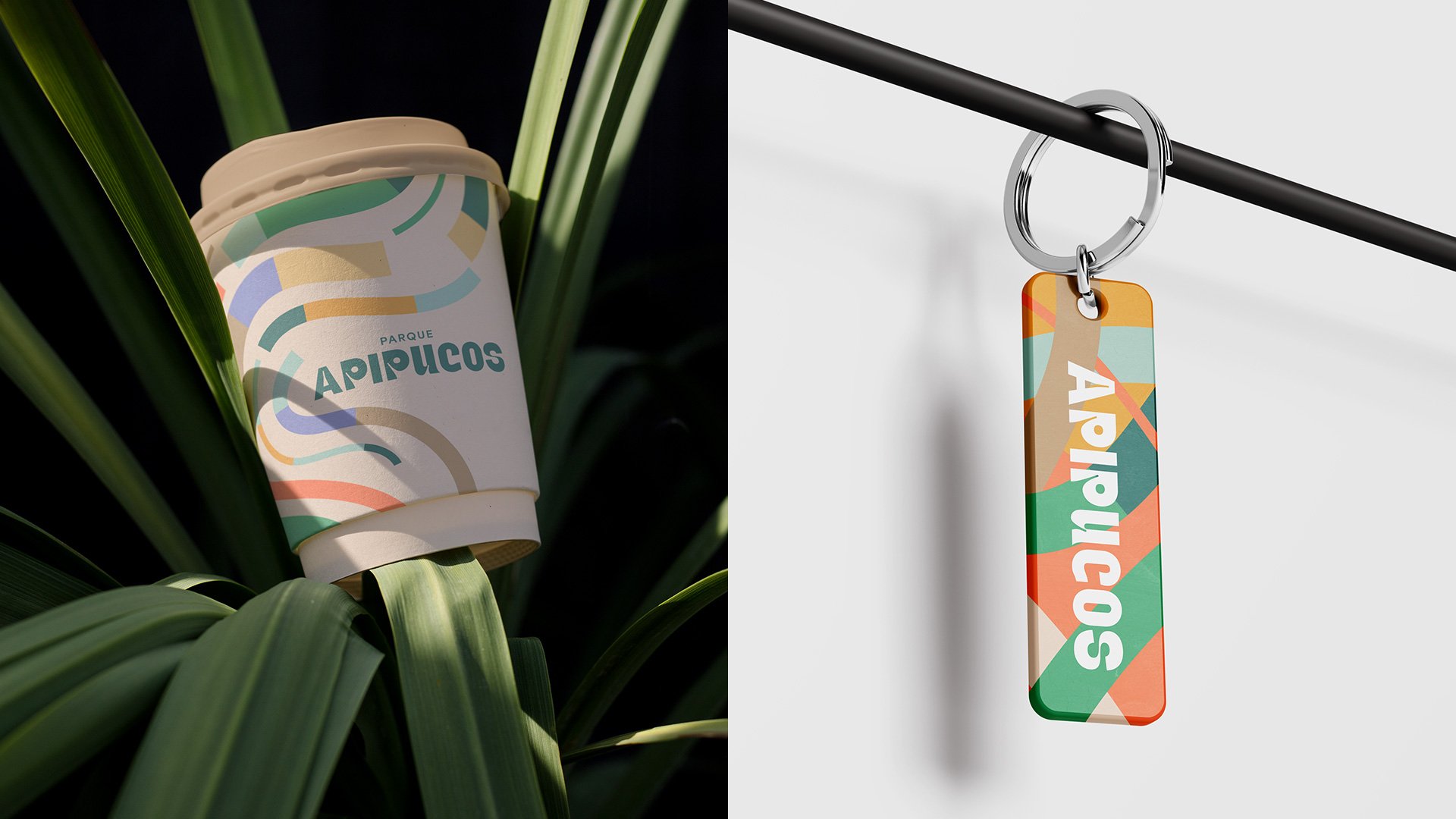
The identity was built on words such as “connection”, “organic” and “belonging”. Soft colors and earthy tones create a welcoming atmosphere, with greens and beiges that recall the forest, the mangroves and the classic architecture of the surroundings.
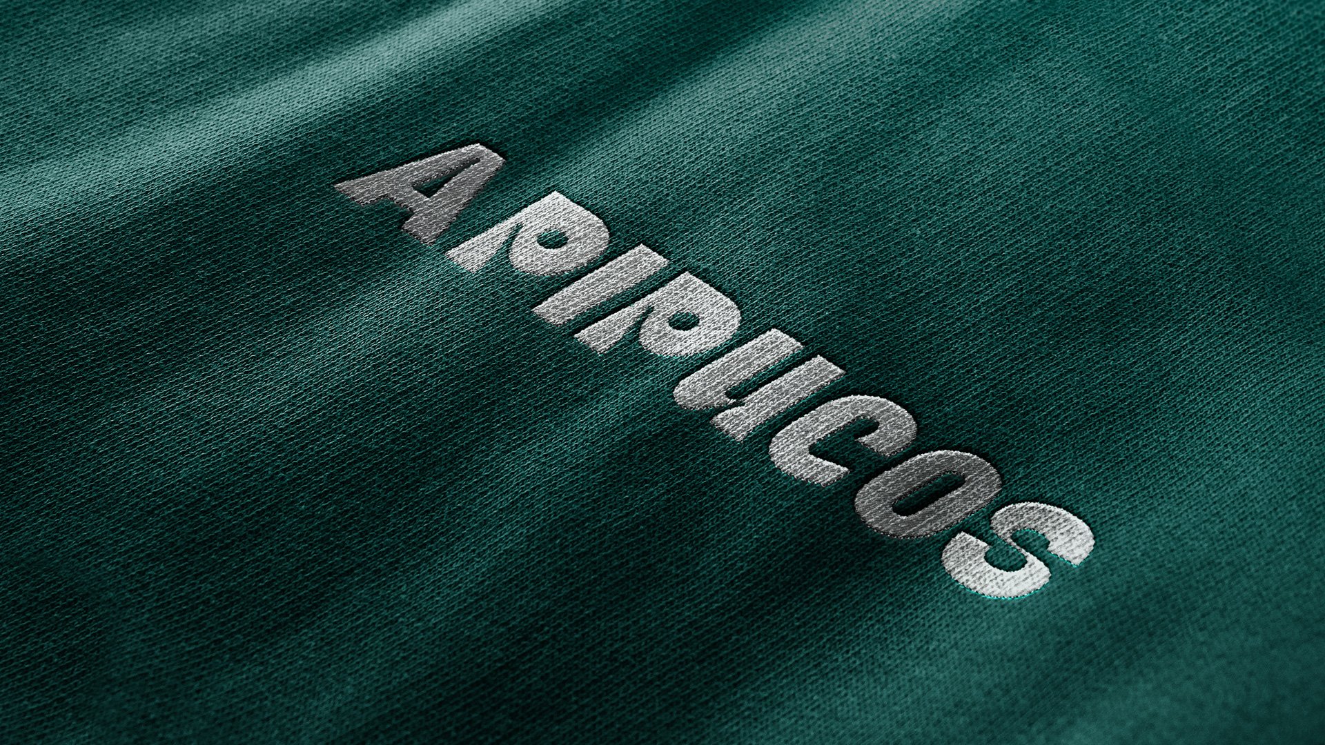
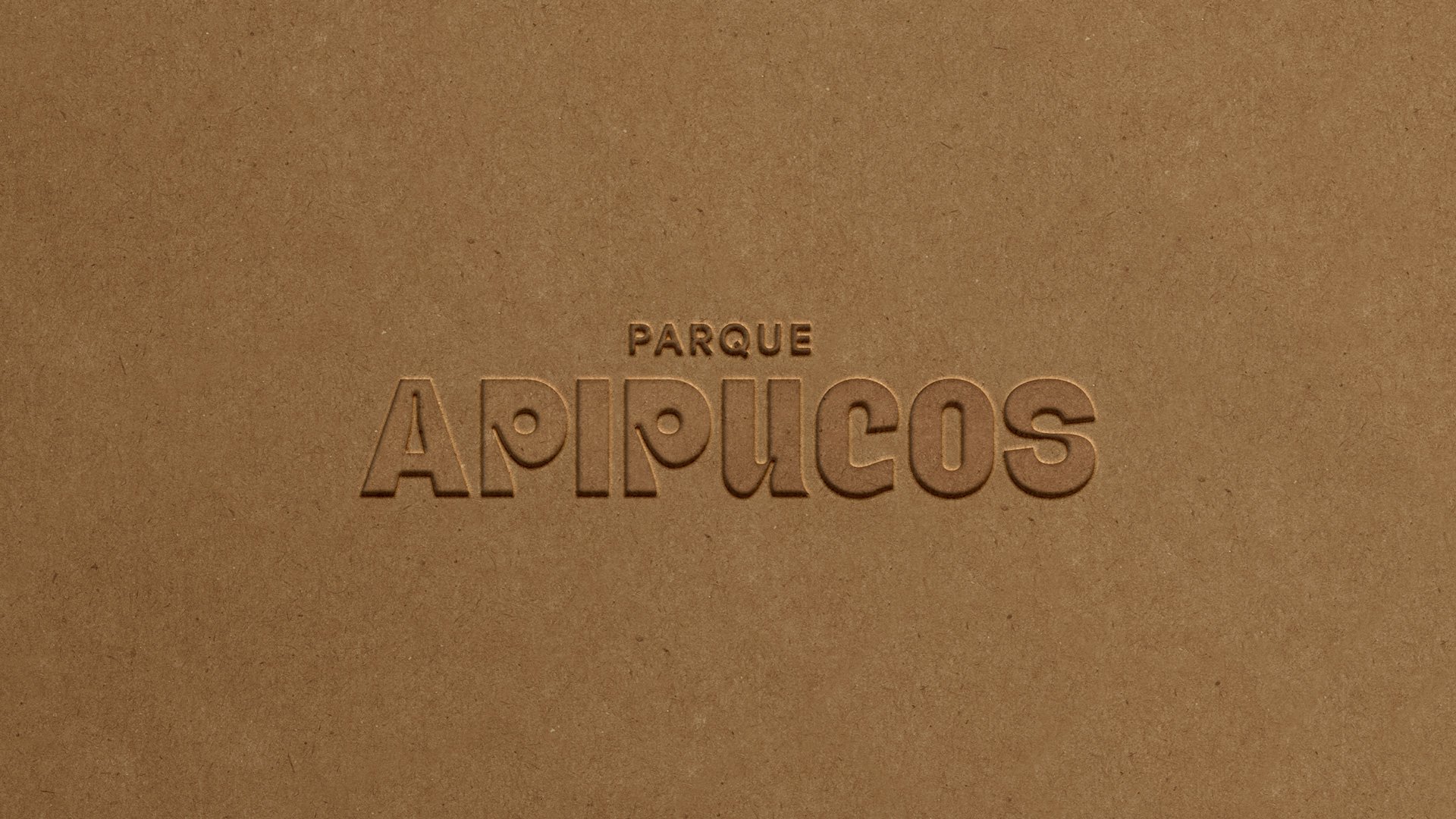
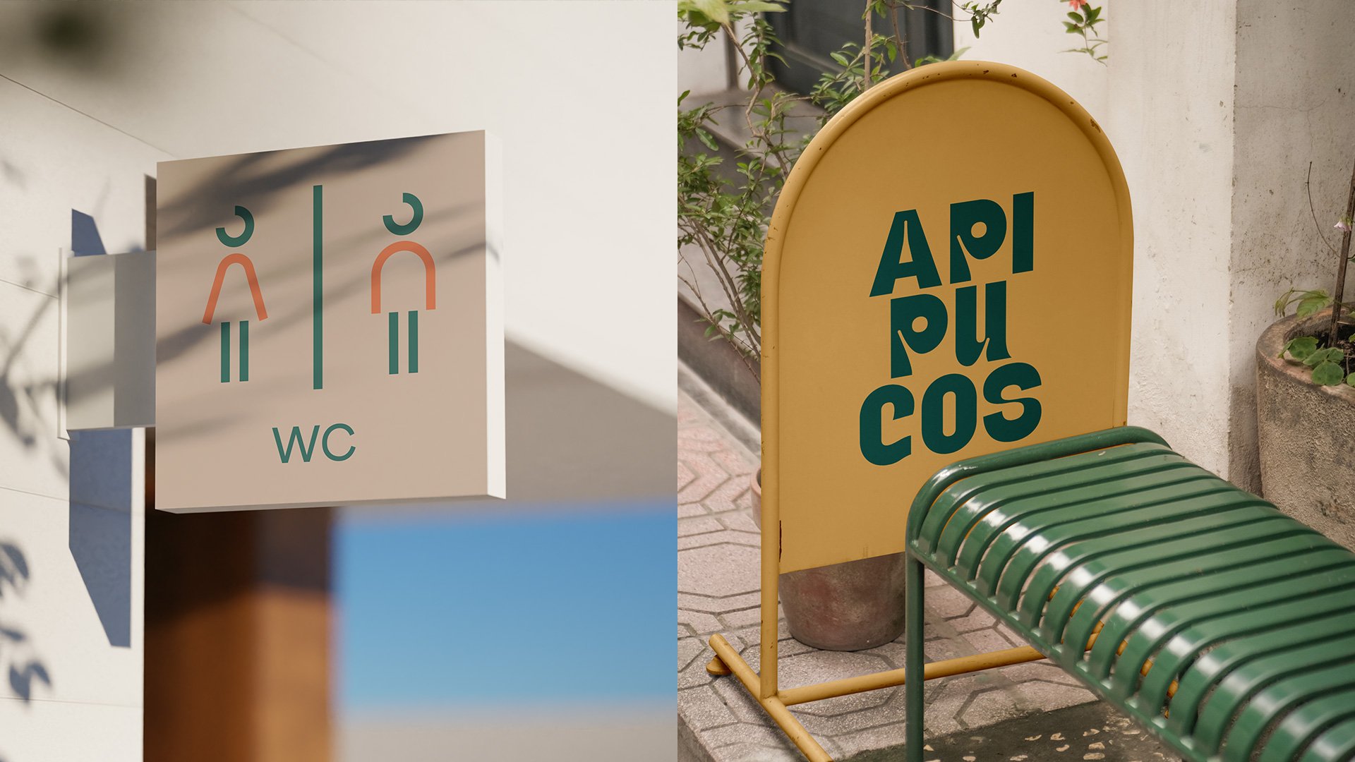
The typography is elegant and light, and the graphic elements, inspired by the movement of water, trails and leaves, form a fluid, gentle language. The iconography is delicate, and the visual communication invites you to stay, to care and to reconnect with the natural pace of things.
Apipucos is a park that embraces. And the visual identity follows that gesture.