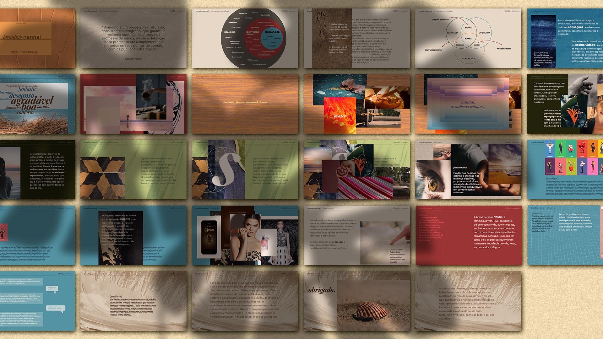
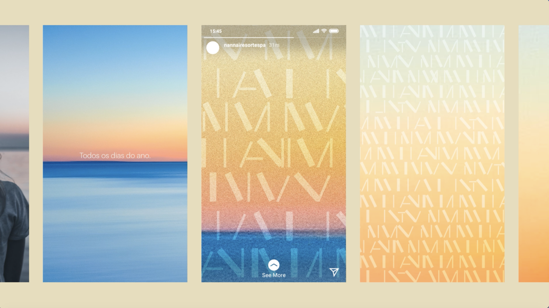
In partnership with Consumix, we carried out an immersion and research into the world of Nannai in Muro Alto, which confirmed some feelings and helped to better define the brand’s entire language.
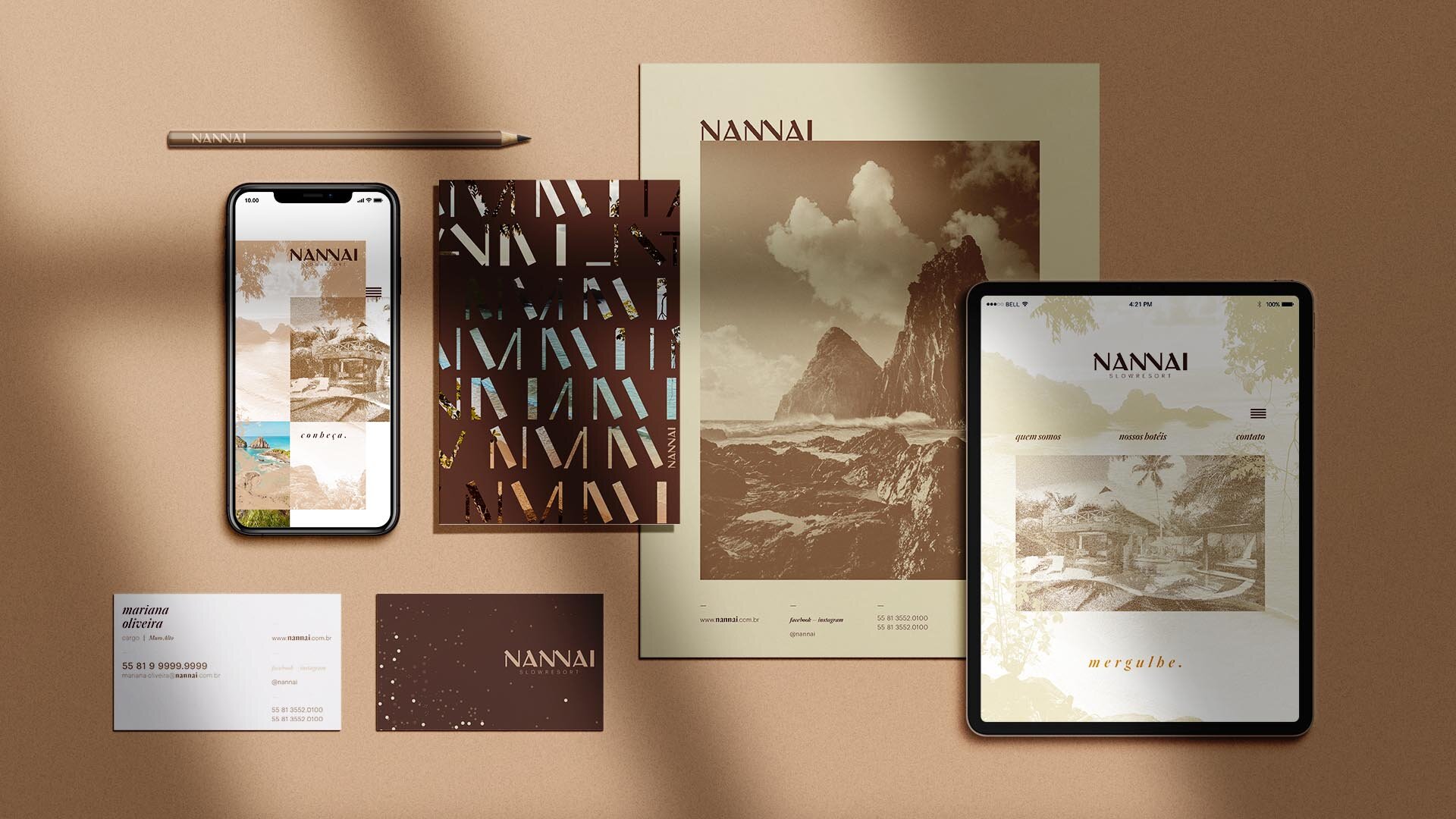
We then proposed a reinterpretation of Nannai’s iconic brand, keeping its roots while updating its positioning, clarifying its DNA, tone of voice and brand spirit, and renewing all its touchpoints.
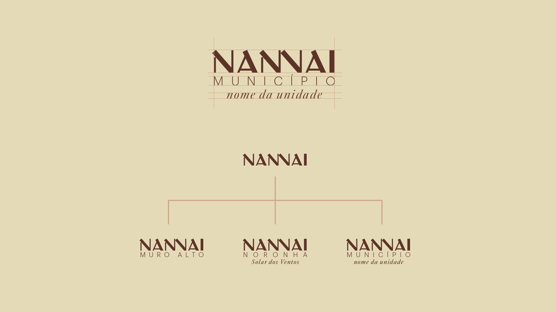
Starting from the initial request to include the name of each property within the graphic structure of the Nannai brand, we realized that rebranding the visual identity could anticipate future obstacles for the entire system.
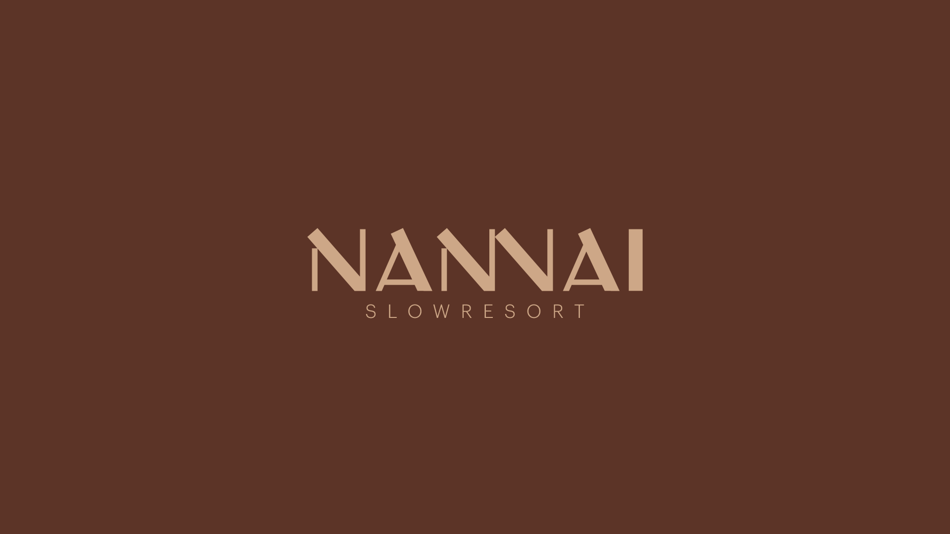
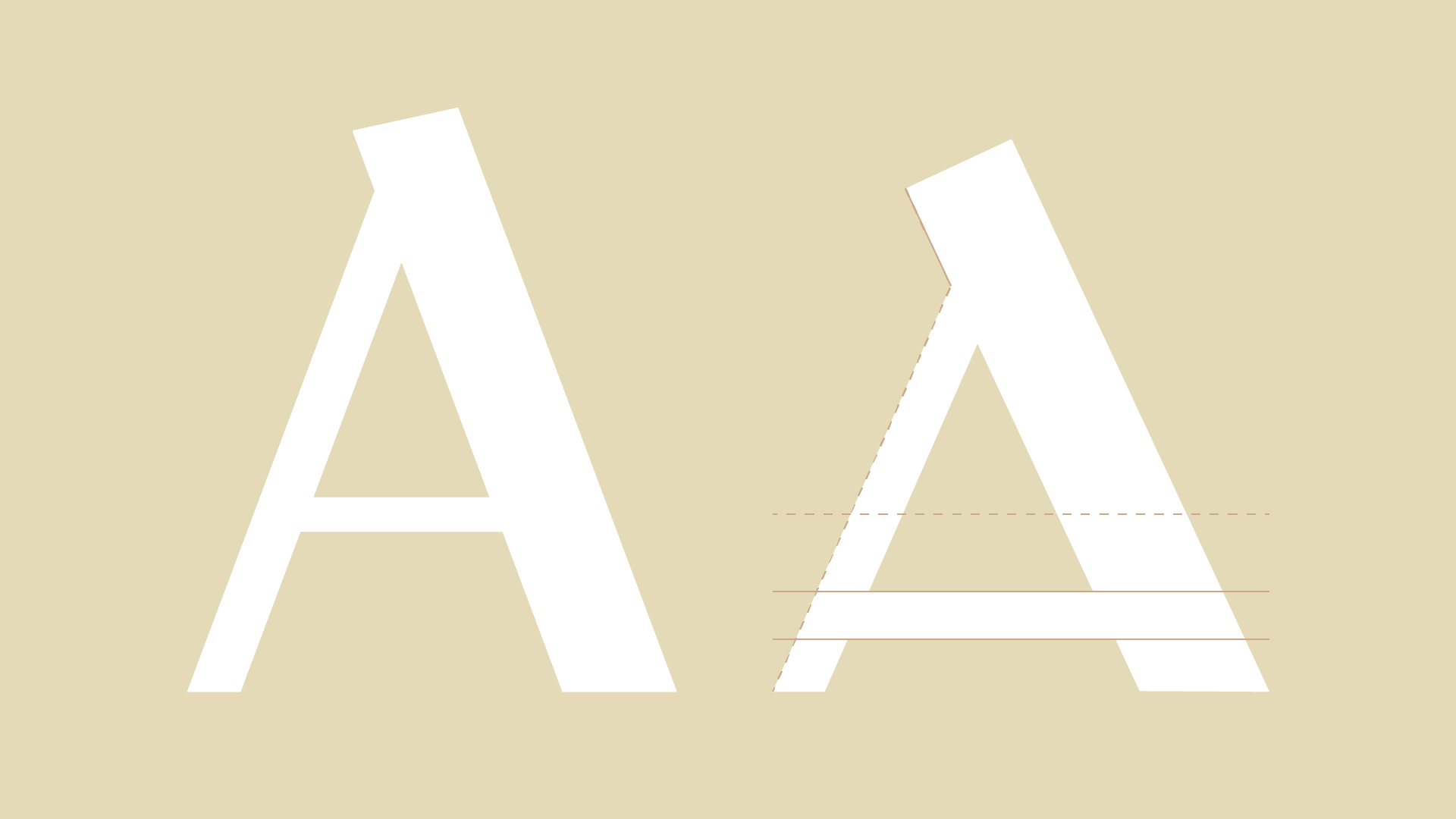
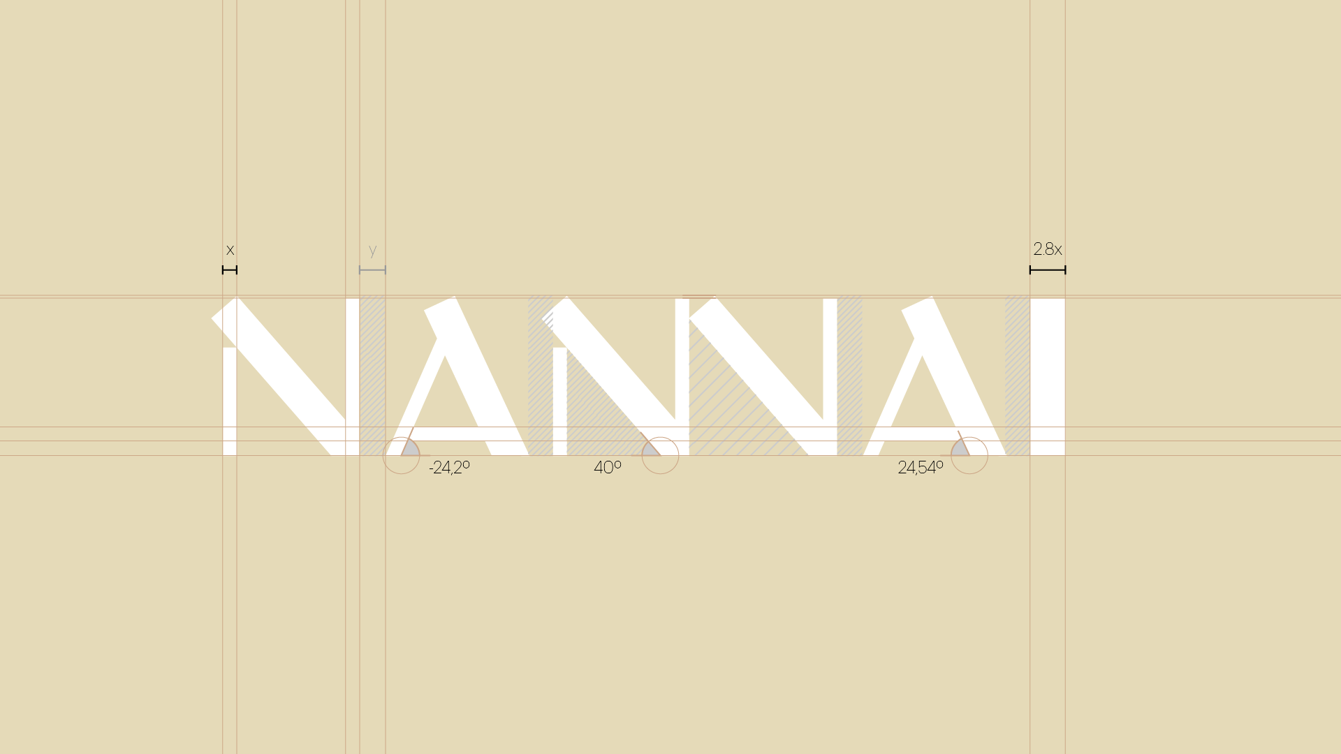
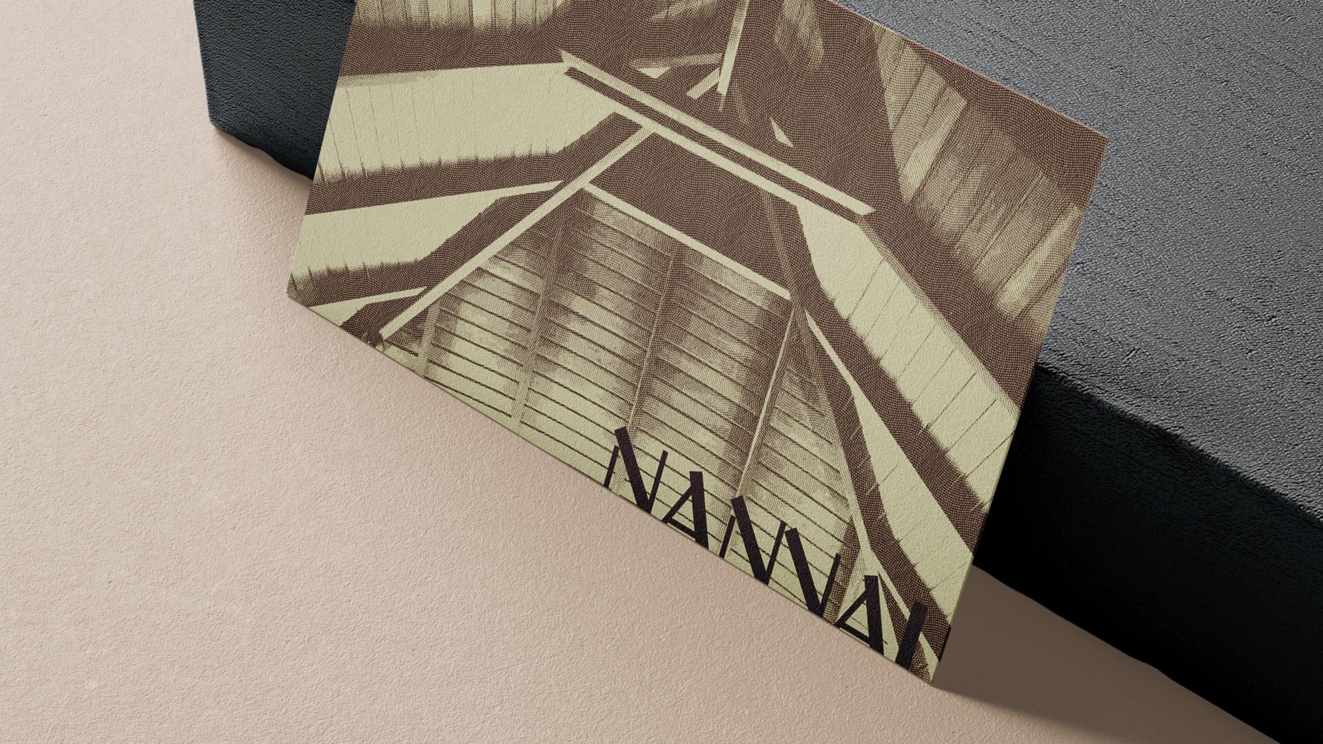
The wordmark was redrawn from the previous version, while daring to use even fewer formal variations.
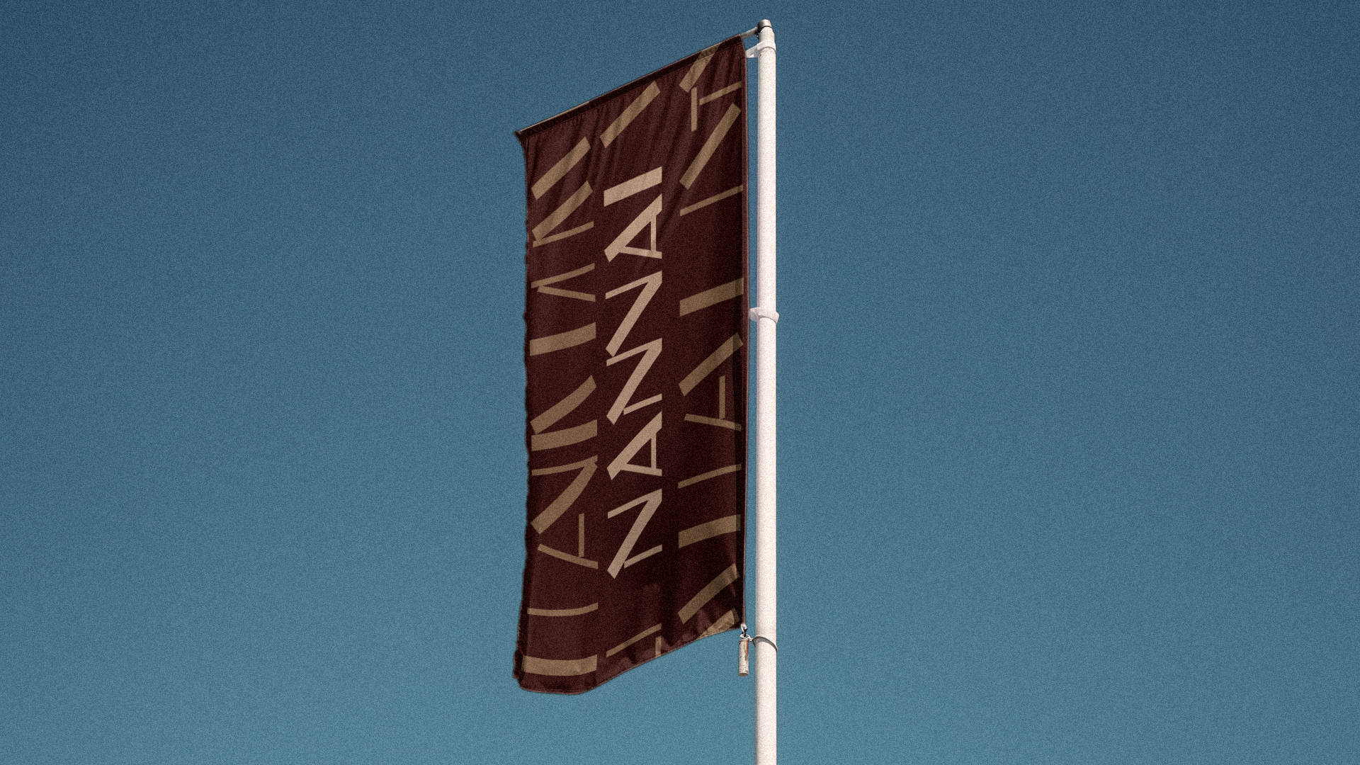
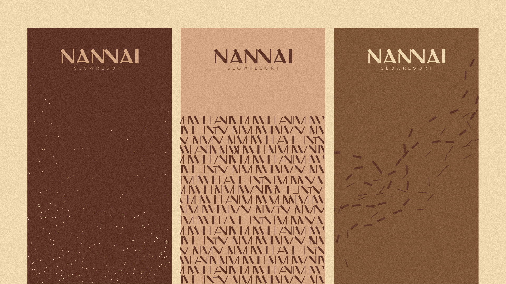
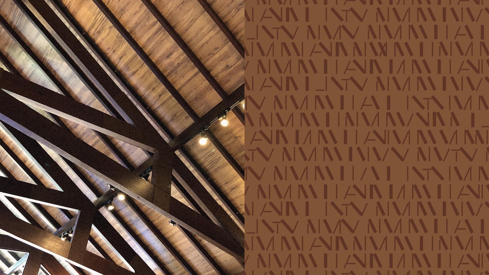
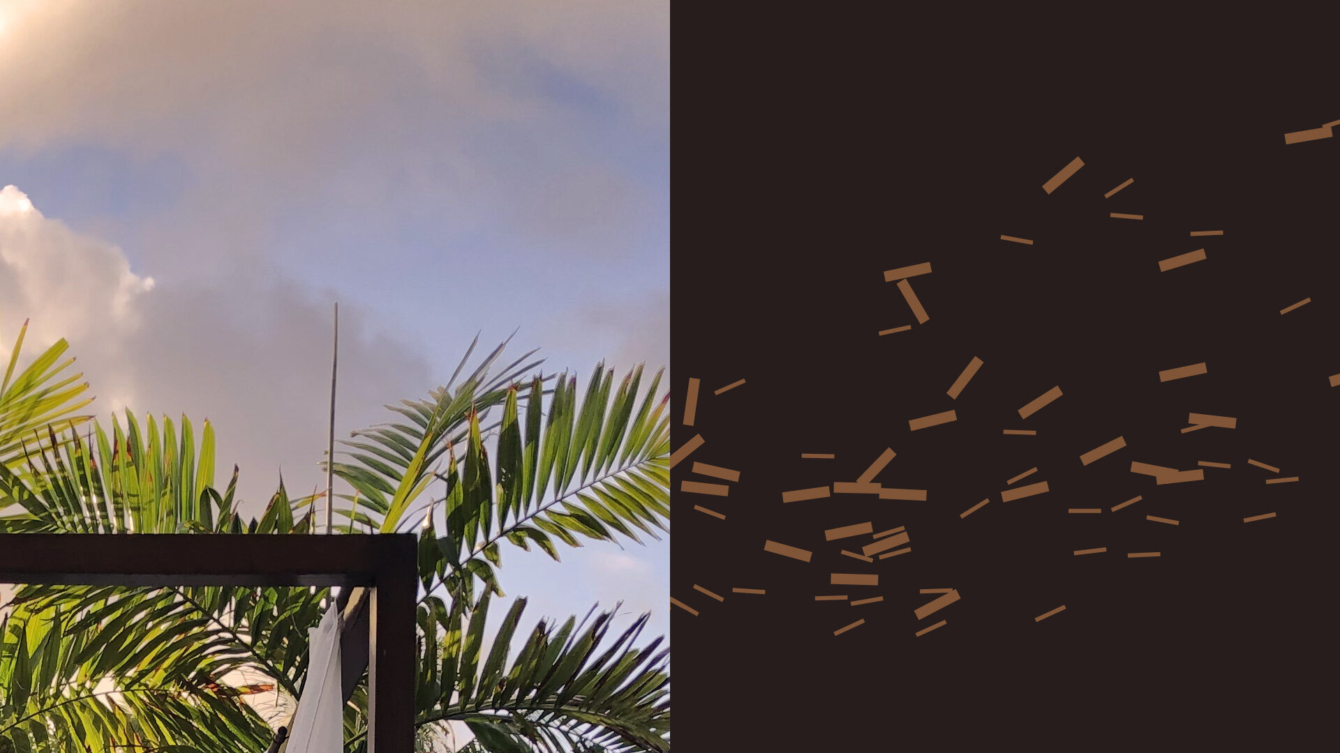
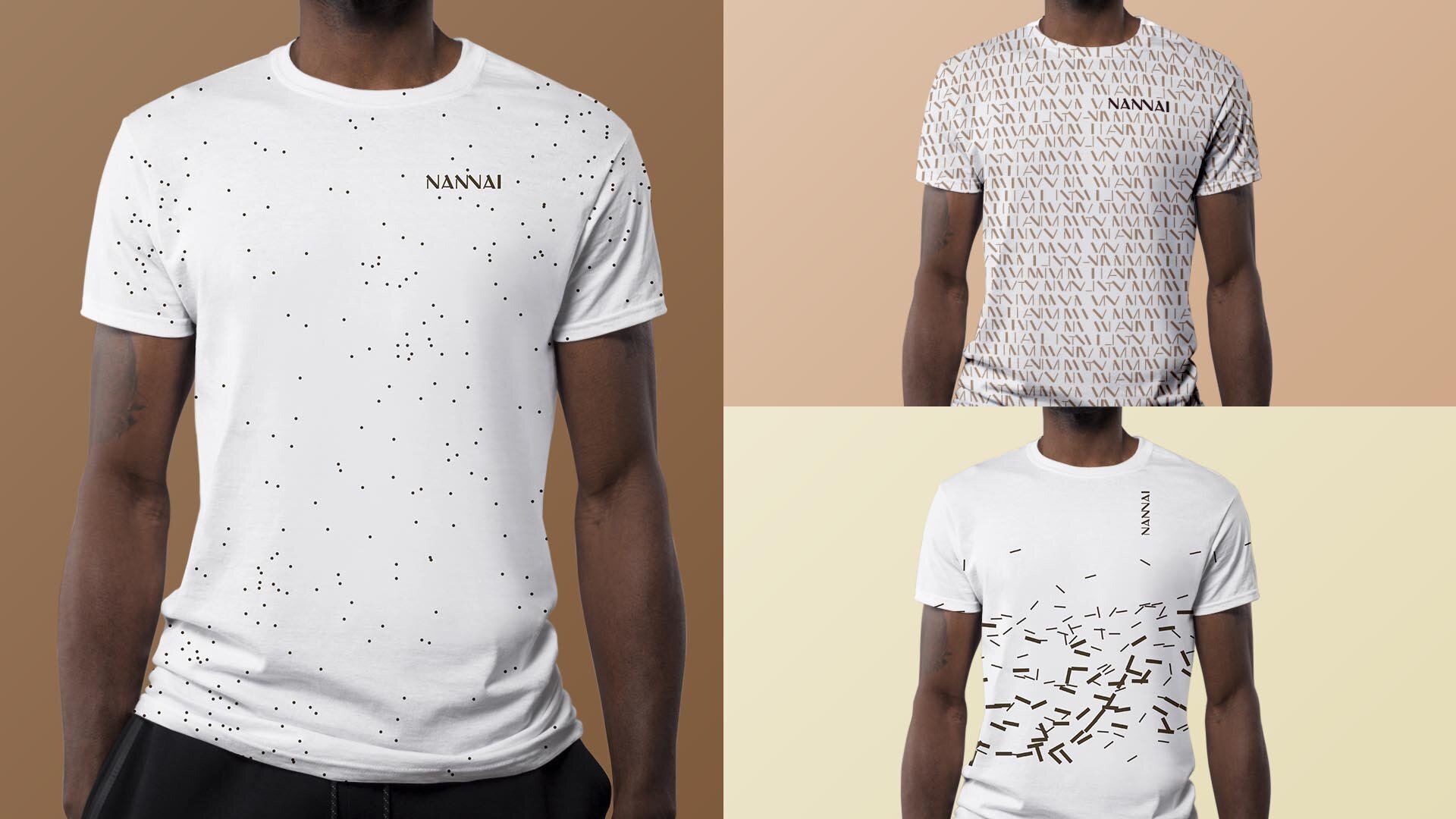
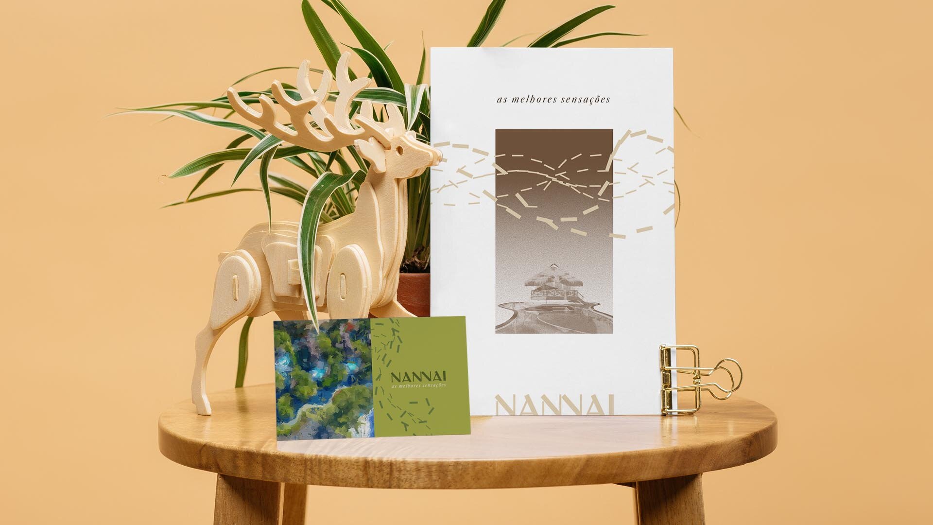
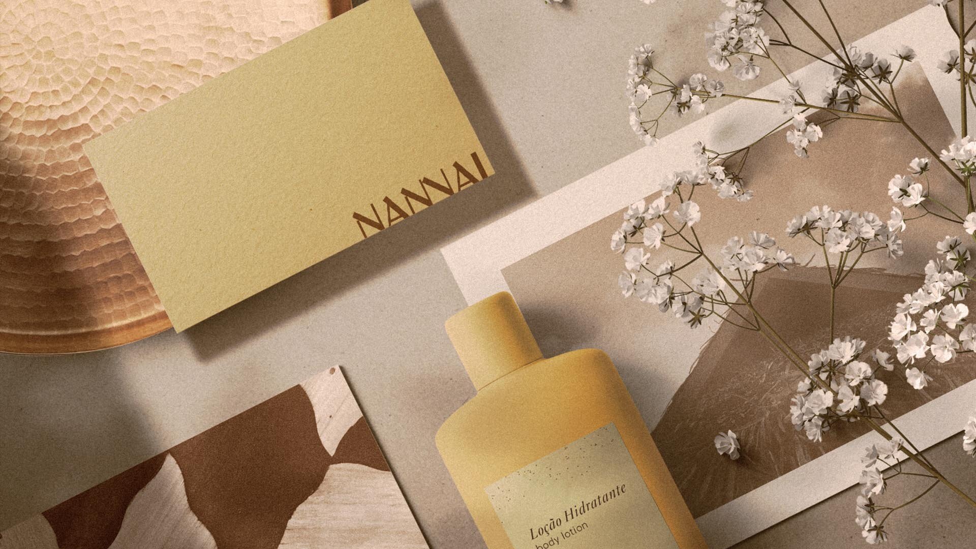
We removed the figurative icon from the primary sign and spread it in different forms, through textures, illustrations and images, across the identity system that defines the Nannai experience.
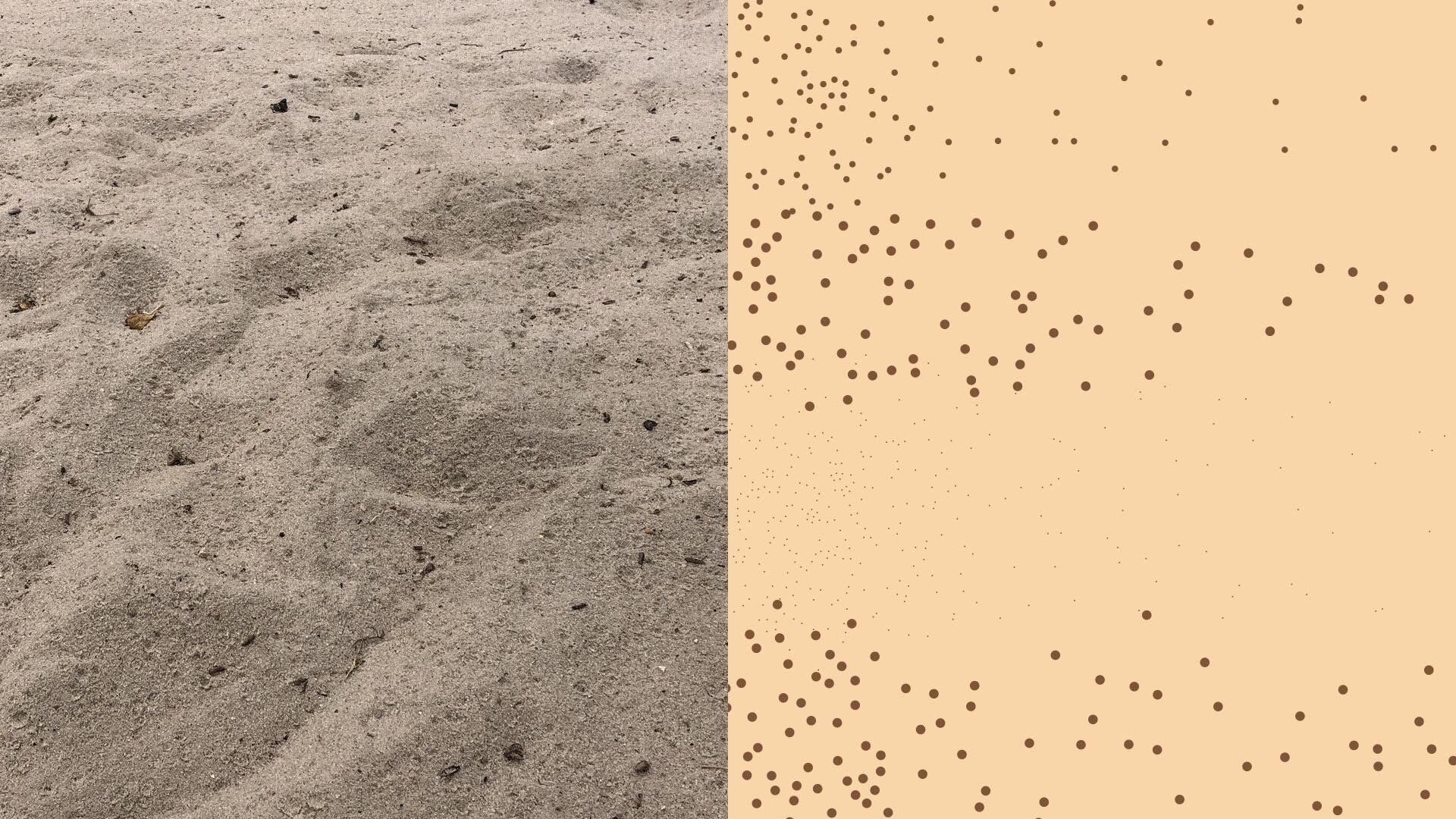
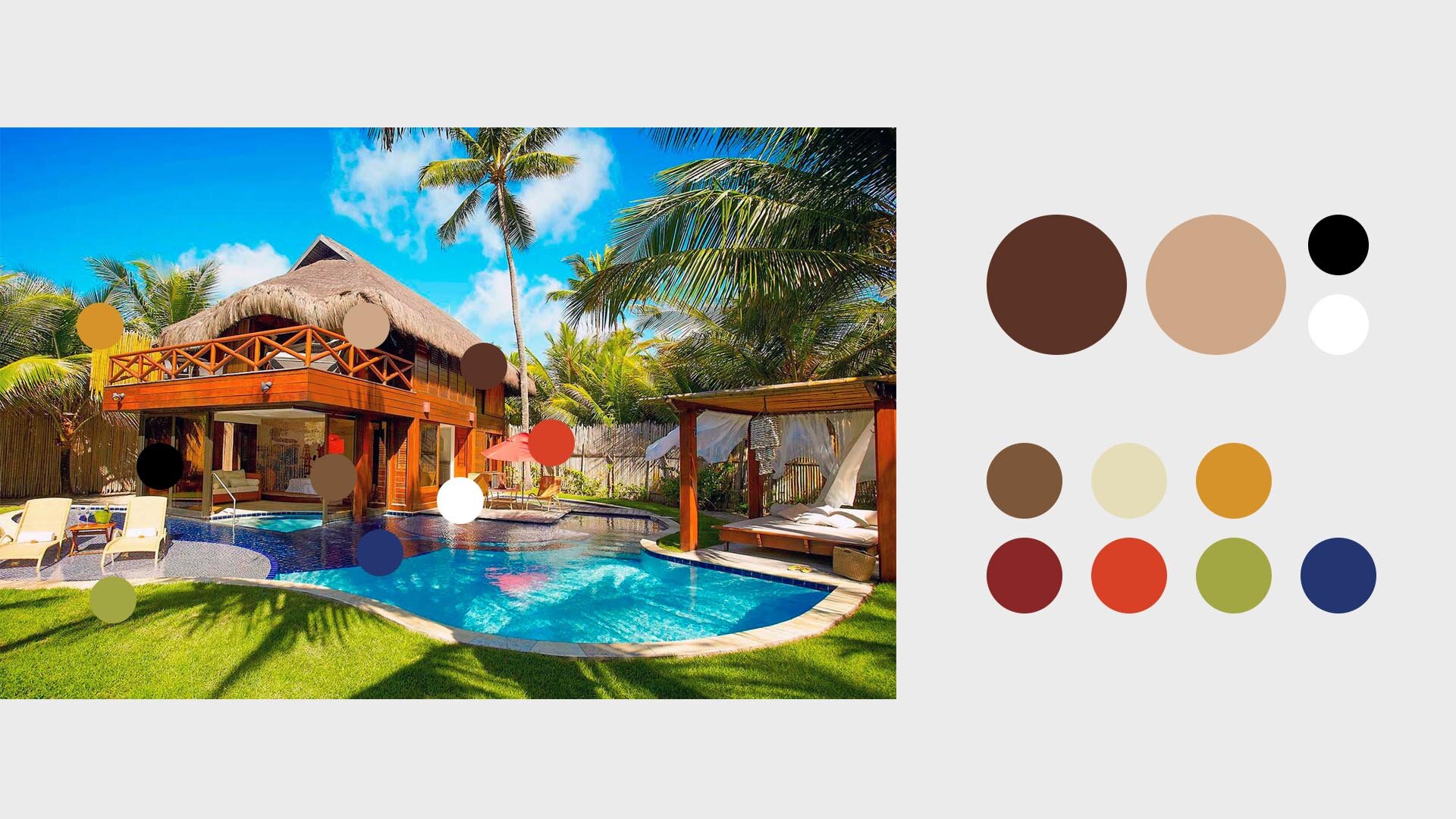
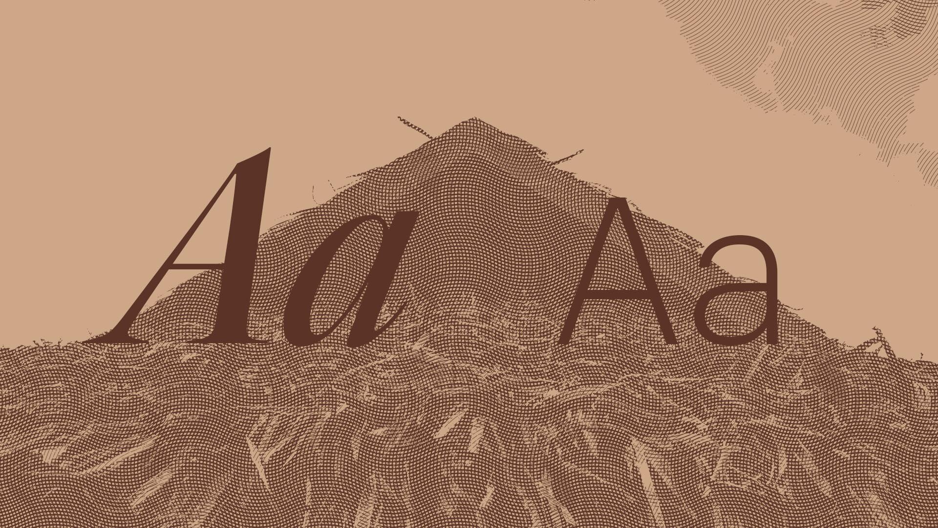
We established standards for color, typography, correct and incorrect uses, illustration styles, texture assets and photo filter patterns.
All without breaking with Nannai’s history, but updating it for new and glorious moments.