Anyone who was young in the 1990s knows what a phenomenon the micaretas were. Spread across the country and following trios elétricos, huge crowds partied, carried along above all by plenty of axé music. Nostalgia took hold of a group of producers who decided to revive and reinvent the party, and the old Recifolia is now Micarê Recife. The new moment needed a new visual identity that could bring the 1990s into a contemporary language without losing the fun, color and freedom of the event that marked a generation. In the new format, updating concepts helped reinforce issues such as diversity and plurality, making the proposal even richer and more multifaceted.
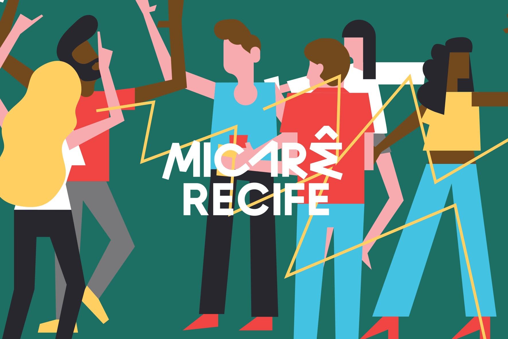
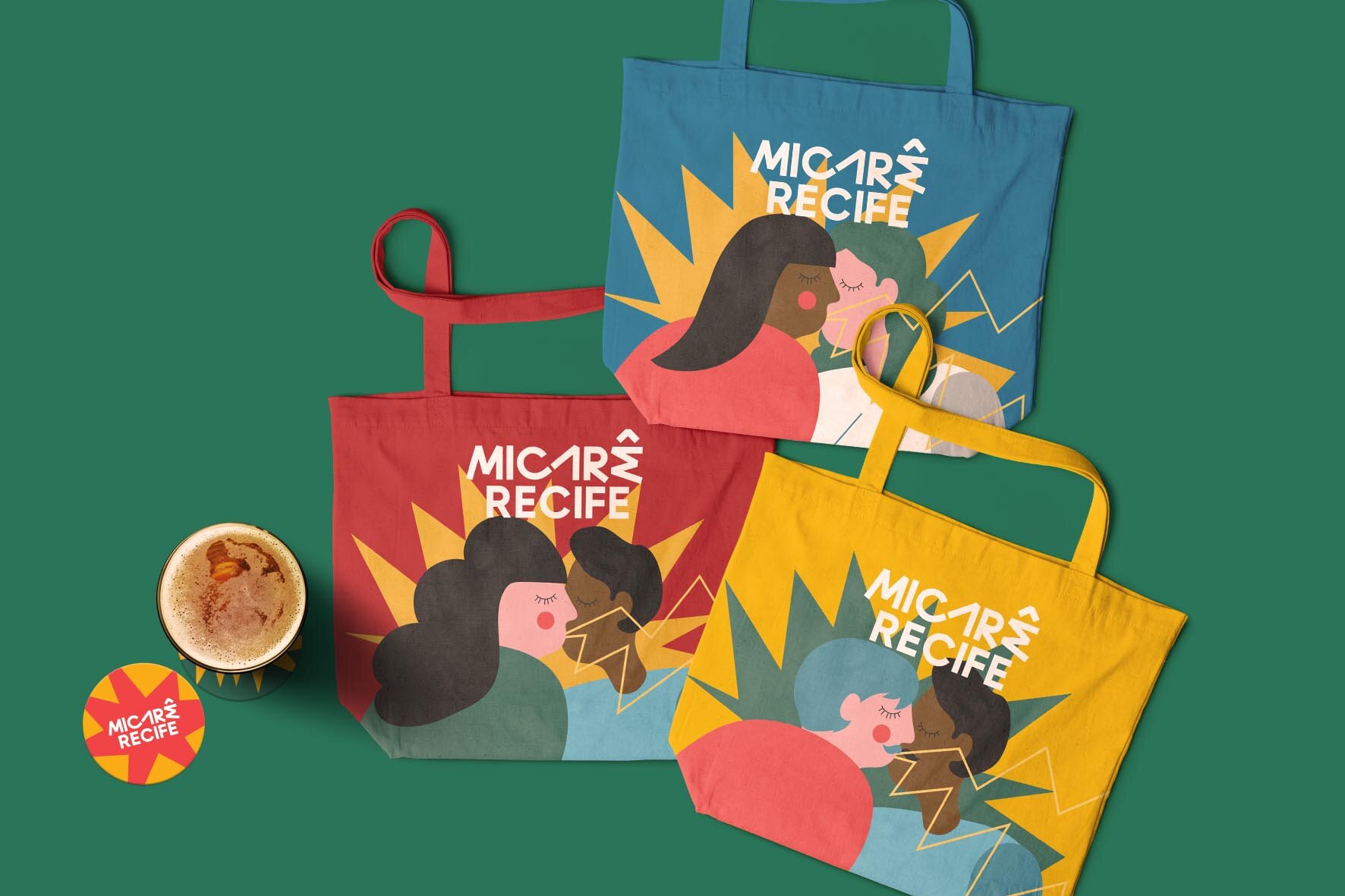
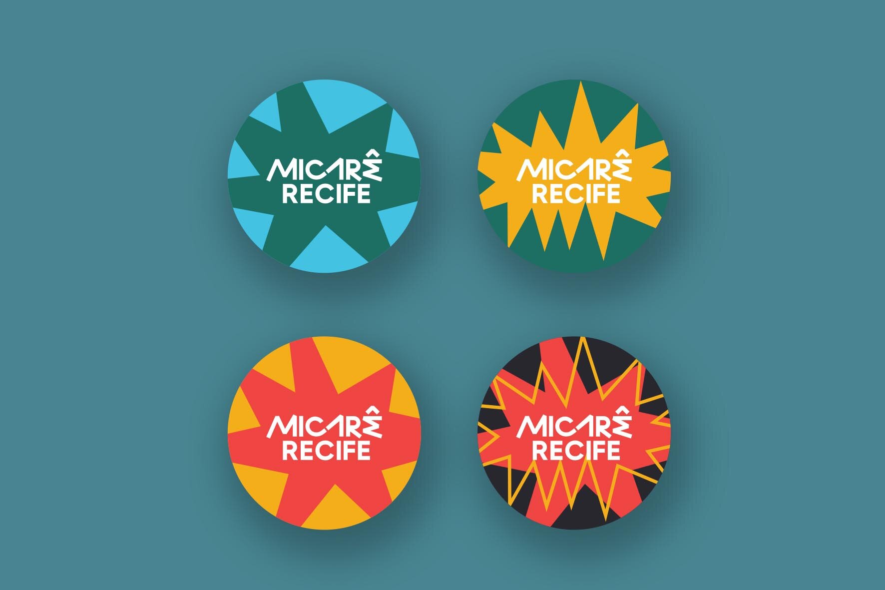
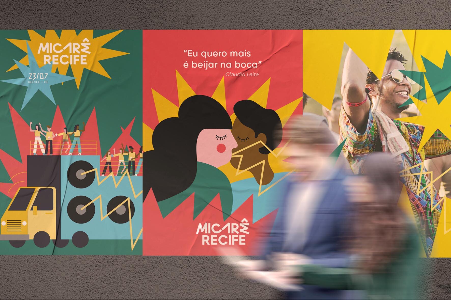
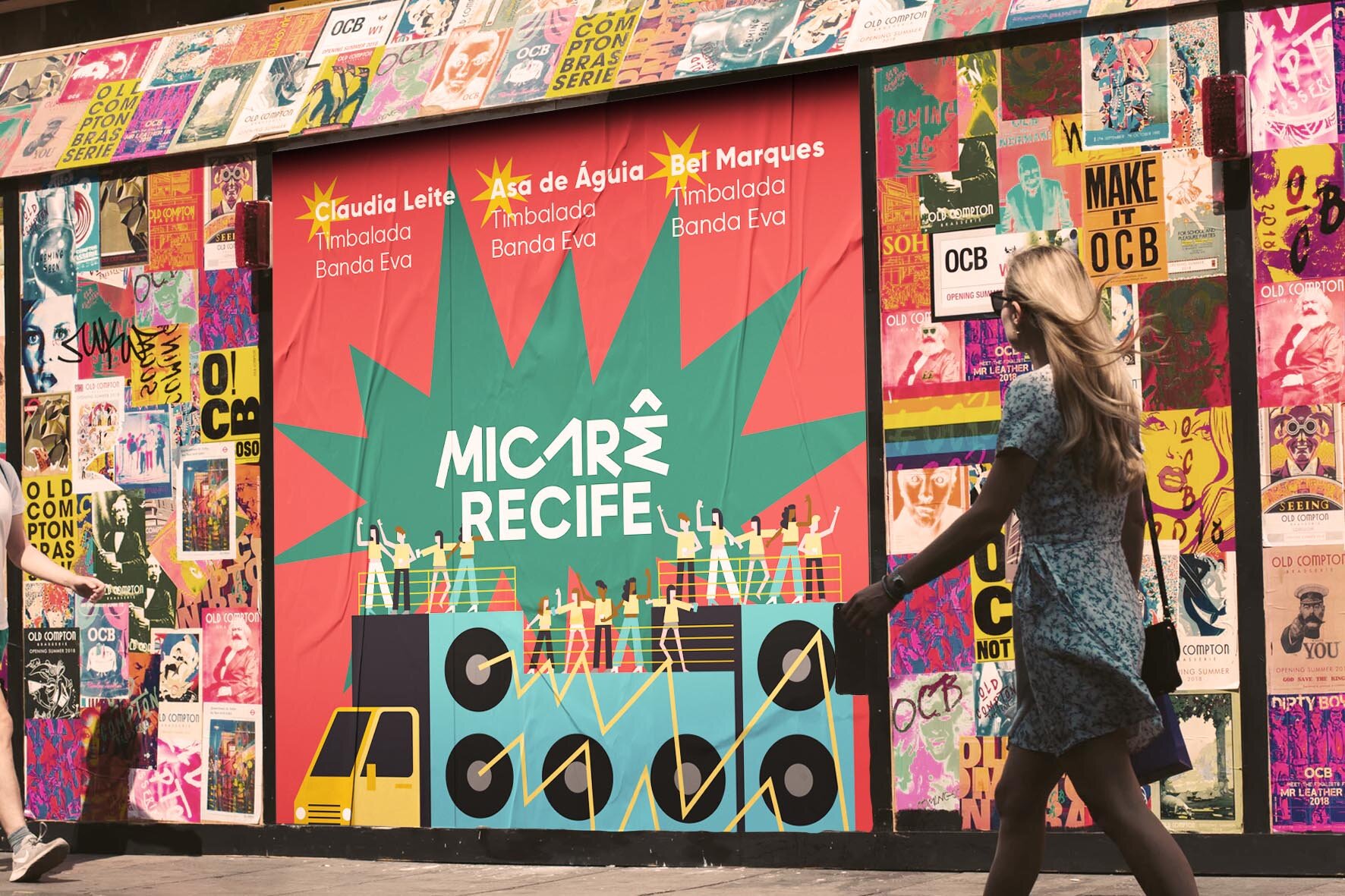
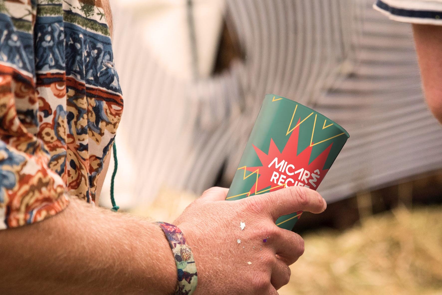
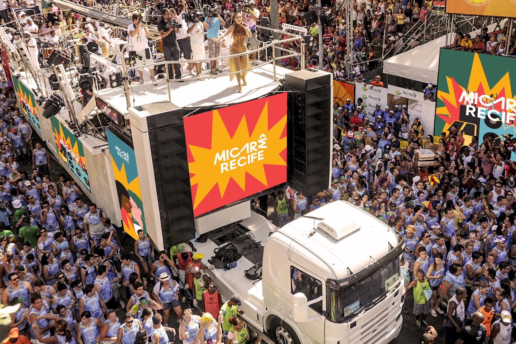
One of the hallmarks of micareta graphic design in the 1990s was experimenting with the visual resources available on modern computers and their full range of colors and effects. The result was a great deal of visual clutter. But it is worth noting that the excess of information matched the diversity that characterized the event. In the new proposal, the idea is to balance both paths, keeping an aesthetic rich in elements and colors, but in a harmonious way. For the brand, a playful lettering with few rules, but guaranteed legibility and plenty of personality. In support, splashes bring a retro feel and help give the brand more impact. All of this is accompanied by rich illustrations with a contemporary line that make it possible to depict easily recognizable situations.
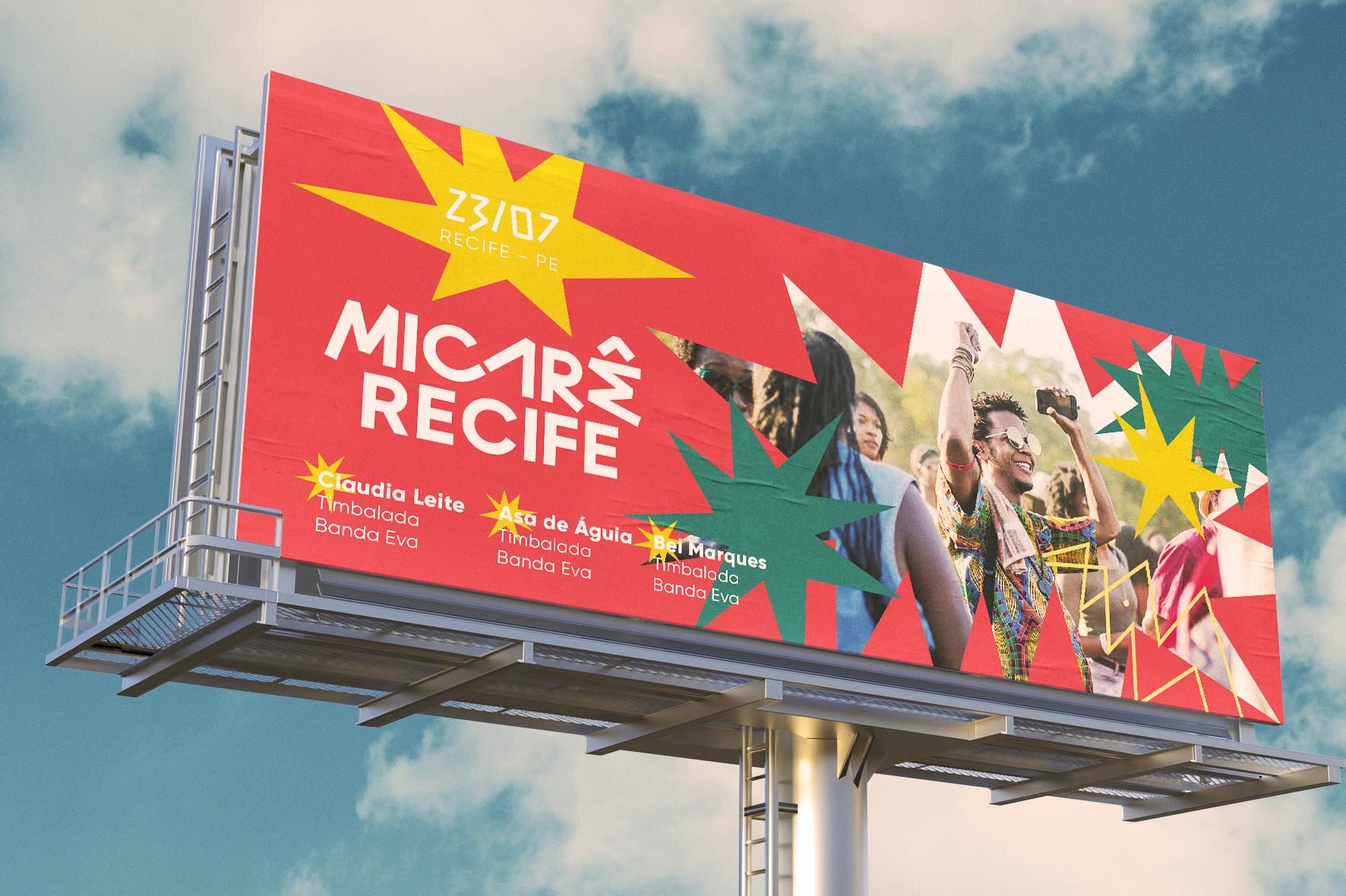
After intense research to travel back in time and get the team into the micareta spirit, several hand-drawn lettering studies were made before moving on to the final design using digital illustration software. The color palette was also defined before drawing the characters and situations that enrich the pieces. Finally, the elements were grouped and applied across different formats: digital, print, compositions with photography, promotional pieces and the festival’s full range of materials.