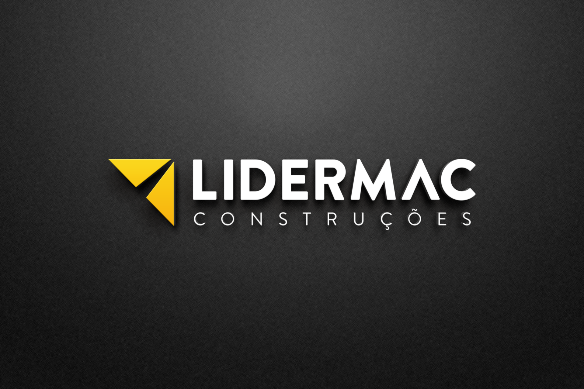
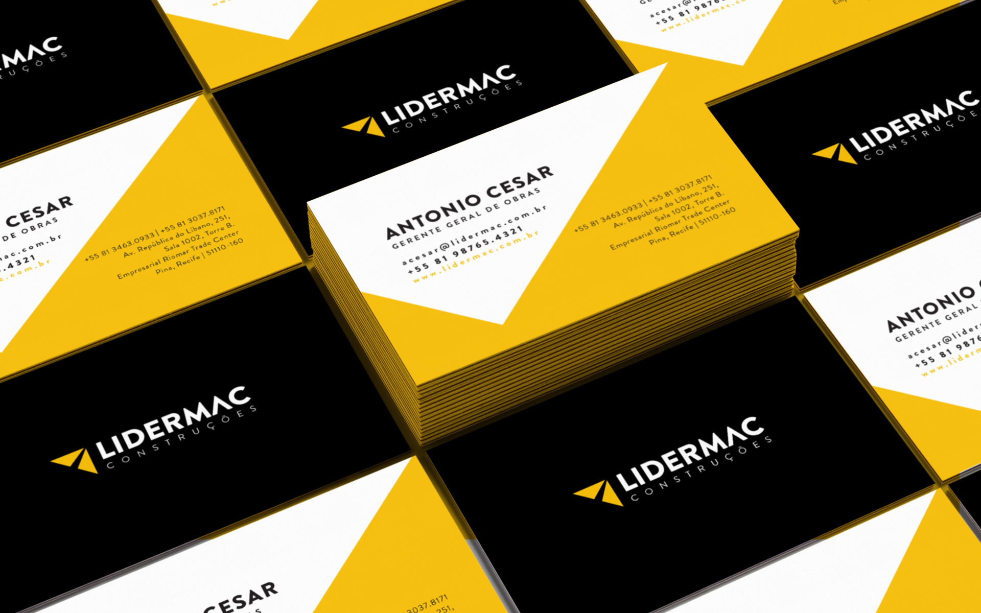
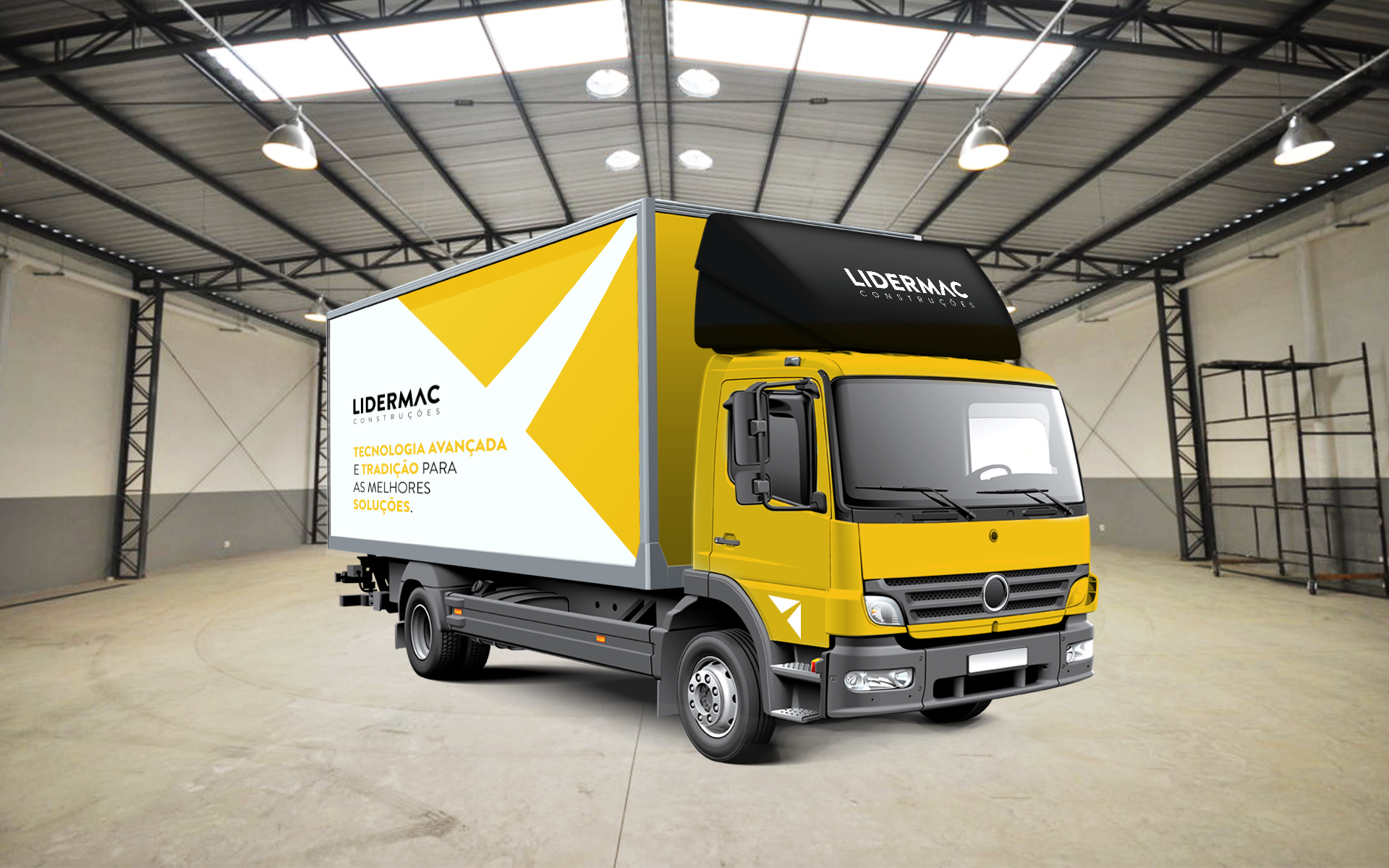
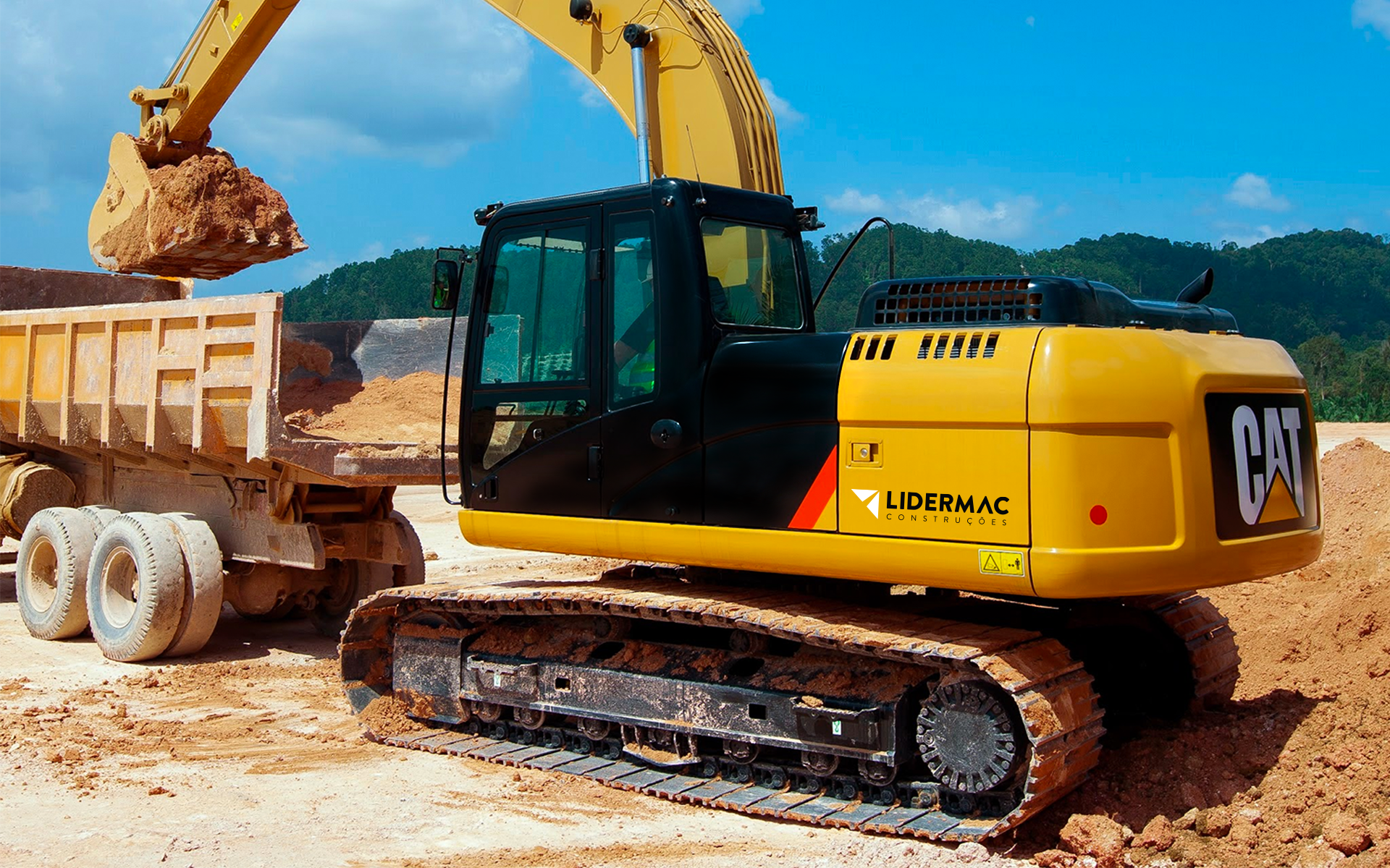
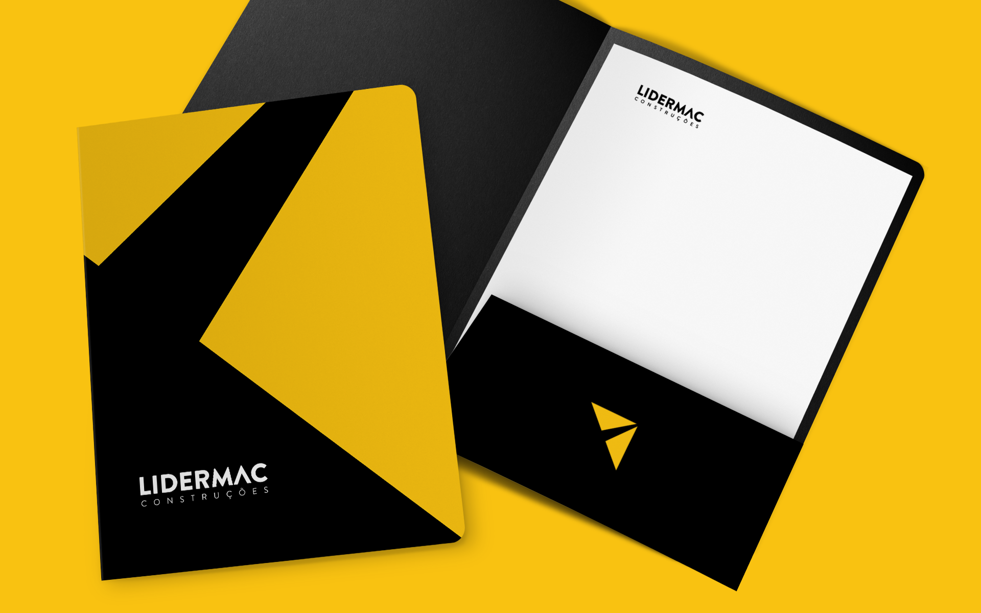
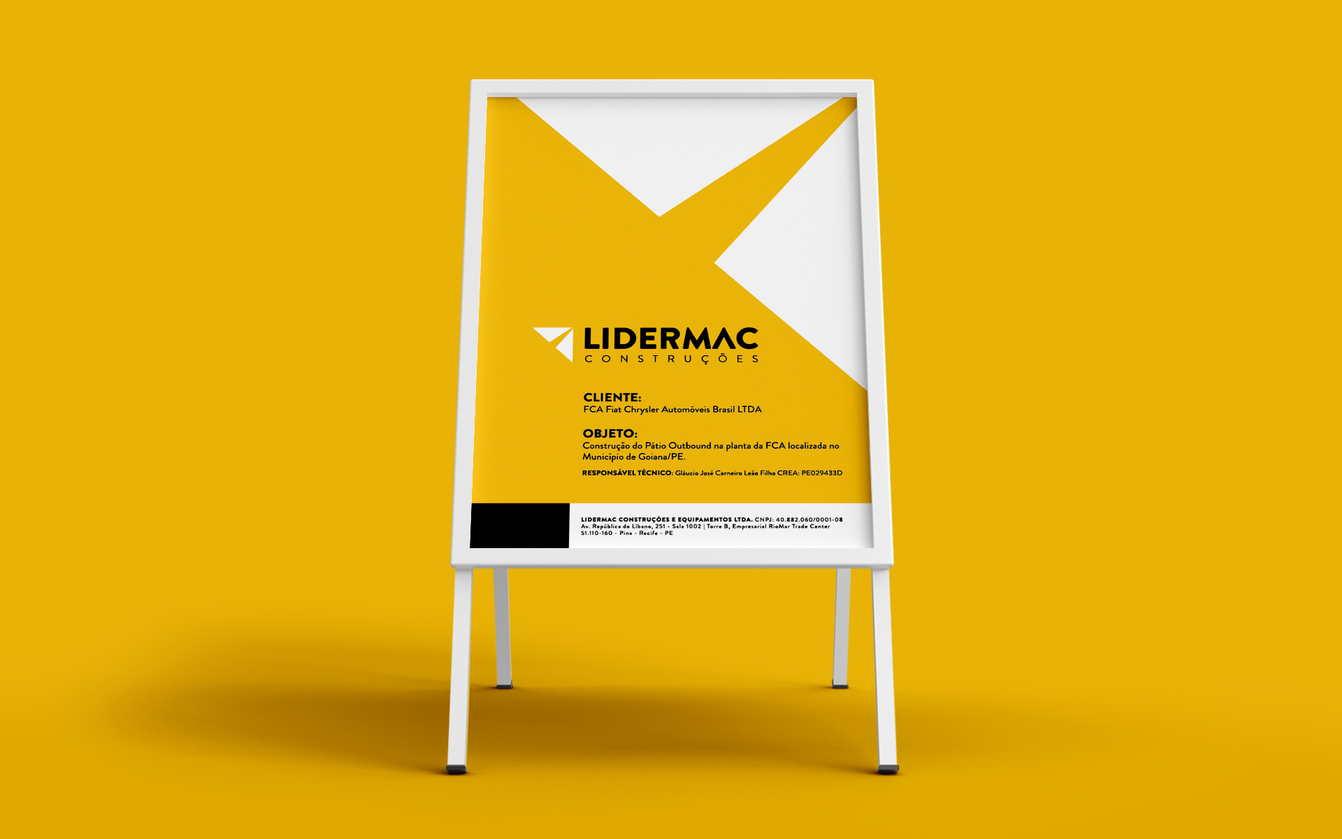
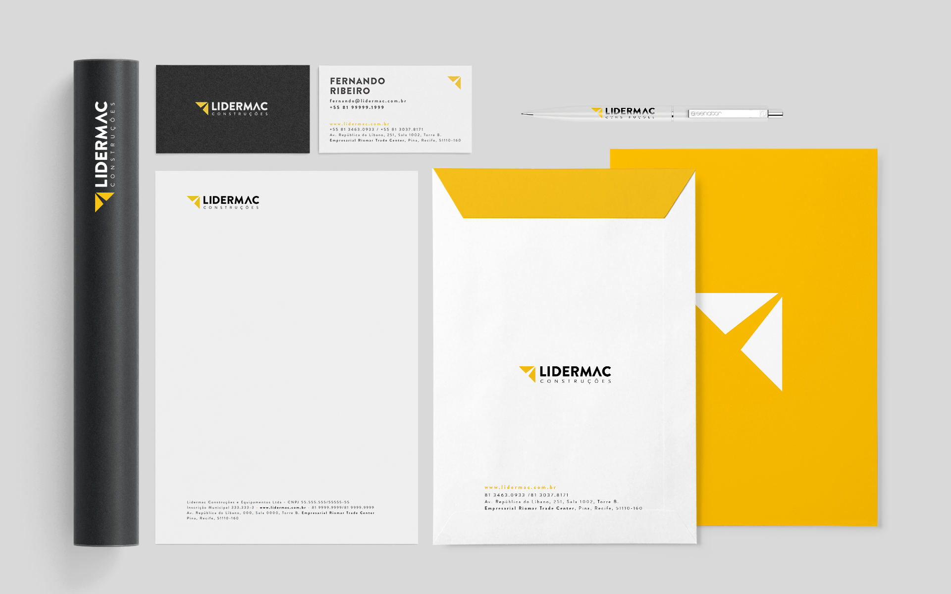
Working since 1992 in engineering, earthmoving and paving services, Lidermac needed an update to its visual identity. Its scope had grown and its brand no longer matched the range of services the company provided. The renewal, however, was meant to modernize rather than break with the past. The colors that made the company easy to identify were kept, and the symbol became more abstract, without such a direct reference to paving, but without losing its positive, forward-looking direction. All materials, from stationery to the fleet, were renewed, and Lidermac now has a contemporary identity in step with its new moment.