Updating the identity of a brand with more than half a century of history is always a balancing act.
The challenge was to translate into visual language the solidity and prestige of the Jairo Aquino firm, keeping its tradition alive while expressing the clarity and relevance that define its work today.
The new brand starts from the principle that form and meaning must go hand in hand.
Every decision, whether typographic, chromatic or structural, was made to visually represent the values that underpin the firm: ethics, excellence, commitment and closeness.
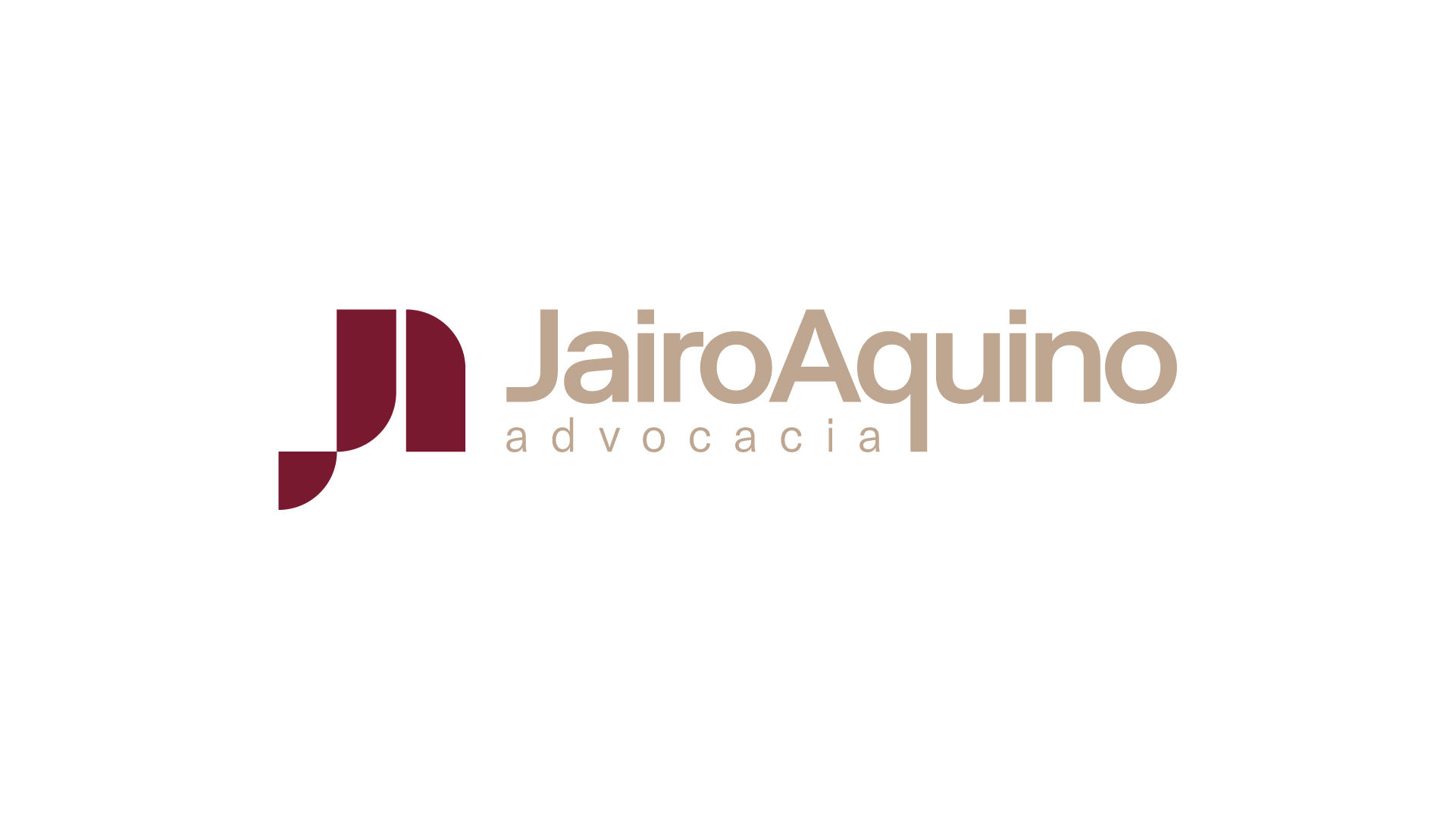
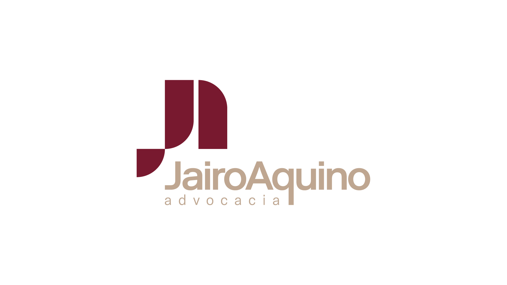
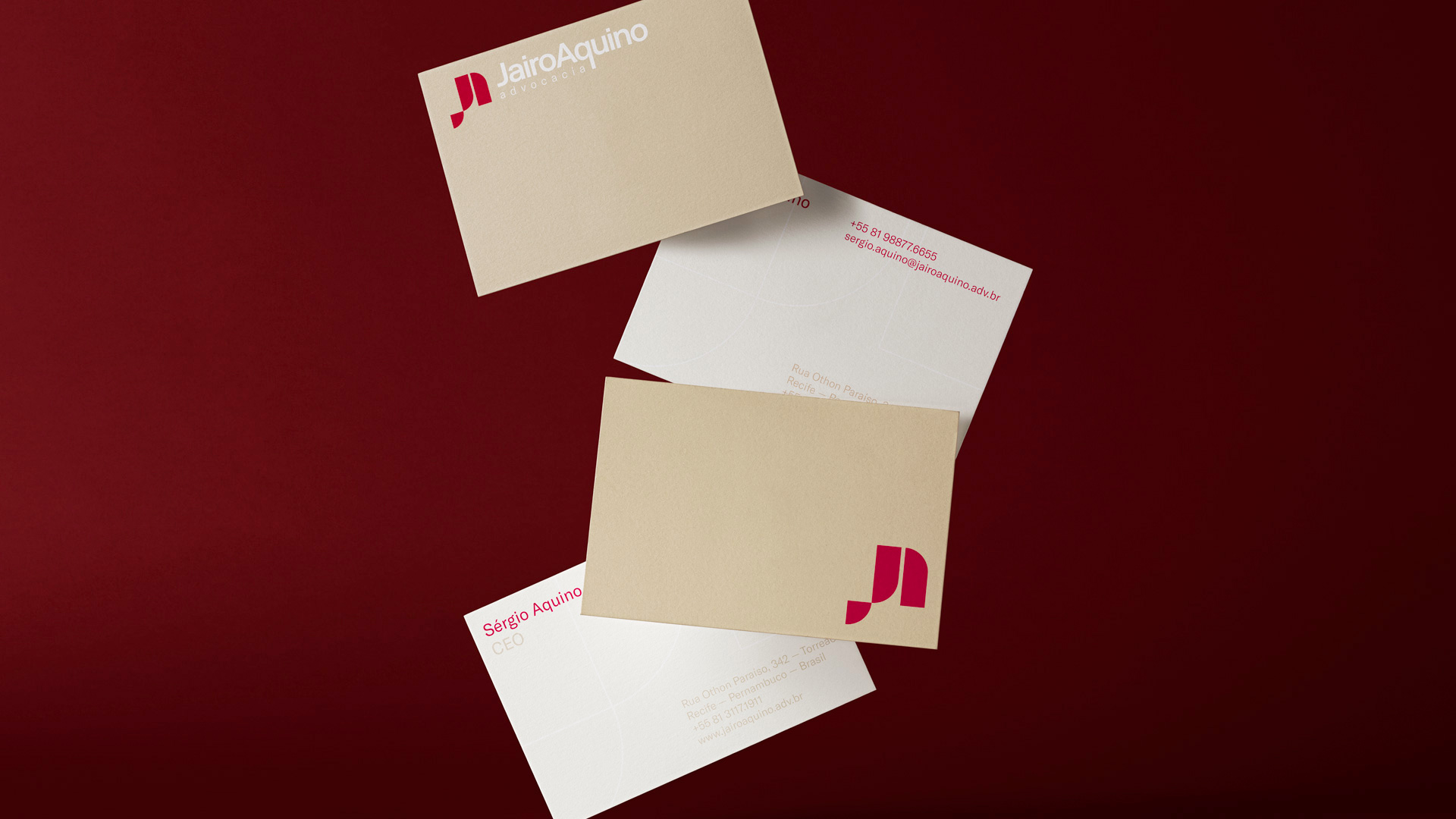
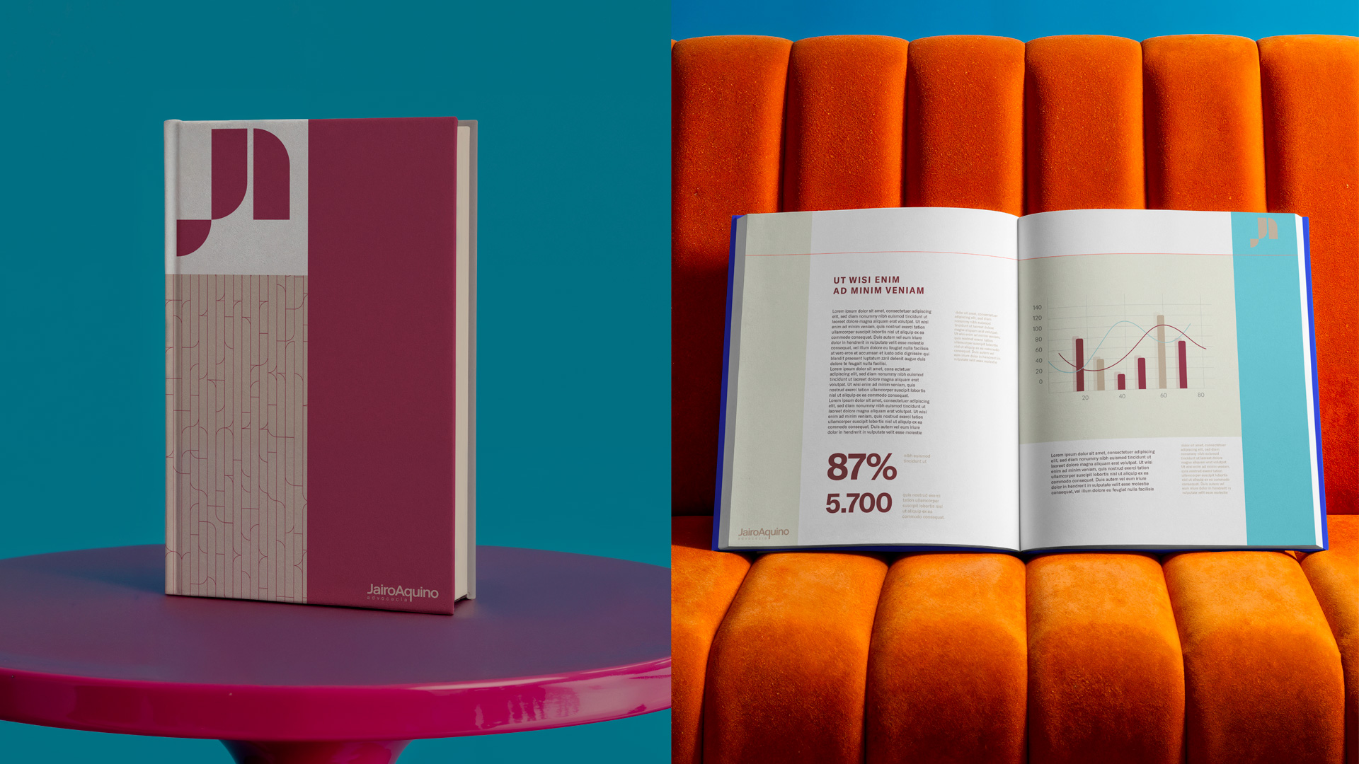
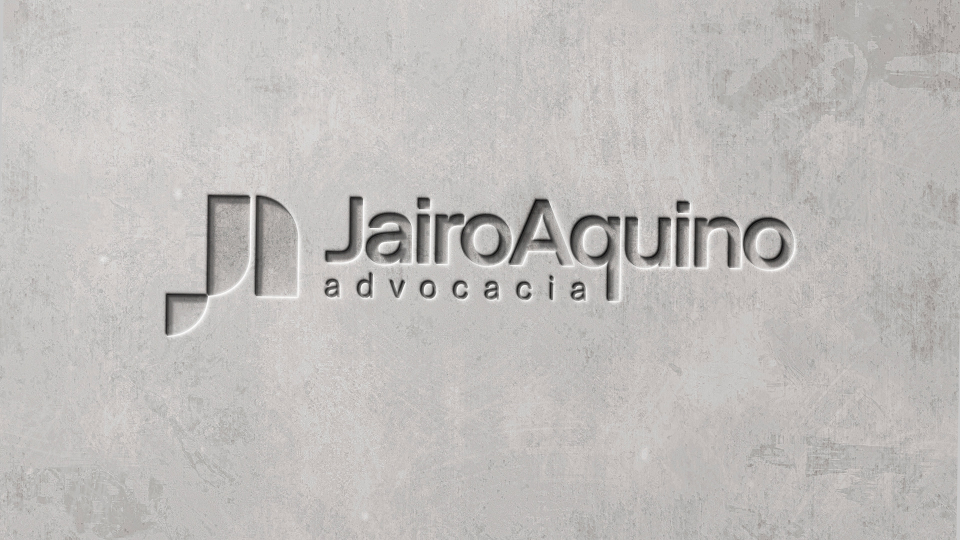
The symbol uses a precise geometric construction, with firm, proportional strokes that evoke method, technical rigor and consistency.
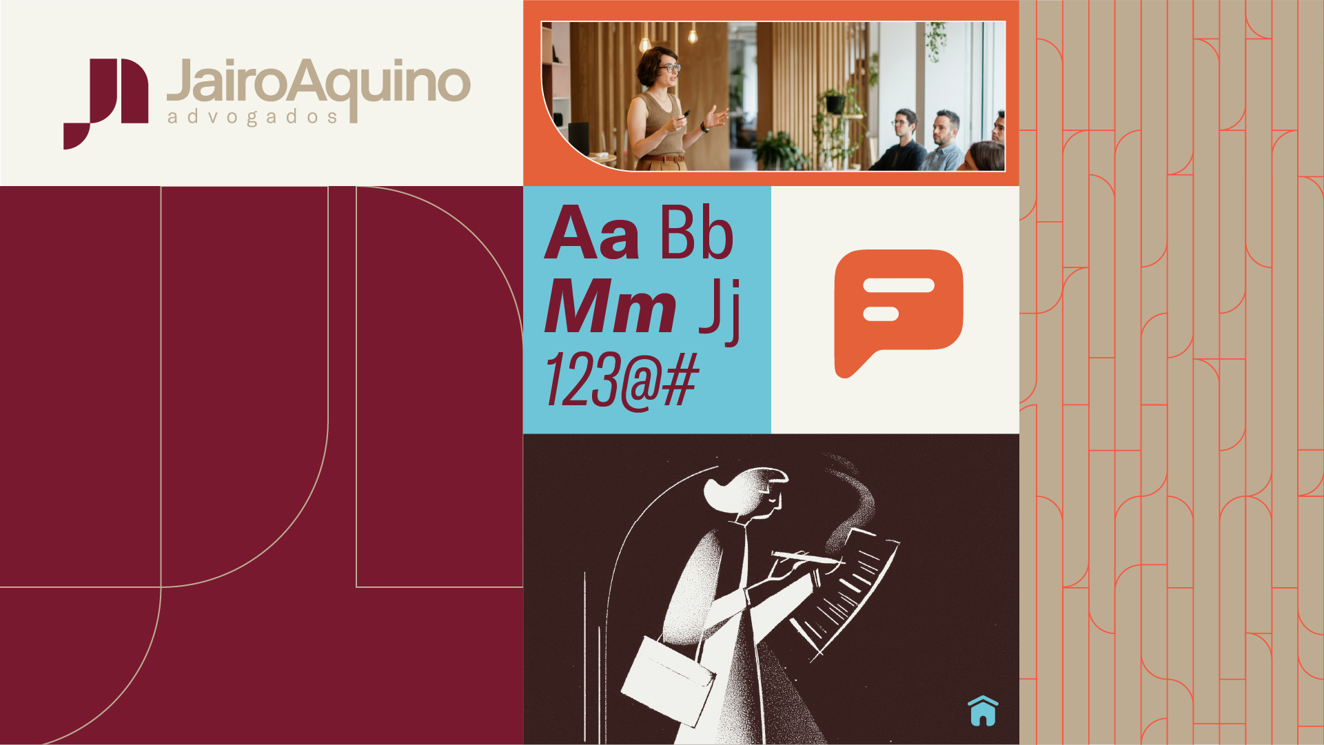
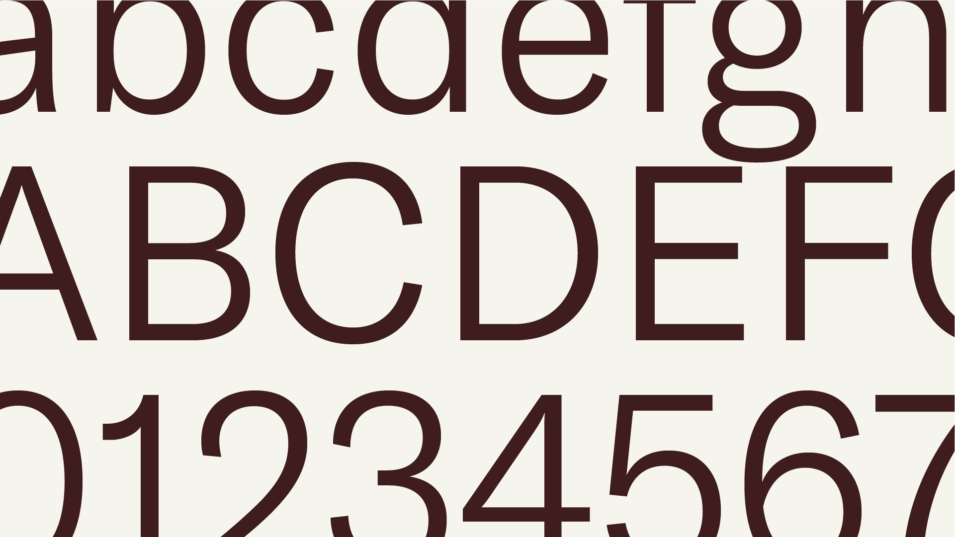
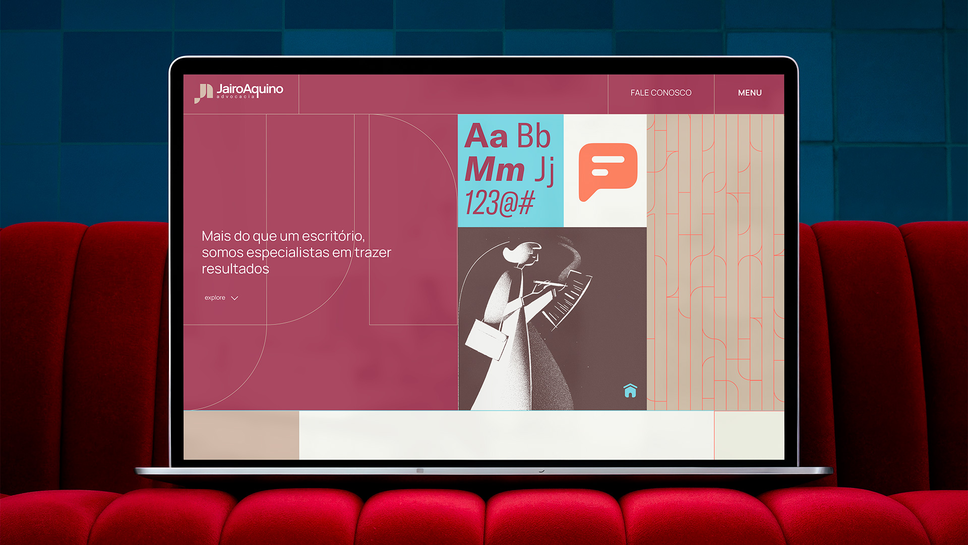
The custom typeface carries a weight and rhythm that reinforce stability and legibility, while the controlled letter spacing conveys closeness and balance.
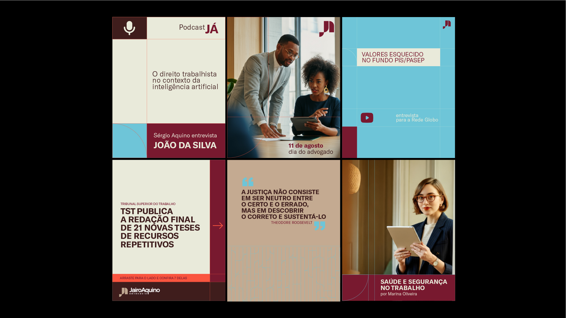
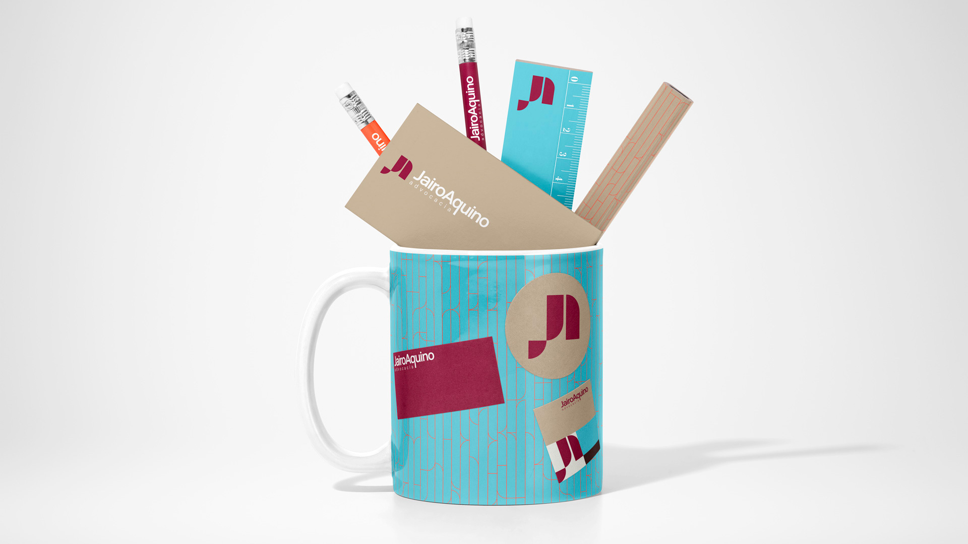
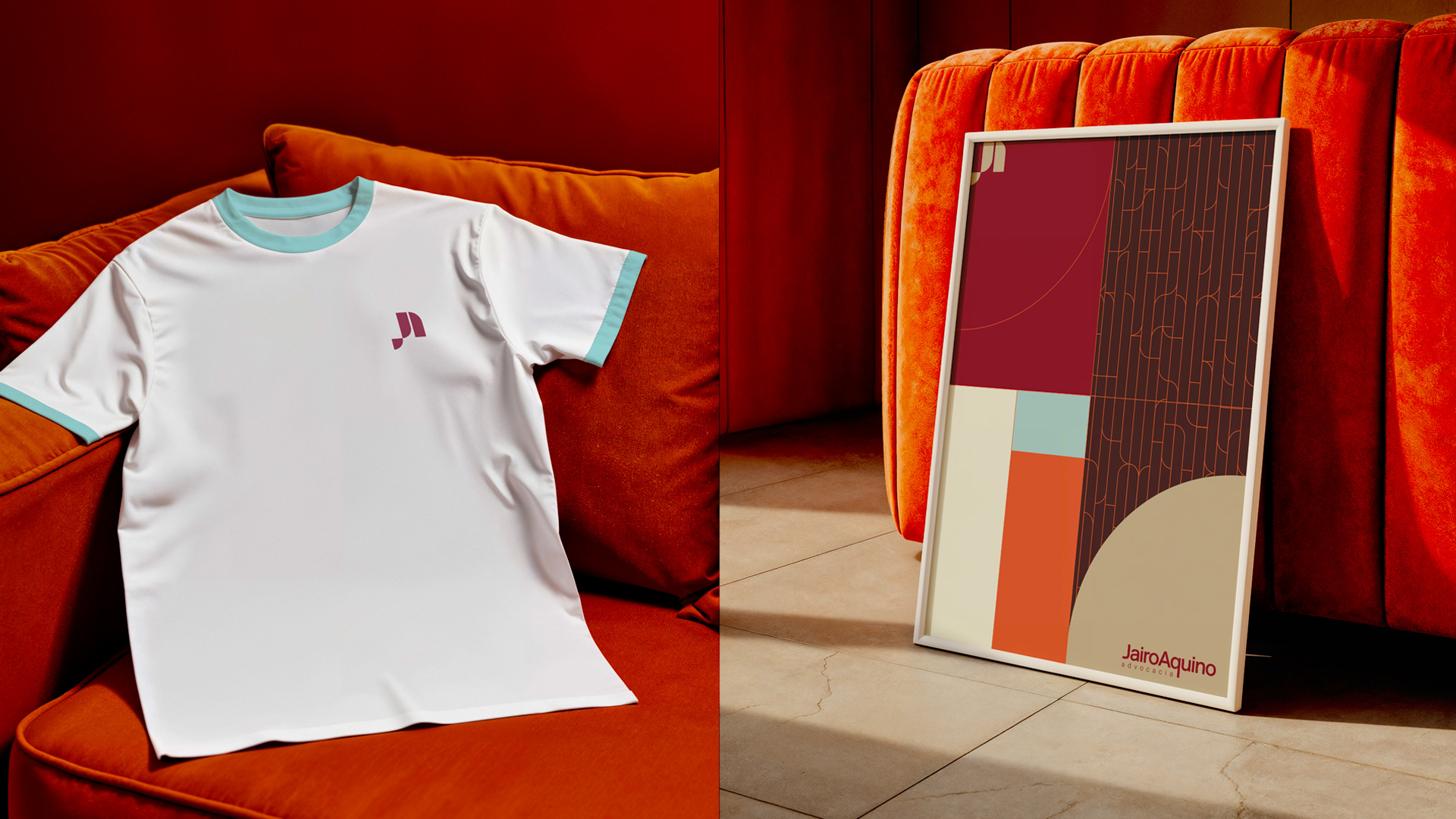
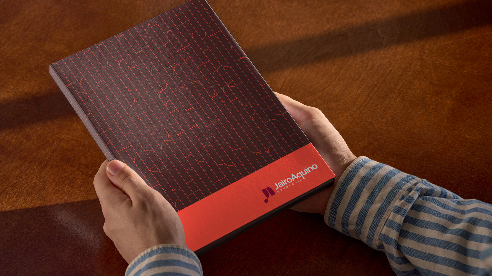
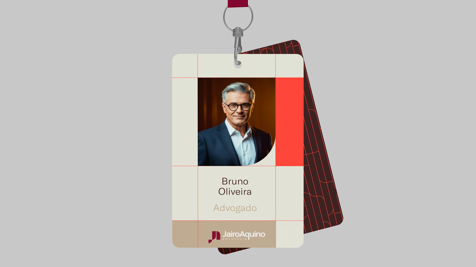
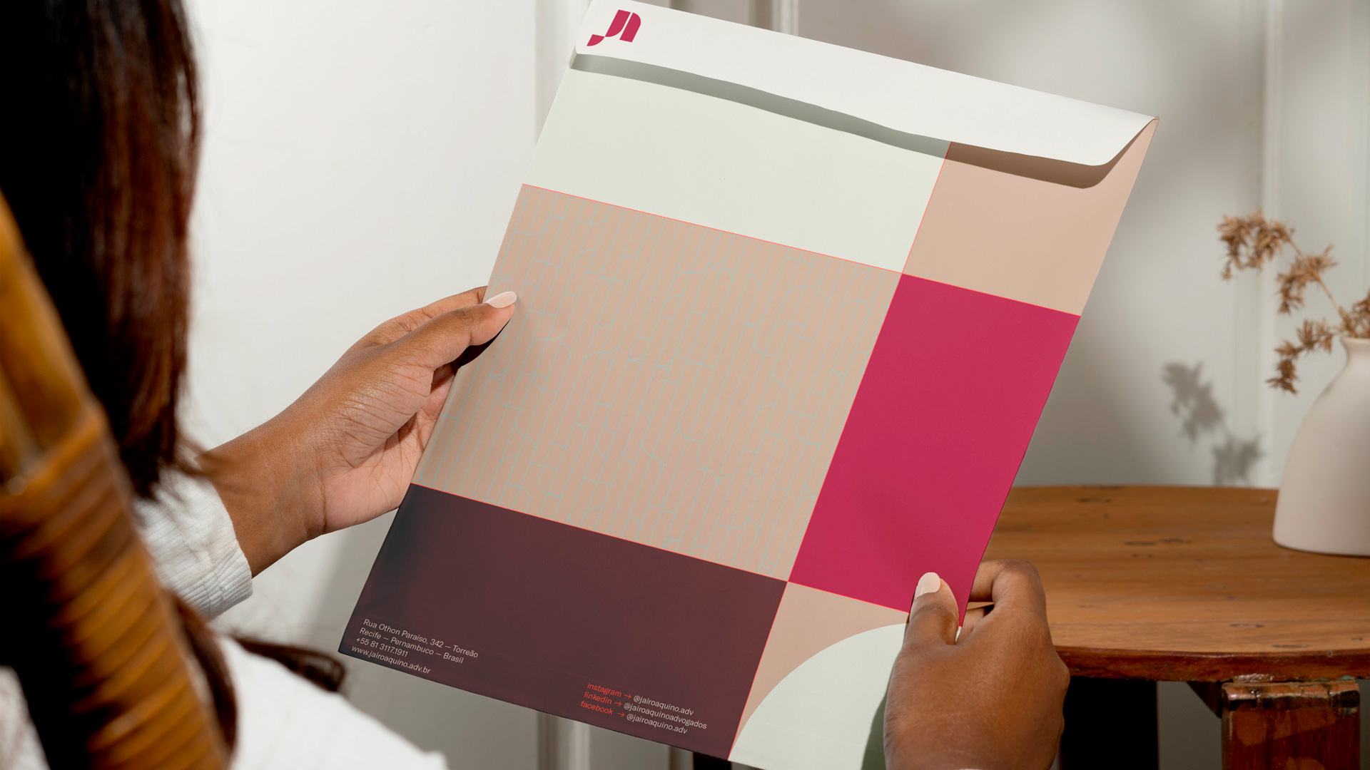
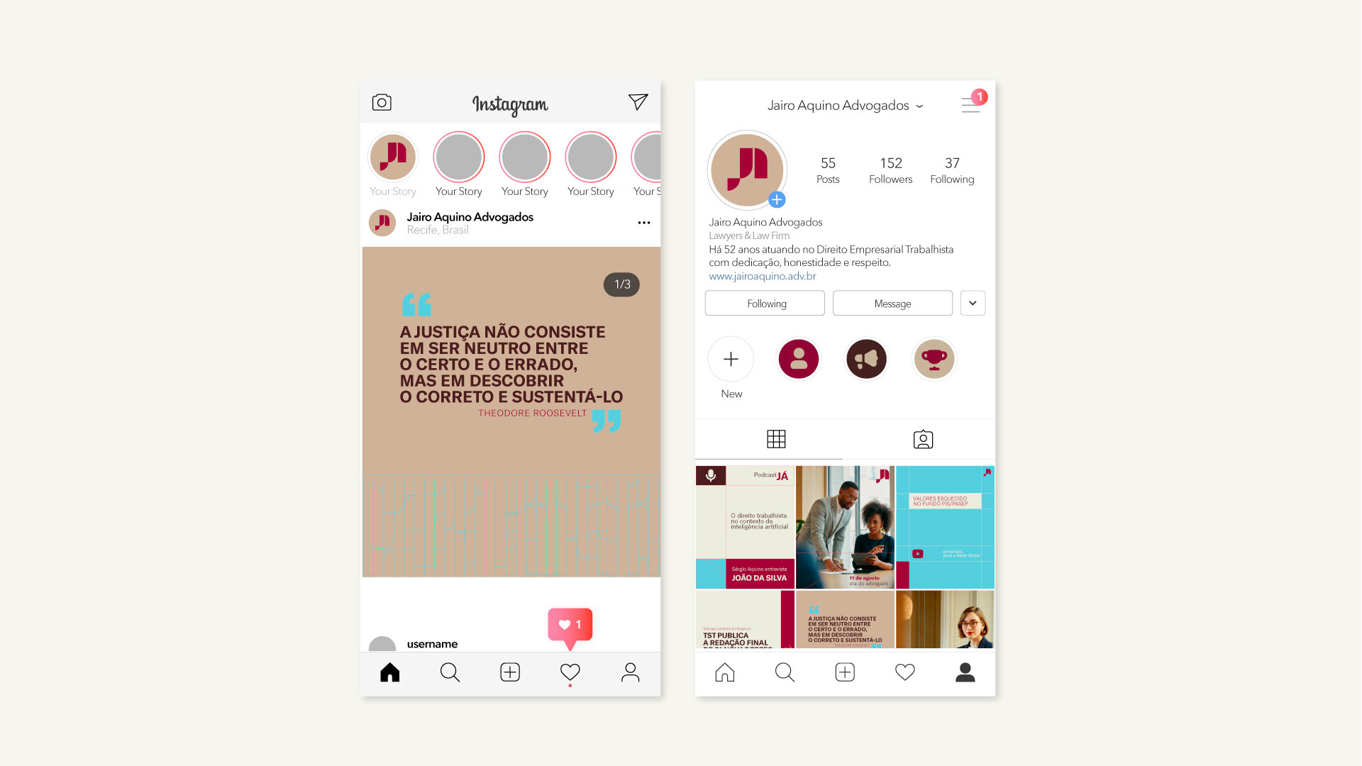
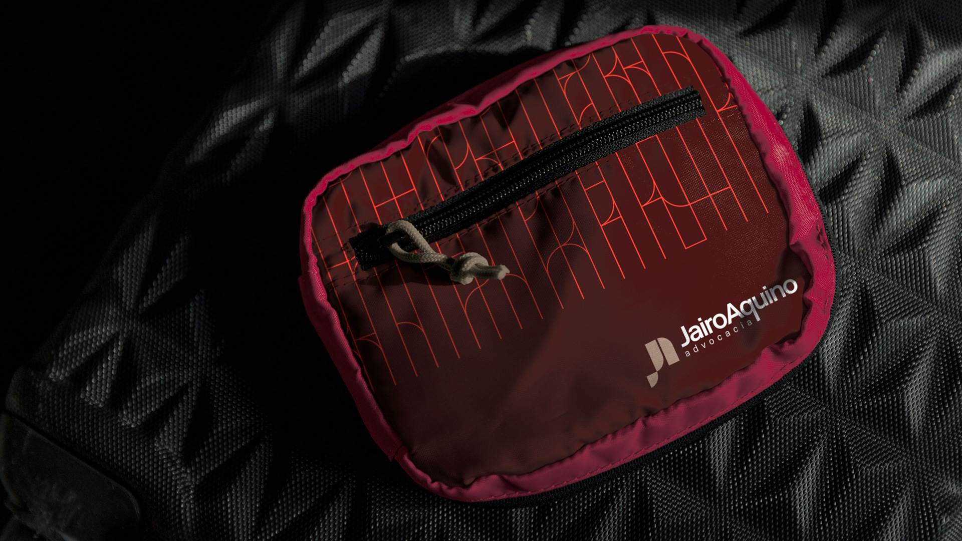
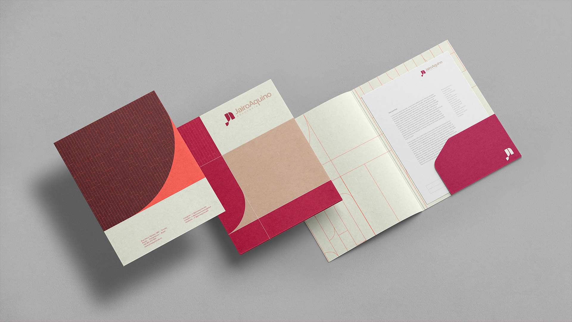
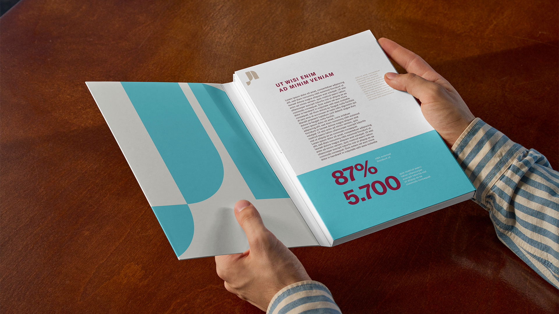
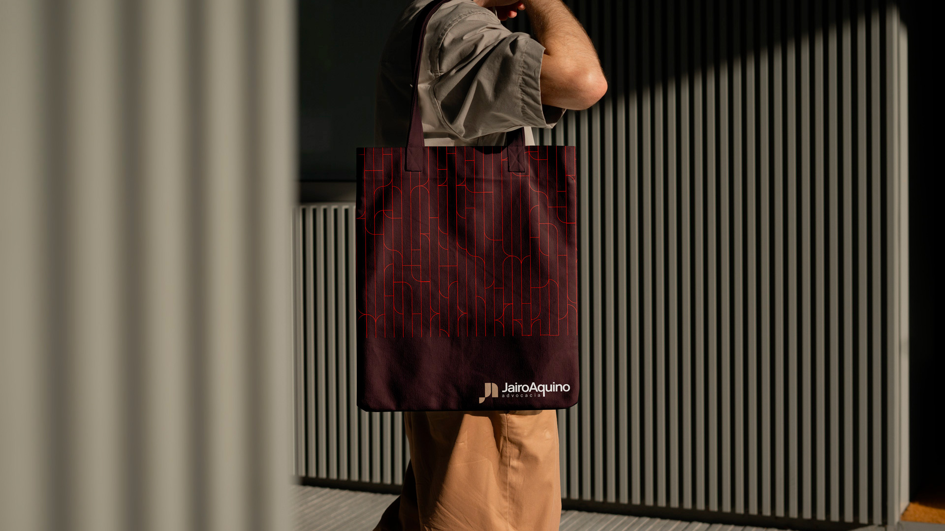
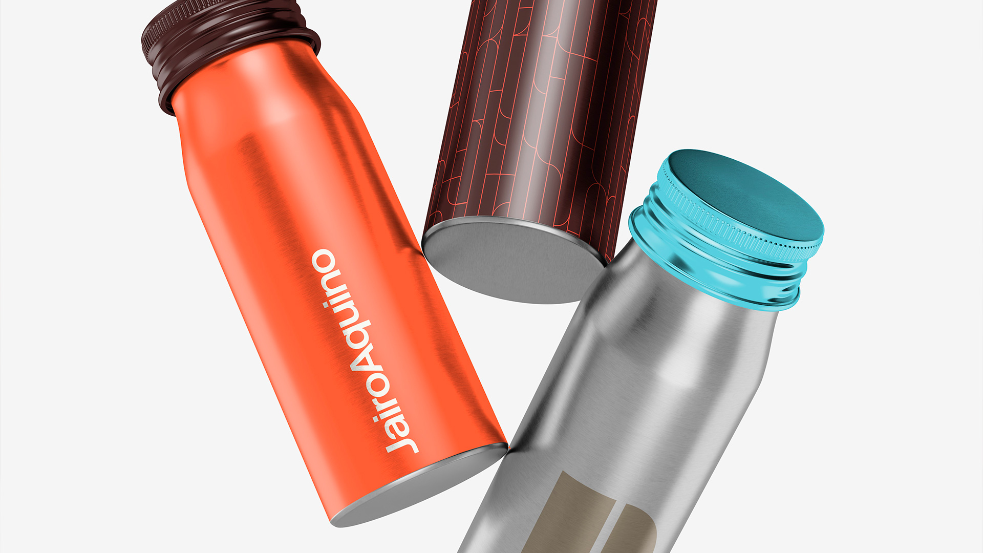
The color palette combines warm and neutral tones, conveying trust, sobriety and lightness. This visual harmony extends into institutional materials, graphic patterns and digital applications that stay consistent between tradition and contemporaneity.
More than a new logo, the project represents a renewed outlook.
An identity that respects the past but updates itself to keep communicating with clarity, precision and humanity, principles that have made Jairo Aquino a solid, relevant name for more than five decades.