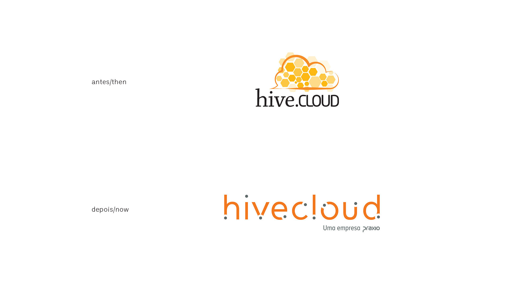
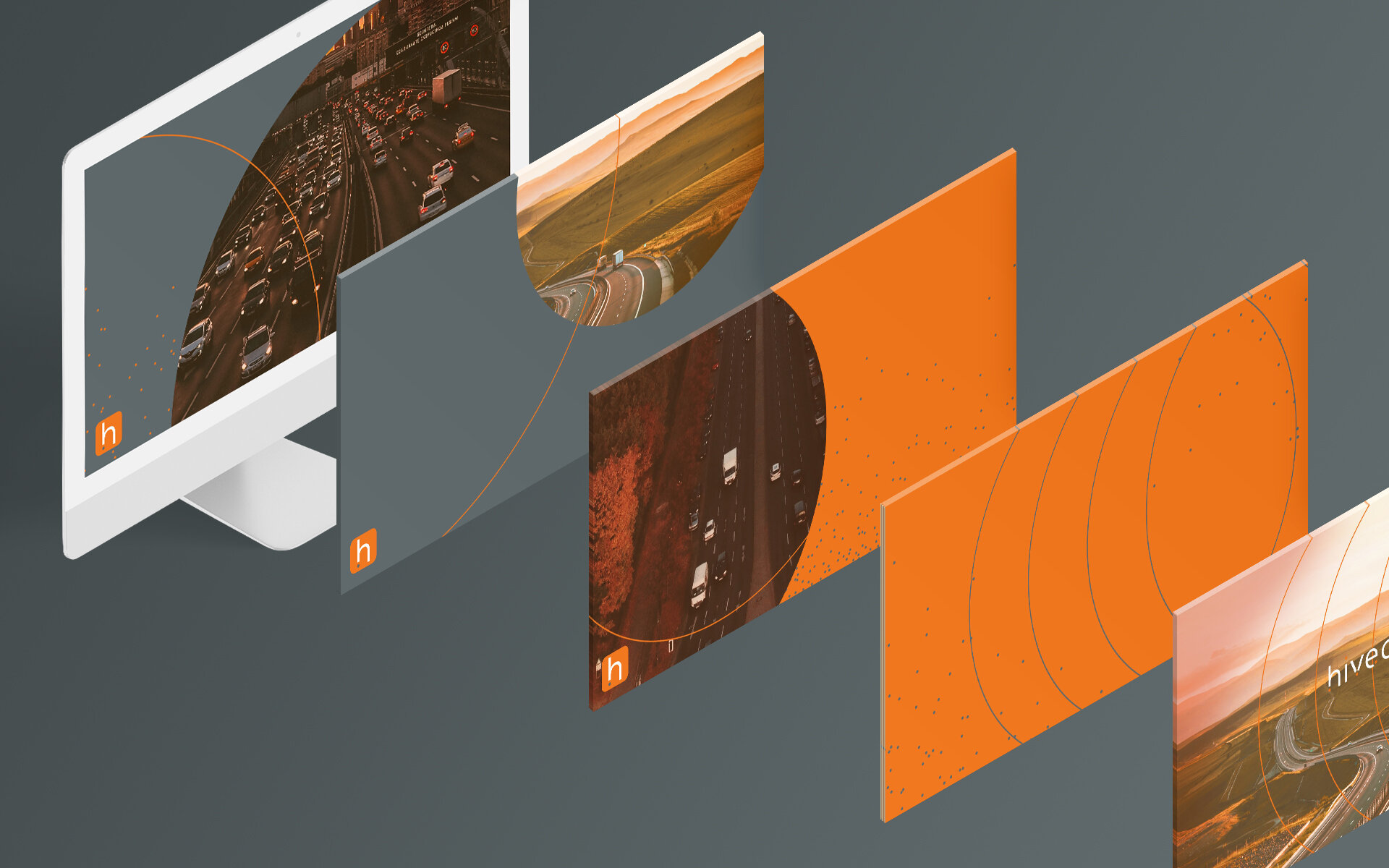
Besides not reflecting its problem-solving character, the company’s brand and its products needed a link and a design structure better suited to its market positioning.
In almost 20 years of existence, Hivecloud was not born with this name. To outline a strategy for redesigning its brand structure, it was essential to understand its history and the development processes of its products.
By understanding the creative structure that gave rise to the business, we arrived at the fundamental point that would guide the creative sequence.
Movement would be the starting point of the creative process. After all, Hivecloud’s business is closely tied to departures, arrivals and, above all, the space between them.
To solve both the brand and the system of elements in an uncomplicated, objective way, we sought the essence of graphic elements. And nothing represents synthesis better than a dot that, through its movement, suggests the drawing of the wordmark’s characters.
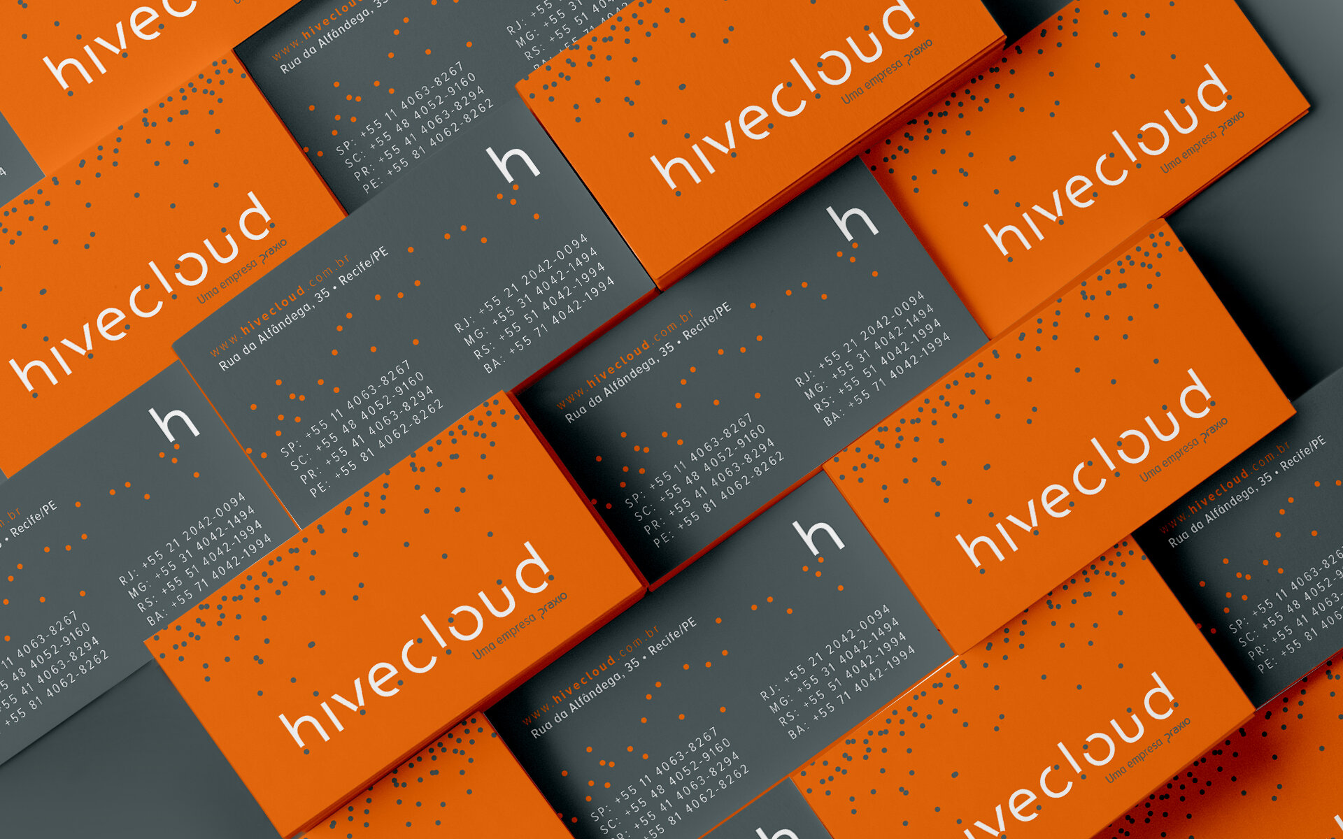
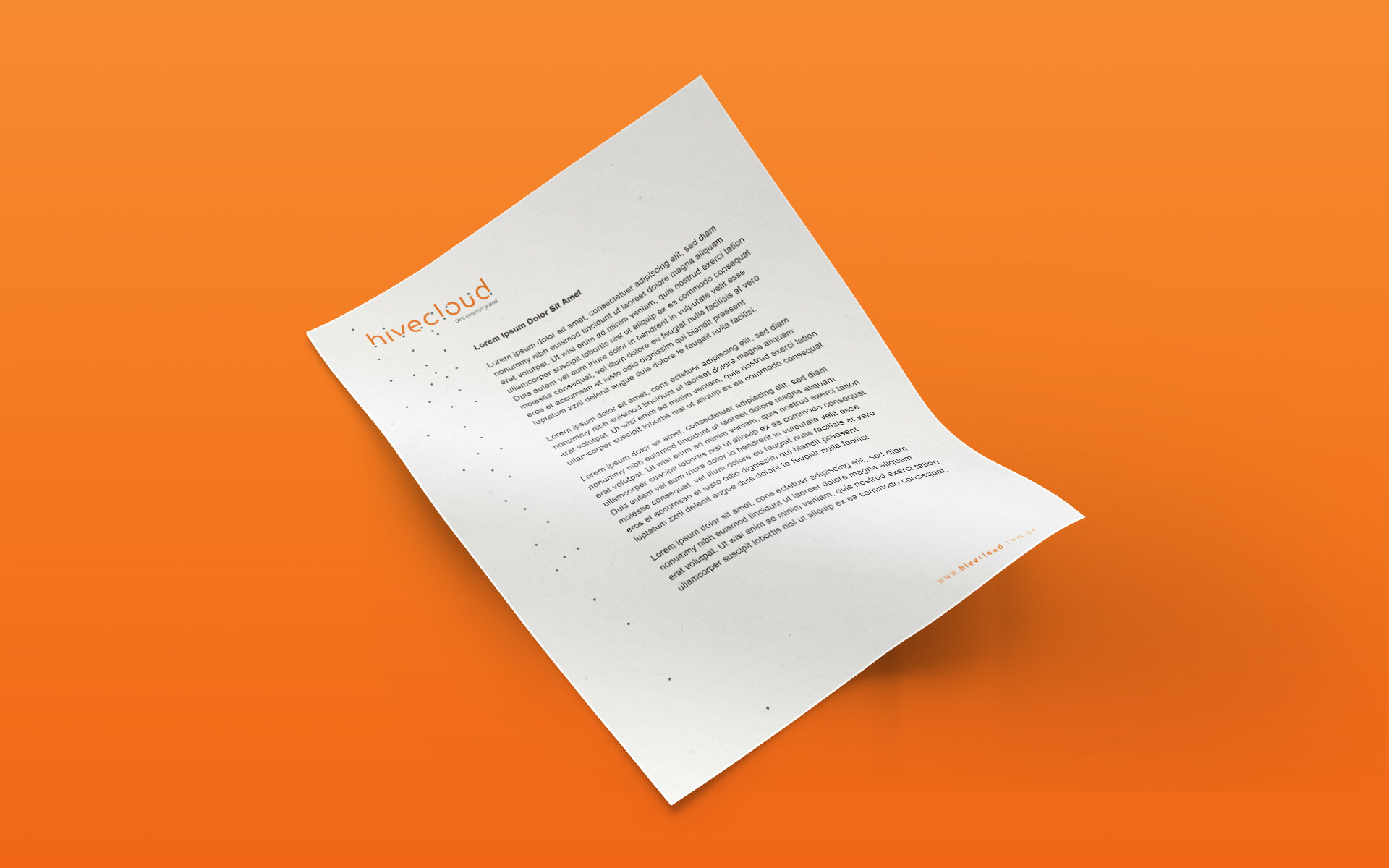
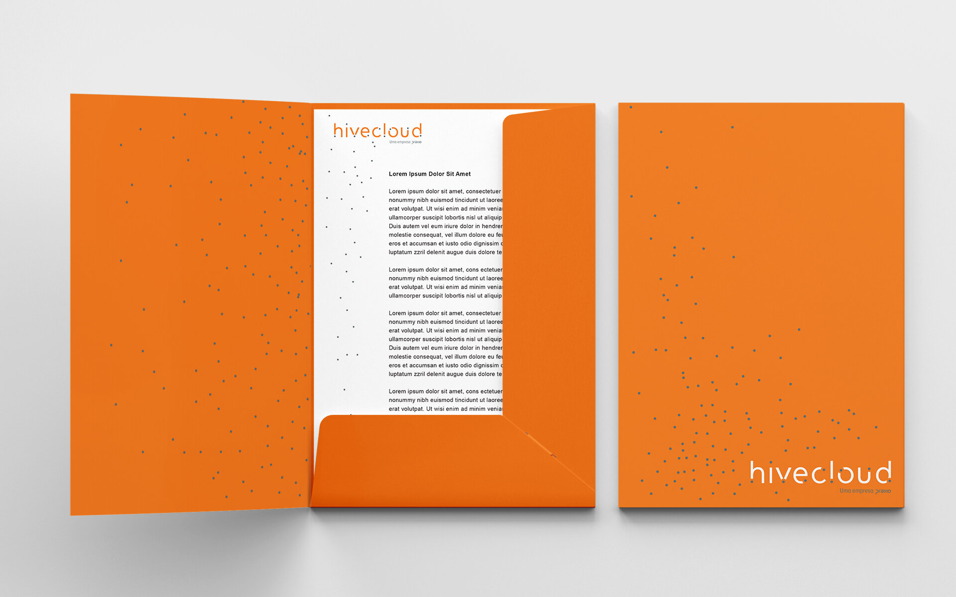
That same dot can move in animations, draw new shapes and return to the start, setting the pace for building a harmonious, striking visual system.