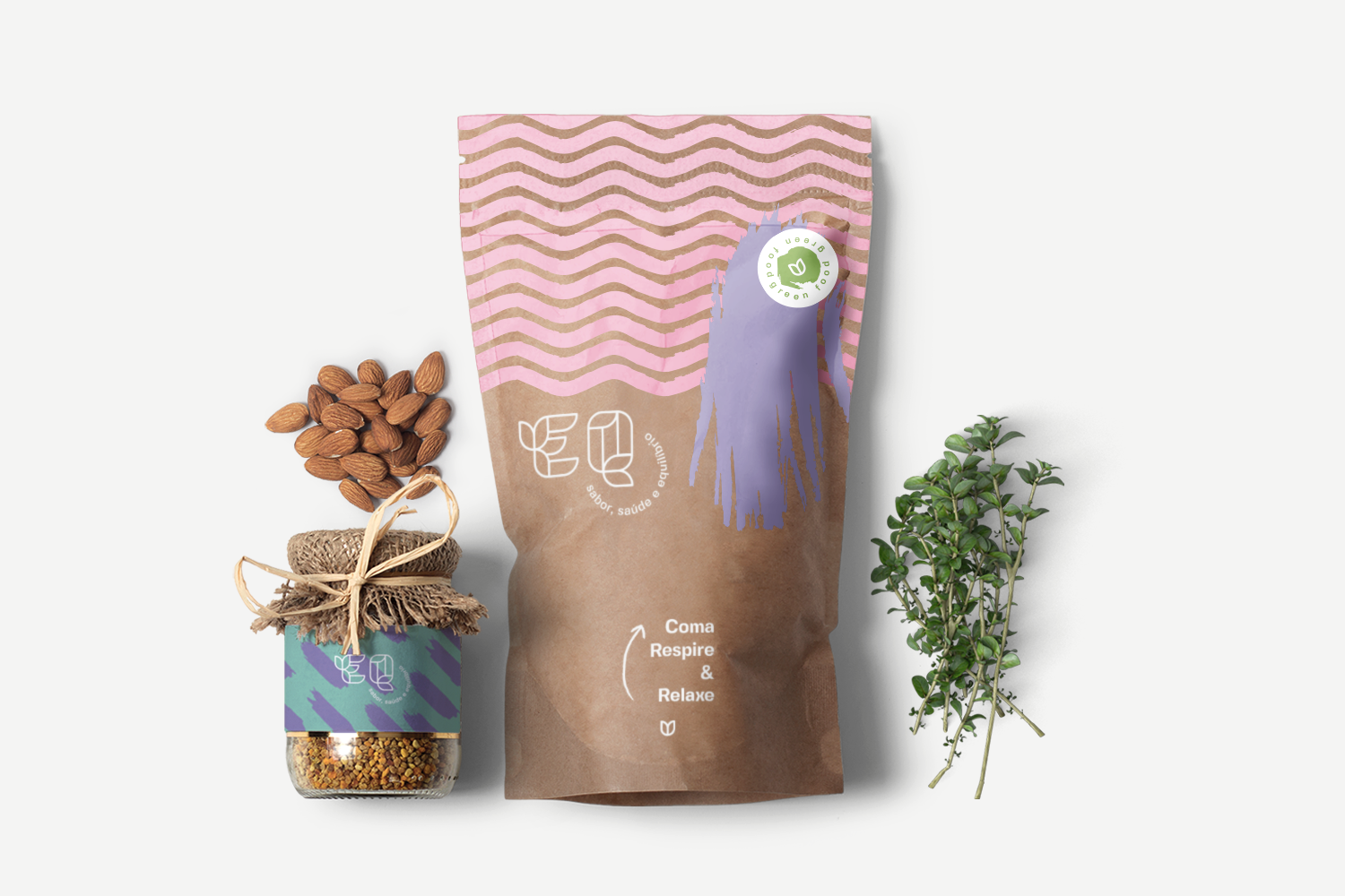
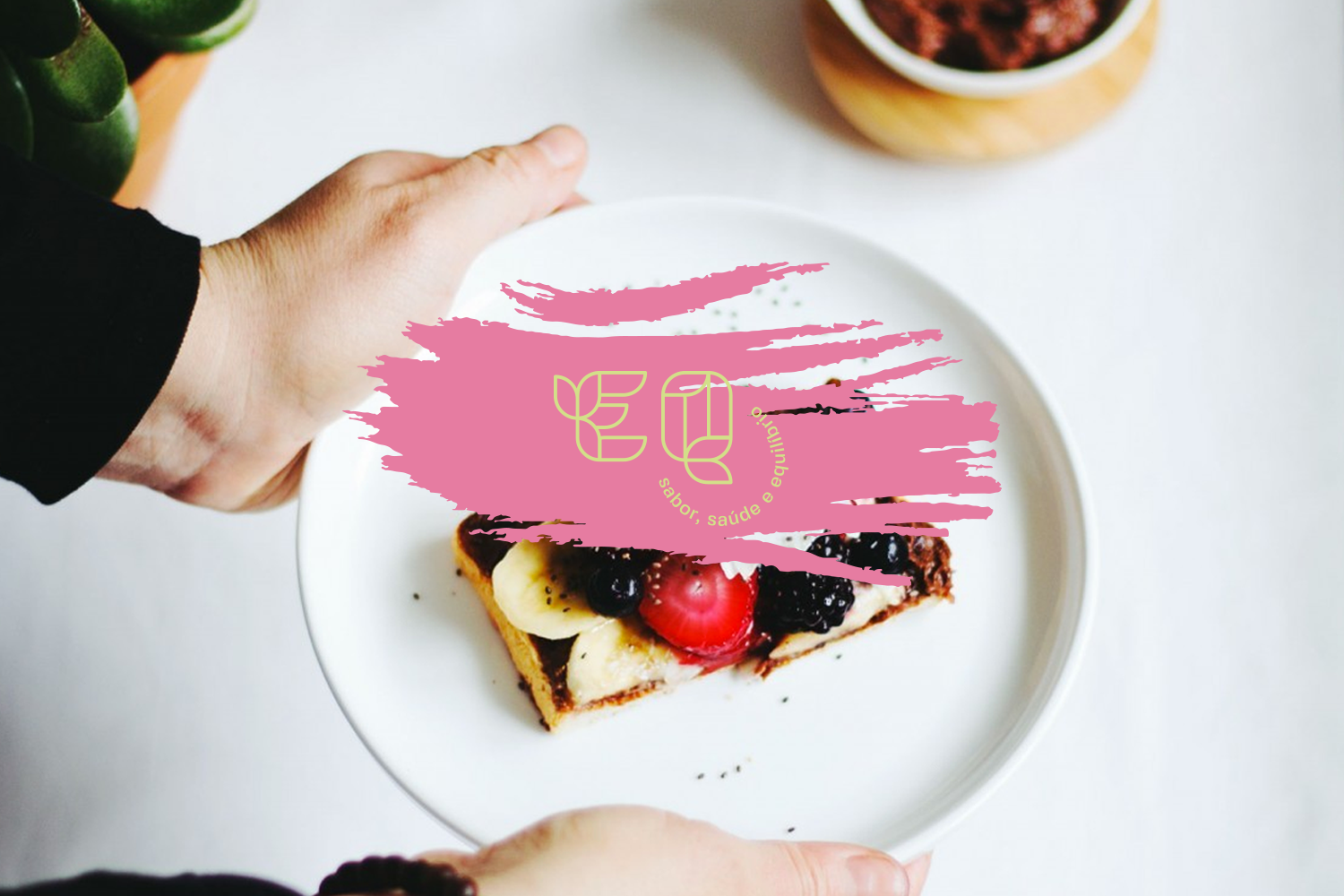
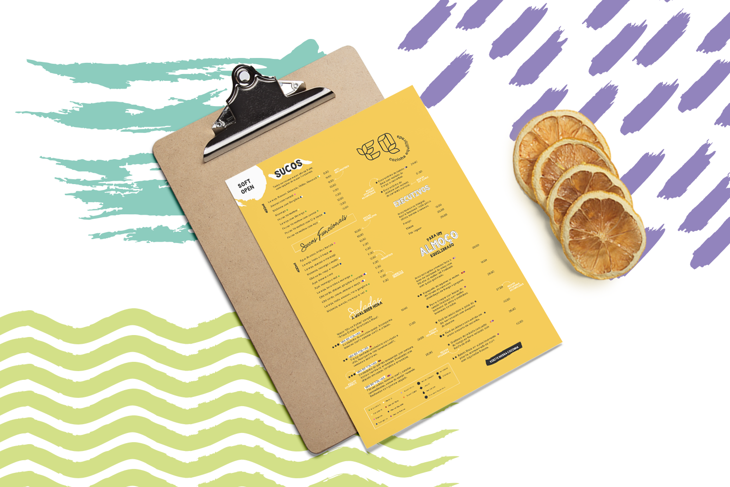
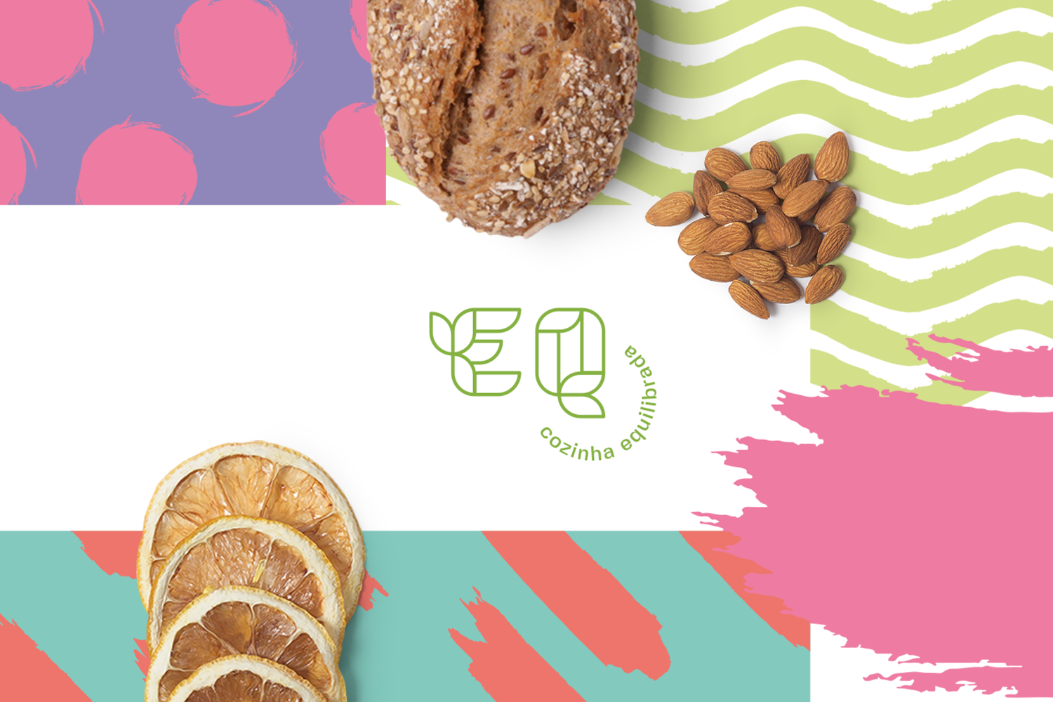
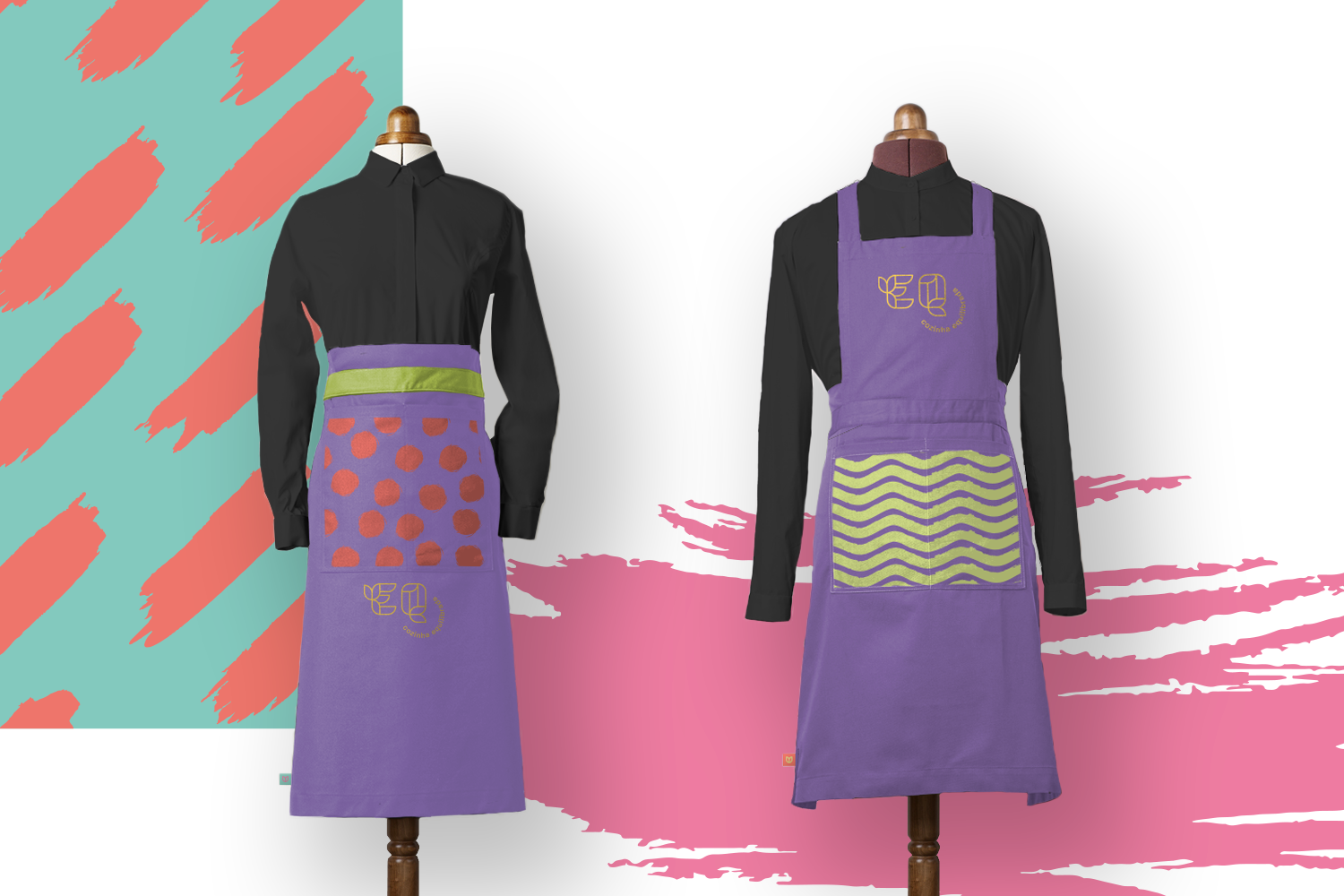
EQ for equilibrium. This is how the new brand presents itself, giving its name a purpose. Because it understands that the search for balance should be the north, the lighthouse that guides our actions. It runs through our habits, our relationships and, of course, our food. Balanced food is not just healthy food. It is also enjoyable, respectful and considerate of those around it. The visual identity of EQ Cozinha Equilibrada seeks this balance in its elements, from the lightness of its shapes resting on a firm horizontal axis to a color palette of comfortable tones contrasting with the weight of darker colors. Its graphics are democratic, with shapes of different paths, angles and types. The whole range of elements seeks nothing but visual balance, to compose a rich, inviting identity.