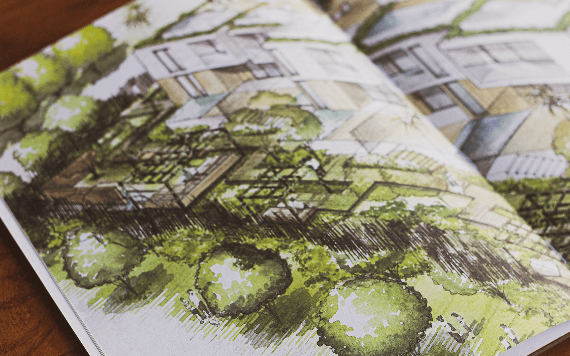
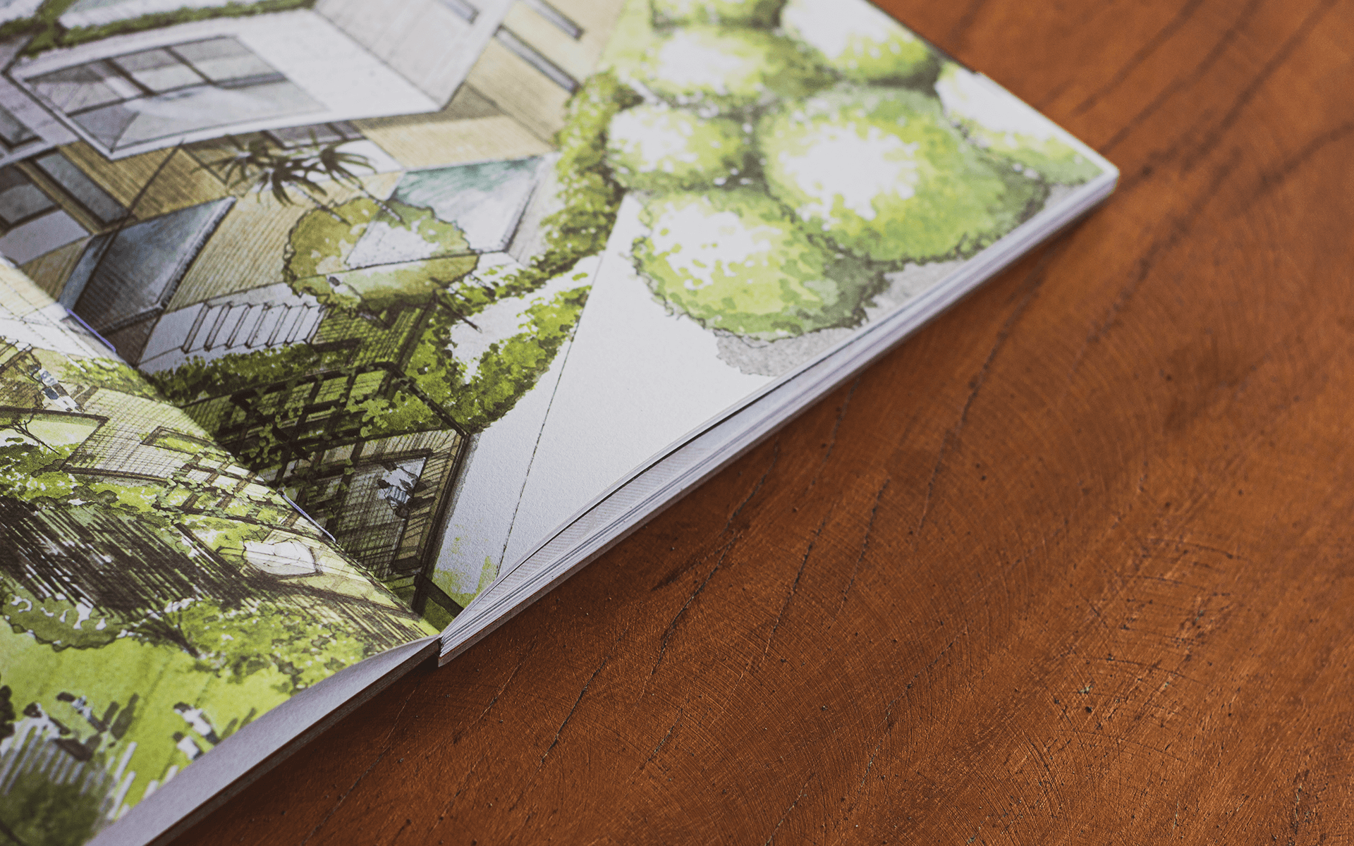
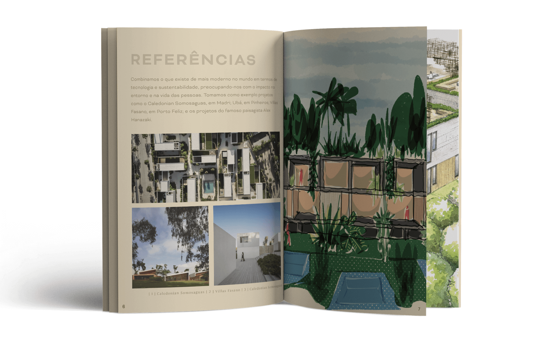
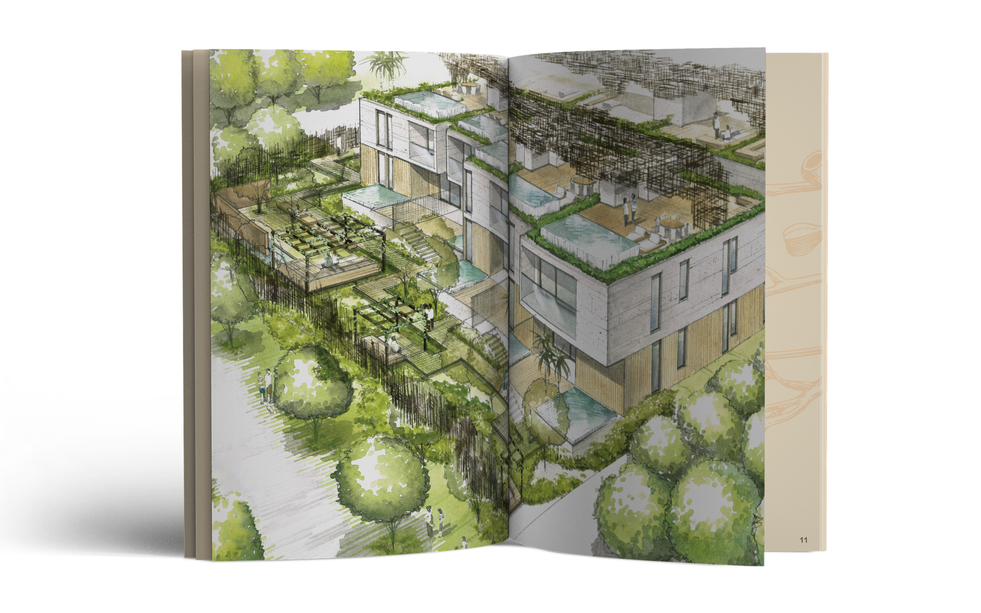
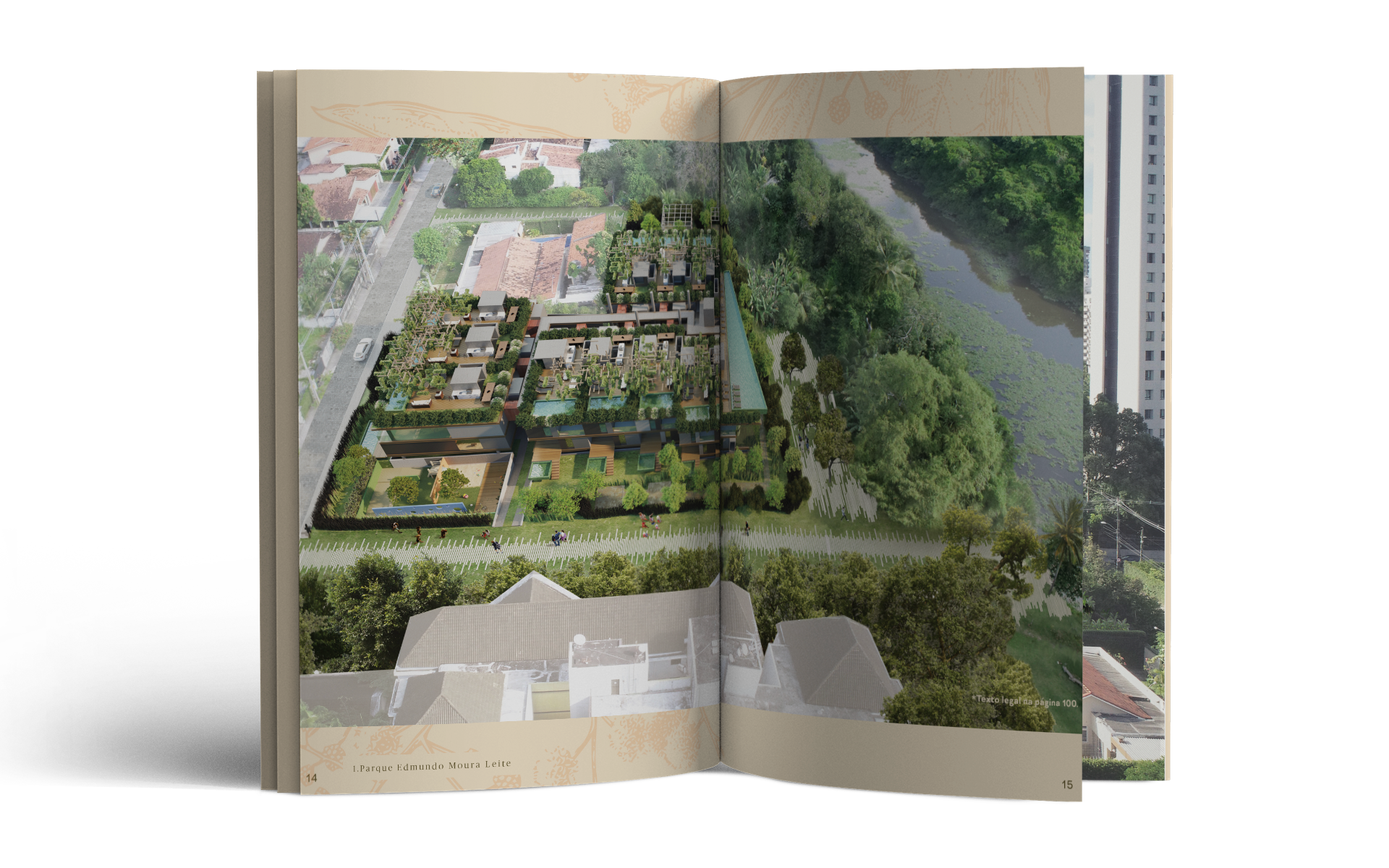
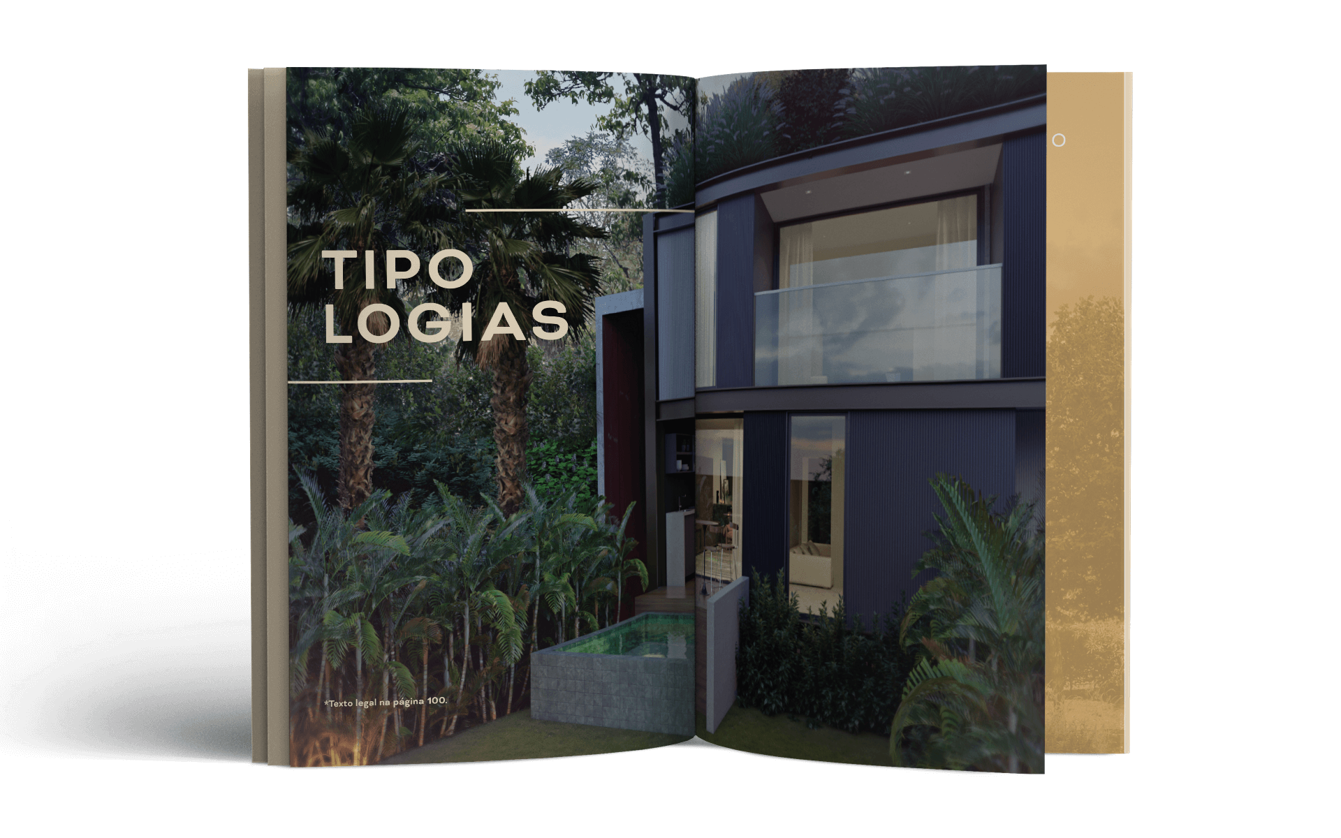
Arbo Townhouses is another Haut development that breaks away from the logic that has guided urban planning in Recife for so many years. Setting aside the city’s rule of building vertically, it would be more fitting to call the Arbo apartments houses, given their horizontal layout and lush gardens. The landscaping, which plays a special role in the project, is by the renowned Alex Hanazaki, who spread several squares across its common area, as well as private gardens in each apartment.
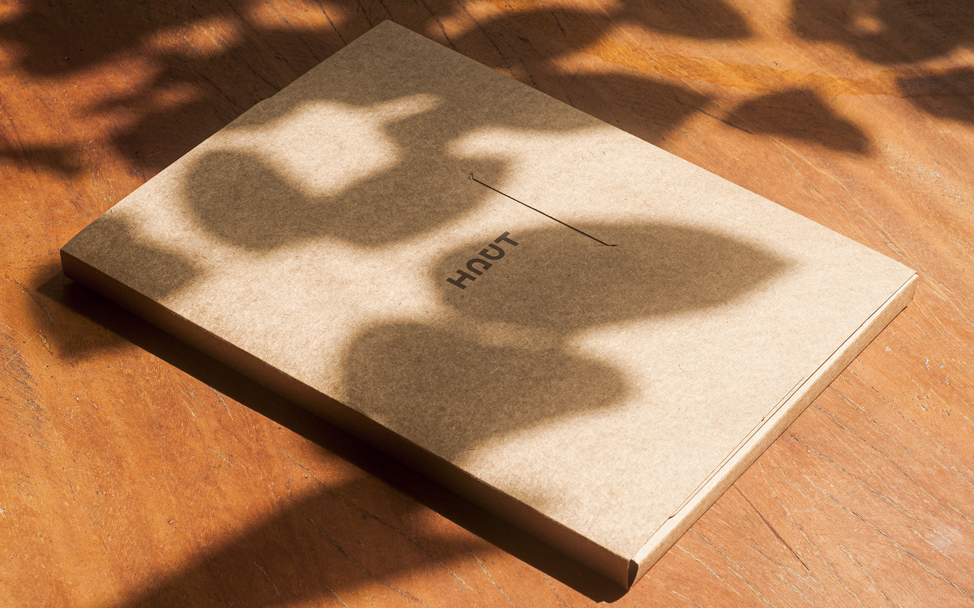
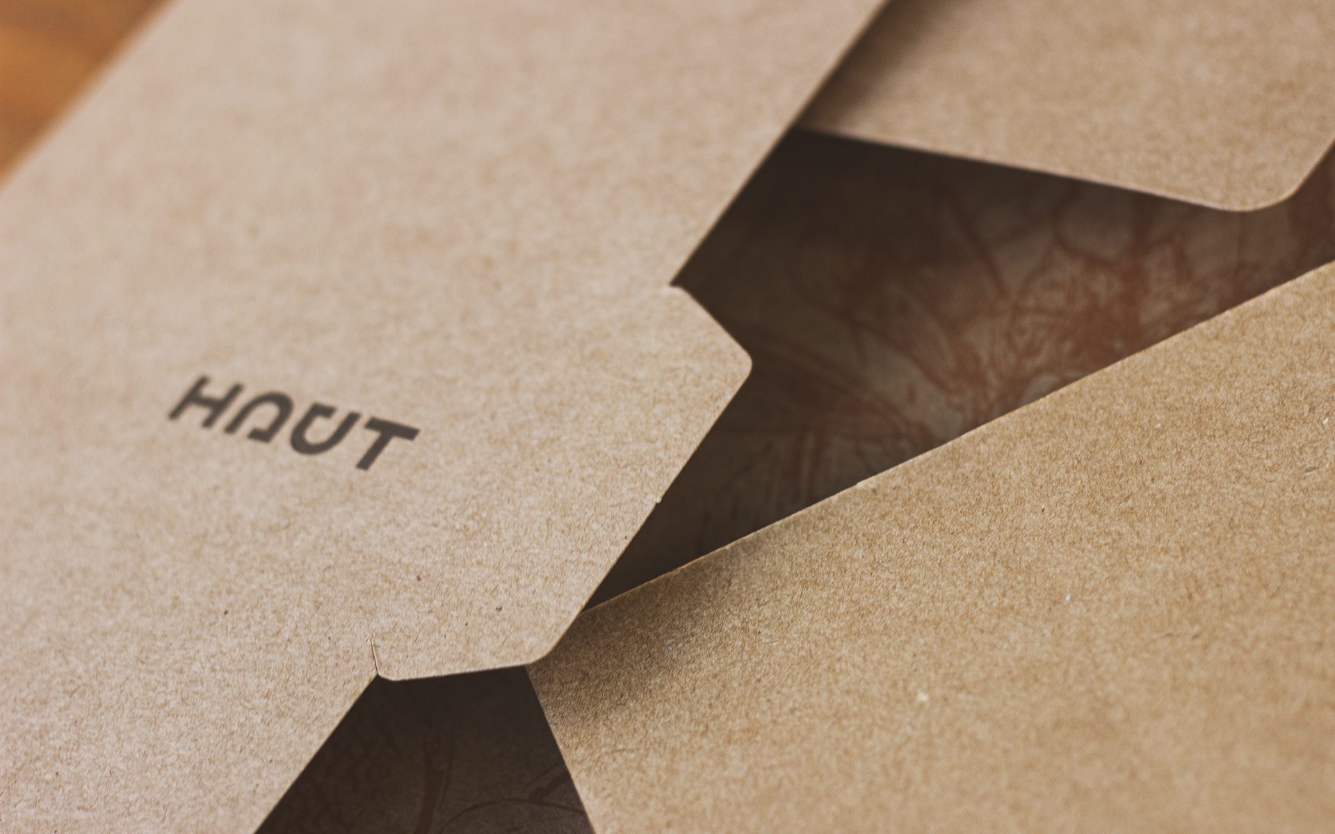
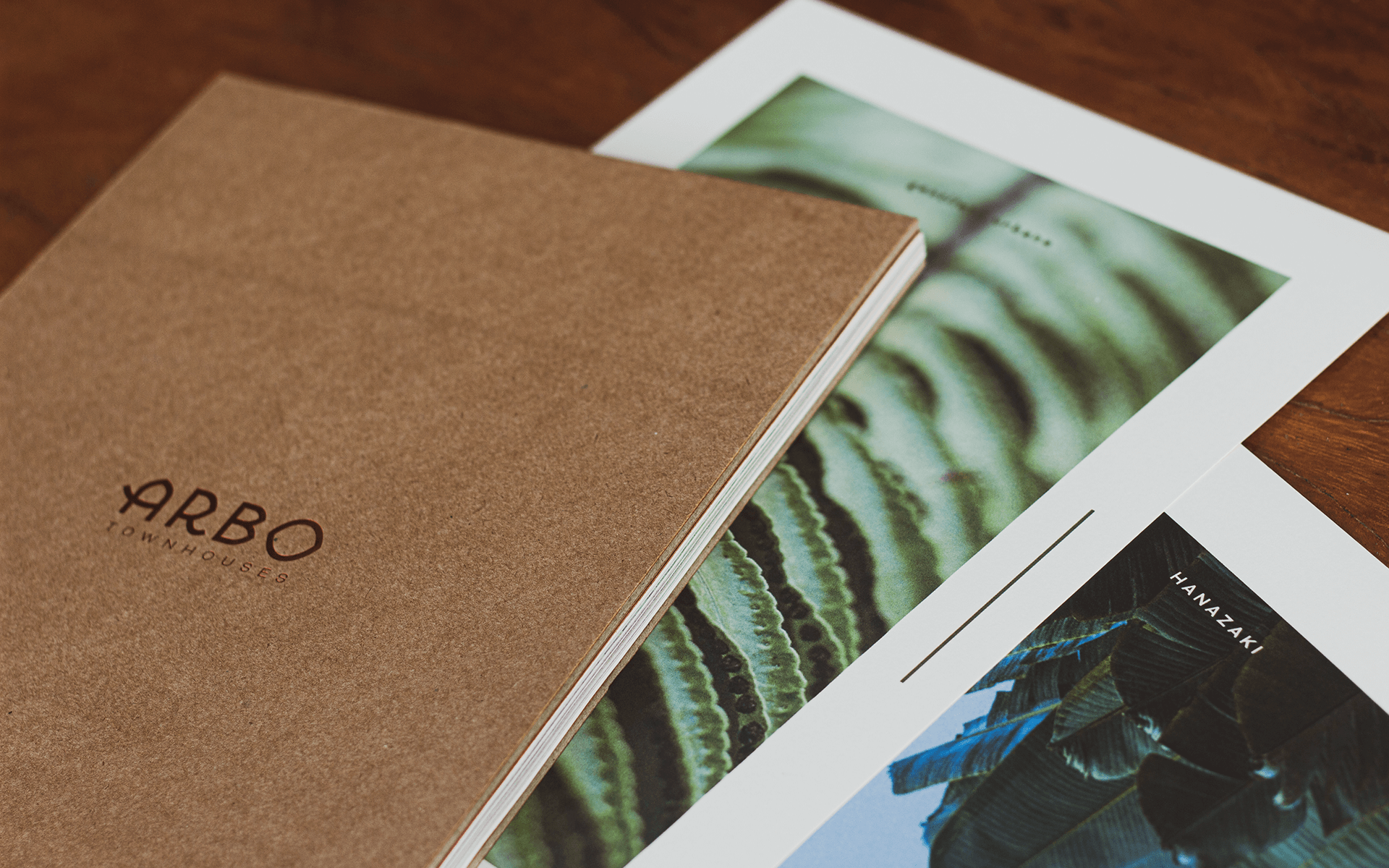
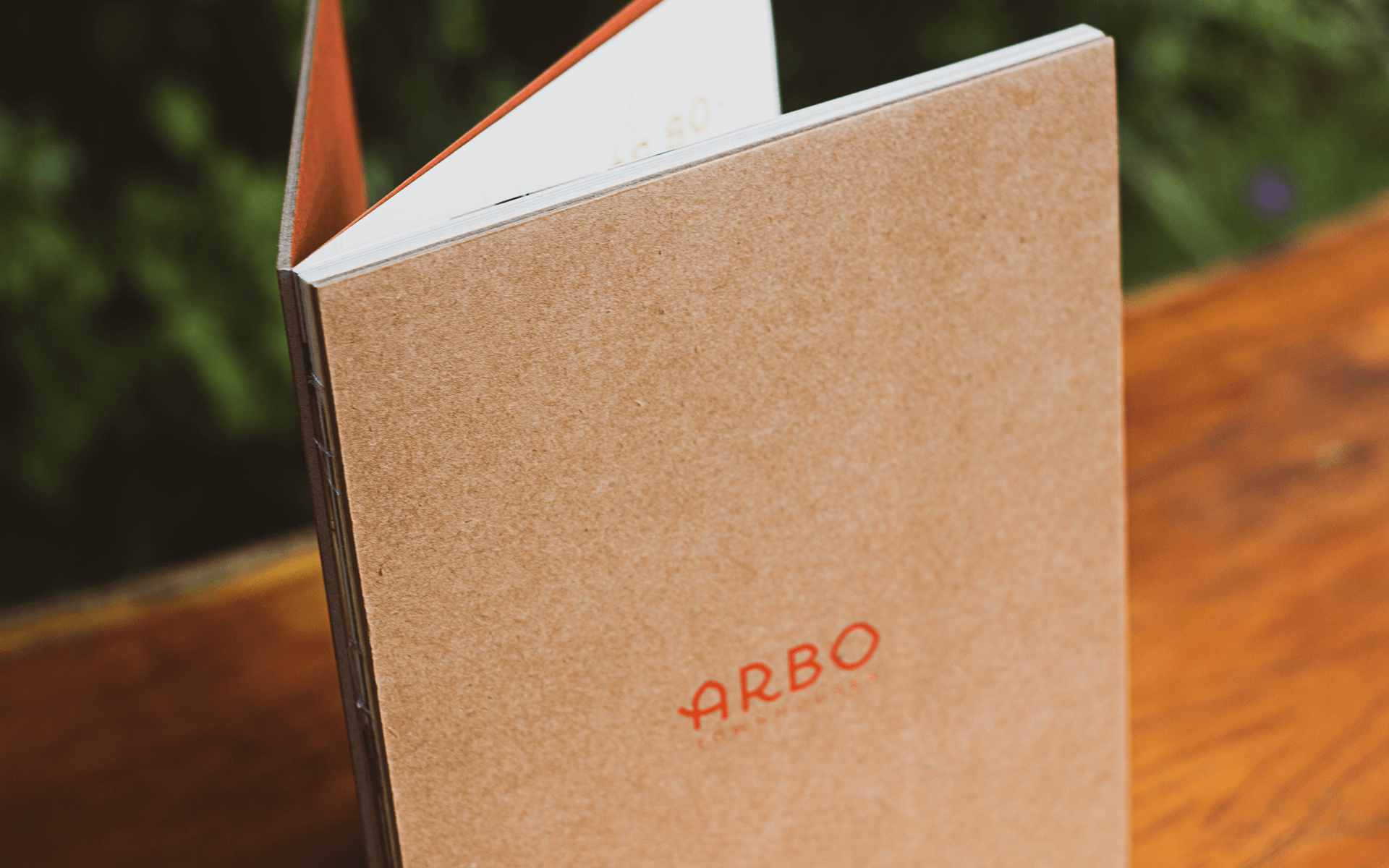
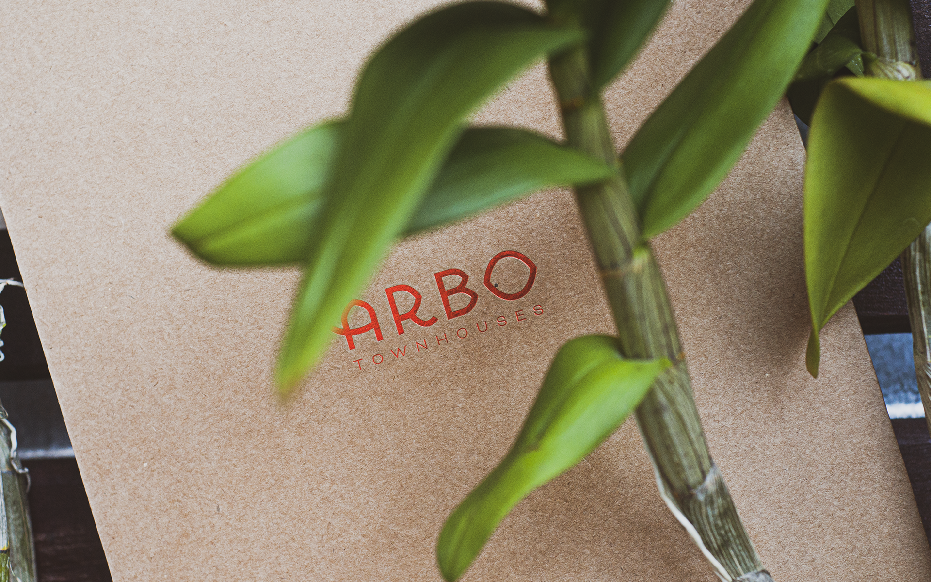
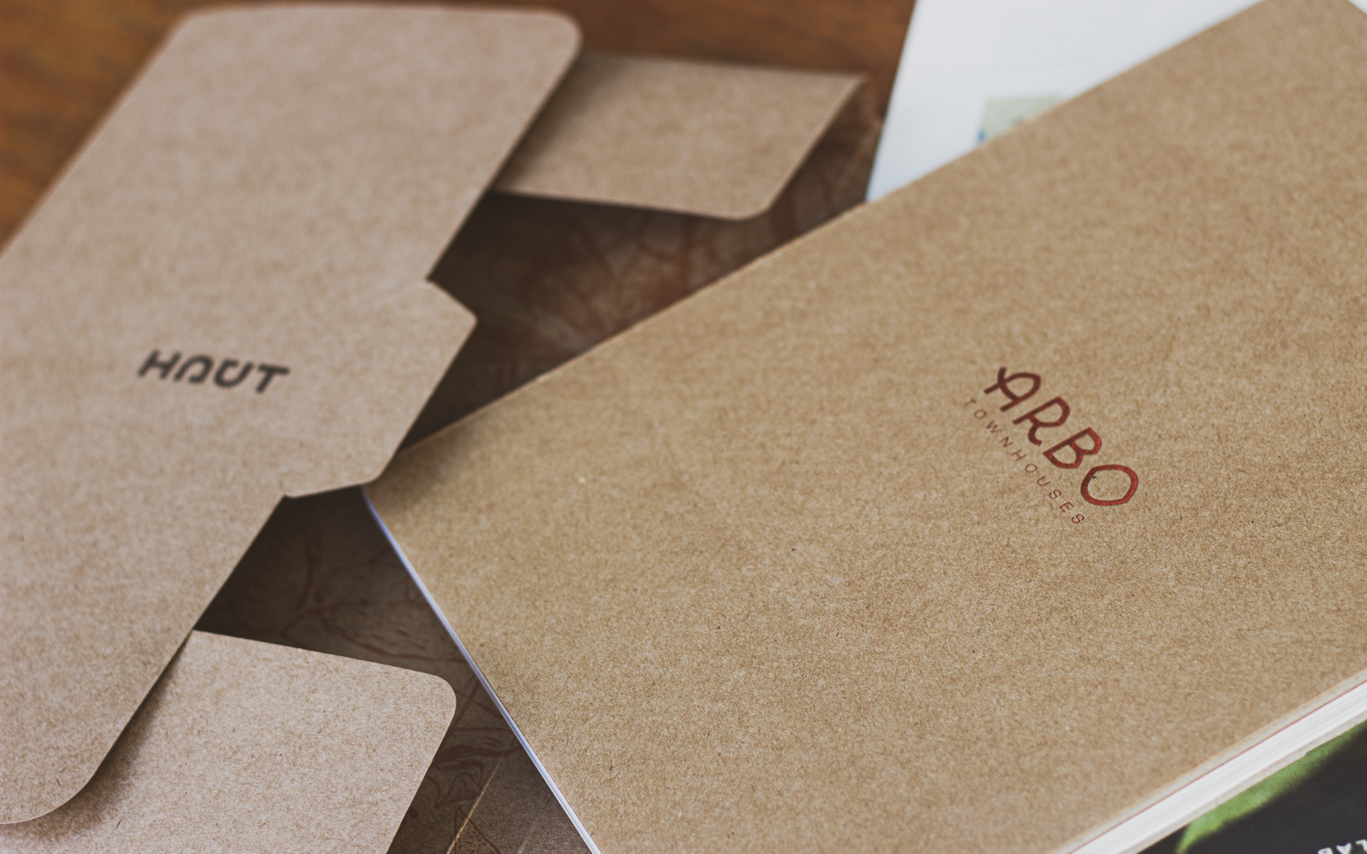
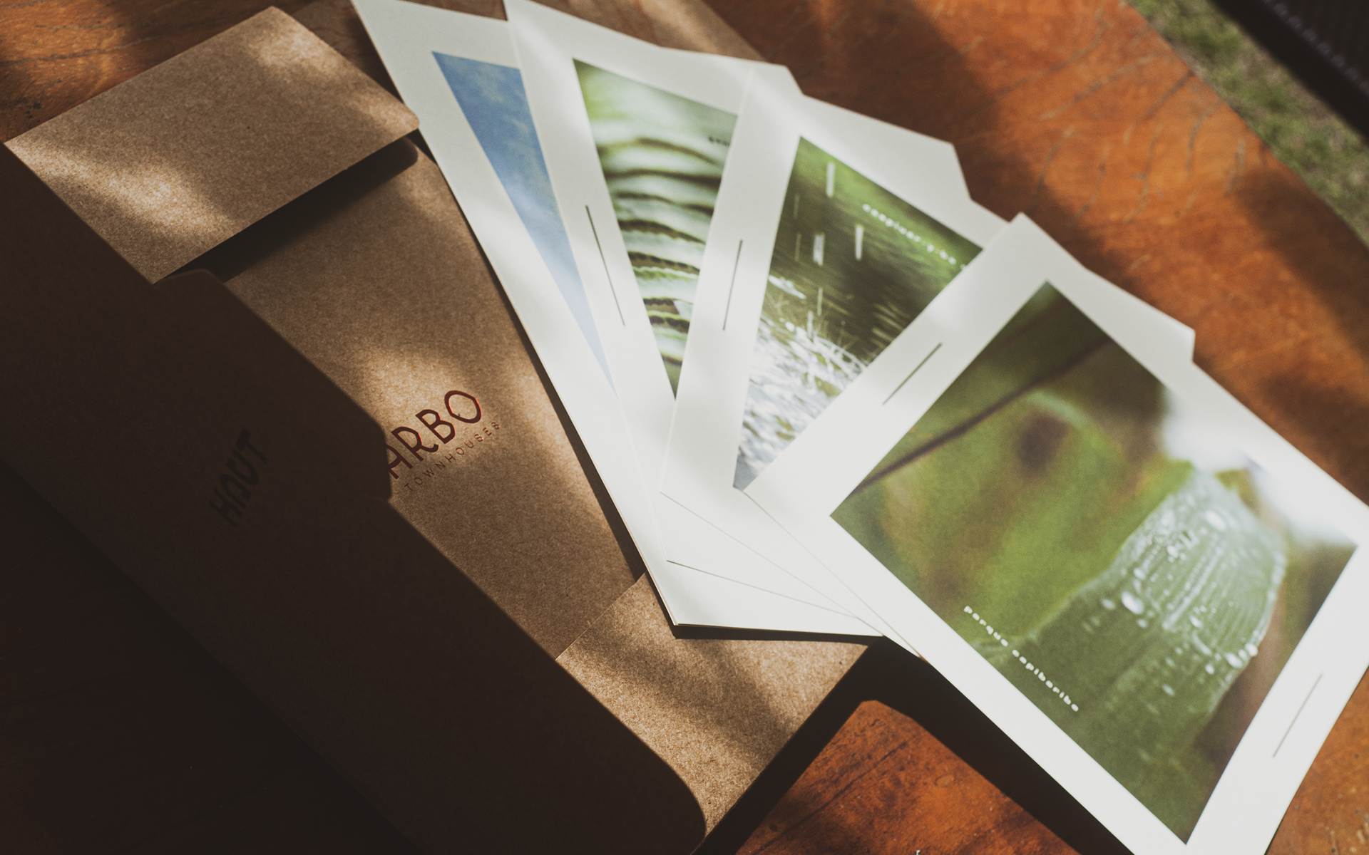
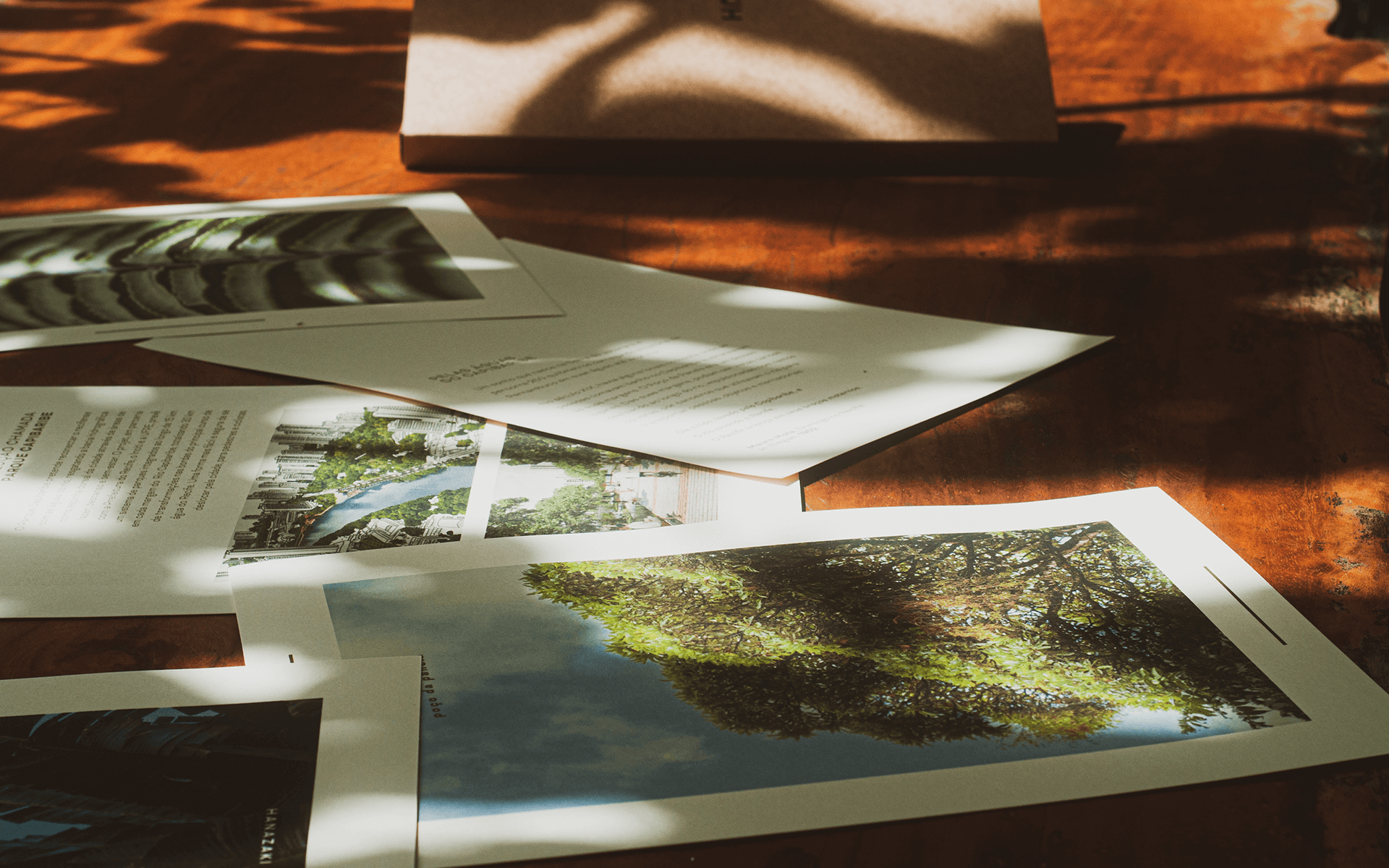
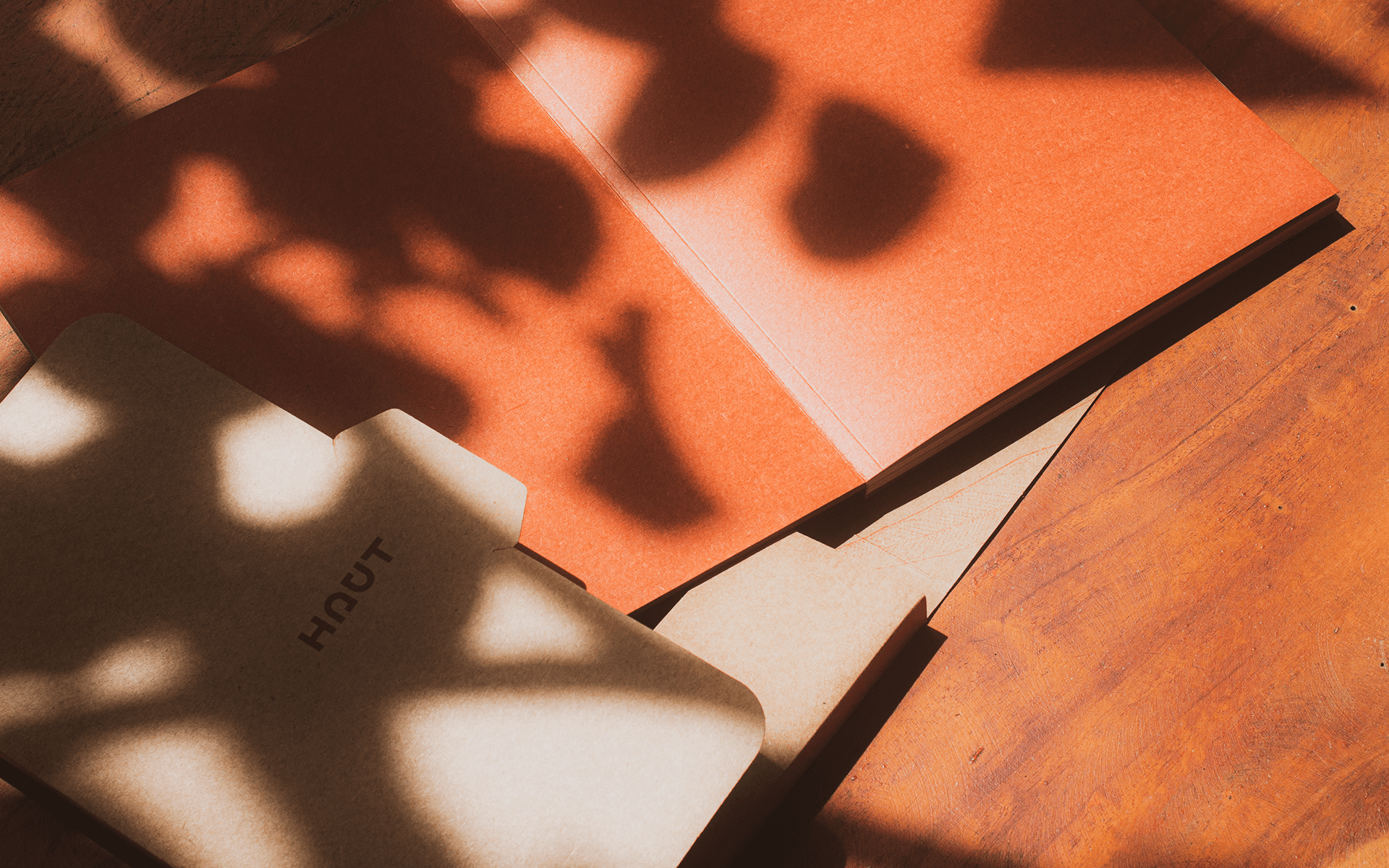
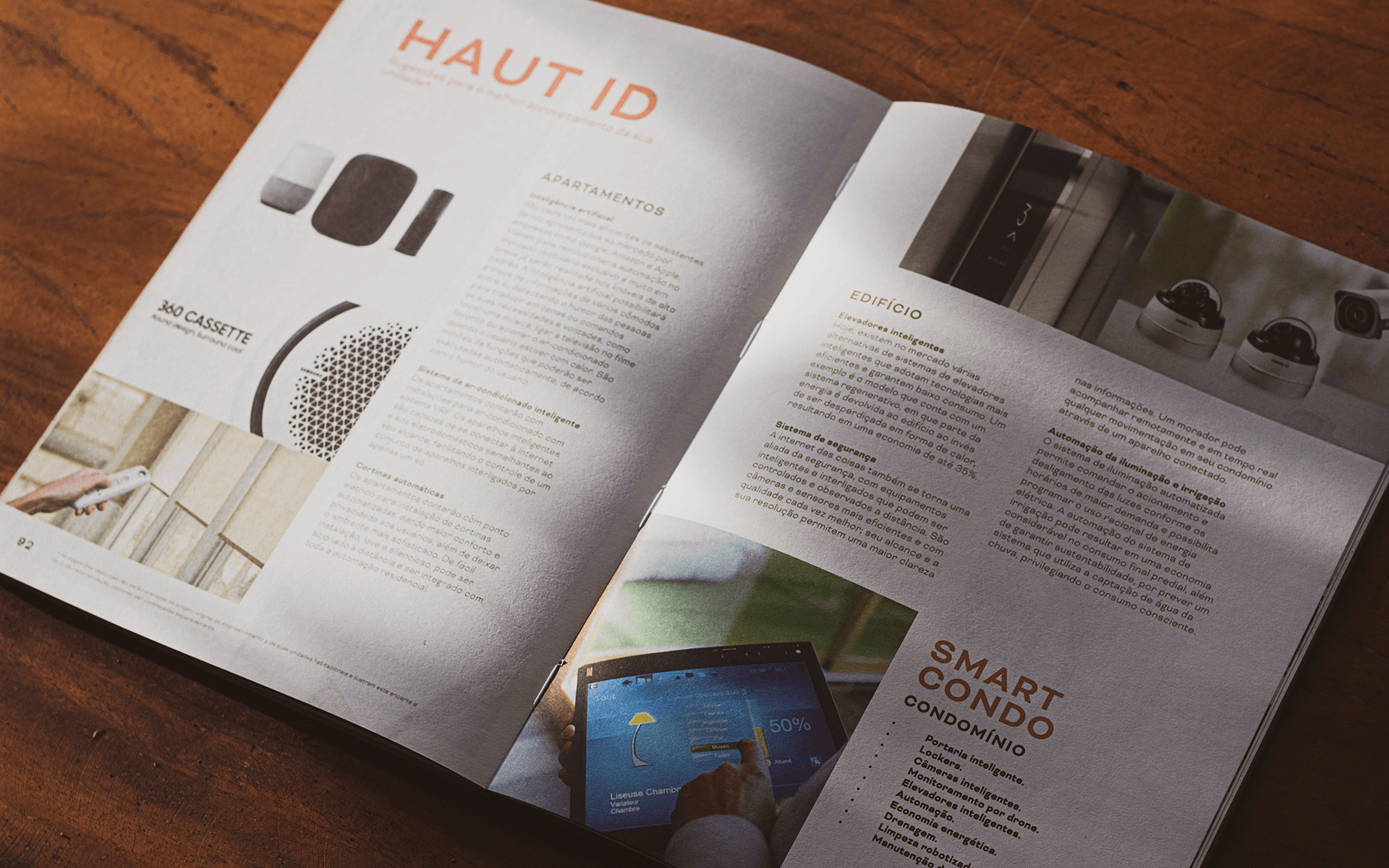
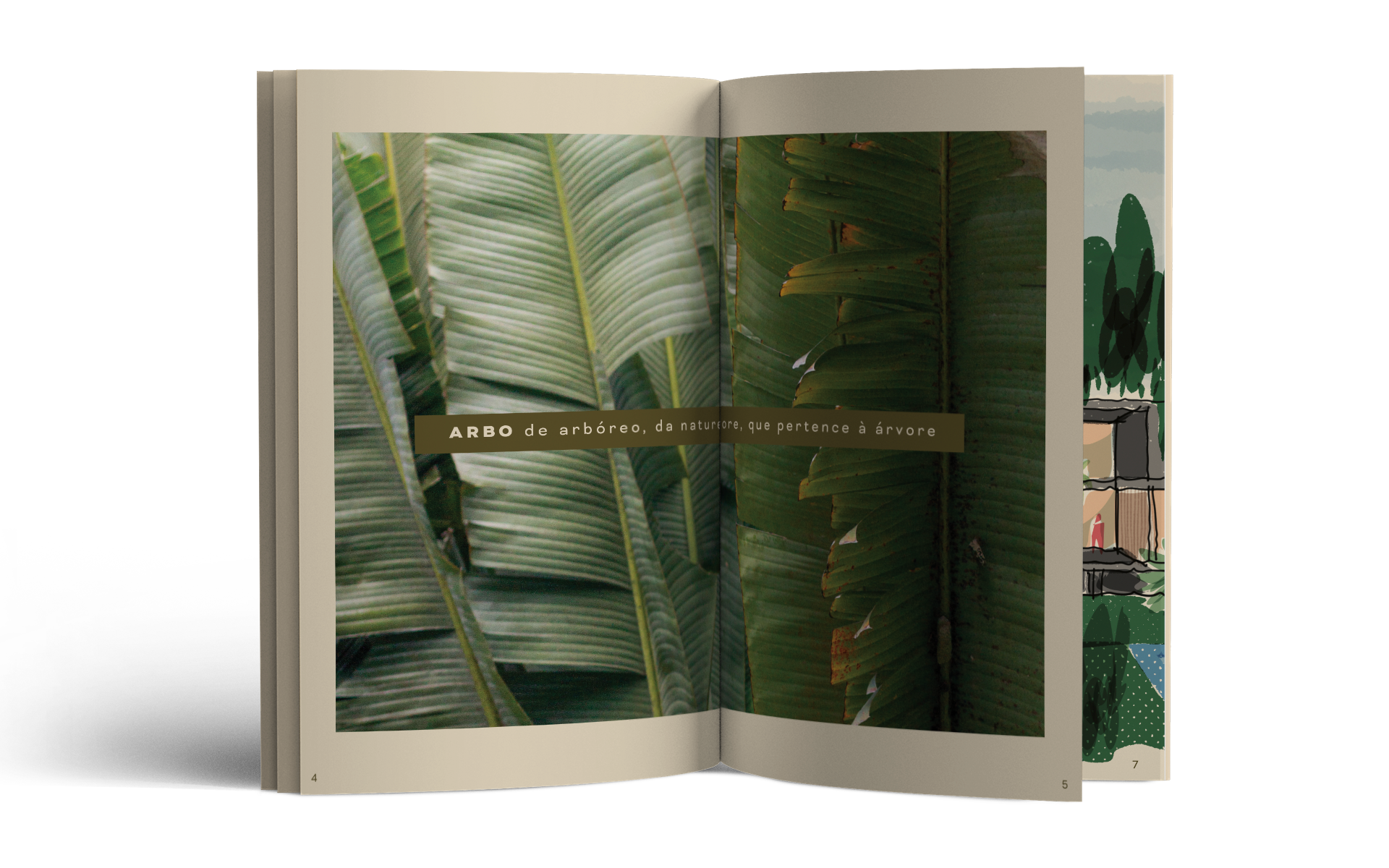
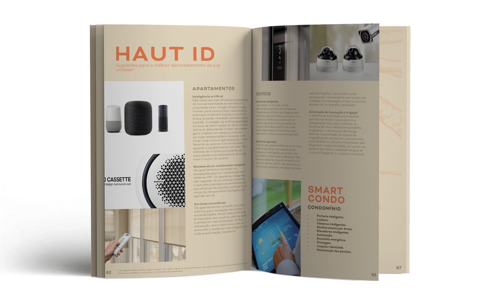
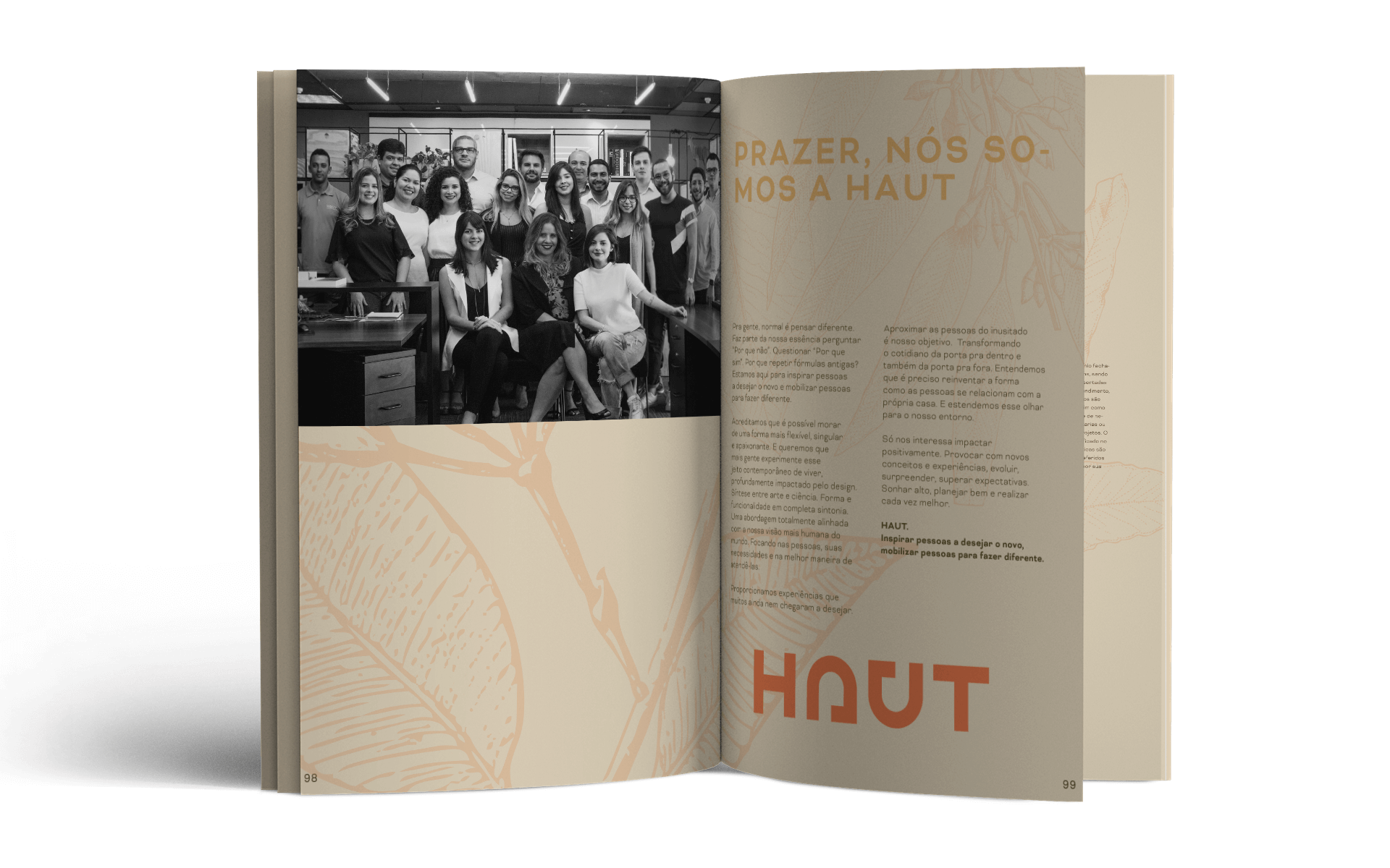
Besides developing the development’s visual identity, we were responsible for creating a book that could express everything that sets the project apart. More than selling the units, the goal was for owners to hold a piece with sentimental value, one that would mark a new stage of life and have a special place in the new home. It was decided from the start that the book would come with poster sheets serving a dual purpose: highlighting special features of the project and, on the reverse, becoming small framed prints to decorate the home. The book would share the format of these sheets so they could form a single block and be delivered in special packaging. The papers were carefully chosen to convey the tactile feel of the project’s surroundings. They have strongly tactile qualities for the cover and packaging (kraft for the packaging and kraft laminated to Paraná board for the cover) and allow the images to be printed in the desired tone for the inner pages (Pólen), while also making for more comfortable reading.
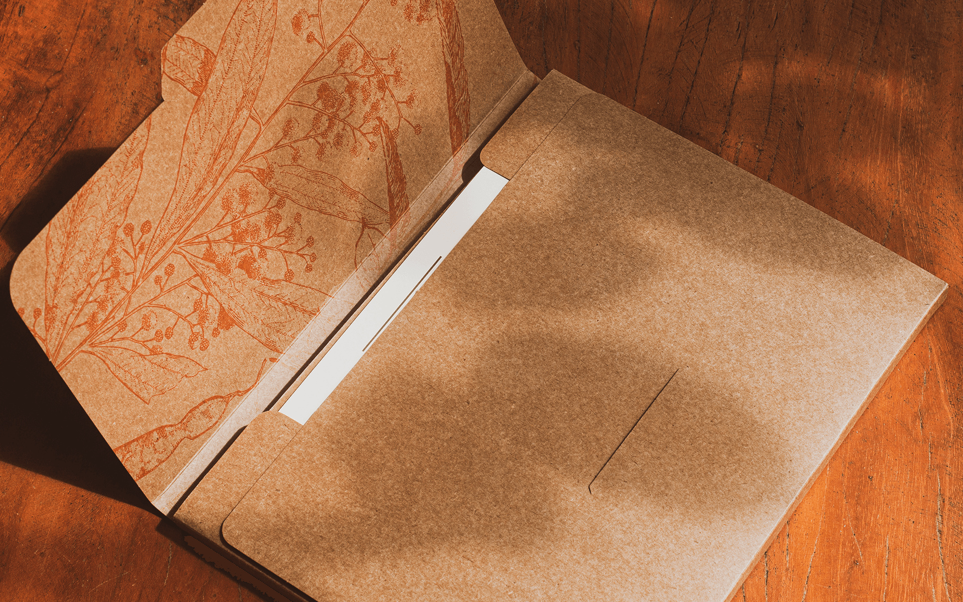
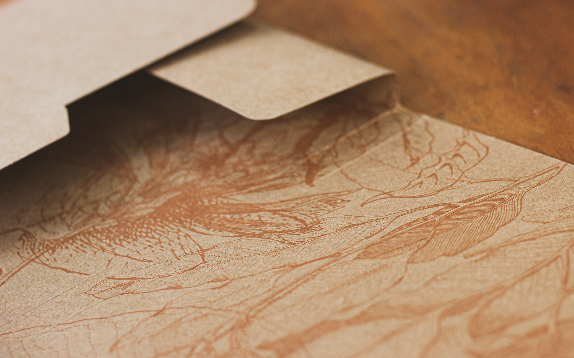
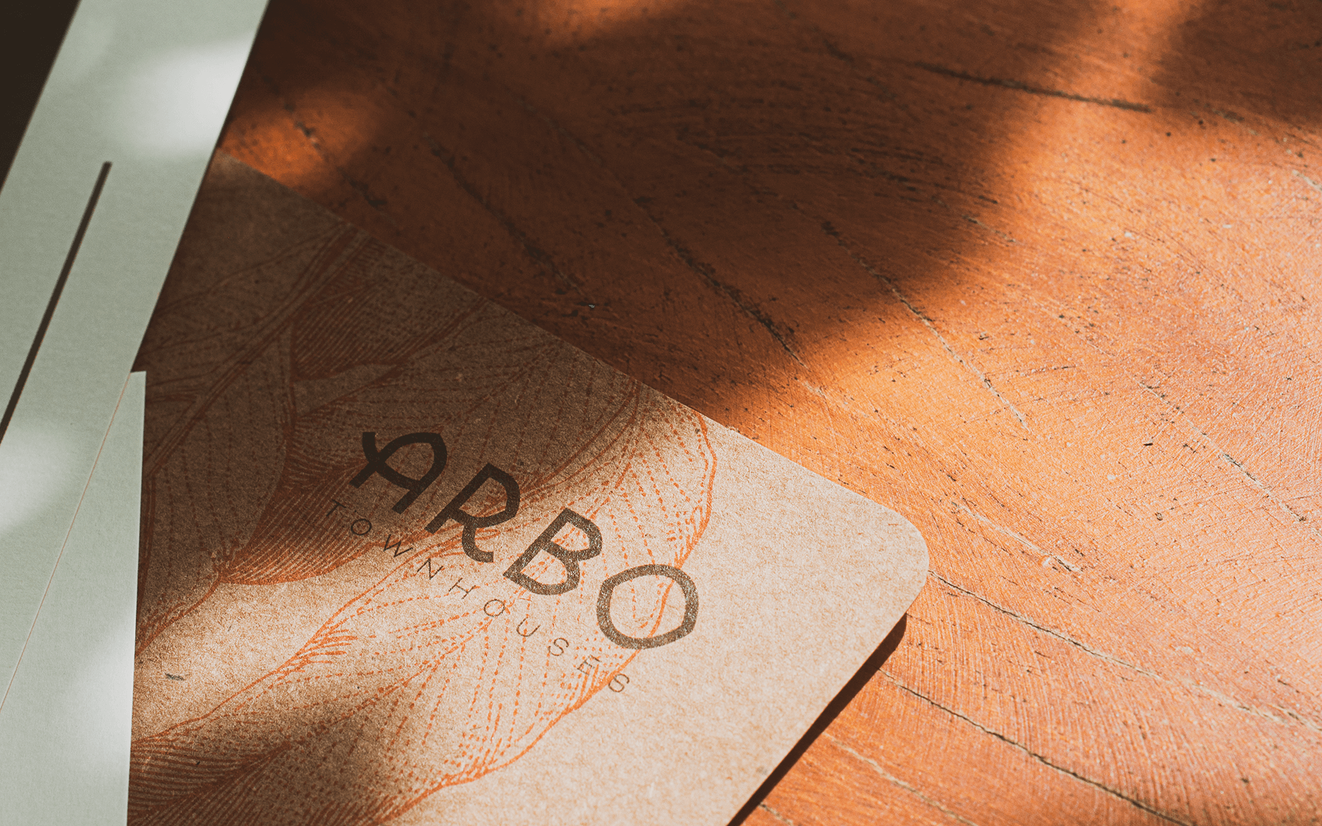
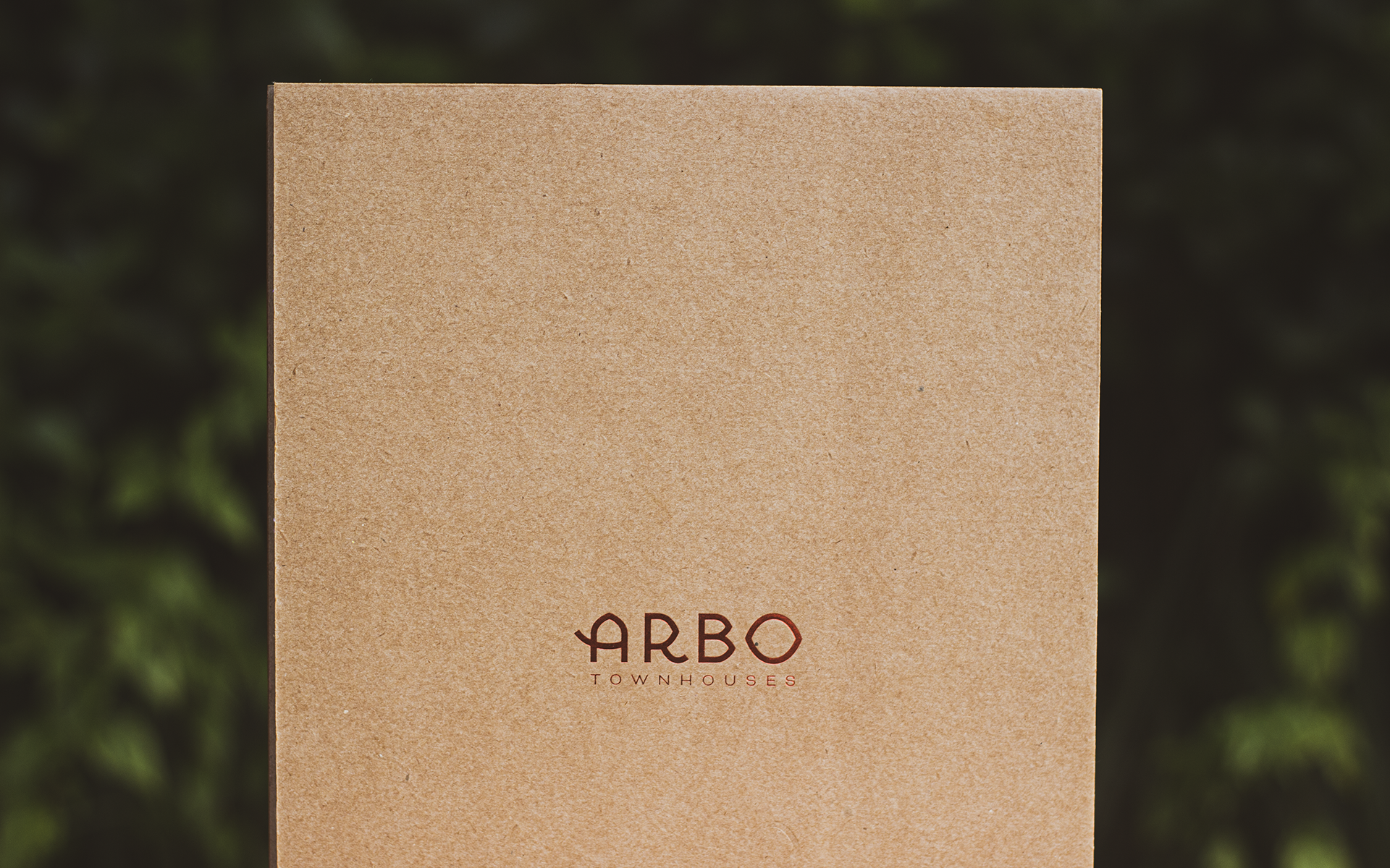
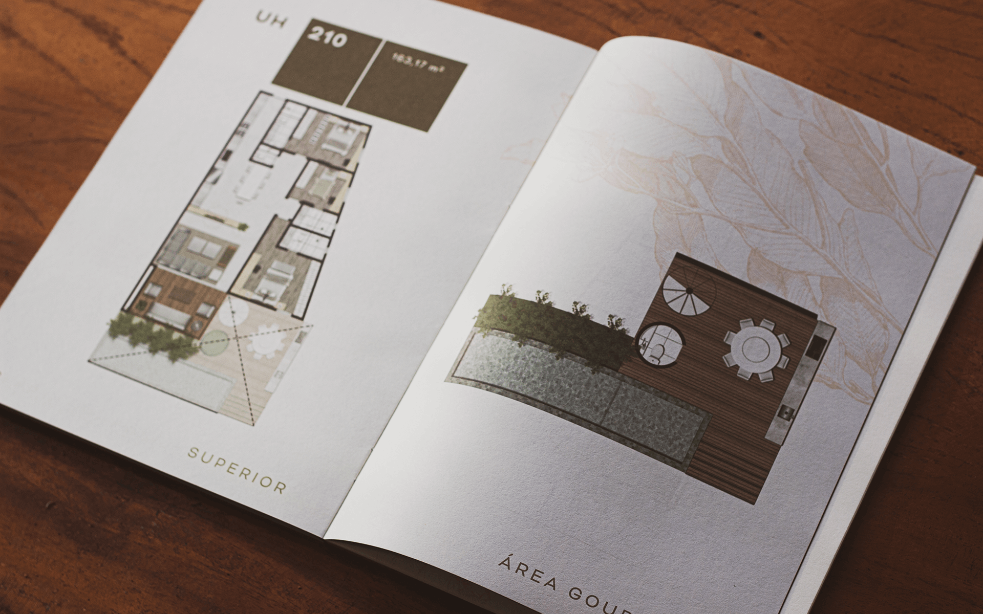
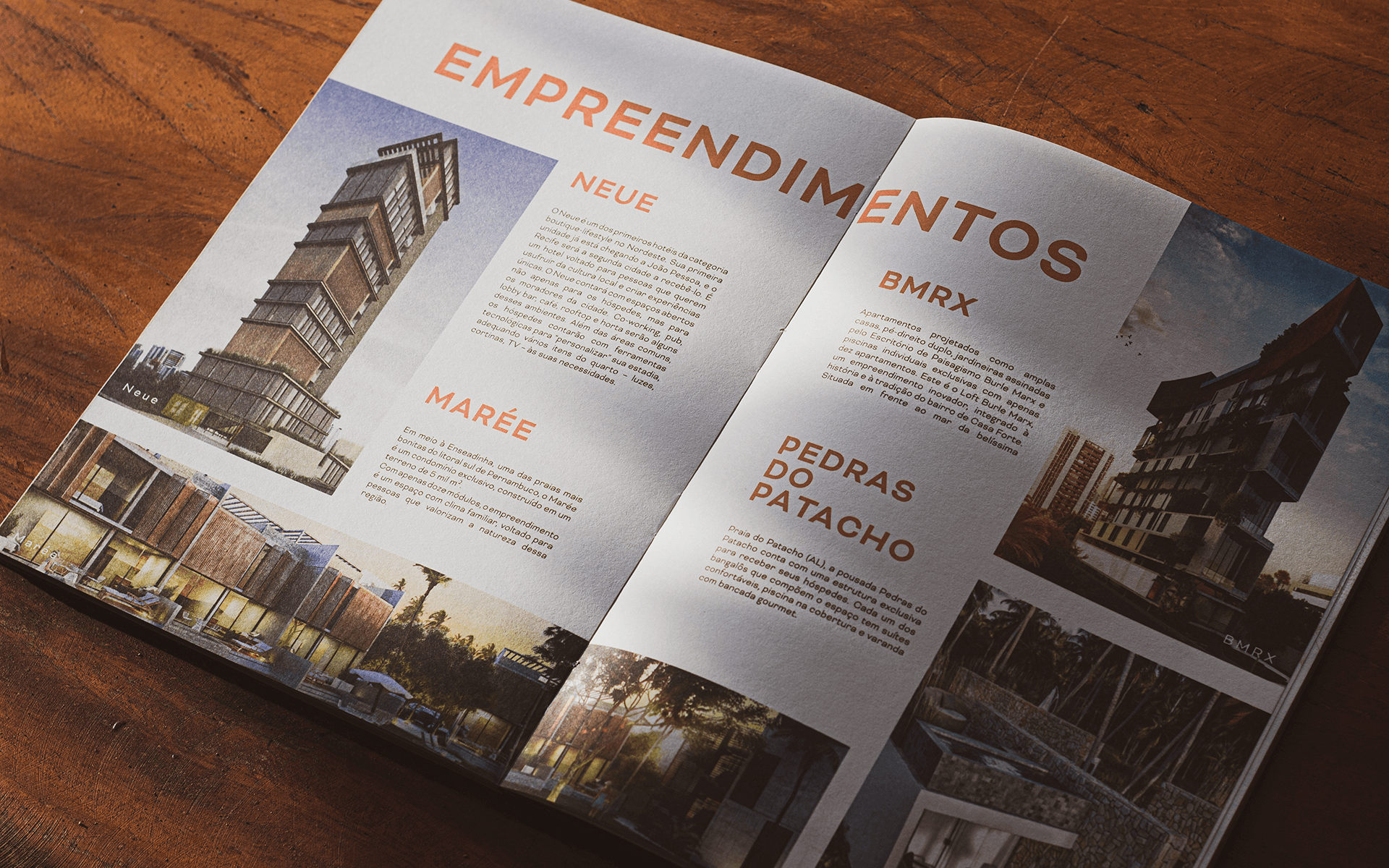
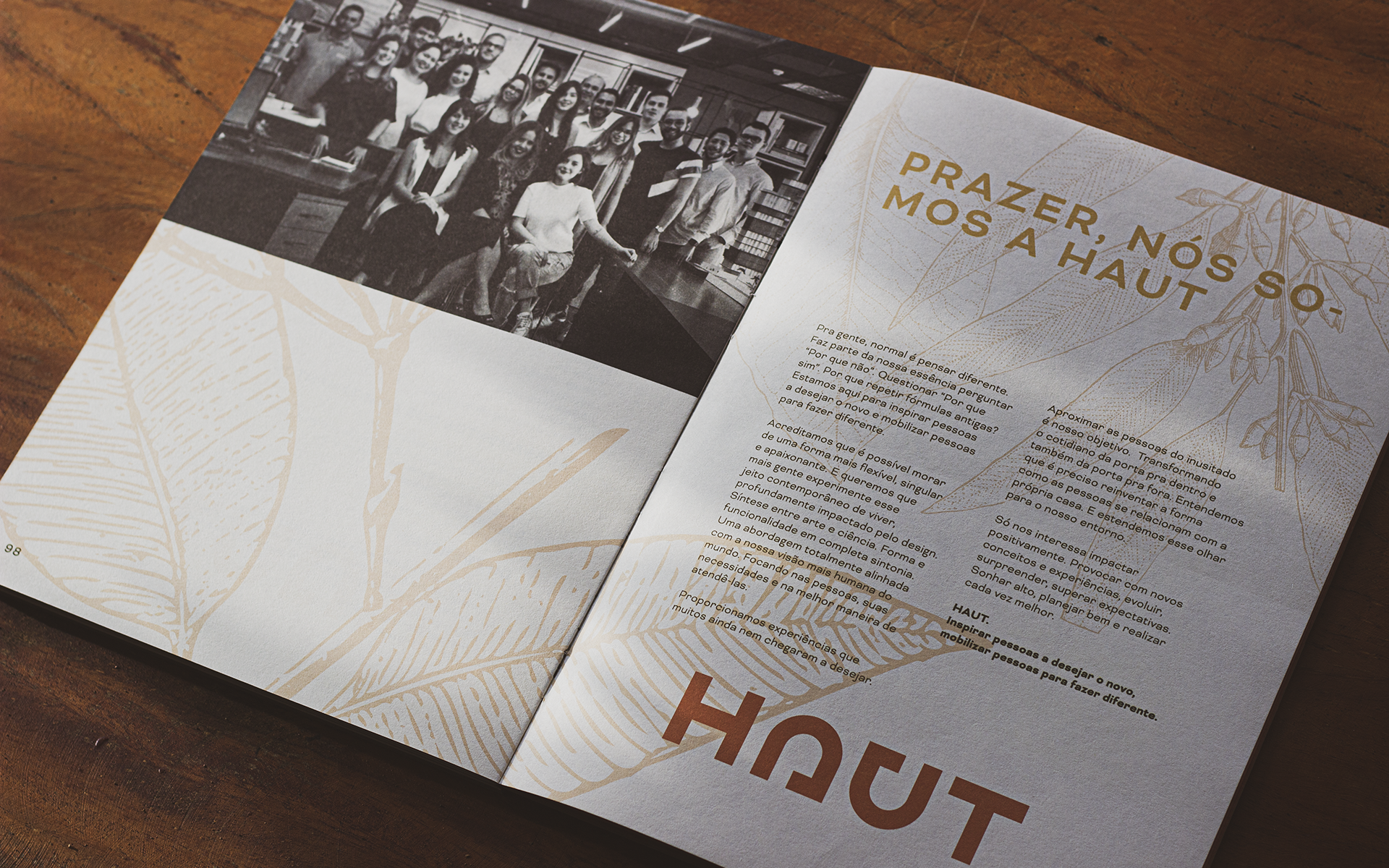
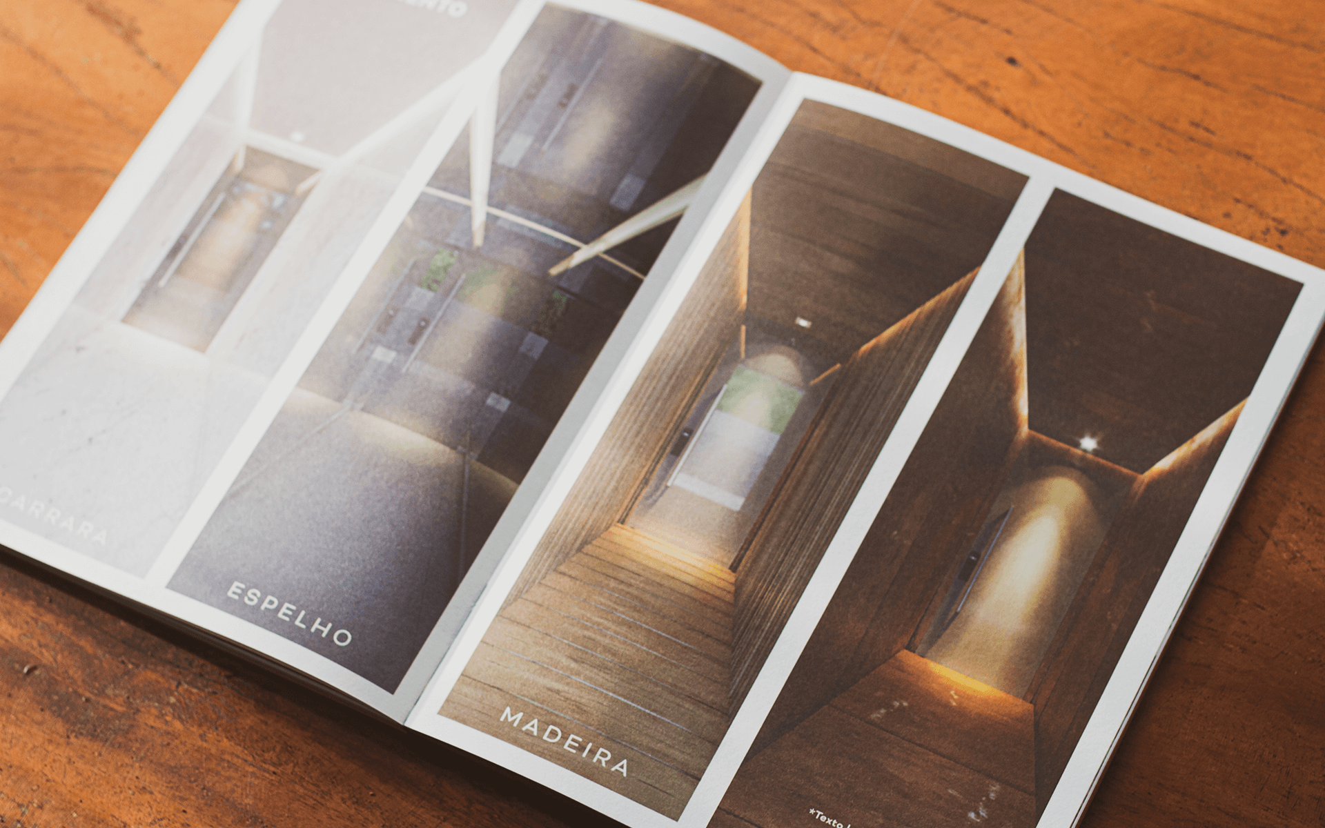
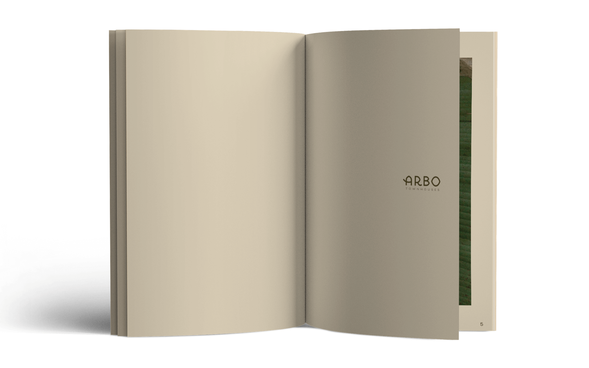
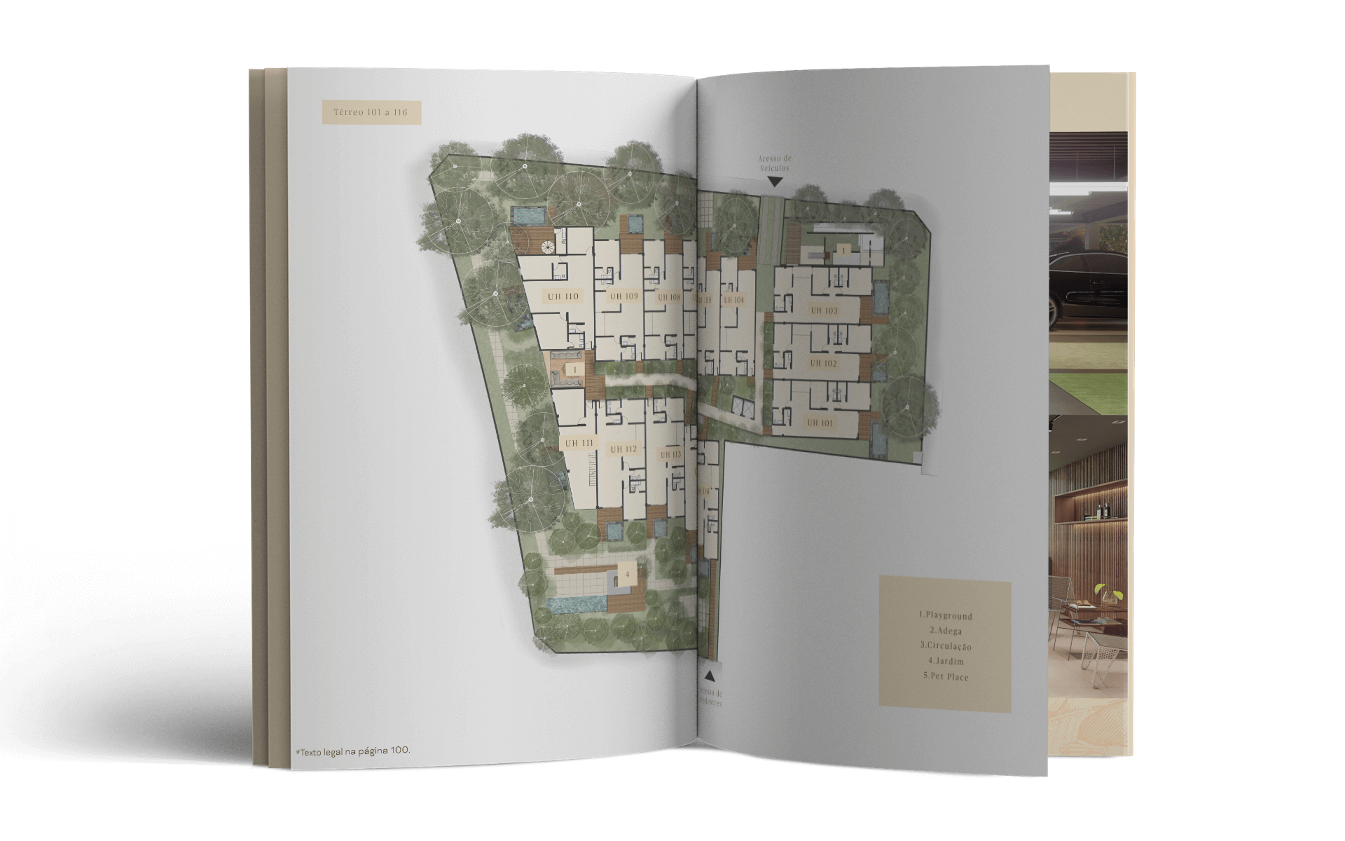
The outside of the packaging follows a minimalist aesthetic in contrast to the inside, where we explored layered illustrations of plants in fine, delicate lines, forming a cradle for the sheets and the book itself. The color of the images and of the poster sheets’ paper reinforces the contrast intended to strike the reader, who then meets the protagonist: the book. The cover keeps the tactile quality of the packaging’s kraft paper, laminated to Paraná board for greater rigidity, durability and a sense of refinement in the hardcover, further enhanced by the hot-stamped Arbo logo. For the inner pages, the graphic design is structured to highlight the images, floor plans and project details. With little text, we had the freedom to use a simple grid and kept interference with the content to a minimum. The result is a high-impact piece completely different from what the real estate market is used to seeing, just like the development itself, and it helped reinforce Haut’s positioning as a singular developer.